7 Small Kitchen Challenges Solved by Houzz Designers
From boosting worktop space to rethinking the floor plan, check out these ideas for maximising a compact kitchen

The usual kitchen design challenges can be amplified when space is tight. Here, experienced designers on Houzz tackle issues from avoiding wasted space to boosting work surfaces to opening up without losing storage. Read on for inspiration.
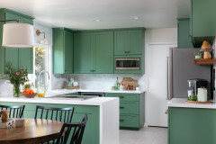
2. Challenge: Not enough worktop space
Solution: Pop in a pull-out
The owners of this compact kitchen love to cook, but even with a new kitchen, designed by Mari Kushino, much-needed worktop space was still going to be in short supply. So Mari came up with an ingenious idea.
This slide-out maple wood butcher’s block can be tucked out of the way when not in use. The feature is next to the cooker – often the most-used surface for food prep – and makes good use of the dead space in front of the window. The drawer beneath it contains the compost bin.
Want to copy the idea? Mari advises making sure the spot you choose has enough room for the pull-out unit and that it won’t block anything important, such as an air vent. She also suggests sourcing a surface that’ll be easy to clean.
You might even want to have your cutting board created so it lifts out for washing after use, or have the pull-out topped with your worktop material and simply use it as a surface to put a chopping board on when needed.
More: A Pull-out Worktop Adds Space to a Small Kitchen
3: Challenge: Small kitchen but can’t extend
Solution: Flip your floorplan
If you live in an unextended Victorian house, it’s likely your kitchen will be in the small galley at the back of the house. To create more room to cook, take inspiration from designer Emma Rodgers of Lived In 365, whose redesign of a Manchester semi turned this familiar layout back to front.
Emma simply switched the kitchen from the poky back of the house to the airy, bright front. She kept the living room in the middle of the house and turned the former kitchen into a dining area. The result? A spacious kitchen with plenty of room to circulate around a central island.
More: A Bold Modern Scheme Updates a Tired Victorian Semi
Thinking of renovating? Find everyone you need, from interior designers to builders, carpenters and decorators, on Houzz.
4. Challenge: Wanting a minimalist aesthetic, but with plenty of storage
Solution: Lose wall cupboards, but extend the storage elsewhere
The order-loving owners of this extended kitchen in a classic Victorian terraced house wanted to combine two potentially incompatible wishes for their kitchen: enough storage to contain family paraphernalia and a minimal, Scandi look.
To achieve the airy feel, interior architect Ruth Milne of Studio Milne designed the kitchen without wall units. Instead, there’s open shelving above the sink and the whole way along the bank of units opposite (seen here). “Even though we were tight for space, it was important to have the shelf above the sink area, so it felt open,” she says.
To compensate for the storage areas lost, Ruth added this long run of cabinets, dropping the height and switching to drawers to incorporate a bench seat at the garden end. “It wouldn’t have worked unless we’d banked out that wall with storage,” she says. “The family even use the space under the bench for kitchen things.”
More: A Family Space That’s Airy Yet Packed with Storage
5. Challenge: The space feels cramped
Solution: Steal back valuable inches
The original kitchen in this tiny Edinburgh flat, owned by designer Amy Shirlaw, had this same layout, but felt cramped. There were heavy-looking wall units on one side and a breakfast bar/work surface and stools squeezed in on the other.
The small space didn’t really allow for a major layout change, though, and Amy was also restricted by the existing location of the sink and washing machine, as the pipes link to neighbouring flats.
To create a more open feel, Amy removed the wall cabinets and the breakfast bar. But how did she compensate for the lost storage and work surface?
First, she came up with the clever idea of reducing the depth of the run on the left. “The difference is only around five centimetres,” she explains, “but if I’d had it standard size, I couldn’t have fitted in a double cupboard under the sink.” It posed no problem for the oven, hob and fridge, but the washing machine now juts out a little, so she added a curtain to hide it.
Amy has a dining table in the adjoining room, so didn’t need to replace the seating she’d removed, and her second storage-boosting solution was the slimline glass-fronted cabinet on the right. As well as looking pretty, it provides essential storage space for Amy’s crockery, a surface for a tea and coffee station and – because it’s on legs – space underneath for a recycling box and her cat’s bowls.
More: A Tiny Galley in a Flat Gains Glamour on a Budget
6. Challenge: No room for an island
Solution: Upsize your worktops
The kitchen in this Victorian maisonette, owned by architect Sam Cooper of E2 Architecture + Interiors, was too small for an island, something he had hoped to include. To make up for the loss of the work surface he would have gained, he came up with a clever solution – extra-deep worktops.
“We made the surfaces 750mm deep rather than the standard 600mm,” he says. “This makes the two sides of the kitchen a little closer together, but we have 1800mm clear between [them].”
The increased depth has really enhanced the work surfaces. “It means you can have your kettle and appliances on the worktop and still have room at the front to work,” Sam says.
One side-effect of this choice is that there’s a bigger-than-usual void behind the base units, which sounds like wasted space, but does have its advantages. “It allows more room for drainage and so on, which gave us more flexibility on how the kitchen was laid out and where we could put the sink and washing machine,” Sam says. “We have a drainage pipe running behind the oven and fridge units, which would have been quite difficult otherwise.”
More: A Modest Extension Transforms a Victorian Maisonette
7. Challenge: Seemingly unusable dead spaces
Solution: Build storage into awkward architectural features
The bittily laid out back of this 1930s house was the opposite of open and well-functioning when the owners first moved in. Designer Claudia Urvois brilliantly reimagined the room – all within its existing footprint – but several architectural details in the kitchen created apparent dead space.
Rather than let this go to waste, Claudia used it to boost storage in ingenious ways. Firstly, the sloping roof created an awkward wedge at the top of the main wall units. To neaten this up and make use of the space, Claudia had the top cupboards (just seen here) custom-made. They’re small inside because of the slope, but still offer handy extra storage.
She also made use of the reduced cupboard space around the extractor fan. Above-hob venting can often create a dead area, whether it’s housed within a plasterboard structure or cupboards. Claudia opted for cabinets so she could include storage around the fan. “When you open the doors, there are four very slim shelves in front of the extractor that hold herbs and spices,” she says.
Finally, a structural column takes up the space at the end of the hob run (seen here), meaning there’s no room to continue the standard-depth cabinetry here. So Claudia came up with the idea of installing shallow shelving in front of the steel. “The owners like entertaining and they use these shelves as a bar,” she says.
More: Kitchen Tour: A Colourful Kitchen-diner With a Smart Utility Room
Tell us…
Have you – or has your designer – resolved challenges posed by your own space-starved kitchen? Let us know in the Comments.
Solution: Invest in bespoke cabinetry
The left-hand wall in this kitchen, designed by Yoko Kloeden, has sections at different depths, which could have resulted in a lot of wasted space, since off-the-shelf cabinets wouldn’t have fitted.
So Yoko designed the kitchen herself and had it made by joiners to maximise the available space. Flush cabinetry at the far end now conceals the shallower areas, which not only creates useful closed storage but also a streamlined look to visually expand the space.
While it may feel like an extravagance, when you have a small or awkwardly shaped kitchen, it’s worth allocating a portion of your renovation budget to going bespoke to ensure every centimetre works hard.
More: A Small Victorian House Where Every Inch is Maximised