9 Green Paint Colors to Consider for Your Kitchen
Prefer a leafy dark? A bold jade? How about a soothing sage? See how these great greens work in various kitchens

We recently shared six ways to add a dash of yellow to an otherwise light and neutral kitchen. Next up: shades of green. Green can be so many things: soothing, lively, bold and reserved. If you’re looking to use this organic hue in your space, here are nine dynamic green paint colors to consider.
For a similar look: Rockwall Vine by Behr.
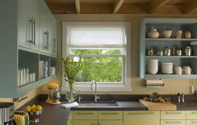
2. Dark Gray-Green
A tad moodier than the previous hue, this dark green has quite a bit of gray in it, making it work well as a neutral green. It offers such a nice, grounding contrast to the abundant shades of white in this elegant kitchen.
Shop for kitchen island lighting
A tad moodier than the previous hue, this dark green has quite a bit of gray in it, making it work well as a neutral green. It offers such a nice, grounding contrast to the abundant shades of white in this elegant kitchen.
Shop for kitchen island lighting
For a similar look: Cushing Green by Benjamin Moore.
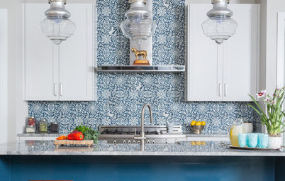
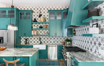
3. Bright Jade
This vibrant shade of green isn’t for everyone, but if you’re looking to bring dynamic color into an otherwise neutral kitchen, check out a saturated blue-green jade.
This is such an eye-catching color that it’s a great choice to draw the eye into a space and distract from any unsavory elements you might have to work with in your kitchen design. And because it calls to mind tropical places, it can brighten and cheer up a space that lacks abundant natural light.
For a similar look: Miami Jade by PPG.
4. Emerald Green
Here’s another gutsy green — a super saturated true green. It’s actually quite versatile despite its high intensity, because it doesn’t veer yellow (warm) or blue (cool). You can pair it with any shade of white, from creamy warm shades to crisp light grays.
Here’s another gutsy green — a super saturated true green. It’s actually quite versatile despite its high intensity, because it doesn’t veer yellow (warm) or blue (cool). You can pair it with any shade of white, from creamy warm shades to crisp light grays.
Because emerald is quite saturated, it tends to work best in smaller doses, such as on the island or as a small accent wall.
It’s a great choice in a kitchen with abundant windows, especially if there are similar enticing green hues on view outside.
It’s a great choice in a kitchen with abundant windows, especially if there are similar enticing green hues on view outside.
For a similar look: Kilkenny by Sherwin-Williams.
5. Soft Blue-Green
Stressful times call for stress-reducing colors. Soft blue-greens are my go-to colors when I meet a homeowner looking to create a calm oasis. It’s a softer, less vibrant version of the tropical jade hue featured earlier and is an excellent choice for anyone looking to add interesting but subtle color to their kitchen.
Stressful times call for stress-reducing colors. Soft blue-greens are my go-to colors when I meet a homeowner looking to create a calm oasis. It’s a softer, less vibrant version of the tropical jade hue featured earlier and is an excellent choice for anyone looking to add interesting but subtle color to their kitchen.
For a similar look: Starry Woods by Valspar.
6. Deep Blue-Green
Here’s another pretty blue-green option, darker than the last hue but similarly muted. It’s a green with heavy blue and gray additions, which help to neutralize it.
Here’s another pretty blue-green option, darker than the last hue but similarly muted. It’s a green with heavy blue and gray additions, which help to neutralize it.
It’s a beautiful choice in a kitchen with medium wood tones. The cool green contrasts with the wood elements, which allows them to really stand out.
For a similar look:
Waterbury Green by Benjamin Moore.
Waterbury Green by Benjamin Moore.
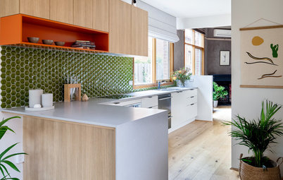
7. Lemon-Lime Green
Looking to liven things up in your kitchen? A zesty citrus green will do the trick nicely. I like using shades of this hue for spaces that need a boost of light. Or for those who want to keep the palette fairly light, crisp and clean but still want some fun color in the mix.
Here’s another example of using an appetizing color — margarita green in this case — to flavor your design.
For a similar look: Limon Fresco by Sherwin-Williams.
8. Spring Green
This appetizing green wall has a lovely fresh and organic vibe and pairs well with the lemon-lime green on the back of the shelf cabinet. Both colors suggest spring, a time of hope, rebirth and growth.
This appetizing green wall has a lovely fresh and organic vibe and pairs well with the lemon-lime green on the back of the shelf cabinet. Both colors suggest spring, a time of hope, rebirth and growth.
The vegetal cabinet color here gives this kitchen a welcoming feel. It’s a cool and refreshing hue for kitchens in warm climates, but it has enough warmth that it can also work well in a colder climate. It helps makes this kitchen homey and hospitable.
For a similar look: Hillside Grove by Behr.
9. Soft Sage
The quietest colors of the bunch, light sages are among my favorites for those seeking a super subtle shade of green. It has some gray in it, which keeps it from being too sweet and pastel. It looks lovely with light woods and warm whites.
The quietest colors of the bunch, light sages are among my favorites for those seeking a super subtle shade of green. It has some gray in it, which keeps it from being too sweet and pastel. It looks lovely with light woods and warm whites.
For a similar look: Sage Splendor by PPG.
Your turn: What’s your favorite shade of green for a kitchen accent color? Please share in the Comments.
More on Houzz
The Most Common Kitchen Design Problems and Ways to Tackle Them
Hire a kitchen remodeler
Shop for kitchen products
Your turn: What’s your favorite shade of green for a kitchen accent color? Please share in the Comments.
More on Houzz
The Most Common Kitchen Design Problems and Ways to Tackle Them
Hire a kitchen remodeler
Shop for kitchen products


Sponsored
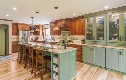
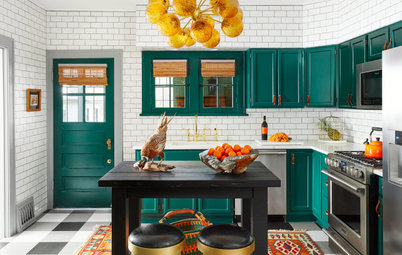
Given it’s the room we cook in — and often eat in — it makes sense to clad a kitchen in appetizing colors. This gorgeous deep green reminds me of my favorite vegetables and therefore really draws my eye into the space. It’s a fantastic accent color for the row of cabinets in this beautiful modern-rustic kitchen.
The plentiful white, wood and gold-hued accents keep the space light, bright and open.
Find a kitchen designer on Houzz