Colour: How to Decorate With Bright Orange
This bold and bouncy shade can liven up any space, and those within it

Google the word ‘orange’ – we’re talking interiors here, not phones or hit TV series – and you’ll find plenty about its health benefits. ‘Improves lung function’, ‘reduces self-consciousness’, ‘stimulates the nervous system’, and ‘expands your thinking’. Maybe. But I dare you to walk into a room peppered with this hue and not feel good. Whether you splash it all over your walls or use it sparingly as an accent or accessory colour, this is one trend you need to try.
Time to discard thoughts of garish 1970s retro designs that force you further into your shell. It’s a new day: bright orange is a mark of confidence in the home. Uplifting, sophisticated and surprisingly versatile. Here are a few tips and tricks to get you started.
Time to discard thoughts of garish 1970s retro designs that force you further into your shell. It’s a new day: bright orange is a mark of confidence in the home. Uplifting, sophisticated and surprisingly versatile. Here are a few tips and tricks to get you started.
Pop some into a pattern
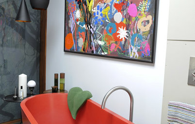
A more deft application of bright orange but one that’s no less refreshing in plain rooms. Geometric prints and bright florals add a touch of eccentricity while also opening up the possibility of introducing other shapes and colours. Grey, black and white are particularly effective contrasting colours, which also add definition. Blue is a more adventurous choice. Otherwise earthy burnt red offsets bright orange very nicely.
See more bright ideas for orange kids rooms.
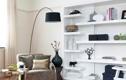
Shake things up in the lounge
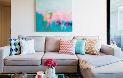
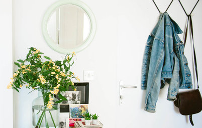
If you’re not much of a risk taker and fear that bright colours will disrupt your neutral kingdom of calm, dip a toe in the paint pot with some contrasting scatter cushions. Small little things but they’ll make that sofa instantly more appealing. Explore ways to complement your new addition – look closely above and you’ll notice a hint of orange in the interior of the lampshade. A wink rather than a nudge.
If you’re not much of a risk taker and fear that bright colours will disrupt your neutral kingdom of calm, dip a toe in the paint pot with some contrasting scatter cushions. Small little things but they’ll make that sofa instantly more appealing. Explore ways to complement your new addition – look closely above and you’ll notice a hint of orange in the interior of the lampshade. A wink rather than a nudge.
Stack shades of the same colour
Now you’ve begun to explore the brighter end of the spectrum, you can start to really have some fun. Work you way back along, looking for subtle ways to riff off bright orange. From low-profile furniture to eye-level ornaments and lampshades up high, a tonal approach to colour helps to tie a room together.
Now you’ve begun to explore the brighter end of the spectrum, you can start to really have some fun. Work you way back along, looking for subtle ways to riff off bright orange. From low-profile furniture to eye-level ornaments and lampshades up high, a tonal approach to colour helps to tie a room together.
Bridge the gap with colour
Let’s say you’ve just opened up a living room or attic. You’re free to move around … perhaps too free. What you need is a space that feels as one. Bright orange works very well as a high-contrast theme, a link between these soft grey sitting and dining areas. From the cushions and rug to chairs, this accent colour enhances the flow of the space without becoming overbearing.
Let’s say you’ve just opened up a living room or attic. You’re free to move around … perhaps too free. What you need is a space that feels as one. Bright orange works very well as a high-contrast theme, a link between these soft grey sitting and dining areas. From the cushions and rug to chairs, this accent colour enhances the flow of the space without becoming overbearing.
Add zest in the kitchen
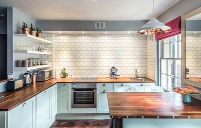
Using glossy orange is a great way to draw the eye to specific features in the kitchen, for example the island countertops and panelling above. Remember, this is one of the most regularly used spaces in the home. Don’t fall flat in a puddle of white every day. Turn big units into wow moments. Splashbacks and stoves also make great attractions.
These orange kitchens show you don’t have to be afraid of the colour.
Maximise warmth and light
Although a light and neutral palette often helps to accentuate the feeling of calm and openness, such spaces can sometimes feel a little cold – particularly hallways and larger seating areas. Take things up a notch with a series of bright orange cushioned seats. Besides adding warmth with their fiery shade, they look so inviting as natural light floods in.
Although a light and neutral palette often helps to accentuate the feeling of calm and openness, such spaces can sometimes feel a little cold – particularly hallways and larger seating areas. Take things up a notch with a series of bright orange cushioned seats. Besides adding warmth with their fiery shade, they look so inviting as natural light floods in.
Break the rules
The clue is in the name. There’s usually room for only one colour in a monochromatic space. But who wants to play by the rules? Instead, create a soft yet strong contrast using a couple of pillows, featuring either a matching pattern or a variation. Instant makeover: quick wins to break the tedium of grey, without keeping you up at night.
The clue is in the name. There’s usually room for only one colour in a monochromatic space. But who wants to play by the rules? Instead, create a soft yet strong contrast using a couple of pillows, featuring either a matching pattern or a variation. Instant makeover: quick wins to break the tedium of grey, without keeping you up at night.
Make the most of your lighting
Bright orange is one of the most effective colour choices when it comes to casting an intense yet diffused glow around a room. Choose the right light fixture or pendant and not only will you draw attention upwards, you’ll also create a relaxing and rewarding atmosphere as night falls.
Have you used orange in the home? Share you decorating stories in the Comments below.


Sponsored

Sponsored
When it comes to block colour, nothing makes a bigger statement than your choice of wall paint. This orange feature adds real fizz to the dark kitchen. It screams, ‘Think you know me? Think again.’ And this isn’t a rash decision that you’ll soon regret. Those matching stools and small kitchen accessories show it’s all part of the master plan.