Decorating
How to Decorate Your Home with Teal
This blue-green colour is a beautiful and versatile mid-toned shade. Check out these 10 ways to use it in your home

Teal is a mixture of blue and green that can range from a bright, almost turquoise colour to a muted green slate. It can look really striking when paired with bright white, but also works with softer tones of cream, navy, pink and especially gold and brown.
Some of the best colours come straight from nature, and teal is no exception. It gets its name from a small duck, the common teal. The males have deep greenish-blue eye patches that beautifully complement their chestnut-coloured heads and this combination of teal and brown is one that also works very well in interiors.
Whether dotted around as an accent or used more widely across walls and floors, be inspired by these 10 ways to use this versatile and appealing colour.
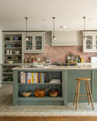
2. Create a statement
Without its teal island, this kitchen by Catherine de Meur Interiors would still be beautiful, but the addition of the strong hue totally transforms the scheme.
The colour-rich unit creates a central focus in the room. It’s a quirky touch and a nice surprise, helping to make this kitchen feel truly individual.
Search for an interior designer on Houzz today.
3. Emphasise its depth
Teal, with its medium blue-green tone, can look vibrant when nudged towards the blue, or warm and deep when taken down towards the green.
In this room, a deep teal forms a rich backdrop for the vibrant blue door and natural wood table. The teal doesn’t fight with the blue; it helps to integrate it. Imagine how starkly the door would stand out against white; teal creates a more sophisticated effect.
4. Add as an accent
Even just a hint of teal can add a little pace and energy to a room, as this hallway by J Kurtz Design shows. Try it on artwork or a cushion to bring focus to a pale, pared-down scheme without it sticking out like a sore thumb.
Even just a hint of teal can add a little pace and energy to a room, as this hallway by J Kurtz Design shows. Try it on artwork or a cushion to bring focus to a pale, pared-down scheme without it sticking out like a sore thumb.
5. Pair it with white
Using teal as an accent works beautifully, but this kitchen by Kate Mountstephens Architecture+Heritage demonstrates how it can also triumph as the key colour in a scheme. By choosing a bright, almost turquoise tone, and using it in conjunction with plenty of white, the effect is fresh and joyful.
Using teal as an accent works beautifully, but this kitchen by Kate Mountstephens Architecture+Heritage demonstrates how it can also triumph as the key colour in a scheme. By choosing a bright, almost turquoise tone, and using it in conjunction with plenty of white, the effect is fresh and joyful.
6. Use on outdoor woodwork
Teal makes an attractive colour for front doors and window frames, and its softness means it’s a good match with older buildings. It looks friendly and welcoming on this cottage, a pleasing partner to the rich stonework rather than jarringly contemporary.
Teal makes an attractive colour for front doors and window frames, and its softness means it’s a good match with older buildings. It looks friendly and welcoming on this cottage, a pleasing partner to the rich stonework rather than jarringly contemporary.
7. Try it on tiles
Coloured tiles can transform a bathing space and these diamond-shaped ones look lovely in a greenish shade of teal. Tonal variations create a wash of subtle colour, while light reflected off the glazed surfaces gently reduces the overall impact of the teal and creates texture.
Coloured tiles can transform a bathing space and these diamond-shaped ones look lovely in a greenish shade of teal. Tonal variations create a wash of subtle colour, while light reflected off the glazed surfaces gently reduces the overall impact of the teal and creates texture.
8. Swap with grey
Try teal as an alternative to grey. It works in much the same way, adding colour and personality to a room, but with plenty of subtlety, so it’s easy to live with.
Choose a shade towards the slate green end of the spectrum to add just a hint of colour without overwhelming the scheme.
Try teal as an alternative to grey. It works in much the same way, adding colour and personality to a room, but with plenty of subtlety, so it’s easy to live with.
Choose a shade towards the slate green end of the spectrum to add just a hint of colour without overwhelming the scheme.
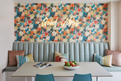
9. Team with bright tones
Teal is rich and strong enough to hold its own against bolder colours, so it can be a good option for an eye-catching scheme.
As shown in this design by Studio Kaimi, it can play a part in a bold room design without being overpowering, and it works particularly well with coral, which is its opposite on the colour wheel.
10. Layer different shades
A subtle way to work with this serene colour is to team it with another shade of teal or even blue.
In this living room by Jeff Schlarb Design Studio, a teal sofa and armchairs stand on a patchwork rug comprised of different shades of teal and blue. The way the shades almost-but-not-quite match creates layers of colour and depth while still resulting in a peaceful scheme.
Tell us…
Have you used teal in your home? Share your photos and tips in the Comments.
There’s a richness and lushness to teal that makes it a perfect fit with velvet. Whether on a headboard, cushion or upholstered armchair, teal velvet seems to shimmer and demand to be stroked.
This scheme by Domus Nova shows how it can bring understated elegance to a room.
More: How to Create a Colourful Yet Calm Bedroom