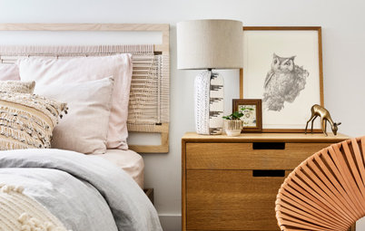
How to Create a Colourful Yet Calm Bedroom
Let the experts show you how to pep up the palette in your sleep space like a pro

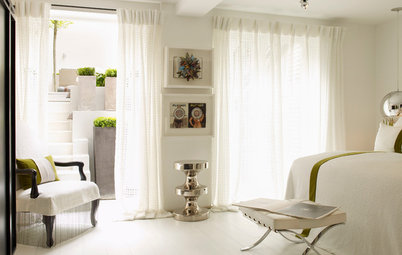
The trend for a long time has been for pale and neutral bedroom schemes to create a soothing sanctuary. Lately, though, we’ve spotted a shift in the photos uploaded to Houzz – suddenly, there’s colour in our sleep spaces, and lots of it.
Vibrant, strong or multicoloured shades can evoke a sense of joy and positivity, so the trend may stem from an ongoing happiness at a return to normal life, post-pandemic. But how to retain that all-important restful feel when resetting your bedroom palette? Let the designers of these gorgeously colour-saturated, yet calm and ordered, spaces inspire you.
Vibrant, strong or multicoloured shades can evoke a sense of joy and positivity, so the trend may stem from an ongoing happiness at a return to normal life, post-pandemic. But how to retain that all-important restful feel when resetting your bedroom palette? Let the designers of these gorgeously colour-saturated, yet calm and ordered, spaces inspire you.
Accessorise boldly
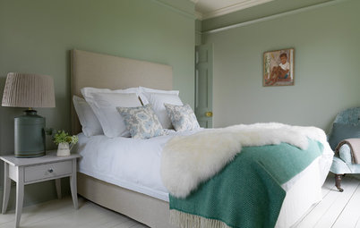
Adding colour doesn’t need to be permanent. Here, a striking, colourful bedspread, pepped up further by bright, stripy bolsters, is the room’s centrepiece.
The designer has also chosen to paint a feature wall in a strong blue shade, tying in with the pattern on the fabric for a cohesive arrangement. This might be too much commitment for a recovering neutrals addict, but white walls would not dampen the effect – in fact, the bedspread would stand out even more.

Need a pro for your home renovation project?
Let Houzz find the best pros for you
Let Houzz find the best pros for you
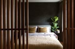
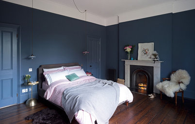
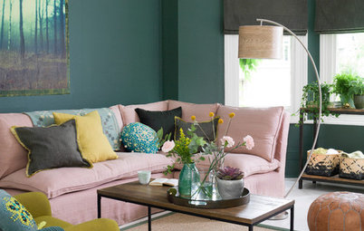
Add contrast
This dramatic design in a Gloucestershire house by Sims Hilditch is dominated by that rich, dark avocado-coloured panelled wall and matching headboard. Purple and pink tones in the artwork, picked out in the cushions, create contrast, which tends to make for a stronger visual impact.
The grey textiles (the curtains and throw) are important here: they temper the effect, so while the design is most definitely bold, it’s also elegant, rather than in-your-face.
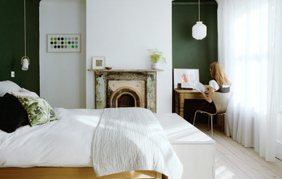
Browse the Houzz photo library for more bedroom inspiration.
This dramatic design in a Gloucestershire house by Sims Hilditch is dominated by that rich, dark avocado-coloured panelled wall and matching headboard. Purple and pink tones in the artwork, picked out in the cushions, create contrast, which tends to make for a stronger visual impact.
The grey textiles (the curtains and throw) are important here: they temper the effect, so while the design is most definitely bold, it’s also elegant, rather than in-your-face.
Browse the Houzz photo library for more bedroom inspiration.
Dot with dark details
Injecting a neutral space with dark, richly hued flourishes is a quick way to change the feel of a room.
Without the deep blue and rich rust shades of the cushions, headboard and artworks, this minimalist space by Fable Interiors would have a Scandi, monochrome mood. But now, punctuated by the additional colours, there’s more punch.
The design discipline here is strong: the colours in the artwork and the cushions match exactly, resulting in a room that would tick the colour box while pleasing the most ordered of minds.
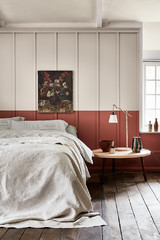
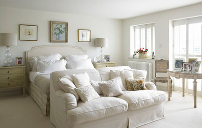
Stay on the soft side
If your comfort tones are neutrals, but you’re game for a small change, take inspiration from the peaceful palette in this bedroom in a 1930s home, created by Drawn London.
On this side of the room there are muted blues and plaster pink, given a crisp finish by the addition of clean whites and anchoring black accents. The result is super-soothing.
For those brave enough to go a little bolder, check out the other side of the room…
…where a rich mustard carpet, warm brick zellige tiles around the fireplace and petrol velvet curtains (see previous photo) add a little more zing.
Take your cue from nature
Combining colours can be intimidating, especially when you want to keep the end result understated. Where to start?
Picking a palette from nature is often a winner. Here, you can imagine returning from a country walk by the sea and coming up with the sludgy sage green and soft, rich blue that form the backdrop for this relaxing room, designed by Matteo Bianchi Studio.
Add in plenty of natural textures – plants, rattan, solid wood – and a couple of accent colours inspired by roadside plants – buttery yellow yarrow and ripening blackberries, say – and the result is strong but calm, just like its natural inspiration.
Confine it to the cushions
While the design of this Art Deco room, created by Fab My Life, layers a number of colours, the difference between a pastel palette and a brightly colourful one is all down to a single accessory – those vibrant orangey-red velvet cushions.
Using the framed artwork above the fireplace as a reference point for every other shade here makes for a very pulled-together scheme.
Cover up the bright cushions and see how the feel of the room changes. And if the owner fancies a different look, they can just move them to another room.
Tell us…
Have you been inspired by any of these colourful bedroom ideas? Share your thoughts in the Comments.


Sponsored

Sponsored
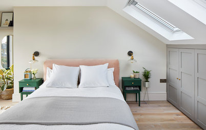
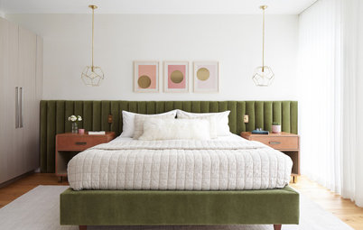
In this sophisticated and restful room, designed by Brooke Copp-Barton Interiors, colour symmetry, in the form of a pair of matching cushions and the cupboards framing the bed, pulls the whole room together neatly.
The scheme also works so well because of its limited palette. Red, white and blue dominate, but – thanks to shades of petrol, duck egg and raspberry, as well as the addition of tan, in the form of rattan accents – not with any echoes of the Union Flag. Nothing wrong with the alternative, but vibrant, primary versions of each colour would change the room entirely.