How to Warm Up a Neutral Bedroom
Neutral shouldn’t be a byword for boring. Here’s how the professionals keep muted colours interesting

Pale shades of grey, taupe, beige and off-white can create a wonderfully calming backdrop in a bedroom, but can be in danger of looking bland. Here’s how to ensure the result is inviting and warm without sacrificing the soothing colours.
Add greenery
The inclusion of plants in this otherwise understated twin room, created by Keyhole Interiors, adds a sense of life. Green is often said to be a soothing colour and here, used as an accent shade, it doesn’t overwhelm the otherwise muted, neutral scheme.
Botanic prints and soft green cushions tie in with the plants and create visual harmony.
Introduce pink and green
These two colours combine very well in the mix of a neutral palette. This is especially so when the pink is soft and the green, whether dark, as here in this room from Ash Island Lofts, or soft and pale, as in the previous room, is at the other end of the spectrum from zingy lime.
Adding to the warmth here is the mix of other pale, neutral colours in the bed blanket and the wood flooring.
Find a local interior designer in the Houzz Professionals Directory.
Bring in some brass
A key softening detail in this room, created by Fervid Group Design & Building Contractors, is one of the smaller ones – those brass cupboard handles. This warm-toned metal can have a powerful aesthetic impact, even when used in very small doses. (Just think of all those Shaker kitchens with brass cup handles you may have ogled here on Houzz.)
What boosts the welcoming feel further are the walls. Not only are they panelled, adding texture, but the colour and form reach across the ceiling, creating a gently cocooning effect thanks to this blurring of the room’s edges.
Layer up earth tones and natural textiles
Rattan mixed with loose-woven textiles is a simple combination that can build interest in a neutral room.
The example here, designed by Studio Morton, is useful for demonstrating the point. The room has no period features or quirky architecture to fall back on, so it’s all about the accessories, namely the retro chair, the lampshade, the basket and the bedspread.
Enriching the natural effect is the accent palette of earthy neutrals – rust, soft heather and barley.
More: Where Designers Would Spend and Save in a Bedroom
Weave in texture
Uniform finishes can have the effect of flattening a room, especially when the palette has little variation. But an almost one-colour scheme can be beautiful and look extremely elegant, as seen in this design by Decoroom.
The trick is to bring the chosen colour in across a variety of textures. Here, there’s the bedspread, fabric wall covering, headboard, curtains, footstool blanket and carpet, all blending in with the overall paint colour, but highlighted by their varied finishes.
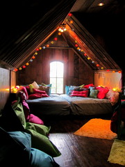
Opt for vintage
Anything that’s lovingly worn around the edges has the potential to introduce character to a room. Although much of this little attic space is finished in similar shades of grey, the painted antique furniture brings a cottage feel.
It’s helped, of course, by the ancient beams, but also the old oil painting, a decorative detail that will almost always be a characterful addition to a room.
Tell us…
What colour is your bedroom and have any of these spaces inspired you to make changes? Share your thoughts in the Comments.
The foundations of this calming colour palette, part of a project designed by Avis Appleton & Associates, are blue and grey. But what stops the combination of more or less only two colours in this room from feeling stark or showroom-y is about more than the colours themselves; it’s the way they appear across different textures, patterns and forms.
With the blue, it comes plain in the chair, as strokable geometrics in the blanket, and as dark and moody shapes in the painting. Similarly, the grey has texture in the painted doors, looks tactile in the carpet, and is patterned in the curtains. The result is depth and a homely feel.