London Houzz: A Tiny Cottage Gets a Bright, Space-Enhancing Reno
Thoughtful design and reclaimed pieces gave a small worker’s cottage space and light – without taking its vintage appeal

It’s a common question – how do you modernise a period property while retaining its original charm? This challenge was paramount for Phil Thomas of building and design company Albert’s House when it came to redesigning a couple’s compact Victorian worker’s cottage in West London, UK. “We wanted to bring the home up-to-date while respecting its character,” he says.
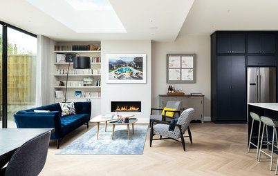
Thomas added a pitched-roof side-return extension and opened up the living and dining rooms to create more space, but he paid attention to detail in his design to ensure the home kept its vintage feel.
Thomas added a pitched-roof side-return extension and opened up the living and dining rooms to create more space, but he paid attention to detail in his design to ensure the home kept its vintage feel.
Thomas sourced antique brass door knobs for the cabinets, and the couple went for a Carrara marble benchtop. “It adds texture to the room and enhances the light,” he says.
Subway tiles on the splashback wall keep the look simple and are echoed in the bathroom upstairs.
Struggling to maximise your space? Find an architect near you who knows what’s possible in your local council
Subway tiles on the splashback wall keep the look simple and are echoed in the bathroom upstairs.
Struggling to maximise your space? Find an architect near you who knows what’s possible in your local council
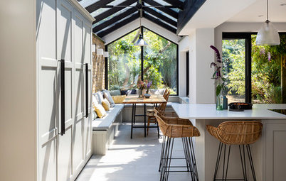
The houses in this conservation area are quite close together, so a pitched-roof extension created more space without impinging on the neighbours.
Thomas left the London stock brick exposed on the party wall to add character. The back door, which mirrors the Shaker look of the kitchen cabinets, is part-glazed to let in light.
Three skylights brighten the space even more, while angled wall lamps illuminate the way in the evening.
Thomas left the London stock brick exposed on the party wall to add character. The back door, which mirrors the Shaker look of the kitchen cabinets, is part-glazed to let in light.
Three skylights brighten the space even more, while angled wall lamps illuminate the way in the evening.
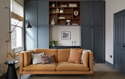
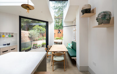
The walls between the dining room, hallway and living room were removed to create an open-plan space. “We laid band-sawn oak floorboards throughout the ground floor to add warm texture,” says Thomas.
“The dining table and chairs were reclaimed from a project our builder had recently finished nearby,” he says, “and the fireplace surround was from the same renovation.”
“The dining table and chairs were reclaimed from a project our builder had recently finished nearby,” he says, “and the fireplace surround was from the same renovation.”
The living room fireplace (just seen) was already in place, but Thomas painted its orange pine surface in the same shade as the kitchen’s base units.
The wall between the kitchen and living spaces wasn’t completely opened up. “These cottages are really cosy, so we wanted to keep a bit of that,” says Thomas. “It’s also more practical for them, as they have a dog. They can pull a baby gate across the larger opening when they come in from a muddy walk.”
The original kitchen door on the left was blocked up, but the top half has been left open to provide a view of the kitchen and as a nod to the original architecture of the house.
In the main bedroom, the bed was wider than the chimney breast, so the team created false half walls on either side to fill out the space. The shelves on top are hinged to give access to storage within.
Opposite the bed, a wall-to-wall wardrobe with internal drawers provides plenty of storage. The MDF-panelled doors were spray-painted in a very pale grey to complement the darker walls.
A divan bed in the second bedroom provides valuable extra storage. Thomas weaved in a vintage feel with an antique chest of drawers and an upcycled wooden crate next to the bed.
“The bathroom is quite large, which allowed us to fit in a separate shower, a freestanding bath and a double basin,” says Thomas. “The basin and bath were reclaimed from the same project as the dining table and fireplace.”
A vintage-style towel rail hangs on the wall to add to the traditional look. Phil painted the side of the cast-iron bath the same colour as the kitchen units to give the home a harmonious look.
A vintage-style towel rail hangs on the wall to add to the traditional look. Phil painted the side of the cast-iron bath the same colour as the kitchen units to give the home a harmonious look.
Carrara marble mosaic tiles on the floor and white subway tiles on the wall tie in with the materials used in the kitchen.
Browse more beautiful bathrooms with shades of grey
Browse more beautiful bathrooms with shades of grey
The attic had already been converted into a bedroom, and the grey wool carpet that features in the first floor bedrooms continues up the stairs.
The pendant light is in the same style as those in the living spaces on the ground floor.
The pendant light is in the same style as those in the living spaces on the ground floor.
Happily, there wasn’t much to do in the converted attic, apart from adding a lick of paint, some skylights, and brushed stainless-steel fittings and sockets.
Your turn
What’s your favourite room or feature in this small worker’s cottage? Share your thoughts in the Comments, like this story, save the images, and join the renovation conversation.
More
Keen to see another beautiful home from overseas? Take a peek at this Paris Houzz: A Fresh Take on Classic Parisian Design

Sponsored
Sponsored
House at a Glance
Who lives here: A couple
Location: London, UK
Property: A Victorian worker’s cottage
Size: Three bedrooms and one bathroom
Designer: Phil Thomas of Albert’s House
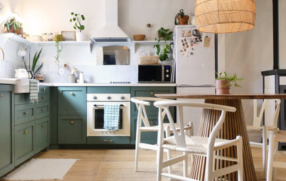
To increase space in the small cottage, the kitchen was extended to the side. “The couple were keen to have an island for sociable eating,” says Thomas. He positioned it to face out to the garden, so diners have a view, and away from the side wall, so it didn’t block the passage to the back door.
The bespoke, Shaker-style cabinets have been spray-painted in two shades; the base units are lead grey and the wall units are an off-white, which helps to open up the space.