The Best Paints and Colours Under the Australian Sun
Let your home make a style statement by painting it inside and out in hues that really shine when enveloped in our gorgeous Aussie sunlight

The blazing Aussie sun can be relentless on home surfaces, especially exterior walls and roofs, so it’s important to choose good quality paint that will last. This initial investment of a fair bit of money and effort will pay off in the long run as your walls set the tone of your property by being the first thing you see when you enter the yard or a room. They also act as a canvas for plants, furniture and decor to play off. Here are the hues that suit our unique, yet strong, sunlight.
Off-white. Keep your cool with this stunning shade that reflects the heat for comfort in summer and echoes the beauty of our sandy beaches.
WHY IT WORKS: It gives the clean refreshing appeal of white without looking too stark.
WHERE TO USE IT: Indoors or out. It’s a high-maintenance choice so choose a washable paint. And avoid placing it in high-traffic areas indoors where children and pets can mark it.
WHY IT WORKS: It gives the clean refreshing appeal of white without looking too stark.
WHERE TO USE IT: Indoors or out. It’s a high-maintenance choice so choose a washable paint. And avoid placing it in high-traffic areas indoors where children and pets can mark it.
Burgundy. Jazz up a plain space with a coat or two of this enriching hue that’s surprisingly versatile. Whether you pair it with a tawny beige or grey to play it down, or a bold green or white for an eye-catching effect, its placement creates a sense of warmth that visually blends the indoors and out.
WHY IT WORKS: It’s rich and masculine and complements Aussie natives from grasses to gums to palm trees.
WHERE TO USE IT: Landscaping structures or feature walls in living rooms. A little goes a long way so keep it as an accent colour.
WHY IT WORKS: It’s rich and masculine and complements Aussie natives from grasses to gums to palm trees.
WHERE TO USE IT: Landscaping structures or feature walls in living rooms. A little goes a long way so keep it as an accent colour.
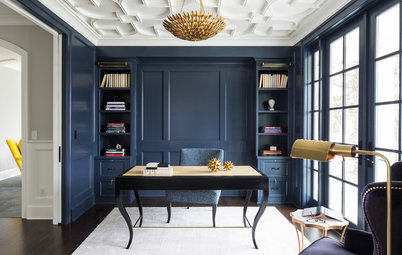
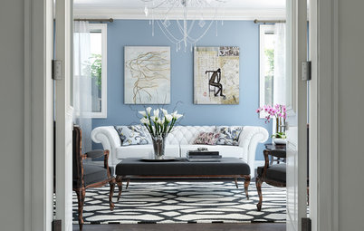
Taupe. Unify the elements of a sculptural home or yard with this fail-safe colour for fuss-free, understated style.
WHY IT WORKS: It’s safe and soothing so it’s perfect if you’re renovating with re-sale appeal in mind.
WHERE TO USE IT: Exterior walls with a white or light trim to provide visual balance and prevent dullness.
Step inside this home
WHY IT WORKS: It’s safe and soothing so it’s perfect if you’re renovating with re-sale appeal in mind.
WHERE TO USE IT: Exterior walls with a white or light trim to provide visual balance and prevent dullness.
Step inside this home
Gunmetal. Get your home off to a firing start with this popular hue which will soak up the sunshine and keep the space warm for outdoor entertaining as the sun dips.
WHY IT WORKS: It subtly blends into its surrounds, letting plants and landscaping features be the stars.
WHERE TO USE IT: Gardens and courtyards. Indoor use will establish an industrial vibe.
WHY IT WORKS: It subtly blends into its surrounds, letting plants and landscaping features be the stars.
WHERE TO USE IT: Gardens and courtyards. Indoor use will establish an industrial vibe.
Ochre. Let the land be your inspiration and paint an indoor or outdoor fireplace in ochre for a low-key look that will disguise dust and dirt.
WHY IT WORKS: Earthy and easy on the eyes, it reminds us of the outback and Uluru.
WHERE TO USE IT: In small doses on fireplace surrounds or on feature walls.
WHY IT WORKS: Earthy and easy on the eyes, it reminds us of the outback and Uluru.
WHERE TO USE IT: In small doses on fireplace surrounds or on feature walls.
Cream. Set the stage for sophistication and a feel of relaxed glamour with a creamy hue that bounces sunlight around a room. Keep in mind that fingerprints and scuff marks will be highly visible so regular cleaning will be required.
WHY IT WORKS: Sweeter and prettier than white, it forms a lovely base to show off the rest of the room and soothes the eye.
WHERE TO USE IT: Interior and exterior walls.
See more of this seaside property
WHY IT WORKS: Sweeter and prettier than white, it forms a lovely base to show off the rest of the room and soothes the eye.
WHERE TO USE IT: Interior and exterior walls.
See more of this seaside property
Celery green. Cheer your home up with this pleasant tone that happily rests midway between sunny yellow and mellow green.
WHY IT WORKS: It subtly blends the home into the surrounding greenery while keeping the space light and bright.
WHERE TO USE IT: Outdoors. Indoors without a bright light source could make it look sickly.
WHY IT WORKS: It subtly blends the home into the surrounding greenery while keeping the space light and bright.
WHERE TO USE IT: Outdoors. Indoors without a bright light source could make it look sickly.
Khaki. There’s a reason khaki is a wardrobe staple. Its low-key appeal adds a touch of colour to exterior walls while going with just about every other hue.
WHY IT WORKS: Subtle, calming and crisp, it showcases foliage to a tee.
WHERE TO USE IT: Exterior walls with a trim in white or varying shades of grey for visual interest.
WHY IT WORKS: Subtle, calming and crisp, it showcases foliage to a tee.
WHERE TO USE IT: Exterior walls with a trim in white or varying shades of grey for visual interest.
Burnt orange. Those with a passion for loud colour can have fun coating a garden feature wall in lashings of this bold hue. A stippled matt or semi-gloss finish will keep it subdued enough to look at in the sunlight without glare.
WHY IT WORKS: It adds the zest of orange to a garden but complements flowers and foliage.
WHERE TO USE IT: Sparingly in the garden. Interior use could take over a small space.
WHY IT WORKS: It adds the zest of orange to a garden but complements flowers and foliage.
WHERE TO USE IT: Sparingly in the garden. Interior use could take over a small space.
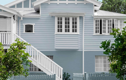
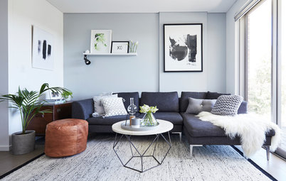
Blue-grey. Easy on the eyes, this calming tone complements metal design features and holds the heat in summer.
WHY IT WORKS: It adds a shot of masculine colour that doesn’t overwhelm the landscape.
WHERE TO USE IT: Exterior walls and garden features. If used indoors it will make a room look smaller.
WHY IT WORKS: It adds a shot of masculine colour that doesn’t overwhelm the landscape.
WHERE TO USE IT: Exterior walls and garden features. If used indoors it will make a room look smaller.
Beige. Avoid arguments with this faithful shade. Beige is the ideal hue for a couple who have different decorating tastes. Perfect for a sunny spot, this versatile shade works well indoors and out by maintaining a light and airy feel.
WHY IT WORKS: It goes with everything and never goes out of fashion.
WHERE TO USE IT: Living and dining rooms for a neutral canvas that allows furnishings to take centrestage. Bright sunlight streaming through large windows will keep the colour light and lively.
More: 12 Beige Rooms That Are Anything but Boring
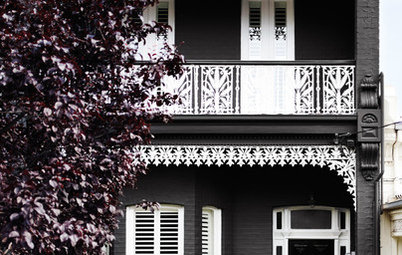
Dark grey. Disguise imperfect surfaces with this durable cover-all. Fingerprints, dust and dirt won’t be noticeable at a glance.
WHY IT WORKS: It’s not quite black but has the richness, strength and sophistication of black.
WHERE TO USE IT: In man caves and on garden walls, especially pet areas.
WHY IT WORKS: It’s not quite black but has the richness, strength and sophistication of black.
WHERE TO USE IT: In man caves and on garden walls, especially pet areas.
CHOOSE THE RIGHT PAINT
Choose a UV-resistant exterior paint that’s specifically designed for Aussie conditions. Talk to the staff at your local paint retailer about the amount of sun, rain and wind your home receives. Cement rendering can also look appealing for an earthy and durable exterior finish on brick walls.
For interiors, choose washable paints for easy cleaning and try eggshell, matt or semi-gloss finishes which are easy on the eye. Leave most high-gloss finishes for the outside to prevent your home looking like a showroom. And remember, our strong natural light will make paint look a shade brighter than it does on colour chips.
MORE
From the Pros: 7 Top Tips for Painting Interior Walls
How to Stop Procrastinating on Paint Colours
Give Your Front Door a Statement Paint-Over
Shed Spruce Up: Inspiring Ideas for Garden Sheds


Sponsored
WHY IT WORKS: Mauve and aubergine add warmth in cooler areas of the country by soaking up the sun. It offers the boldness and fun of purple without overwhelming an area.
WHERE TO USE IT: Exteriors, sheds, landscaping features and outdoor eating areas. It could look murky if used indoors.