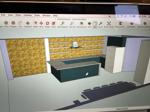
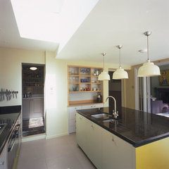
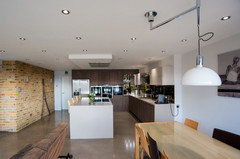
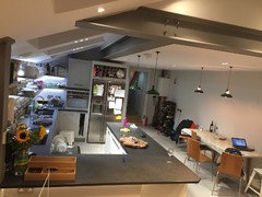
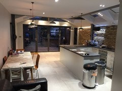
Help! Colour Scheme for Industrial Style Kitchen
svendolina
9 years ago
Featured Answer
Sort by:Oldest
Comments (9)
 PRO
PROStealth design
8 years agoRelated Discussions
Need help with a colour scheme for our forthcoming kitchen
Comments (4)Hello, our customer had rustic ivory kitchen painted doors - she also chose leathered steel grey granite worktops (much softer, than say a polished granite worktop) and she choose a beautiful blue colour for her walls which I personally think went fantastically well together (and then her red range cooker also went beautifully with her colour scheme. I hope this may help?...See Morecolour scheme help for open plan kitchen/living area
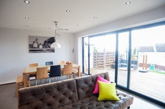
Comments (3)It's an awkward one as a lot of the kitchen is in the dining area, and the space that you don't want to have a table & chairs is opposite the sink. You could put one of the armchairs there. Keep the sofa where one is at the moment. You could go for a darker cognac leather or dark grey. Grey tones go with the brick. A nice bright rug would look good, but I'd keep the walls light and airy as they are now. In order to place something like this arrangement, you will have an armchair near to the sink. Although the kitchen is lovely...........If you ever have the budget, i'd consider moving the kitchen around. Change the island possibly for a smaller one and turn the side run of units along the left hand wall to across the room for 'U' Shape, giving you a much better sofa / lounge area....See MoreI like concrete kitchens but I don’t like industrial style...
Comments (17)I'll second what others said before me- concrete doesn't NEED to be industrial at all. It is used often to achieve this effect, but it's really a pretty natural material, like stone! So if you think of your concrete as you would think of stone, a whole new realm of possibilities opens up -- and adding wood and other natural materials and plants will work very well to get you to the effect you want....See MoreHelp with kitchen tiles with awkward colour scheme
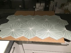
Comments (6)I love your worktop, I think it looks really classy and looks perfect with the cashmere. I would look at something like Skimming Stone as a wall colour and then it's sample time for tiles, lots of them. Avoid anything that looks pure white or creamy. Creamy tiles (yellow hue) will clash with the units, pure white will make the worktop look dirty. I would look if possible at tiles that come in a mix. Mandarin Stone Hoxton tiles might be worth trying as they are all slightly different colours and so you are less likely to get a 'clash'. The Hoxton Ivory doesn't look ivory at all but looks fairly cool so might be worth looking at. You would need more that one sample though as they are all different. They also do pink, and grey, might be worth trying. Zelige tiles are horribly expensive but really bounce light around. They look more like a 'texture' than tiles, this could also be an option. When you look at tiles, ask yourself are they blue-ish, green-ish, yellow-ish or pinkish? Avoid yellowish at all costs with cashmere, avoid greenish, try to avoid blue-ish and so taupe or pink (greyed shell colours) will possibly work. As an accent colour, amber looks really good....See More PRO
PROAkiva Projects Ltd
8 years ago PRO
PRODom Designs
8 years agolast modified: 8 years ago PRO
PROMy-Studio Ltd
8 years ago PRO
PROLa Vista Designed Interiors
8 years ago- PRO
Akiva Projects Ltd
8 years ago 
svendolina
8 years agojonandmitch
8 years ago


minnie101