missyann1973

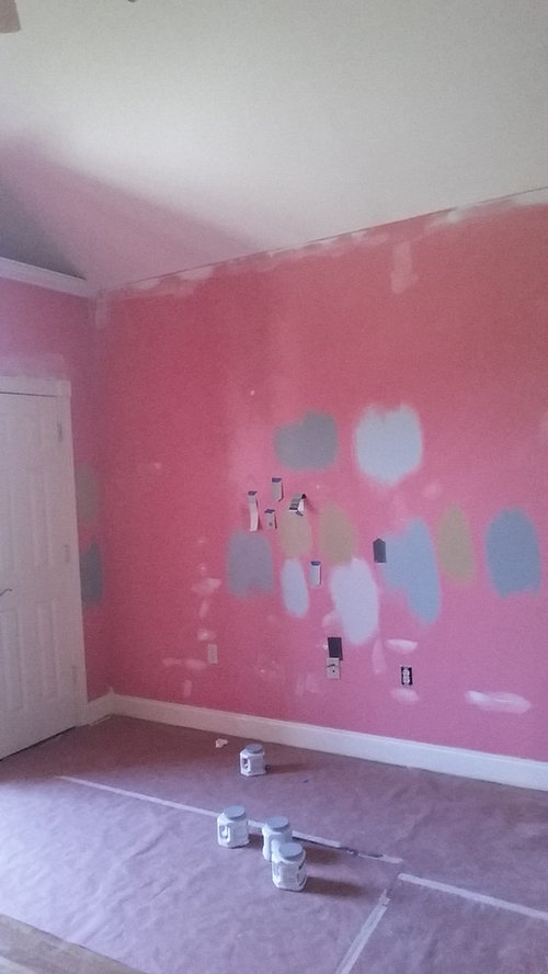
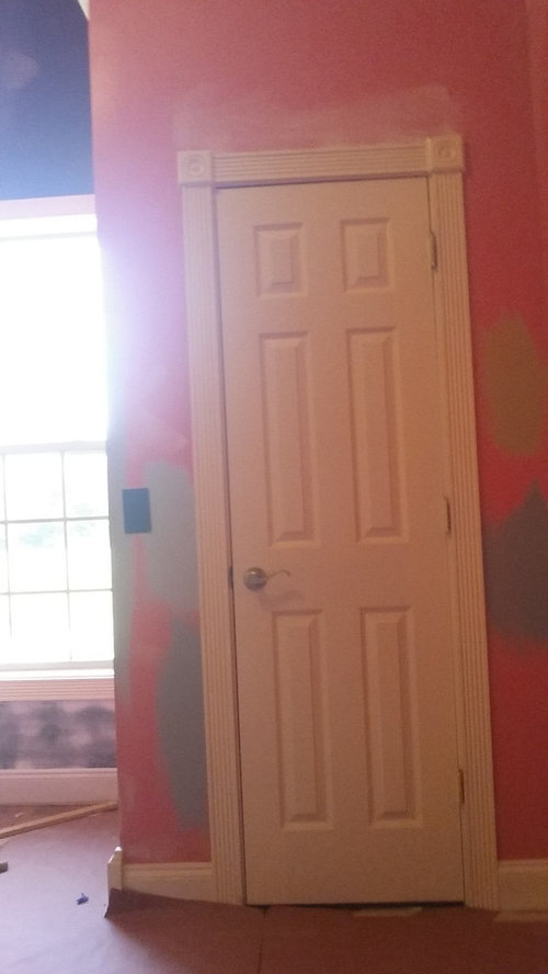
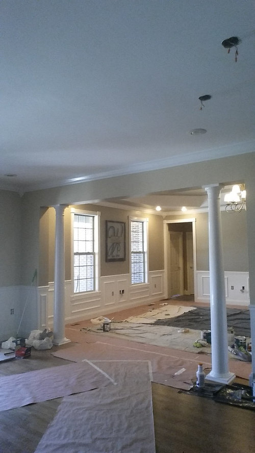
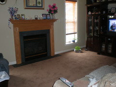
help with office color

missyann1973
8 years ago
Hi,
Im in the process of picking out a color for my upcoming home office. the livingroom is stone lion and so will the entry way off from the living room be the same color. My office will be visible from the living room so I wanted a nice color that flows. .was thinking of a soft blue or blue gray, but not the blues with green in them. ..HELP, there are way too many!! I will have an accent wall that I am considering to paint kendell charcoal BM ,which has a tall ceiling and has a window on it. The room gets descent natural lighting. .I considered Smoke by BM but the sample just looked soooo pale. ...I put a sample of Puritan Gray BM up as well and got spooked..lol..I'm a coward when it comes to color. ..the pink room is what I'm looking at painting. .ignore my color samples. ..I have posted
a pict of my living room color and the door off from the living room is going to be my office. ..

thanks. ..

Comments (22)

  • PRO
    Ashdan
    8 years ago
    I love your panelling and colour in the main room, it looks very elegant. I think the colour you choose for your office in part depends on what you intend to use your office for. If it's something creative, light colours work best but if it's more business like, in my opinion darker colours work best. From the samples I like the highest colour beside the door frame and maybe do an accent wall in a darker shade. Good luck, judging by what you have done so far, I think you will make the right decision!
  • Related Discussions

    Home Office help with colour palette.

    Q

    Comments (17)
    Hi, I have been playing around with the colour palettes to decide on cushions as well as the cover for the bench seat. I am leaning towards the one with the Orange. The blue cushion fabric would be the bench seat with the dark grey and orange as cushions. Do you think the blue will look ok against the blue of the feature wall? Thoughts/comments?
    ...See More

    Help Me Update the Sterlingbuild Office Entrance!

    Q

    Comments (6)
    What a fun idea of a customer feedback wall. The blue stairs are great. I would paint the walls dark blue, have some of the comments printed, between quotation marks, in light grey as wall stickers. Change the ceiling tiles to something more attractive. Perhaps wood. Or there's a company that does LED lighted ceilings that look like a sky. If that's a step too far, a great chandelier would be nice too. I'd love to see more of the space.
    ...See More

    Help choosing cladding colour for garden office to match bifolds

    Q

    Comments (9)
    This may help. I also like Minnie's suggestion, but what is odd is that the grey/beige RAL colour looks so different on the close up image. Avoid anything with a violet hue as this will clash horribly. Also make sure that whatever you do is either considerably lighter or darker unless the colour is the same, colurs can look discordant if they are too similar tonally. https://www.e-paint.co.uk/Colour_alternatives.asp
    ...See More

    Home office layout and style - help please

    Q

    Comments (5)
    Thank you for your help. I was thinking of putting a large bookcase on wall that backs onto utility room but I want to get the desk location right first. I just need plenty of storage and enough space to work on a laptop. I would like the room to double up as a nice reading room too I think. I was hoping to have it as an office and craft room but it's just not big enough for crafting in I don't think, and my husband likes the idea of it also being a reading room too.
    ...See More
  • Sally Hess Keys
    8 years ago

    I don't blame you for getting rid of the pink. Whew.. we bought a house 2 yrs ago with a Peptobismal Pink master bedroom and bath. It was too much.. 17 x22 bedroom AND the bath. I picked Ramie ( Sherwin Williams) It is a khaki color . It's a very calm color that goes with many things. In our previous house, I had painted this same nuetral color on the walls of a spare bedroom to make a den. used dusty blue accents in the chairs and window curtains. Oriental rug had a primary blue color as well. A friend of ours commented, "how do you stay awake to watch TV? ' Yes.. the blue was just that calming! Shannon is correct on yellow being energizing. I painted my sewing/craft room that color and even on a dismal rainy day... I felt like getting things done. I love your picture of the living room.. always have loved the look of wainscoting! Here is a picture of our living room that I recently painted the ramie color before the new carpet was installed. As you can see.. it looks great with oak or cherry wood. Good luck on your project :)

  • Lisa M. Rogers
    8 years ago

    Great soft blue is Moonbeam by Valspar (originally a Martha Stewart paint color). Looks great with cherry/mahogany/espresso wood tones.

  • PRO
    Norsk Construction and Design
    8 years ago

    My first thought was what are you using the office for? If it is just a room to pay bills, read emails, etc. Then the middle green color is really elegant and flows well. (I also like bringing the outdoors in.) However, I love the soft grays in one home office that I worked on - Knitting Needle by Sherwin Williams. It is on my HOUZZ page. Take a look.

  • concordhome
    8 years ago

    SW Comfort Gray is a great color. It is a soft gray/green/blue. We have it in our living area with SW Accessible Beige in ajoining rooms. It flows beautifully. I do suggest you get some poster board and paint the entire piece with whatever colors you are trying. The large piece and easily be moved from wall to wall with thumb tacks at different times of the day. It has always made picking out colors easier for us. It's hard to get past the current pink with the little samples on the wall. Love your other rooms.

  • kathyjohnstonkathy
    8 years ago
    There was a recent HOUZZ article about popular blue gray colors. Take a look at that for some help.

    I love the idea of blue. I have a similar colt scheme and choose BM Yukon sky for my office. Love it!
  • cardon
    8 years ago

    We have a money color in our office since that is where bills are paid and money is made.

    Benjamin Moore's Healing Aloe always soothing.

  • calidesign
    8 years ago

    Your samples will look different when they are not next to the pink color. Either prime the walls with white, and then paint your samples, or get big white poster boards and paint a sample in the middle. I like the lighter colors of your samples, which I think will look softer with your beautiful wall color in the adjoining rooms.

  • Kate R
    8 years ago

    Your home is beautiful--great trim and details. ConcordHome is right: get some large pieces of Foam Core and paint the entire thing, so you can move it around. Your samples are too small, and you need to be able to see each sample in different parts of the room, with different light, etc. Re: your color choice, any sample is going to look "too light" laid right on top of that carmine pink now on the walls. Imho, blue may end up looking dated soon, and may severely limit your choices for furniture, window treatments, floor covering, etc. But you could go with a blue-gray that "reads" more gray than blue. I personally would choose something more neutral, like a pale taupe that complements the Stone Lion in the LR. Or even a green-gray would be less limiting than blue.

  • PRO
    Gloria Jaroff, A.I.A.
    8 years ago

    There's a reason you are "spooked" and the samples look "sooo pale". You are viewing them on a bright pink (complementary) background which is drawing out the wrong tones. Paint the samples on a white background. Or order large 8 x 8 samples from the BM website and try them on every wall in the room. Then go with your gut. It will always be the right choice.

  • studio10001
    8 years ago

    You are right -there are way too many. We cannot choose specific colours with great accuracy for you on the internet, and no mention of a palette in either room suggests that there will be ongoing difficulty with the flow you are looking for, especially since you are choosing paint colours first ( atypical). This makes you a good candidate for a design consult - much faster and less expensive than what you are trying to do alone. Good luck with your project.

  • samattes
    8 years ago

    Whatever color you pick, be sure and view it ftom the hall and room that you took pic from. It should flow from those colors, as that is how your eye will travel. The undertones need to work together, regardless of the color.


  • Shari
    8 years ago

    stonnington or stepping stones

  • PRO
    Dwell Style Interiors
    8 years ago

    Your home is gorgeous and the wood trim around doors, and crown molding are awesome detailed touches! Because I'm a firm believer in accessories being the "pop" of color in any room, I'd say to keep with the flow of the same color, stone lion, that's in the hall and living room areas, as a great choice! Then get a "WOW" picture on a focal point wall, a "WOW" occasional chair in a corner and a contemporary, sleek desk with desk chair. Let the room furniture be your focal point and what draws your eye into the office. The walls are just a background. This is coming from a stager's point of view -- make the room look crisp, classic and clean and you've got a winner!

  • PRO
    CB Interior Design
    8 years ago

    I agree with the comment above I love the stone lion color you have given to the Living Room and entry area, it looks beautiful with the white wood trims and doors. I would try either the Blue Cruise SW7606 or the Adrift SW 7608 (is a little lighter than the Blue Cruise) it will work better if you are planning to paint one wall in charcoal. I combined them with a similar color to the stone lion just to see and they do look great.

  • PRO
    Etalon Studio
    8 years ago

    I also agree that the Stone Lion Color combination with the wood trim is a beautiful and classic look. I painted my last office SW7621 Silvermist and received numerous compliments as it is a soft grayed blue and will work with the other tones. If you are going to transition to another color for your office I recommend not doing an accent wall as there is no need for a third wall color. You can bring in charcoal accents on other finishes, furnishings and accessories. In the aforementioned office I had a charcoal laminate desk and file cabinet, and a charcoal leather desk chair with chrome accents. To bring out more of the blue from the paint color I used a ceiling light fixture that had blue glass and the guest chairs had the same blue hue in the fabric. Happy painting!

  • sandradclark
    8 years ago

    First of all paint the room with a good primer - white. All colors are being influenced by the bright pink as caldesign stated. You may want to get a folder of all whites to look at as well. There are such lovely shades in this range. Please avoid any gray. It can be depressing & so many are using it too much.

    I would not paint an accent wall, however I can see (after all the furniture is in & arranged) painting a section of one wall near your desk with a blackboard paint. This paint comes in many colors & need not be black or charcoal. You could even add a frame to it to set it off. Any way add a small shelf under to hold the chalk.

    Have fun with this project & I'm sure it does not need to be done right away. Take your time & make it yours. Be sure to add art & plants as they will help the creative juices flowing or at least make the work you do in there more pleasant.

  • suezbell
    8 years ago
    last modified: 8 years ago

    Definitely put a white coat over that pink first. Then consider staying with the same stone color as your other rooms and add color and decorative touches to the new office walls by other means, including going vertical with furnishings -- bookcases, built ins along one wall, etc.

    Have you considered adding a chair rail with paneling below and, perhaps, wall paper above -- or, better yet, reproduce the really nice look in the living area?

  • Gretchen Maurer
    8 years ago

    It is way too daunting to pick a color first.....I always fall in love with a piece of art or fabric first and then pick my colors.........there is more "emotion" in art or fabric and that can guide all the following choices.........it helps because you have one thing you love first and that drives the project and helps with the fears.

  • lefty47
    8 years ago
    last modified: 8 years ago

    HI -- You need to prime the room first because you cannot truly judge a paint color sample against that pink . You will have to prime anyway before painting over that pink . Benjamin Moore has paint color sample cards that can be tacked up for viewing . Have a look at this color that is a great office color . "Amsterdam Blue " by Benjamin Moore

  • goodewyfe
    8 years ago

    I really can't tell what stone lion is - grey or khaki or somewhere between those colors? I would go with something that works with that color/is an undertone to that color and keep the trim and door white to retain continuity with the other rooms.

United Kingdom
Tailor my experience with cookies

Houzz uses cookies and similar technologies to personalise my experience, serve me relevant content, and improve Houzz products and services. By clicking ‘Accept’ I agree to this, as further described in the Houzz Cookie Policy. I can reject non-essential cookies by clicking ‘Manage Preferences’.