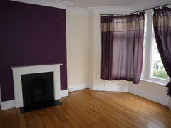
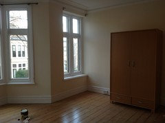
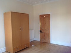
Has anyone used F&B Tallow in a north facing room?
cavgirl
8 years ago
Featured Answer
Sort by:Oldest
Comments (22)

minnie101
8 years ago- PRO
User
8 years ago Related Discussions
North facing dining room - what colour?
Comments (20)@ensignaccesories no, I meant Dulux Natural Taupe, it's available on different tones. I've seen the taupe you mentioned, but I found it too dark. I've had a change of hearts about the wallpaper after I was told that that one is actually a very old design and Laura Ashley no longer stocks it. Also talking to the lady at LA I realised that trying to force my idea of grey/beige is probably not the best for this particular room, but what I need is something more cheerful and bright, like the green colour I already have in my living room (accessories) . So with this in mind, I headed to John Lewis and took a few samples of green wallpaper. When I stuck them onto the wall next to one I had originally liked, I could see a big difference in the mood of the whole room, it didn't feel as gloomy as with the other grey colours. So, what do you think? Using something like these examples on the front wall? i still need to find what colour to pain the other walls, though. Thanks!...See Morehelp! white paint for north east facing sitting room
Comments (7)We used white cotton in our north facing room which is lovely and light but not as strong as brilliant white. Skimming stone and cornforth white are also lovely shades but a bit more to them than just a standard white. We always paint a tester in the room we're going to decorate, as its amazing how a grey can look like it has hints of lilac in a different light. Also allows you to check it doesn't clash with the flooring colour (a friend of mine recently had decorators in only to realise after the walls didn't compliment the carpet). Good luck on your project....See MoreWarm white paint for a dark North facing living room in England
Comments (37)Hi Evie. The reason I've been slow to post photos is because my house is very much still a building site and work in very slow progress. I have flung paint on walls a relief from 1927 plaster and peeling wallpaper that went up decades ago. I haven't hung pictures yet as the walls are so hard - picture hooks break - and the friend who is going to do the task hasn't yet been. So, none of these photos will persuade you to use colour - the walls are bleak. But I'm posting them in the right spirit. As for feature walls, I have never liked them. For info, Kate Watson-Smyth said, in a recent post, that they are "so ova". I associate them with the 1970s, which is when I believe they first emerged. I like all over colour; I find it much less intrusive than one wall that stands out awkwardly. As for my furniture, it's mostly interim - on loan as I had nothing after chucking out my two sofas which I bitterly regret. Anyway, with all those embarrassing provisos, here we go. Terracotta sitting room: Caravan by Paper & Paint Library (it's not a current colour; my local independent paint shop keeps records of previous colours and identified it for me); it goes up to the picture rail; I haven't yet found the colour I want above it and on the ceiling; the picture rail, window frames, doors and door frames will all be Caravan, too; the room is really bitty (four doors, jutting out bits, fussy door and windows into the garden, a big fireplace, original tiles around the fire area that I wanted to complement but tone down, and a busy stained glass window) and needs blanket coverage to make it seem less busy. .Green bedroom: Sanderson Laurel below the picture rail; Goblin Green above it and on the ceiling; picture rail and all other woodwork not yet painted; I might do them in a linen colour to tie in with the bed frame though I hate the bed frame and am desperate for a new one. You can see that I'm work in progress by the undealt-with and unpainted grille covering the hole where the fireplace was. Hideous and offensive; longing to put it right. Lots of pictures/paintings to be hung all over. Blue bedroom: This blue is a bit flat but it was only after painting it that I discovered the colour I really want - Abigail Ahern's Bowery Blue which despite being intense has a real lift to it giving it life and vibrancy. The ceiling in here is the wrong blue (bought in haste); I will use a lighter blue. The unhung painting on the right (sorry it's not more visible) is so much more vibrant against this blue than it was against the pale yellow of the wall it was hung on in my previous home. I will have mirrors above the bedhead and a gallery wall opposite plus a mirror near the small window to throw a bit more light in this seriously dark bedroom (dismally dark before I painted it interestingly dark). Bronze shower room: Impossible to photograph this as it's a tiny room; the tiles in the shower area are subtly jazzy and moody. I love having it open (I grew up in India where all showers were in the middle of the room so I've never understood the closed-in box version or the fiddly over the bath option). The bronze tiles are much richer in colour than the photo conveys; the walls are Sanderson Brick Light which looks pale and peculiar in this photo; it is a lot more interesting than on the paint card and picks up on colours streaking through the tiles; it's not such a stark contrast as the photo conveys. That's it. The bedroom that will be a mustardy yellow isn't painted yet so I can't show the walls in there. And, again, apologies for the really unsophisticated furniture and mismatched upholstery, etc. Lots still to be done!...See MoreF&B paint colour for north facing study
Comments (11)I think it depends on what else you have in the room. My Mum has a north facing room with lots of yew furniture- she painted it Vardo and it look superb. Given it’s a study it likely there is not much wall showing and plenty of furniture so I say choose a colour that works for you rather than a neutral then break it up with plenty of pics. Separately I have always used Daiseys trick of getting Johnson’s to mix the Farrow and Ball Colour. I’m not sure you save that much but you do keep your decorator happy- I would add that during the pandemic the quality of the colour matching and the quality of the paint at Johnson’s has gone down. Right now I would buy the real Farrow and Ball paint....See More PRO
PROELB Design Ltd
8 years agocavgirl
8 years agominnie101
8 years agocavgirl
8 years agominnie101
8 years ago
mrsmcee74
8 years agomrsmcee74
8 years agominnie101
8 years agocavgirl
8 years agomrsmcee74
8 years agocavgirl
8 years agomrsmcee74
8 years agocavgirl
8 years agomrsmcee74
8 years agoUser
8 years ago
Claire Daly
8 years agofpm17
7 years agocavgirl
7 years ago
Luciana
7 years agolast modified: 7 years ago


cavgirlOriginal Author