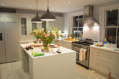
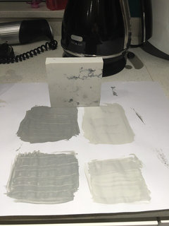
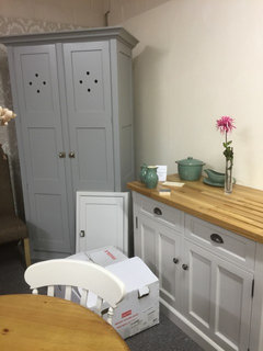
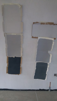
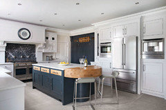
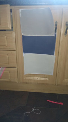
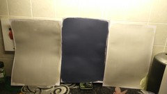
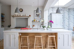
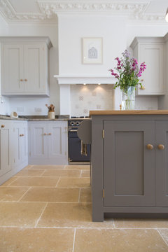
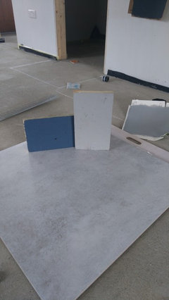
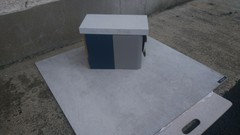
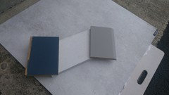
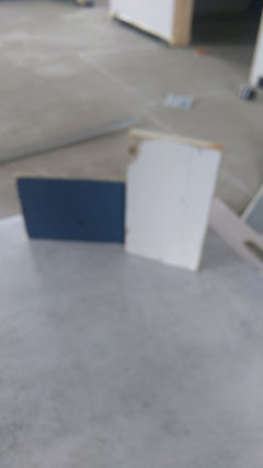
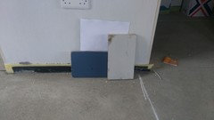
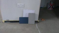
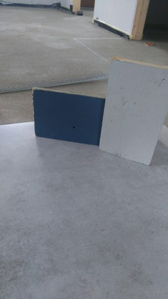
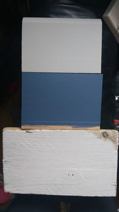
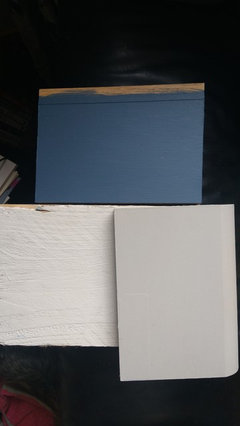
michelle_mckenna1561204

Kitchen greys!

Michelle
8 years ago


trying to pick a grey (or two!) For kitchen cabinets and island. Who would've thought it would be so difficult!

Comments (49)

  • mrshste
    8 years ago

    I think the plainer the colour, the harder it is to choose. We went for a bright, sunny yellow in our dining room... so easy to choose. The beige in our living room was much more difficult!

  • Michelle
    Original Author
    8 years ago

    Those are f&b worsted (new colour) and downpipe. I thought the worsted was too "mushroomy" until I put the cooler greys against it. The lighter colours are Purbeck stone and pavilion gray.

  • Helen C
    8 years ago
    How interesting, I thought they were railings and purbeck stone! What's the bottom right on the first photo? Is the one on the brown edged card pavilion grey?
    Michelle thanked Helen C
  • Helen C
    8 years ago
    Wait let me guess, is it moles breath?
    Michelle thanked Helen C
  • Michelle
    Original Author
    8 years ago

    Yes pavilion grey top right and manor house grey bottom right. No moles breath!

  • PRO
    Peden & Pringle Ltd
    8 years ago
    Good evening. Lovely space. A few questions... What colour are you having on the walls, what is the floor & worktop finish? Best, CPI
    Michelle thanked Peden & Pringle Ltd
  • Michelle
    Original Author
    8 years ago

    Everything is to be decided based on our cupboard colours, but I am expecting a shade of white on the walls and definitely want a white silestone. Floor we are thinking wood effect tiles, with grey and blonde tones in it.

  • PRO
    Peden & Pringle Ltd
    8 years ago
    Sounds lovely. I love Down Pipe with a light worktop & you've got the right size of room to pull it off. Cornforth White looks good with it. I've attached a photo of one of my projects that mixes Down Pipe, Plummett & Cornforth White. Good luck! CPI
    Michelle thanked Peden & Pringle Ltd
  • Helen C
    8 years ago
    Judging by your third photo you have a good eye for colour. The combinations you have both work. From the colours you have chosen I would try the following combinations: listed as cabinets, island unit, walls

    1. Cornforth White, worsted, wevet
    2. Purbeck stone, worsted, ammonite
    3. Manor House grey, downpipe, pavilion grey

    If you like downpipe I would suggest getting a sample of railings given you have chosen other blue/grey colours. From your photo I like option 2 a lot.
  • Michelle
    Original Author
    8 years ago

    We are worried Purbeck stone may be too light/on the units? We have no wall units and an american fridge and 2 x double larder units on the wall in the third pic (one of which is a door through to pantry). I have toyed with Railings but I don't think want as big a contrast, plus I think it could tie me too much to blue tones. It's an open plan kitchen living room and I want a bit of flexibility on accent colours.

    Mock up of kitchen (units on right to be changed to double larders beside fridge)

    Living end of the room

  • Helen C
    8 years ago
    What a beautiful room, it will be stunning when finished. If you don't want to be tied to blue tones I would say avoid Manor House grey and pavilion grey as these appear very blue (to my eye anyway!). Maybe I'm biased as I have purbeck stone cabinets and railings island, I don't find purbeck too light (mine is a south facing kitchen with lots of Windows). Is the room south facing? Also do you want a very neutral kitchen or a striking one. Have you considered all the units in downpipe for instance.
  • Helen C
    8 years ago
    Just seen camillas post there, love her suggestions, totally agree re downpipe and Cornforth White too.
  • Michelle
    Original Author
    8 years ago

    I would prefer it neutral, with our own stamp on it but I definitely wouldn't go dark on all the units. I want it to look bright and spacious. I have only just come around to doing the island a shade or two darker. I am tending towards the Purbeck stone, worsted or downpipe.

  • Helen C
    8 years ago
    If you want neutral I think worsted on the island would be lovely then use either purbeck or Cornforth White on the other units. Going slightly darker on the island stops it from being too bland. Downpipe is quite a striking 'colour' and can look a bit depressing and cold, it does need to be brightened by lighter greys/whites. Purbeck and worsted have a warmer feel to them.
  • PRO
    Kitchen Republic
    8 years ago

    In your case I think I would be tempted to go with something like railings on the island to give the work top definition but more importantly bring the windows in to the scheme (which look like anthracite aluminum). Hench going for a dark grey with a slight blue undertone to match the anthracite.


    This is a recent one we did with similar scheme. Charcoal base units, french gray wall units, Little Greene Swallows on the wall a quartz carrara worktops.


    Or if you don't want to go so bold on the island then I would be tempted to keep all the units the same. You'll have to excuse the picture!!!! but hopefully get the idea and the floor is closer to what you describe - Units french grey, walls little greene Inox, designer white corian worktops


    Or as another option go for light grey units and go a bit bolder with the the wall colour. This is a modern kitchen but again you get the idea hopefully. French grey units, anthracite island, white corian and steel worktop, french grey walls but with Little Greene Bone China Blue glass splash backs, so you could imagine what this kitchen would have looked like with bone china blue walls, instead of the french grey. And in your case would frame and give definition to your fridge/freezer larder units which run the risk of fading in to the back ground if too similar to the walls.


    Your kitchen designer should be able to update your renders with the colours you're playing with, also get them to update the floor and window colours to suit so you get the whole scheme.

  • Michelle
    Original Author
    8 years ago

    Just seen this and thought yeah!

    www.edmondsoninteriors.co.uk/the-blog/very-on-trend-kitchen

    Thing is, we will have to look at this kitchen for a long time. I think this style is going to date very quick? More muted tones of grey might be more timeless?

  • Julie Hardie
    8 years ago
    Hi Michelle - I have been having exactly the same dilemma and we seem to have similar kitchen plans. I think I am going to go with Little Greene Lead on my island and Little Greene French Grey on all my other units. They are very similar to Farrow and Ball Lamp Room Grey and Pavillion Grey. I found looking at photos online an absolute mine field as they always look different but I keep looking at the sheets I painted and I am happy. Hope that helps!
    Michelle thanked Julie Hardie
  • Helen C
    8 years ago
    Michelle I would say don't worry about whether something is on trend, just go with what you like and want. It can always be repainted a few years down the line whatever you choose. It sounds like you much prefer muted soft tones so I wouldn't try to convince yourself you should have a darker 'statement' colour. Which is your favourite out of the samples you have?
    Michelle thanked Helen C
  • Michelle
    Original Author
    8 years ago

    Hubby prefers something more striking so we are trying to find a compromise!

    I want something with a bit of wow factor, though that doesn't necessarily need to come from dark colours. I am afraid of colour in general which is why I am hesitant. I tend to stick with neutrals and introduce/colour through accessories.

  • Michelle
    Original Author
    8 years ago

    I quite like the worsted.

  • Helen C
    8 years ago
    As you say the wow factor is achieved by a combination of factors -lighting, statement pieces of furniture perhaps, accessories etc. A neutral kitchen colour on the cabinets will be an excellent base for everything. Perhaps you could introduce a stronger colour on one or two walls to satisfy hubby :)
  • Helen C
    8 years ago
    I like worsted too, I actually think it's quite a dark colour but you can see it in the room, it sounds like the room needs a mid tone grey, I get the impression the lighter greys look a bit washed out?
  • PRO
    Peden & Pringle Ltd
    8 years ago
    Hello Michelle. Trust your instincts. The great thing about a hand painted kitchen is that you can always repaint it when & if required. Be bold! Best, CPI
  • hawleyjulie
    8 years ago
    Hi
    I was having same problem
    Spent a fortune on sample pots
    Ended up picking Manor House grey for bottom units teamed with cornforth White
    I'll try to send a pic of the colours so you can see them together
    However my kitchen gets no sun so I've sadly had to change to creams and whites which I'm still pondering
    It's not easy is it?
    This is Manor House grey with cornforth White
    Looks nice
    I've got wardrobes in the Manor House and it looks lovely
  • Julie Robinson
    8 years ago
    Hello hawleyjulie

    You say you are changing the colour of your kitchen from Manor House and cornforth White? I was going to choose these colours for my new kitchen/dining/family also. It's a north facing room too, but has loads of light. Do you feel the colours look too cold and dreary?
  • hawleyjulie
    8 years ago
    Hi
    The colours look fab together
    The reason I changed was because one side of my cottage gets little sun so I chickened out and went for traditional but still having a nightmare choosing lol
    I put the grey in my daughters room and it looks lovely so you should be fine
    Wood floor or tops or table always adds warmth if you find its too cold looking but the two colours definitely work well together
    I can't believe how hard it's been to choose a colour
  • Julie Robinson
    8 years ago
    Thanks hawleyjulie, it is so difficult! Yes we have an oak floor and table, so fingers crossed! What colour did you use on your walls?
  • hawleyjulie
    8 years ago
    I'm still deciding I've not got kitchen yet
    Farrow and ball are really helpful if you call or email they will give you some suggestions
    Best of luck
    I'm sure it will look fab!
  • PRO
    Caldicot Kitchen & Bathroom Centre
    8 years ago

    Ah, the joys of grey - the colour of the moment! I've seen some really stunning kitchens of late with two tone great (darks in island/base units and lights in wall units) as well as combining a light grey with either a deep blue or aubergine for a real splash of "wow" factor. both these latter go fantastically well with oak worktops/floor and give a really contemporary feel when combined with fairly modern pewter handles.

    Look forward to hearing/seeing what you go for!


    John @ Caldicot Kitchen & Bathroom Centre

  • Michelle
    Original Author
    8 years ago

    We added railings to the combination today. I think it is too dark but am tending towards a navy tone for the island. Any suggestions for a navy, bit lighter than railings (f&b or lg)? Something like the below pic, unfortunately these were the designers custom colours.


  • Helen C
    8 years ago
    Michelle that photo is wrights design house who I used, I've seen the same kitchen in their showroom and the colours are exactly the same as Cornforth White and railings. Other f&b to try would be Hague blue and stiffkey blue.
  • Helen C
    8 years ago
    It's not really navy but have a look at tempest by fired earth, somewhere in between Manor House grey and Hague blue!
  • Michelle
    Original Author
    8 years ago

    Yes, it is wrights! Our railings looked so much different. We have lots of light but the windows are west/north facing. I wonder how different the paint colour is on wood than on a bit of card. I do like the contrast between railings and worsted.

  • Helen C
    8 years ago
    I think the emulsion you've used on the sample card will be slightly darker than the paint for wood. But I would say the difference is slight. Railings can look very dark at nighttime and on a dull day in my kitchen. When the sun is shining through is when the navy blue tone is more noticeable. You may prefer Hague blue then which isn't quite as deep in colour. Good fun isn't it trying to commit to a paint colour!
  • Dundrum 16
    8 years ago
    Have just read all these comments and was reminded of a holiday job I had in the early seventies- updating school rolls. I became adept at telling at a glance what year I was dealing with. A preponderance of Jason and Kimberley indicated Primary 5 whilst Dominic and Abigail were Primary 1. Similarly, I fear that 2015/16 is going to be the year of the grey house!! I wonder if the difficulty in committing to a scheme may not be down to an unvoiced aversion to greys coupled with a fear of choosing something not dictated by the fashion gurus?
  • Helen C
    8 years ago
    I decorated my previous home 9 years ago in greys and blues. I think people choose colours they feel comfortable with and ones which make them feel content in their own home.
  • Michelle
    Original Author
    8 years ago

    Latest colours

    worsted, stiffkey blue and Purbeck stone . i have also ordered two navy tones from little Greene but I think this is the line we will go down.

  • dassie4
    8 years ago
    Lots of colour options
    Hard to decide the last images as you're showing against a dark floor and aren't you wanting a light floor..?

    Stick a sheet of white paper underneath...


    I agree with a splash of bold and I would use this on the island.
    Greys are trendy and I love them but worry that they've been around for a while

    I love the idea of aubergine, a rich warm colour. And worsted. I think that's the one but not familiar with f&b on the side.
  • Michelle
    Original Author
    8 years ago

    The lighting isnt really accurate at all because i need to take a photo in our new house but it gives me an idea. I realise grey is on trend but I also think as a neutral it should stand the test of time.I would be more concerned about the blue looking dated.

    The way I see it though I might as well put in a kitchen I like now and perhaps go off it, than putting in something that's "OK" just cos its not a current fad. There's nothing else jumping out at me at the minute.

  • PRO
    Sustainable Kitchens
    8 years ago

    Hey Michelle! Here's a couple of photos of what Pavilion Grey and Purbeck Stone look like in fully completed kitchens.

    A Scandinavian Woodland Inspired Kitchen · More Info


    Redland Town House · More Info
    This one is a mix of Purbeck Stone for the base cabinets and Mole's Breath for the island. Hope this helps!

  • Michelle
    Original Author
    8 years ago

    thoughts please?

    Worsted, stiffkey blue and brilliant white techinstone

  • Helen C
    8 years ago
    To my eye the stiffkey blue and worsted are a little dark together and may be quite dominating. If you are happy with the stiffkey blue I would be more inclined to go with purbeck stone to keep it light and fresh. To me both stiffkey blue and worsted are accent colours. Would love to know what others think.
  • Helen C
    8 years ago
    Is the first photo worsted as well? It looks a lot lighter than the second and third photo.
  • Michelle
    Original Author
    8 years ago

    Yes both are worsted. It was overcast in the photos taken outside, the first one was in the kitchen its going into.

    Totally get what you mean about them both being dominating, it is a concern I have, but I hope as we have no wall units it might not be as strong.

    Purbeck stone has too much of a cream tone for us, its not grey enough.

  • Michelle
    Original Author
    8 years ago

    Purbeck stone

    worsted

  • Michelle
    Original Author
    8 years ago


  • Susanna Kalitowski
    5 years ago

    Michelle - I'd love to know what you chose in the end. I know you posted a few years ago, but I'm having similar dilemmas now. Did you use Worsted in the end? It's currently our favourite, but we haven't seen too many other examples and don't know anyone else who has used it.

  • littlehousedream
    5 years ago

    I am also very confused about what colours to choose. I really like cornforth white for units and hague blue for island. I have also seen some kitchen pics with moles breath kitchen island with cornforth white and it looks lovely too, more neutral so less risky. I would be interested to see island in worsted colour. I am after a more subtle neutral colour combination. Any ideas?

United Kingdom
Tailor my experience with cookies

Houzz uses cookies and similar technologies to personalise my experience, serve me relevant content, and improve Houzz products and services. By clicking ‘Accept’ I agree to this, as further described in the Houzz Cookie Policy. I can reject non-essential cookies by clicking ‘Manage Preferences’.