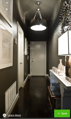
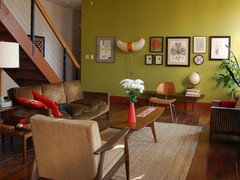
colour advice required please
Emily
5 years ago


Featured Answer
Sort by:Oldest
Comments (34)

Emily
5 years agoJonathan
5 years agoRelated Discussions
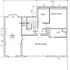
Extension Advice Required
Comments (12)Jonathan, I actually really like your proposed downstairs layout and it makes better use of the space and flows really nicely. Thanks. I think you've solved my downstairs dilemma! The upstairs plan is really interesting, I'm going to chew on it for a bit? I will post a pic from my phone to see what you think? Thank you....See MoreKitchen splashback advice required please
Comments (19)Thank you for all your responses. My preference is matching splash back to the bench-tops. The trouble is the size of these laminate splash back comes in are 3000mm x 600mm or 1500mm x 1210 mm - I will require at-least 3100mm by approx 695 mm (h) as all units are set a little bit higher due to the minimum requirements for gas hob clearance. I opted all units to be set higher as I wanted streamlined look hence I am looking at a minimum of 2 joins. Would 2 joins on a laminate splash back look okay? Or would it be too obvious. ( I will of course ensure the joining material glue or whatever is called is matched to the laminate colour?) Thank you...See Moreshower room dimension advice required
Comments (5)I've just got a 760x760 shower and it's fine for us. The room is 327 x97 (they must have lost a fair bit with tiling and plumbing). My previous ensuite was a similar size with the same size shower. We fitted our old ensuite and the priority for me was a really good shower rather than a teaspoon of water over your head! I know you may look a bit mad but you could go to a showroom and try getting in a cubicle! Or see if any friends have the same size as I think you'll need the extra space for getting ready but it does obviously also depend on the height and build of your family...See MoreUrgent colour advice: open plan living room-kitchen required, please!
Comments (3)It's really hard to have an opinion on a screen............uinfortunately, colours just look different to people as the colours on their screens differ from one another.......does that make sense. I can tell you however, having used Dusted Moss 2 & 3 on many occasions, that it is a lot more green than it looks on your chart above, which looks grey. It has grey tones, but as the name suggests it is a green. Dulux is for sure, lovely paint,. The colour charts however, aren't so accurate and the paint mixing compared to the colour cards is also not that accurate. I always suggest to people to go get colour cards and testers and paint at least an A4 piece of paper with 2 or 3 coats. Move the paper around as the paint changes with the light in differing positions. Probably not what you want to hear, but you can't choose paint from a computer screen and hope for any accuracy at all. I now prefer Valspar ( B&Q ), used to be Crown. The colour matching is phenomenal. The accuracy to the cards is spot on, and the paint is good. I used to be a Dulux everything fan................but since discovering Valspar I have been converted....See MoreEmily
5 years agoEmily
5 years agoEmily
5 years ago PRO
PROZeta Interiors
5 years agolast modified: 5 years agoEmily
5 years agoUser
5 years ago
honeypoppet
5 years agoJonathan
5 years ago
Juliet Docherty
5 years agolast modified: 5 years ago
rachelmidlands
5 years ago
E D
5 years agoJuliet Docherty
5 years agoA B
5 years agoEmily
5 years agoEmily
5 years agoEmily
5 years agoEmily
5 years agoJuliet Docherty
5 years agoEmily
5 years agoJuliet Docherty
5 years agoEmily
5 years agoEmily
5 years agoEmily
5 years agoJuliet Docherty
5 years agoEmily
5 years ago
Anthony (Beano)
5 years agoJuliet Docherty
5 years agoAnthony (Beano)
5 years agoUser
5 years agoEmily
5 years agoLaura Hulse
5 years ago


Zeta Interiors