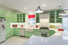
Sprucing up a retro kitchen
Rachel W
4 years ago

Featured Answer
Sort by:Oldest
Comments (12)

Juliet Docherty
4 years ago
rinked
4 years agoRelated Discussions
Need affordable living room sprucing up
Comments (20)The shelf above your sofa is a key space to add some colour or some statement pieces that would bring your room to life. I assume you can see that shelf as you look down from the kitchen to the sitting room. Firstly, I would stand the books on the shelf vertically and have the plant pot by the side, this would give some more height. Have a look at our project boards for some art print ideas and you can find some bargain frames from ikea and most supermarkets, this will make that shelf space look really special. Bringing a colourful print will highlight your black and white picture that you have already. Little changes and you will make your space look amazing!...See MoreAdvice on industrial/retro look
Comments (12)Hi Layla! You've got a very interesting project! It sounds like you have a right idea what to do. To be honest, this style industrial and especially in mix with retro can be hard to recreate not being professional. But the best advice I can give you - try to keep it simple, don't try to mix too many shades and colour tones. Add more textures and details in accessories! Than more colours you have to mix than harder it will be to balance all together. Blue is gorgeous but still too many colours around - cream, grey, white, brown wood, blue, copper...surely i missed something! If you like to highlight your breakfast bar by making it blue, may be at least to use similar worktop as in the kitchen? What finishing do you plan to use for walls? Industrial loves brick, concrete, bare pipes, wires. Retro - clutter free space, funky colours, old look furniture and appliances. How much if each style would you like to bring in? which style is dominant?...See MoreI think I've given up - Living Room v Man
Comments (27)We may not share artistic values but we do share one good thing... love and our life together - he's simply your typical man who loves to lounge around even when covered in dirt! We may have completely different ideas for our home but he is a good egg :) Anyway I do believe we have found common ground... surprisingly he really likes my idea of using grey with bright colours. We have agreed that as long as I stop forcing him to endure flamingos or similar, he will put up with me buying vintage and completely unnecessary furniture. He's said I can do whatever I want with those awful armchairs... WIN! I think we are going with man friendly greys meets pops of colour/vintage. It's pay day next week and I simply can't wait any longer!! Having said that... some ideas for what style of vintage and arrangements will be wonderful! Here is the photo from my kitchen door - anything attached to the walls were already there from the previous residents and will be removed... such as the mirror which isn't in line with that hideous folding table and the strange religious wall in the corner.... plus the half finished wallpaper on the chimney breast lol. x...See Morehelp me wrap up my kitchen, new inspiration...
Comments (17)The wood effect tiles tend to only come in quite large sizes, saying that, it might do the trick. I'm going for a smoked limed oak LVT flooring through a very large portion of the house which butts up to the kitchen doorway, so I'm not sure if I could see that sort of amount of wood effect going well. I could get a hold of some more blonde/warm samples but I'm guessing what HIS answer will be already although its certainly worth a look. Perhaps Cornish driftwood? http://www.toppstiles.co.uk/tprod45453/cornish-driftwood-dark-tile.html ... but we are back to the problem of finding sensible sized tiles as wood effect is generally only made suitable for floors... The herringbone is a glossy tile, but also textured ripped and pitted, it is however £333/square metre so oven splash maybe but not as a main on both the kitchen and laundry! I'm operating on a budget of £600 to £1000 for tiles supply only, plus trims, adhesive, etc. If I tile regular splashback heights, its square metres, plus nearly another metre behind the oven up to the extractor. I hear what youre saying about being careful not to detract from the lights. As we see the window directly from where we sit in the living room, we found we quite like that the wires disappear into the black background so the globes kind of float there. Thats mainly why I liked the marbled effect paper rather than a strong pattern or light colour there. / Here is a better view of the Terra pearl that I am waiting on (less than £50/m), and as you can see, youre all spot on that I'm looking for texture / a more tactile finish. The thought is that it may go very well as the main splash, tying in with the light strip in the floor as well as putting a bit more light into the room I was dead set on the metallic steel linear mosaic for some time, below is the copper version nobody seems to have a sample of, However, once the granite went in, the screen printed effect on the tiles look absolutely awful Painting the wall the same colour of the cupboards.... I actually painted the laundry a similar colour, although I know its a bit more vibrant than the cupboards (totally teal) I think I'll find it a but much...See More
Jules Mc
4 years ago PRO
PROShahina Mulla
4 years ago
Daisy England
4 years ago
E D
4 years ago
Sonia
4 years agoJules Mc
4 years ago PRO
PROSchmidt Kitchens Fulham
4 years agoJules Mc
4 years agorinked
4 years agolast modified: 4 years ago


Rachel WOriginal Author