jan_guenin

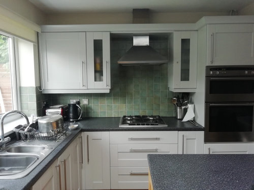
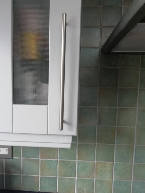
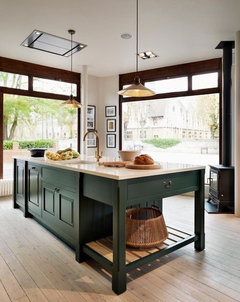
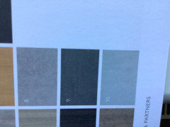
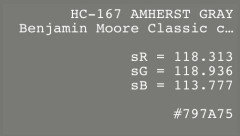
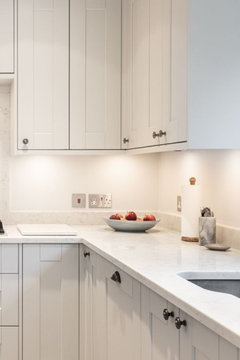
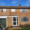
What colour for contrasting island and worktop?

Jan Guenin
3 years ago

I have just painted my kitchen cabinets stonington grey from Benjamin Moore and now looking for a contrasting colour for the island

The cabinets have a blue tone which isn't quite what I wanted - the sample looked more green (my backsplash is green) I am on a tight budget so left the tiles which aren't great!

Also plan to get new sink and worktop so looking for colour ideas for that as well


A note to anyone thinking about painting their cabinets - it is such hard work and difficult to get perfection. Wish I hadn't started but too late now!


Comments (42)

  • Daisy England
    3 years ago

    Agreed it is hard work but it looks as though you’ve done a great job and what a difference it’s made. Well done. I think a navy blue on the island or even graphite would be a nice contrast. Look for a light coloured worktop possibly something similar to Carerra Marble.

  • Sonia
    3 years ago

    Wow that looks amazing! Painting is so laborious but you’ve done a great job. Have you posted before, I recognise those tiles? I agree navy or darkest grey would look fab, but what a deep green? It would look amazing with brass knobs or handles. Something like this

  • Related Discussions

    What colour cabinets go with wooden worktops?md

    Q

    Comments (5)
    I would say that almost any colour can go with wood but not all shades of any colour. It tends to work best with more complex / less intense colours. So sage green or grey/blue would go well, but lime green or bright blue wouldn't go so well. Sage or grey/blue are usually available in off-the-shelf Shaker style doors, which you have there. They also go well with other subdued colours, so you could have either of those mixed with cream or pale grey. I wouldn't mix blue and green as you seem to have in your picture above, though, but that might just be my tastes. Also, I was extremely underwhelmed by the quality of oak worktops. They use a fast growing species (there are several species of oak) which has very little character and often a rather nasty orange tint. I chose a birch worktop from B&Q instead, which is much cheaper and has an amazing 'tigers eye' effect once oiled - absolutely no regrets there, my worksurface looks way better than my brother's more expensive oak one. Lastly, I did a lot of research and chose Fiddes Hard Wax Oil to finish the worksurface. Do not skimp on the finish, I've known people who have and they've univerally regretted it. I am extremely pleased with the Fiddes, water can sit on there as long as it wants and never sinks in. I know 2 people who chose different worktop oil brands and they have to wipe water off within 5 minutes or it leaves a mark.
    ...See More

    What colour for the worktop each side of the aga

    Q

    Comments (1)
    Given that the top of the Aga is dark I think your current worktops work. However perhaps someone has a kitchen with the same colour cabinet and can recommend a silestone pale alternative
    ...See More

    kitchen island worktop

    Q

    Comments (1)
    We would need pics. From your description it sounds a bit 'orangey' with the colours so maybe you need to lighten it - white or a dark charcoal/black contrast.
    ...See More

    Grey Kitchen what colour worktops

    Q

    Comments (17)
    Tony I can see serious approach on the kitchen from you, drop us a call today if possible. My colleague Dragos is the perfect person you can speak with, he leaves at 5pm. He might have some free time next week just to survey your residence with paying special attention to interior design, he has unique background on that. Right after that we will send you some visualisations on how would our proposal look like like after it is going to be done. It is quite affordable solution for everyone, so don't hesitate to contact us on 020 3870 4399.
    ...See More
  • Marylee H
    3 years ago

    Hi Jan - I understand your frustration when colours don’t turn out as expected - even when the result is as pretty as yours!


    Your observations about Stonington Gray are bang-on accurate. Your chip, in the balanced light of the showroom will appear a near neutral grey. Slightly green toned if anything.


    Unfortunately low Chroma colours from this Hue Family neighbourhood are prone to shifting blue in imbalanced light.


    They aren’t blue & don’t have blue undertones - it’s a lighting phenomenon. Potentially, in another room in your home, Stonington Gray would render just as you imagined.


    But now you are left with this very soft blue. So I would suggest you have two ways to go for the island. Either echo the blue of your cupboards with a mid or darker blue or choose a blue-green which links to your tiles.


    Perhaps if you choose a dark for the island then what about a light or mid-tone for the counter tops or vice versa?

  • Marylee H
    3 years ago


  • Marylee H
    3 years ago


    A couple of greener suggestions,,

  • Jan Guenin
    Original Author
    3 years ago

    Thank you so much everyone for coming back to me so quickly. I haven't posted here before so someone else has the same tiles! What a great forum - wish i had posted before i started my project!


    I do like the idea of a dark charcoal or a green that ties in with the tiles/curtains. I'm not sure about a blue as feel it would be another colour in the mix and although the cabinets have a slight blue leaning, I wouldn't say it was very obvious.


    The work tops, i thought about solid wood for the island and a dark colour for the rest as wondered if a light one on top of light units would be too bland/samey

    Took a chance with Benjamin Moore as lots of expert painters seemed to rave about them on their forums - so was looking to use their range for the island


    I bought about 6 samples at nearly £8 each!) and am loathe to do the same again for the island - but suppose i will have to choose a couple at least - just need to decide . Maybe one dark charcoal and one dark green/grey if anyone could suggest which might be suitable?


    I very very stupidly bought 2 gallons of Stonington Grey (I know, I don't know what I was thinking!) Didn't realise how huge a gallon was but should have realised by the price! Anyway, I only used half of the first can - that paint goes such a long way - so will have to try and sell the other one!


    Thank you so much again for your invaluable advice and look forward to hearing your suggestions

  • Marylee H
    3 years ago


    Also from the Green-Yellow Hue Family,,

  • Jan Guenin
    Original Author
    3 years ago

    Love this colour Marylee!

  • Marylee H
    3 years ago

    Me too. 🌈


    But be aware it’s another of those low Chroma colours from the same Hue Family neighbourhood.


    So should you fancy it, best to test with either a large paint chip or sample on lining paper, to see how it will render in your space.


    You know now it‘s a near-neutral from the Green-Yellow Hue Family and so has the potential to colour-shift to show a blueish aspect.


    But just because Stonington did, there’s no guarantee that this will do so too. It does have double the amount of Chroma than Stonington Gray.


    Were it to shift blue and you didn't want that, the strategy would be to move anti-clockwise further back into the Yellow Hue Family & look for something similar.


    🌈

  • Jan Guenin
    Original Author
    3 years ago

    I think I will get a tester for Cob Stonewall. I would also like to get one in a more true darker grey to see which I prefer if you could suggest a couple in the BM range. Need to also think about the walls but want to use a cheaper brand paint as the testers at bm are almost £8. Any help for this colour as well would be so appreciated


  • Marylee H
    3 years ago
    last modified: 3 years ago

    When you say a more true, darker grey, do you mean something which appears more neutral to your eyes? And also darker than Cos Cob Stonewall? I can look for that if so.


    It may help to know that every black/white/grey paint colour belongs to an identifiable Hue Family. So there are options are to be found in every section of our colour wheel.


    Using near neutrals from the same Hue Family as a chosen fixed finish is a way of keeping control of harmony.


    I would advise that ideally, you decide upon those fixed finishes before choosing paint colours.


    You have your flooring & backsplash in place, but your work top is another big-ticket item, that the paint colours need to have a connection to.


    You may find it much easier to find a paint colour to work with the chosen work surface, than vice versa.

    🌈

  • Marylee H
    3 years ago


  • Marylee H
    3 years ago

    Here’s a colour palette I created for a client.

    The second colour from the bottom is Cos Cob Stonewall.


    In order to select those colours we ‘measured’ the colours of both her stone floor tiles and fabulous marble work top, using a small device.


    Even though those surfaces are quite near neutral in appearance, they still belonged to identifiable Hue Families. Even the whites & grey graining in the marble were measured & plotted.. Knowing that, makes it a whole lot easier to narrow down paints to sample.


  • Jan Guenin
    Original Author
    3 years ago

    thank you so much Marylee. I love all the colours in that palette! So I went to look at worktops and looks like I will have to go for laminate as all the others will cost around £3000. Do you think I could have real wood for the island as if I go dark on the island I don’t know what i could have that would go with both cabinet colours? I found these

    worktops


    have no idea what would work with the Coventry gray and cos cob. could you suggest a second island colour that is darker and I will get both testers? Or should I choose the laminate first? I am so lost about what will look good. I’m probably being dumb but I don’t know how to connect the wheel of colour to specific shades.

    thank you so much for your advice. I would be lost without you!

  • Jan Guenin
    Original Author
    3 years ago

    just googled dreamdoors.co.uk and there is a showroom near me. their website has so much choice , it’s an impossible task!

  • Marylee H
    3 years ago

    You’re not dumb! It’s a complex task making multiple surfaces and colours relate well together.


    There is a little device from Amazon called a Color Muse (approx £60) with which you can measure the colour of different materials inc paint, wood, tile, marble etc. It links to a phone app wirelessly. It’s a bit like taking a smart phone photo, but it tells you to which Hue Family colours belongs plus other details.


    Most definitely worth the investment if you are doing multiple rooms/surfaces etc.


    Alternatively you can take a sample of your work surface material into Benjamin Moore & they use their device to tell you what paint colour is nearest to a match for different elements of it. Even that info we could use then to find out which Hue Family it belongs to.


    I think a good rule of thumb is to attempt to limit the number of Hue Families you introduce into your space to ideally no more than 3. More isn’t wrong - it’s just more difficult to

    coordinate effectively. Every Hue Family has strong/weak, cool/warm, colourful/ near neutral colours within it.


    You can order free paint chips from Benjamin Moore of your shortlist colours and take them to the work surface showroom to compare with the finishes.


    You already have flooring which appears from the Yellow-Red Hue Family, cupboards from the Yellow-Green Hue Family, tiles from potentially the Yellow-Green or Green Hue Family.


    So in choosing a worktop I would stick to one of those. Wood or wood effect could most definitely work, but you would want to make sure it has a connection to your flooring in some way.


    Work surface then colour, will definitely be easier to manage. But it’s no harm having a few paint chips with you to help narrow your choice.

  • Marylee H
    3 years ago

    P.s. Coventry Gray + Cos Cob Stonewall are both from the Green-Yellow Hue Family. For darker still again have a look at Ashwood Moss as an option.

  • Sputnik
    3 years ago

    So much good advice here, so I'll stick to generalities: Not every item in your kitchen needs to shout 'look at me' but some tonal contrast is needed or some crazy artwork worked in to give your kitchen a point of individuality. Don't let this expensive long term project remain so we behaved that it just a blends into the background. Grey is the new beige.

  • Sonia
    3 years ago

    If it’s any consolation I don’t understand Marylees posts either 🙄

  • Janet
    3 years ago

    I don’t have any expertise in the science of colour but when we choose paint colours we paint our samples onto card/ thick paper that is a minimum of A4 size. We then move these around the room, look at them in different natural light and artificial light etc. over several days. We learned a hard lesson ourselves many years ago with a Farrow and Ball shade which was a lovely buttery yellow in daylight but turned a horrid acid lemon in tungsten light. I would be in the blue/ green camp for your island. Would love to see the final result.

  • Jan Guenin
    Original Author
    3 years ago

    Thank you all for your comments.


    i am not a good decision maker! I know what I don’t like but find it hard to visualise things. Have spent soo many hours looking at photos for inspiration .


    I don’t have a Benjamin moore outlet near me and the uk website only seems to sells samples . Are chips the equivalent of cards? I have spent so much on their sample paints (why do they have make them so large , it seems ridiculous?). If I can’t get chips/cards I will have to buy 2 more. It can’t be helped but I want to make sure I definitely go with one of the 2. I like Ashwood Moss as well so maybe I will order that and cos cob

  • Marylee H
    3 years ago
    last modified: 3 years ago

    Hi Jan - you can ring one of the outlets and ask for paint chips for the colours you are considering.


    They also have larger postcard size samples too. It may be worth doing that before you order the paint tin samples, so you can narrow down your selection a little further.


    Also think about offering for sale to others, the sample tins you have bought online. You could try in your local area first. (Neighbourhood app) There maybe someone wishing to snatch your hand-off! You can just state how much has been used out of them.

    🌈

  • Marylee H
    3 years ago


  • Jan Guenin
    Original Author
    3 years ago

    I have advertised the samples and the gallon tin but not had any takers yet. Don’t think it’s a well known brand in uk, I may try on one of the professional painter forums.

    thanks for info re calling the outlet. I will ask for all the above and see what they look like in the kitchen.

  • Juliet Docherty
    3 years ago

    Sonia, you're great with colour ( :


  • Jan Guenin
    Original Author
    3 years ago

    Just an update on my kitchen. It’s been a bit of a nightmare actually. Went with Ashwood Moss for the island. Beautiful colour but coverage and durability not! Painted them over a month ago and am not impressed with the coverage. Also haven’t been able to put the handles back on as when I tried, the paint scratched off with just the slightest movement. I am beyond frustrated to say the least!

    anyway I now can’t decide on a work top that compliments the two colours. Stonington grey and ashwood moss. only have a budget for laminate and haven’t seen anything I think will go with both. Thought about wood effect but I have oak flooring and not sure if I need to exactly match. Or should I go black or a mid grey?


    any advice would be greatly appreciated!

  • Marylee H
    3 years ago

    Oh Jan! I am sorry! Exactly which paint line with BM did you select?


    I will be very happy to help with anything I can.

  • Marylee H
    3 years ago

    These are the specification sheets for application for the two different types of kitchen grade paint lines. Was it one of these which you used? The 1st sheet is for Advance and the 2nd is for Scuff-X.


  • Jan Guenin
    Original Author
    3 years ago

    thank you Marylee. I used Advance and only thing i didnt use was their primer. I used Zinsser BIN which may well be the problem. Although the Stonington Gray adhered better, it is still susceptible to scratches 2 months on

    Anyway I still need to choose a worktop and has to be laminate due to cost. I like the idea of wood but as I have wood flooring , I don’t imagine it would look right. Just don’t want to end up with a clinical looking kitchen so not sure what to go for


  • Marylee H
    3 years ago

    Hi Jan. I really am sorry you have had such awful trouble. Were you able to wait the required times between under coat - first coat + subsequent coats?


    No help now, I do realise, but scuff-x has a faster re-coat time and incredible durability. All our discussions were about colour and I am just sorry we didn’t talk about specific product lines.


    If you are considering any work surfaces from national chains & they have branches within 15 miles of Manchester, I will be happy to go and measure some colours for you. Or if you have access to any samples you are welcome to send any my way for measuring.


    Your colour selections are lovely and I want you to be pleased with all your hard work.


  • Jan Guenin
    Original Author
    3 years ago

    Yes in fact I waited longer than the times stated!


    i really appreciate your advice and help. I have ordered some sample worktops so will post them once received along with a photo of the island

  • Marylee H
    3 years ago

    Oh Jan. I will enquire more from my Decorator contacts.


    Yes - please direct message me and I will send my address if you need to send any physical samples.


  • Jan Guenin
    Original Author
    3 years ago

    I have found a mid grey worktop but still thinking of wood has to laminate due to cost.

    with wood floor and doors will this be too much? I just don’t want to end up with it looking cold and not cozy. Yes I know it’s my fault for going with grey in the first place!


  • Jan Guenin
    Original Author
    3 years ago

    Photos of other end of the room, changing the table which is why it is covered at the moment. Bureau is there until I decide what to do with it as it was my grandads. Will probably paint the small tables


  • Jan Guenin
    Original Author
    3 years ago


    Closer picture of the colour of island

  • Sonia
    3 years ago

    I would choose a white worktop. Maybe a soft white rather than stark white, then it probably wouldn’t clash with anything else. I wouldn’t choose more grey. These are quartz but there are some good laminate copies about.

  • Marylee H
    3 years ago

    Jan - the cabinet colours do look good. Is the sample next to them the mid-grey worktop?

    (I don’t understand the label upon it.) It appears to sit really well with both.


    You also mention a potential wood laminate? Personally I think that would be harder to pull off next to the lovely floors and doors.

  • Jan Guenin
    Original Author
    3 years ago

    Thank you both for responding. I really appreciate it


    Sonia Im not sure abut a very pale colour especially on the island which is really dark grey. I think it would be high maintenqnce to keep looking clean and a bit too much of a contrast? If you have found any similar I would love to see. I have looked but nothing that grabs me


    Marylee I put the worktop sample upside down sorry! I know what you mean re more wood though I have seen lots of examples where people have done it successfully. I guess it would have to match exactly.


    It's giving me such a headache!!

  • Marylee H
    3 years ago

    I am sorry Jan. You have come so far!


    What puts you off the worktop you show in the photos? Does it not offer enough contrast to you?

  • Sonia
    3 years ago

    I found these images of laminate worktops from Howdens and Ikea. I’ve no idea how hardwearing they are but they would contrast beautifully with the light and the darker units.


  • Daisy England
    3 years ago

    Those images are Calacatta Marble or Carrera Marble depending on all the different suppliers in a laminate finish.

    I have dove grey doors on my units and I’m swapping my laminate to solid surface and what I’ve chosen from the Mirostone range is Taj Mahal and it’s exactly the same.

United Kingdom
Tailor my experience with cookies

Houzz uses cookies and similar technologies to personalise my experience, serve me relevant content, and improve Houzz products and services. By clicking ‘Accept’ I agree to this, as further described in the Houzz Cookie Policy. I can reject non-essential cookies by clicking ‘Manage Preferences’.