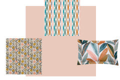
help with fabric to complement Farrow and Ball setting plaster
HU-956384372
3 years ago
Featured Answer
Sort by:Oldest
Comments (10)

Carolina
3 years agoRelated Discussions
Need help for my enlarged bedroom - Part One
Comments (25)Hi Denise I have just ordered shutters for my house for all the front windows which is costing around £1000 and roughly 8 or 9 square metres I'd estimate. However this is for DIY install shutters from the California Shutter company who have been recommended by a friend who uses them regularly, they aren't arriving until first week of December so I can't vouch how easy they are to fit yet!. They're prices start at £125 sqm in the sale at the moment. http://www.californiashutters.co.uk/ Take a look at Nina Campbell's Pagoda Garden fabric it's similar to your original accent fabric in the photo, although I don't have a sample to hand just now. It looks as though it has the stronger bluer tone you need to stand up to your walls. http://shop.ninacampbell.com/nina-campbell-fabric/autumn-2006/pagoda-garden.html I recommend a sample of a velvet or woven chenille for your footstool such as Osborne and Little's Peregrina F6350-07 or Canaletto F6142-10. These are contract fabrics suitable for upholstery which I can supply. Also Osborne and Little's domestic fabric Brehon Linens in F6520-20 is really gorgeous with lots of blue tones in which I feel would complement your scheme. Finally Sabi Addo F6272-08 is a really luxey light reflecting velvet and Rondelle Takarshi pictured here: http://www.osborneandlittle.com/products-and-collections/fabric/autumn2012/rondelle/tarkashi?id=2c149a3fd57045fd971eb480ac6a2b06 is a beautiful cut velvet for amazing cushions or throws if you are looking for that extra wow factor! If the blues become to silvery or yellowy you could always add in a neutral colour as I have done in my Coastal Scheme if you look on my profile. Just ask if you need to know any fabrics you see on the pictures. Hope this helps! PS I also supply Nina Campbell fabrics so if you need samples quickly please contact me rachel@spiniverdesign.com or 01637 621038 Best of luck I know how frustrating it can be! Rachel...See MoreKitchen help please! Help with colours etc for a small update.
Comments (31)I had a similar situation in a house I moved into years ago. I did a quick fix of painting all of the walls, woodword and the cupboards the same shade of cream. Sounds a bit OTT but it really knocked back the cupboards, which in all honesty are not something you want to make a feature out of, and created a calmness to the whole space. In your case, I would go for an off white so that the gang plug wires, radiator pipes and covers hiding the wires for the extractor fan etc., are disguised as much as possible -- that will tie in with the palest of the tiles in the splash back, and then you will have a pretty basic colour scheme of a very place colour and the dark worktop, fireplace and floor, which will stand out more. I think you need more storage with doors -- that bookshelf isn't doing anything for the kitchen. If you could get something in there that could hide lots of clutter -- even if just something cheap from IKEA, that would help greatly. Or work something around the filing cabinet that you have? A huge cheap mirror over the fireplace would bounce some light around too. If you don't want to go for undercupboard lighting, and if you have enough plug points, how about some lamps on the worktop, especially at the FF end with a floor standing lamp at the end with the chair. For the table, I would go for a table cloth and reupholster the chairs if they are not to your taste. A new blind in a much fresher colour would be great. Depending on the colour of your filing cabinet (if you use it), I think a petrol blue could add a nice vintage vibe to the chimney breast, and make more of a feature of it. I would try and go down a vintage/slightly industrial route rather than country. You may have some stuff lurking around that you could use, once you have got the base colours right -- currently it just feels a little cluttered and a bit of a mish mash. Best of luck. Looking forward to seeing some after shots :)...See MoreI think I've made a big mistake..... please help!
Comments (36)Yellow was very popular in the late 1980s - often paired with royal blue or duck egg. As a colour it stimulates brain activity so it's sometimes used in school classrooms. If you must use it, use a F&B wallpaper for your feature wall which includes the yellow. Or scrap the existing feature wall and have the entire room yellow and go shopping for textiles that go with it...See Morenude plaster pink paint colour help
Comments (16)We have a room in Setting Plaster, it’s a N facing room and I found that colour looks like a warm neutral in N facing but sickly peach in S facing. Conversely we have a S facing room in Calamine, this looks too sugary pink and almost blue toned in N facing but warms up nicely in S facing. So my advice would be to go less peach and more pink with your choices as you are S facing. As it happens Tani - I have an identical layout to yours, and am also pondering what to paint my white sofa wall! It does look a bit blank and stark in white. I’m going to buy a terracotta/rust/tan sofa but need a colour to go behind it. And some stuff for on the wall. Your plants have inspired me to get some thank you!...See More
HU-956384372
3 years agominnie101
3 years agoHU-956384372
3 years agoCarolina
3 years agoHU-956384372
3 years ago


Carolina