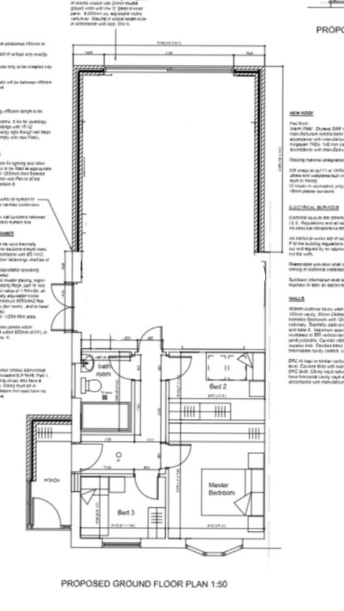
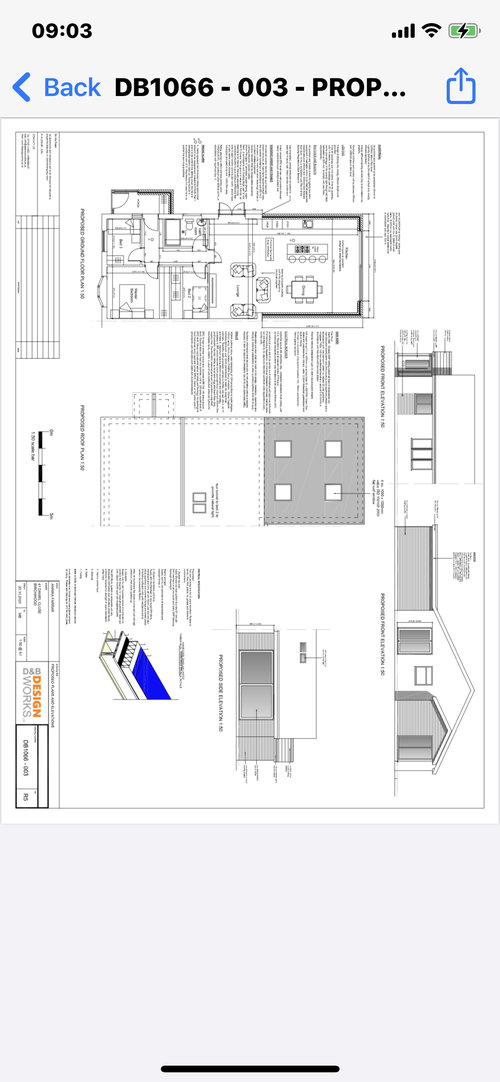
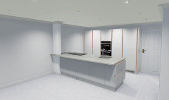
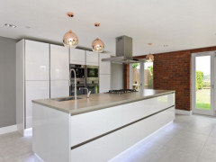
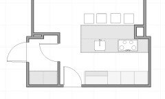
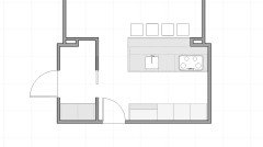
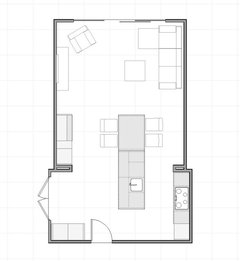
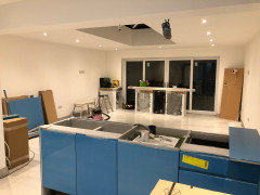
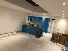
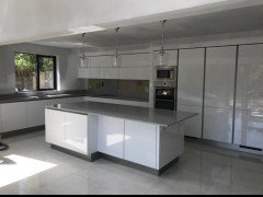
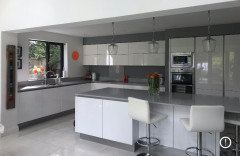
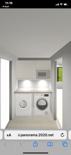
sam_dahou

Need your HELP!!

Sam Dee
3 years ago
last modified: 3 years ago

Hi all,

Happy Sunday 😊

I‘m having issues trying to layout our new extension with a knock trough its 9.5M x 5M

theres a roof lantern 3Mx1.5 .

I want it to flow kitchen with lounge

I’ve attached a plan.

the patio door on the left isn’t in a window can go there.

Thanks in advance


This is the original plan from the architect

Comments (115)

  • Mat SP
    3 years ago

    Similar sized house

    Sam Dee thanked Mat SP
  • Sam Dee
    Original Author
    3 years ago

    Morning all,


    there have been changes made again!! 😩🤦🏽‍♂️


    we set up the last agreed kitchen layout .. and it felt closed in especially with the utility wall .. so to get that feel for space we’ve removed the units along the right wall and moving the island (1300 gap from wall units and 1250 gap from utility wall ... giving it a clean and contemporary look.


    see pics


    The quartz wrap around the nib won’t be there (making the nib the width wider and moving the island 🆙


    thoughts please

  • Wumi
    3 years ago

    Hmm.. You are saving yourself 60cm of floor space but you now have virtually no work surface. Where is your kettle, microwave, toaster, cafetiere, etc going to go? Where will you put the extractor if the stove is facing towards the living area? Where will the dirty plates for the dishwasher sit?


    This layout is too cramped. I'd put the cooker along the right wall and move the sink to the towards the wall so you have a good chunk of worktop free as you enter the kitchen.


    Sam Dee thanked Wumi
  • mckenna_deirdre
    3 years ago
    last modified: 3 years ago

    I agree I think you are leaving yourself short on worktop space. Could you balance it out by losing two high larders, put larder to the right along that wall and then start worktop into the corner and around outside wall to the peninsula. That gives you two corner presses so you dont lose storage and you get a nice corner at the larder wall for your appliances such as coffee machine. It also has the advantage that you could put the sink along the outside wall and frees up space on the peninsula.

  • Ellie
    3 years ago

    Yip agree it's not good as mentioned above with no room to put things on worktop.

    I don't see the point in you having the overhang for stools as when sorted at a stool there you are going to be looking at a blank wall of tall units, when I'm sure you'd like to be actually looking into the nice space you are creating. I know it doesn't bother many, but I wouldn't have that, your back to most of the room, and the sliding doors.

  • mckenna_deirdre
    3 years ago

    I should have said I have similar worktop space around my hob and sink and very frustrating and doesn't allow for two to work together I rely on my peninsula for baking etc!

  • Sam Dee
    Original Author
    3 years ago

    We have integrated microwave, quooker tap the extractor will sit flush in the ceiling. The worktop is 2.8m long so there’s plenty of workspace.


    this is my friend kitchen which has a similar layout


  • Ellie
    3 years ago

    If you are ok with a 1 person only kitchen then it'll be fine. Would anyone ever do any washing up in sink as there really isn't any space to do that, I know you have a dishwasher but I still like to wash up in sink

  • Wumi
    3 years ago

    The difference being that your friends layout is not against a wall with a nib, neither is it doubling as a breakfast bar. If you do decide to go for this, I would remove the stools.


    2.8m minus what looks like 80cm for the hob and say 60cm for the sink leaving with 1.4m of broken up work surface. Will your sink be under-mounted. Where will you put washed items that can't go in the dishwasher?

  • lolalola73
    3 years ago

    Your friend’s set up is also different because both neither the wall units nor the island end at a wall. I think your blank wall will look a bit strange with nothing on it. You’d be better to go lower level units on the other wall & move your sink off the island.

  • rinked
    3 years ago

    You mentioned there is 210cm between bedroom wall and column? That leaves 90cm aisle? That is very very tight! A dishwasher door opens up about 70.

  • rinked
    3 years ago

    Are you sure the measurements you gave were right?


  • Wumi
    3 years ago

    I believe it was 2700 @rinked

  • rinked
    3 years ago

    Whoops, read 2100 :)

  • rinked
    3 years ago

    Ok that could work.

    I traded the narrower tall units for a drawer and upper, so there's some space to put the breadbox and coffee machine.

  • Siglint Kessler
    3 years ago

    My favourite layout for a kitchen is indeed what you show in your friend's house, an island opposite tall units. But it all depends on the situation, there is much more space in that house. In yours, a U-shaped kitchen really gives you the best result. It actually won't feel cramped, on the contrary, shortening the "cul de sac" is better, as is having more worktop and storage.

    I'm saying it now for the 3rd time - if you don't shorten the peninsula by just a bit, the dining table won't fit. At least, try to include a table now, in your drawings, rather than just looking isolated at the kitchen, to convince yourself. If you're giving up on a dining table and are only left with bar stools, I really don't think it is pleasant for the family to sit with backs to the garden, as was pointed out before, and also not nice to sit all in a row - always. In daily life, it's much more likely the stools are used for a quick coffee by one of you, or giving the children breakfast, rather than for family meals, and as such 3 seats will be plenty. As a last argument: if you don't find a dining table important, when it comes to selling, I assure you that having one would be a plus.

    I am also baffled that I see in your rendering drawers coming out sideways from the peninsula. That is a traffic zone, man! Imagine someone rummaging through drawers and another family member needs to go from livingroom to bathroom, having to wait.

    You're making your life difficult...

    Sam Dee thanked Siglint Kessler
  • rinked
    3 years ago

    (that's a grooved side panel, Siglint, faux drawer fronts)


    I agree a dining table is sooooo much better than a bar.

  • rinked
    3 years ago

    Island with height drop. No utility but outdoor views.


    Fridge next to hob, but other appliances elsewhere. Oven could go out of view next to sink, but if you like to see it, opposite the island. Washing machine (and vacuum cleaner) in a tall unit that looks just like the kitchen.

    Sam Dee thanked rinked
  • Sam Dee
    Original Author
    3 years ago

    So here’s a bit of background:


    There‘s.. only me & my partner living in this house.


    we occasionally have my son/daughter over once a fortnight (15 & 5)


    utility room is a must


    dining table is a must (love sitting with family and having a meal)


    3 chairs around a breakfast bar is also important


    we have friends around once a month


    we love cooking together as a team.


    we like minimalistic don’t have anything on show/worktops ie microwave, toaster kettle


    we want the kitchen to flow into the lounge and dining area without obstacle.


    I had the option to go 8M wide but didn’t want to lose anymore garden


    it Difficult living in a bomb site whilst fully renovating it at the same time... so some decisions are hazed and made in haste through anger and sleep deprivation 😩🤦🏽‍♂️


    I really thank you for all your input as it’s helped us out... yes you were right!! We were just focusing on the dream kitchen and negl

    everywhere else.


    so thank You again as your comments have been so helpful


    Sam xx

  • mckenna_deirdre
    3 years ago

    Hi @Sam Dee

    I was watching all the suggestions here and looking at your measurements I think you have plenty of space to do what you want. You wont regret the utility! Here's a couple more options (sorry but I had to resort to excel! Wfh! ) I've put a bench with a dining table in the space beside the utility, as that could very well become dead space, so you can keep it tidy against the wall or pull out to use it.

    In option 2 I've put in a desk space at the end but that could be kitchen units either.

    The peninsula option is the same way we did it, gives you space for a small desk area using a high stool behind the pillar and we put a wall unit underneath and it's a great way to get additional storage in, that you dont need accessible. In each case without the peninsula you could leave bedroom wall blank and go back to the full wall with long island opposite.

    Good luck with it all, and most of all try to enjoy it. I know how stressful this can get 😣

    Deirdre


    Sam Dee thanked mckenna_deirdre
  • lolalola73
    2 years ago

    What did you decide to do in the end Sam? Would be great to get an update.

    Sam Dee thanked lolalola73
  • Sam Dee
    Original Author
    2 years ago

    Hi @lolalola73


    I’m still not made my mind up... but this was our latest design


    https://panorama.2020.net/view/dp0fn2dve2yj15wuuus1a


    what are your thoughts?


  • mckenna_deirdre
    2 years ago

    I love that layout! Still gives you lots of space

  • mckenna_deirdre
    2 years ago

    Only thing I should do is switch your hob and sink, otherwise you are cooking with your back to the room, I hate that when you have people over!

  • Wumi
    2 years ago

    Looks good to me!

  • mckenna_deirdre
    2 years ago
    last modified: 2 years ago

    @Sam, if you are on Instagram go check out by_cli. It's just what your layout will look like in real life. Her stories today shows it but she has also shared her plans! It's lovely

    Sam Dee thanked mckenna_deirdre
  • Sam Dee
    Original Author
    2 years ago

    @mckenna_deirdre just checked it out and it looks lovely and cosy 😍

  • lolalola73
    2 years ago

    It looks good! Well worth taking the time to get it right. I might consider putting the hob on the island just to keep the island sleek but the layout & space is looking great.

    Sam Dee thanked lolalola73
  • Sam Dee
    Original Author
    2 years ago

    Definitely swapping the sink and Hob 😍

  • Sam Dee
    Original Author
    2 years ago
    last modified: 2 years ago

    Hi Guys,


    just an update

    thoughts?


    and thank you all

    xx

  • User
    2 years ago

    Every kitchen needs a shoe hanging from the ceiling ὠ9

    Sam Dee thanked User
  • Sam Dee
    Original Author
    2 years ago

    Sarah L 😂😂😂😂

    thats lost property hook 😉🤣

  • Sam Dee
    Original Author
    2 years ago

    @lolalola73 @rinked @lolalola73 @Ellie @Siglint Kessler @Mat SP what do you think pendants style, colour of quartz and would you go for acupanel behind 75” tv wall?


    Thanks 🙏🏽 Guys x

  • Sam Dee
    Original Author
    2 years ago

    @Wumi ??

  • lolalola73
    2 years ago

    Hey Sam, layout looks good. I’m not 100% sure though if the cupboard doors are blue or if there is a protective cover on them at the moment?

  • Sam Dee
    Original Author
    2 years ago

    @lolalola73 thanks, the blue protective film is still on…. the cupboards are a light grey… just not sure whether to go with a light or dark quartz worktop🤔

  • Wumi
    2 years ago

    Nice to see progress! I’d go for pendants with glass for soft diffused light. Umage do a pendant light called Acorn which is quite understated.


    I’d opt for a lighter worktop and bring in come colour/interest with a tiled backsplash.


    One vote for acupanel! Wood will bring in some warmth to the room as currently you have a lot of cold, hard surfaces.


    I’d opt for a wooden table and/or chairs and a rug in the seating area for the same reason.


    Sam Dee thanked Wumi
  • Sam Dee
    Original Author
    2 years ago

    @Wumi the pendant acorn light is perfect… tot totally ununderstand your comment on a colour scheme, burnt orange is where im thinking of goiing with it…

  • lolalola73
    2 years ago

    I went for Laura Ashley’s Oakley pendant light. I use filament bulbs & they add a bit of interest. I also went for a fairly bright orange as an accent colour but I’ll be honest I did tire of it relatively quickly.

  • lolalola73
    2 years ago

    Sorry meant to add this photo

  • Siglint Kessler
    2 years ago

    Hi Sam,

    In my view, a dark worktop will work well with burnt orange splashback and it's good to be a bit more bold. However, it comes down to personal taste...

    I notice something else: I would want to cover up the utility area, as guests will walk through to the toilet. For example slim wooden shutter doors (of around 35cm width, so the washing machine/dryer have double doors to access) or two light sliding doors along the whole length, like a wardrobe, so you access either right or left side at a time.

    In order to achieve this, the light switches which I see near the door leading outside have to be adjusted: on top of each other rather than next to. This is a change worth doing!

    Good luck...

    Sam Dee thanked Siglint Kessler
  • Siglint Kessler
    2 years ago

    Talking of light switches - why is the one near the kitchen behind the door? I would have put it on the other side and used that space for more kitchen cupboard. As it stands, maybe the door to the kitchen has to open the other way.

  • Sam Dee
    Original Author
    2 years ago

    The utility looks like this… thats a temporaily set up


  • Siglint Kessler
    2 years ago

    You still want to cover it up, so you can leave things lying on the worktop as well. Sliding doors will be wonderful.

  • Wumi
    2 years ago
    last modified: 2 years ago

    I think a muted orange could work. Claybrook have some nice burnt orange/terracotta tiles.


  • lolalola73
    2 years ago

    The tiles directly above from Wumi are a pretty colour and not as “in your face” as that bright orange I went with. We eventually tiled between the cupboards. Because of the various colours in the tiles we have a range of colours we can accent with.

  • mckenna_deirdre
    2 years ago
    last modified: 2 years ago

    I think the idea of a dark worktop would work well but totally depends on the look you want and your flooring. Try not to do too much especially as you want to incorporate some orange. Could you try paint or something reasonably less permanent then n case you tire of them. But I love the idea of that colour scheme. The kitchen looks great.

    Sam Dee thanked mckenna_deirdre
  • rinked
    2 years ago

    White top, solid as the floor already has a pattern. No orange. Add warmth with accents (wood, gold, bronze), like in the second image. Amber colored pendants will help add warmth, but make sure the bottom lets through regular warm white, or your food will look odd.

    Kitchen Renovations · More Info


    French inspired Reno · More Info


  • Sam Dee
    Original Author
    2 years ago

    Just a quick update… what do you think of the layout and colour scheme?

  • lolalola73
    2 years ago

    Thanks for the update Sam. You must be delighted to get to this stage. Looks good. In the summer when you’ll probably be in and out of the garden more you could move the sofa into the room a little more for access. How is the kitchen looking now?

United Kingdom
Tailor my experience with cookies

Houzz uses cookies and similar technologies to personalise my experience, serve me relevant content, and improve Houzz products and services. By clicking ‘Accept’ I agree to this, as further described in the Houzz Cookie Policy. I can reject non-essential cookies by clicking ‘Manage Preferences’.