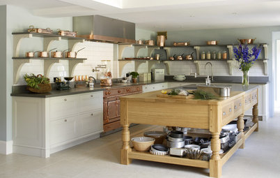
6 Brilliant Before and After Kitchen Renovations
Check out this inspiring array of transformations that look beautiful and function brilliantly

Whether expanding without extending, cleverly flipping a layout, reimagining storage or reconfiguring windows to free up room and boost light, these designers have used their skills to create great-looking, practical kitchens in existing spaces.
Take a look at the satisfying before and after shots of each project and let us know which one’s your favourite in the Comments.
Take a look at the satisfying before and after shots of each project and let us know which one’s your favourite in the Comments.
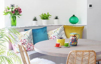
Removing the partitions created a large, 50 sq m living area, seen here from the same spot as in the previous image.
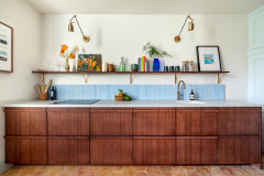
Muted colours and lots of natural materials lend the room a lovely softness. “For contemporary spaces that don’t have any appealing architectural details, my key rule is to add texture,” Marie says.
Gone are the chilly-looking floor tiles and in their place are pale oak boards. As for the kitchen itself, a tight budget called for some creative thinking.
“Ever since my time in London, I’ve been a huge fan of the Classic English Kitchen by deVOL,” Marie explains. “Since that was not within our budget, we did the best with what we had.” Her solution? A solid-wood Ikea kitchen, customised with green paint and brass handles.
Marie finished the splashback in zellige tiles. A quartz worktop was on the wishlist, but Marie went for the cheaper option of laminate, which works beautifully.
More: Earthy Hues and Texture Add Character to a New Home
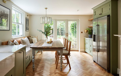
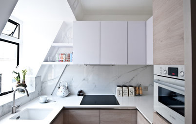
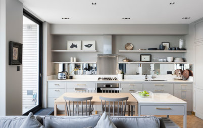
2. Boosting brightness
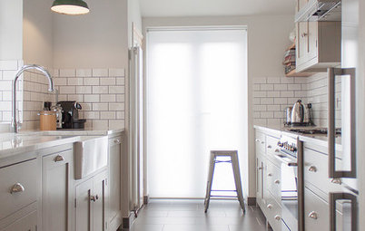
This tiny kitchen, in a flat in East Sussex, was dingy and lacked storage. “There was a gas meter in one of the corners, so we moved that outside to make the kitchen more useable,” says interior designer Nicky Percival, of Nicky Percival Interior Design, who oversaw its revamp.
Find interior designers and architects in your area on Houzz.
Nicky kept the same layout, but replaced the dark cabinetry with pale, flat-fronted units. To stretch the budget, she used Ikea carcasses with Fenix-faced plywood doors from Plykea.
The cabinets reach right up to the ceiling to make the most of the limited space. The corner to the right of the sink was left empty to accommodate a coffee-making zone, so Nicky added a pendant light to illuminate the area.
Against the neutral, pale grey backdrop, Nicky injected a flash of colour in the form of a bright orange glass splashback.
More: Art Deco Meets Midcentury in a Fun Seaside Apartment
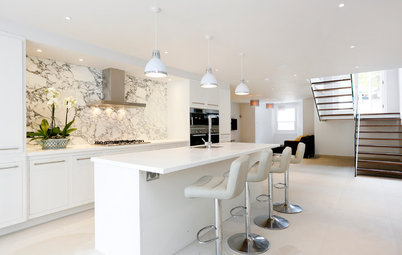
3. Flipping a layout to create more space
When the owners of this London kitchen in a post-war house approached architect Ian Troake of Troake and Rowsell, they needed help creating a room that functioned better and felt brighter.
Previously, as seen here, the cooking zone was on the left, darker side of the room; this area was also the most direct route to the garden, making the flow through the space less than ideal.
The kitchen didn’t benefit from the daylight from the rooflights on the other side of the island and, while tall windows along one wall added additional light, they also reduced storage opportunities.
Ian’s solution retained the original shape of the room, but repositioned the kitchen (adding masses more storage). Along with a few other small tweaks, he completely transformed this room. So what were the key changes?
The most significant decision was to put the kitchen on the other side of the room and free up the access route to the garden. This change also made use of the rooflights, which Ian enlarged a little, so they pull more light into the working part of the room.
This allowed him to remove the windows on the right, making way for a full wall of kitchen cabinets. Just out of shot, beyond the oven stack, is a new, high up horizontal window that boosts light further. Then, at the far end, he added a large mirror to reflect the garden and bounce light around.
Another simple change involved the support steels. “There was really thick boxing around these,” Ian says. “We suggested stripping that away and just painting the exposed steelwork.” This small change adds to the increased sense of space in the new kitchen.
More: An Old Extension is Tweaked for its New Owners
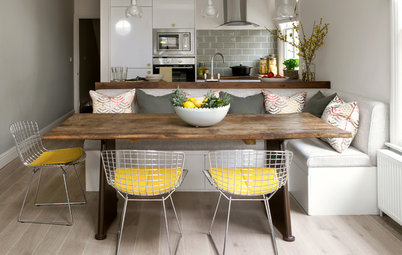
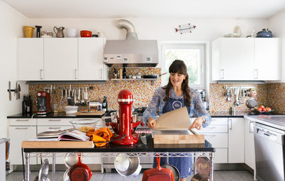
4. Maximising a galley – sustainably
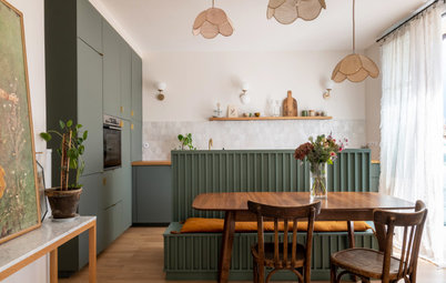
Interior designer Cathy Dean of Studio Dean was charged with turning this 2.5m-wide space in Northumberland into a colourful, sociable room with bags of storage without either extending or trashing what was in situ. “We like a challenge!” Cathy says.
The first step was to convince the homeowner it wasn’t possible to achieve her dream kitchen with the existing units, so Cathy helped her to sell or donate every component, leaving a clear deck to pack in a hidden breakfast cupboard, two sinks, bench seating, a table for two and more storage than the homeowner was able to fill
On the left, Cathy created a clever and flexible seating nook with a sliding table and bench storage. Colour comes in the form of the strong patterned wallpaper in here, making it a cosy spot that has its own identity. The two-tone units and terrazzo flooring add more warmth.
To ensure the small space didn’t feel crowded with so much going on, Cathy integrated all the appliances for a streamlined look and tempered the vibrant details with chunky white Corian worktops, a pale ceiling and calming oak cabinetry at either end.
More: A Slim Galley Gets a Sociable, Storage-packed Redo
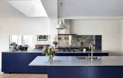
5. Expanding without extending
Designer Sybille Garnier Le Mené of Into interior design was brought in to completely reimagine the kitchen in this terraced house in south-west London. Due to budget constraints, the homeowners weren’t planning to extend the room. “I had to work with the existing space without touching the structural walls, apart from a chimney breast [not seen], which I convinced them to remove,” Sybille says.
The old kitchen was in need of modernisation – and it wasn’t just that the units were shabby. “The layout was not optimised at all,” Sybille says. “It needed to be entirely rethought.”
Which is exactly what Sybille did. The owners’ brief was for a functional room with plenty of storage that was also bright and cheerful with a relaxed atmosphere.
Decoratively, the garden was a big inspiration, leading to the choice of green cabinets and a new window to better frame the view.
Perhaps the most significant change layout-wise was the island. “Having an island was an absolute requirement for my client and she wanted it to have a small breakfast bar area,” Sybille says. “It was a bit tricky, as it couldn’t be large, but we made it work.
“Storage space was highly maximised,” she continues. The washing machine and tumble dryer are now stacked in a tall unit just out of shot. Sybille also incorporated a tall larder unit and integrated fridge-freezer, and added shelving and a microwave to a cabinet that hides the boiler, which couldn’t be moved.
Open shelving ensures that, while the storage is efficient, it doesn’t take over. This display space allows the room to ‘breathe’, and the owners have filled it with plants, cookbooks and pretty crockery.
More: A Nature-inspired Design Lifts a Tired Scheme
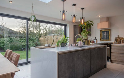
6. Staggering the side return
The original kitchen in this Edwardian family home in north-east London was, in the words of its interior designer, Gemma Fabbri of Studio Fabbri, “very long!”
It was also very narrow, at just 2.5m wide. “Once you’ve put in units either side, that’s not much space,” Gemma says.
This corridor-like kitchen wasn’t conducive to family life and, with no real zoning of the space, a lot of it ended up being unused.
Not so now… The room was extended sideways at this far end by architect Rosie Craggs of SS4 Architects, with whom Gemma often works. The extra 1.3m has transformed the space into an airy, practical and family-friendly room.
Rather than a straight-across opening at the back, the extension creates staggered openings to the garden: a door on the left and an oriel window on the right. The latter cleverly creates space for bench seating with storage, and play space for the children. “We specified a pivot and slice window, so it could be completely open, but you can also open just one half,” Gemma says.
Floor-to-ceiling storage to the right of this packs in a laundry, larder and fridge-freezer.
Exposed brick along the left-hand wall adds warmth. “It’s also great for acoustics and muting sharp sounds – as is the wooden floor,” Gemma says.
More: A Long Thin Room Gains Function Storage and Light
Tell us…
Which of these makeovers do you like best and why? Let us know in the Comments.

Sponsored

Sponsored
When interior designer Marie Guédon, of Home by Marie, renovated her new family home in Pornic, France, the kitchen – seen here before the renovation – was a priority.
The space, in a 2000s detached house, had been partitioned with a half-wall and decorative arch. Marie, who had a three-year-old and a baby on the way at the time, wanted an open-plan space that would work better for family life.