Decorating
Colour: Ways to Work With Copper Blush, Dulux's Colour of the Year 2015
Get ahead on the trend for 2015 and check out these ways to work Copper Blush into your home

Dulux have announced their Colour of the Year 2015, and it’s no surprise that the trend for copper shows no sign of falling out of fashion. Copper Blush takes a new approach to the look, melding it into a more subtle, paint-friendly tone that can be applied liberally to walls for a soft, warm effect.
Copper Blush lies somewhere between the bold tones of copper, the richness of clay and a much softer, paler pink. The warm undertones tone the pink side down, giving it an earthy feel and making it a versatile choice across a broad spectrum of decorating styles. If you think it still might be a bit much covering your walls, stay on trend with some blush-painted furniture and accessories instead.
Copper Blush lies somewhere between the bold tones of copper, the richness of clay and a much softer, paler pink. The warm undertones tone the pink side down, giving it an earthy feel and making it a versatile choice across a broad spectrum of decorating styles. If you think it still might be a bit much covering your walls, stay on trend with some blush-painted furniture and accessories instead.
Revamp an old piece of furniture
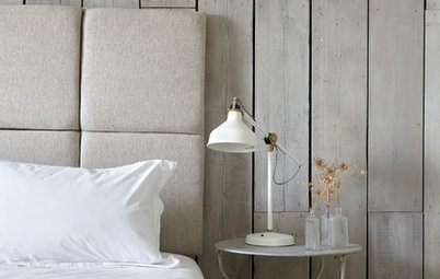
The warm earthy shades of the pink hue lend themselves particularly well to the shabby-chic look, so why not dip into the trend and paint an old chest of drawers or other item of furniture in the warm peach shade? Either cover the whole piece, or use less paint to give an uneven, distressed look, as shown on the drawers here.
Learn how to upcycle a drinks trolley into a bedside table
Soak it up
A softer hue is used in this bathroom, creating a relaxing and warm space. It keeps the room open and light, but adds a touch of elegance to the room. Paired with the claw-foot bath the shade has a vintage feel about it.
A softer hue is used in this bathroom, creating a relaxing and warm space. It keeps the room open and light, but adds a touch of elegance to the room. Paired with the claw-foot bath the shade has a vintage feel about it.
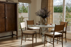
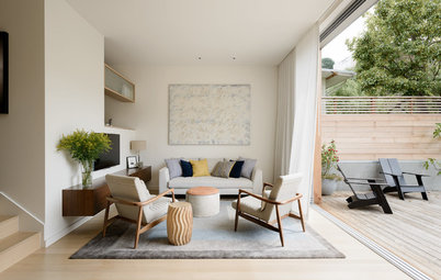
Create some accent seating
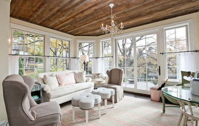
If you’re keen to work the colour into your scheme but not quite ready to commit to a full wall, picking one or two accent items of furniture will do the trick. In this room, an occasional chairs in a peachy tone give a subtle nod to the look.
If you’re keen to work the colour into your scheme but not quite ready to commit to a full wall, picking one or two accent items of furniture will do the trick. In this room, an occasional chairs in a peachy tone give a subtle nod to the look.
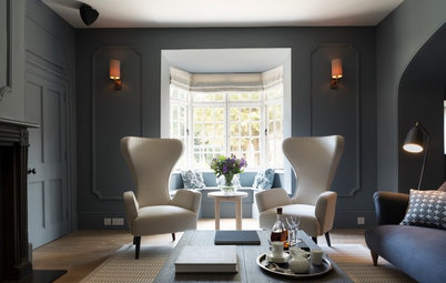
Team with copper
To bring out a different tone, pair it with the metal from which it takes its inspiration. This brings out the warmer, bolder hues and has a contemporary feel. For a look with more of an edge, this is the way to go.
Check out why brass and copper are big style news
To bring out a different tone, pair it with the metal from which it takes its inspiration. This brings out the warmer, bolder hues and has a contemporary feel. For a look with more of an edge, this is the way to go.
Check out why brass and copper are big style news
Add just a touch
In this bedroom, just the tiniest hint of colour transforms an otherwise blank canvas into a lovely yet understated room. Accessories like these pom-poms are the perfect way to work in colour without any real commitment. If you find it’s not right for you in a few months, not too much is lost.
In this bedroom, just the tiniest hint of colour transforms an otherwise blank canvas into a lovely yet understated room. Accessories like these pom-poms are the perfect way to work in colour without any real commitment. If you find it’s not right for you in a few months, not too much is lost.
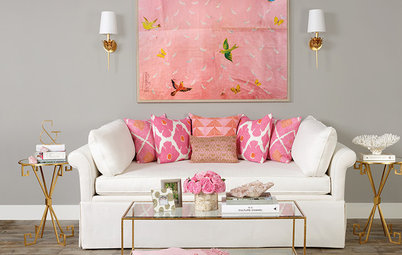
Mix your hues
Another way to get the look is to go for shades that are similar to Copper Blush – those that sit on either side of it on the colour spectrum. Here, rose-coloured furniture mixes with more orangey, coppery cushions and a soft-pink painted bookcase to give the overall impression of the shade.
TELL US…
What do you think of Dulux’s colour of the year? Where would you have it in your home? Share your thoughts in the Comments below.
Sponsored

Sponsored
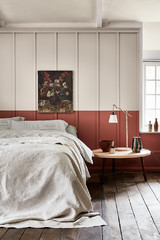
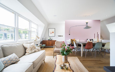
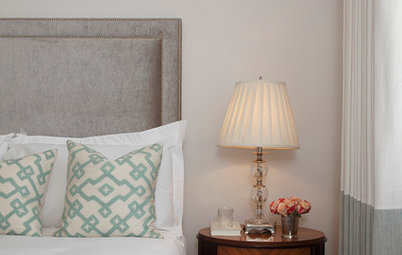
If you love it, don’t shy away from it. From the walls to the headboard to the curtains, there’s certainly no chance of escaping the trend in this room. The soft cream and white accessories lighten up the scheme and the pearl sheen to the textiles lend it a soft glamour.