


Houzz Tour: A Luxurious London Flat with a Boutique Hotel Feel
Warm tones and rich textures transform a blank canvas into the perfect city pied-à-terre

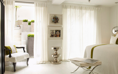
As well as the glamorous central London location, one of the key attractions for the couple buying this luxury apartment was that the structural headaches had already been taken care of. While the 19th century building’s stunning façade was intact, they wanted to add their own stamp inside, so they got in touch with Sacha Berger of Honey Bee Interiors to help them give the space a luxurious and comfortable boutique hotel feel.
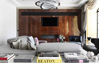
At the other end of the room, a media unit dominated the space and a low-hanging pendant light blocked the view of the TV. Sacha reworked the design to give it a lighter feel by incorporating white shelving with a bronze mirror behind.
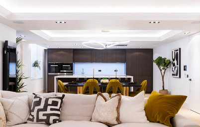
“We worked over the panels that were there, and added slatted wooden panelling either side to create a feature wall,” Sacha says. “The colour of the wood goes with the earthy element, and also helps to balance the space with the kitchen at the other end.”
As the ceiling is low, pendant lighting wasn’t practical, so Sacha needed to find other ways to create ambience. “I just put one pendant over the dining table, and then fitted low lighting in as many corners of the room as possible,” she says. “You don’t always want spotlights on in the evening, so I put a table lamp on the console, and then uplighters behind all the plants.”
Dining table and chairs, Liang & Eimil. Pendant light, Heal’s.
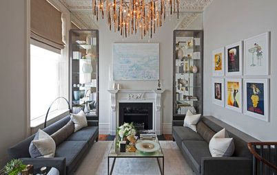
The substantial walls were crying out for some artwork, but Sacha was keen to avoid overcrowding the space and introducing extra colours into the mix alongside the ochre. “The artwork is of a certain scale, but I wanted to keep it monochrome and decorative,” she explains. “Yellow’s a strong statement colour, so I needed to calm things down in other areas.”
She also factored green into her original moodboard. “I was always planning to bring a lot of greenery into the space,” she says. “I knew a plant would work well with a monochrome print behind it.”
Artwork, Liang & Eimil.
She also factored green into her original moodboard. “I was always planning to bring a lot of greenery into the space,” she says. “I knew a plant would work well with a monochrome print behind it.”
Artwork, Liang & Eimil.
In line with the brief to create a boutique feel, Sacha went for plenty of brass accents and plush textures wherever she could. “The key was to not make it feel ‘blingy’,” she says. “It was about bringing in the luxe, but then grounding it with the plants and a slightly bohemian feel, so it still felt livable and down to earth.”
Console table, Andrew Martin. Swivel armchair, Eichholtz at Sweetpea & Willow. Plants, Happy Houseplants.
Console table, Andrew Martin. Swivel armchair, Eichholtz at Sweetpea & Willow. Plants, Happy Houseplants.
Being able to unwind was key for the owners, so Sacha chose a sprawling bespoke sofa where they can relax in comfort. She had cushions made up in a variety of fabrics and patterns, and chose an ottoman instead of a coffee table; the owners’ toddler was just starting to find his feet, so making it a safe environment with no sharp corners was a priority.
You might also enjoy How to Make Your Living Room Sociable.
You might also enjoy How to Make Your Living Room Sociable.
Sacha found a dramatic polished brass floor lamp with three golden palm leaves to light up another corner and pick out the warm tones running through the space. “That floor lamp’s quite amazing – a real statement,” she says.
Las Palmas floor lamp, Eichholtz at Sweetpea & Willow.
Las Palmas floor lamp, Eichholtz at Sweetpea & Willow.
In the guest bedroom, Sacha opted for plush fabrics and textured wallpaper to take the sumptuous hotel feel to the next level, and had the bed made bespoke.
“The main colour idea was the Bordeaux wine hue for the bed,” she says. “I always go for velvet, as it makes colours richer and deeper. It took forever to find the right shade, but it’s perfect. I then needed a contrasting colour for the curtains, so went for gold.”
“The main colour idea was the Bordeaux wine hue for the bed,” she says. “I always go for velvet, as it makes colours richer and deeper. It took forever to find the right shade, but it’s perfect. I then needed a contrasting colour for the curtains, so went for gold.”
To tie all the colour themes together, Sacha chose an Art Deco-inspired velvet fabric for the cushions.
Cushions with fringing, Anna Hayman Designs. Bedside tables, Andrew Martin. Antique brass bedside lamps, RV Astley.
Cushions with fringing, Anna Hayman Designs. Bedside tables, Andrew Martin. Antique brass bedside lamps, RV Astley.
A slimline wardrobe has been covered with a textured laminate veneer to blend with the wallpaper.
Sacha also created a home office area in the corner of the spare room. “I chose faux shagreen leather for the desk, and added a gold inlay,” she says. “I wanted it to be a work space, but also to be able to double as a dressing table for when the couple have guests.”
For the main bedroom, Sacha decided on a completely different colour scheme. “Sometimes, the inspiration can be something very simple,” she says. “I loved these cushions, as there was a bit of a Pucci effect, so I decided to use the different blues in them.”
Cushions, Romo. Bedside lamps, Pooky.
Cushions, Romo. Bedside lamps, Pooky.
Sacha went for a fluted bespoke headboard that runs right across the room to make it feel bigger, and chose Beverly Hills-inspired artwork that blends with the colour scheme, as the couple had recently relocated from LA.
Artwork, Galerie Prints.
Artwork, Galerie Prints.
An Art Deco-style, scallop-shaped sofa at the end of the bed boosts the glamour, and Sacha added a ‘leaning’ floor-length mirror, fixing it to the wall for safety.
Sofa, Eichholtz at Sweetpea & Willow. Mirror, West Elm.
Sofa, Eichholtz at Sweetpea & Willow. Mirror, West Elm.
A small desk in the window creates an extra work area with just enough space to sit down with a laptop if necessary.
Desk, Oka.
Desk, Oka.
As the toddler loves animals, Sacha chose a jungle-themed mural for the nursery, then used the colours in it as the basis for her other choices.
The couple were keen to follow Montessori principles for the design, to encourage independence and give their baby a sense of ownership over his surroundings. They chose a low Montessori bed, which he can get in and out of as he pleases, and all artwork was placed at his eye level. A low bookcase gives him easy access to his books.
Wall mural; Montessori bed; bean bag, all Etsy.
The owners are delighted with their finished apartment. For Sacha, the whole project was a joy from start to finish. “If I had to choose a favourite part, it would be the guest bedroom,” she says. “The colours in there are just fabulous.”
Tell us…
What’s your favourite part of this luxurious pied-à-terre? Share your thoughts in the Comments.
Tell us…
What’s your favourite part of this luxurious pied-à-terre? Share your thoughts in the Comments.

Sponsored

Sponsored
Who lives here? A couple with a toddler
Location Marylebone, central London
Property An apartment in a luxury development
Size Three bedrooms and three bathrooms
Designer Sacha Berger of Honey Bee Interiors
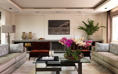
Sacha chose a simple but effective colour scheme for the kitchen and living space. “My starting point with this room was that it had a kitchen that we weren’t changing,” she says. “It’s made from wenge [a dark hardwood], so I decided to use that as the basis for the palette, and chose ochre to keep it warm and earthy.
“It’s a big space, but the ceiling is low, so painting it white helped with that,” she continues, “and I went bold with the furniture and fittings.”
Find a local interior designer on Houzz today.