

My Houzz: A Small Victorian Flat is Transformed With Vintage Gems
Bold colour and a mix of thrifty buys and on-trend touches give this small period garden flat a fun, personal feel

Anyone working on their home could do worse than take a leaf out of Rebecca Hadley’s book. Her home is a great example of what you can achieve with hard work, some carefully chosen second-hand buys and lots of imagination. This mix has helped her transform a poorly configured ground-floor flat in north London into a space that flows beautifully, linking its relaxed living area with a spacious garden.
A flair for knowing when to splurge and where to save has helped Rebecca kit out her home on a realistic budget, and the ability to be flexible proved invaluable, too. ‘Nothing ever goes the way you think it’s going to,’ she says. ‘You have to be prepared to make changes to your original plans.’ What Rebecca didn’t swerve from, though, was her love of Mondrian’s colours. ‘The whole flat was influenced by Mondrian, and his use of white, red, yellow and blue,’ she says.
A flair for knowing when to splurge and where to save has helped Rebecca kit out her home on a realistic budget, and the ability to be flexible proved invaluable, too. ‘Nothing ever goes the way you think it’s going to,’ she says. ‘You have to be prepared to make changes to your original plans.’ What Rebecca didn’t swerve from, though, was her love of Mondrian’s colours. ‘The whole flat was influenced by Mondrian, and his use of white, red, yellow and blue,’ she says.
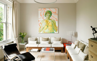
Rebecca bought the sofa from a design company that imports classic Danish pieces and re-covers them. ‘I chose the fabric and the contrasting black buttons,’ she says.
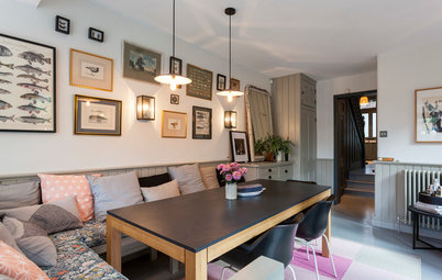
The images above all have meaning; many of them were gifts, including the map of London, which Rebecca’s brother bought for her. ‘I really like black and white imagery,’ she says. ‘It suits this end of the room. In the middle, where the kitchen is, it’s bright and fun, but down at this end, where the sitting space is, it’s quite simple.’
Sofa, Pelikan. Map print, Bold & Noble.
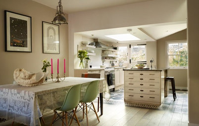
‘I had a blackboard in my last place and found it really useful,’ says Rebecca. ‘The wall near the stairs was the obvious place to put one, so that became my main working area.’
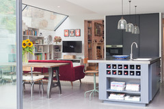
From this decision, the rest of the open-plan space flowed. ‘There are windows at each end of the room. I wanted the light from them to fall on the areas in which you sit and eat, and where you relax, so the dining space is at one end and the living room is at the other. The kitchen then easily went into the middle, where there was plumbing in place, too.’
Desk, Urban Outfitters. DSW chair, Eames for Vitra.
See 10 of the best chalkboard ideas
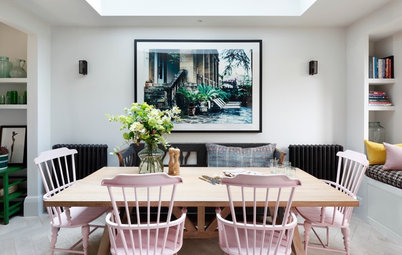
The dining table benefits from the light flooding in through the glazed garden door to the side, making it an appealing place to sit and eat, or to spread work out from the compact desk behind.
Rebecca bought the dining chairs with rounded backs cheaply and painted them in bright, Mondrian yellow. ‘I love their shape,’ she says.
Rebecca bought the dining chairs with rounded backs cheaply and painted them in bright, Mondrian yellow. ‘I love their shape,’ she says.
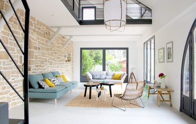
‘The typical layout at the back of these houses is kitchen, then dining room, then garden,’ says Rebecca. ‘You often see that, but I really wanted that feeling of inside and outside spaces connecting while I relax.’ So she positioned the living space here and installed new bifold doors to open it right up. ‘It’s a lovely place to sit,’ she says.
Furniture and lighting made with copper crop up throughout the living space, leading the eye through it and towards the bifold doors. The pastel table legs and geometric cushion add subtle colour at this more muted end of the living space.
Tables, Urban Outfitters
Tables, Urban Outfitters
Installing the wood-burning stove was more difficult than Rebecca had anticipated. ‘The chimney had to run the whole height of the building,’ she says. She had hoped to fit it in the far corner of the living area, right by the garden, but instead tucked it further into the living space, so the chimney could run up the exterior wall.
‘In the winter when you have the fire on it’s really cosy,’ she says. ‘If it’s raining and the fire is lit it’s amazing. You get that sense of inside and outside blending.’
Wood-burning stove, Chesney’s.
‘In the winter when you have the fire on it’s really cosy,’ she says. ‘If it’s raining and the fire is lit it’s amazing. You get that sense of inside and outside blending.’
Wood-burning stove, Chesney’s.
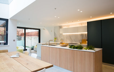
Rebecca chose inexpensive units for the kitchen and simple Formica worktops, but then invested in a beautiful tap and quality appliances. ‘It’s a mix and match approach, combining cheap and expensive,’ she says. ‘The lovely tap and a nice oven bring it all together.’
Kitchen cabinets, Wren Kitchens. Engineered oak flooring, Havwoods.
Kitchen cabinets, Wren Kitchens. Engineered oak flooring, Havwoods.
‘I really wanted a stone worktop in the kitchen, but it was too expensive,’ says Rebecca. Instead, she splashed out on this red mixer tap. ‘Now people come in and don’t notice the Formica worktops, they notice the tap!’
Tap, Vola.
Explore the pros and cons of different worktop materials with this expert guide
Tap, Vola.
Explore the pros and cons of different worktop materials with this expert guide
The kitchen worktop has been designed to extend out from the cabinets, creating a small breakfast bar. The copper-topped stools complement the pans above. ‘I wanted to use some copper because it’s on trend, but it also links this space,’ says Rebecca. ‘There’s the copper pendant light and side tables at the end, and then the stools and pans. These pieces lead the eye through this section of the flat.’
Orson copper bar stool, Swoon Editions. Copper pendant shade, Tom Dixon.
Orson copper bar stool, Swoon Editions. Copper pendant shade, Tom Dixon.
‘I feel classic design is the best,’ says Rebecca. ‘Vintage pieces have a bit of life to them and you can imagine how they were used and all the history and stories behind them.’ She found this sideboard in a shop on London’s Holloway Road. ‘My parents are very into antiques, so it’s in my blood,’ she says.
The images arranged above have been collected by Rebecca over the years, including the silhouettes, which came from her grandma.
Check out 15 ways to style your sideboard
The images arranged above have been collected by Rebecca over the years, including the silhouettes, which came from her grandma.
Check out 15 ways to style your sideboard
Rebecca built a wooden terrace to flow off the living space and wraparound the side. ‘The garden is my favourite place,’ she says. ‘Once you open up the doors, it makes the flat feel so much bigger.’ You can just see the wood-burner chimney, fitted against the house wall.
Decking timber, Havwoods.
Decking timber, Havwoods.
Colours inspired by the works of Mondrian feature in the garden. ‘I wanted to make it more fun out here,’ says Rebecca, ‘and keep it bright all year round.’
The garden is north-facing, so doesn’t get much sun, and the soil is poor, too, so only certain plants can survive here. ‘I can’t have bright flowers, so I chose plants with strong foliage. They sit beautifully against the fence. I designed the garden with winter in mind, with the plants making strong silhouettes against the coloured fence.’
The garden is north-facing, so doesn’t get much sun, and the soil is poor, too, so only certain plants can survive here. ‘I can’t have bright flowers, so I chose plants with strong foliage. They sit beautifully against the fence. I designed the garden with winter in mind, with the plants making strong silhouettes against the coloured fence.’
In the bedroom, Rebecca has used colour to create a more moody atmosphere. As in the rest of the flat, she did the painting herself. ‘It’s quite boring painting white,’ she says, ‘but it’s fun painting a colour.’
Walls painted in Teal Tension, Dulux.
Walls painted in Teal Tension, Dulux.
Rebecca made the corner headboard with her mum after being inspired by something similar at the Maison & Objet design show in Paris. ‘We made it from ply, foam and velvet,’ she says. ‘It means you can sit up in the corner and use the bed as a sofa.’
A vintage standard lamp makes a characterful bedside light. ‘I wasn’t sure where to put it,’ Rebecca admits. ‘I quite like it here; it’s a good light for reading.’
‘I like animals and, for some reason, I really like butterflies,’ says Rebecca. She found the butterfly print in a second-hand shop, while the elephant and tortoise were picked up while travelling in India.
Discover 10 ways to add a butterfly motif to your décor
Discover 10 ways to add a butterfly motif to your décor
Lamps create soft, flexible lighting in Rebecca’s bedroom. ‘I’m not a fan of bright light,’ she explains.
Light, Urban Outfitters.
Light, Urban Outfitters.
A cluster-style pendant light hangs in Rebecca’s bedroom, providing a contemporary contrast to the vintage standard lamp by her bed.
Pendant light, Urban Outfitters.
Pendant light, Urban Outfitters.
Rebecca created a bathroom between the two bedrooms, designing it so it could just accommodate a small tub. ‘I really wanted to fit in a bath,’ she says. ‘It makes the flat feel complete. It’s nice and relaxing in here, especially when I light candles.’
Bath, Victoria Plumb. The basin and taps were from a local bathroom store.
Bath, Victoria Plumb. The basin and taps were from a local bathroom store.
Bright red grout brings zest to the shower. ‘There are so many different coloured grouts to choose from, I wanted to use them all!’ says Rebecca. They brighten up inexpensive white tiles and channel the Mondrian vibe, too.
So did she enjoy creating such a fun, characterful home? ‘I loved it,’ she laughs. ‘I want to do another renovation!’
So did she enjoy creating such a fun, characterful home? ‘I loved it,’ she laughs. ‘I want to do another renovation!’
TELL US…
What do you like about Rebecca’s home? Share your thoughts in the Comments below.
What do you like about Rebecca’s home? Share your thoughts in the Comments below.


Sponsored
Who lives here Rebecca Hadley, a business development consultant
Location North London
Size 2 bedrooms, 1 bathroom; the living space is approx 9m long
Property A ground-floor flat in a Victorian terrace
Rebecca bought the flat in February 2014 and moved in the following September, doing most of the renovation work herself, with some help from her parents. ‘I did it all during weekends and evenings,’ she says.
An extension had already been built onto the rear of the flat when Rebecca bought it, but it was divided into a series of rooms, with the bathroom at the back. ‘Even when I first bought it I knew exactly what I was going to do in here,’ says Rebecca. ‘My brother asked, “Why are you buying this really small, dingy flat?” But I knew it could be nice! I just needed to rip it all out and open it up.’