Search results for "Space above kitchen cabinet" in Home Design Ideas
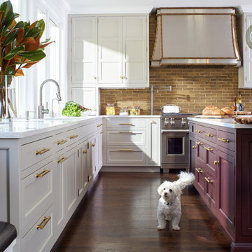
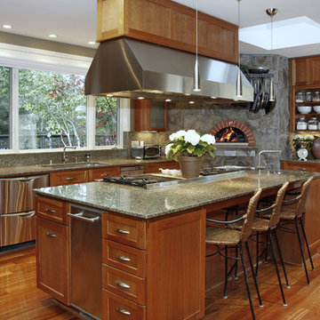
For this expansive kitchen renovation, Designer, Randy O’Kane of Bilotta Kitchens worked with interior designer Gina Eastman and architect Clark Neuringer. The backyard was the client’s favorite space, with a pool and beautiful landscaping; from where it’s situated it’s the sunniest part of the house. They wanted to be able to enjoy the view and natural light all year long, so the space was opened up and a wall of windows was added. Randy laid out the kitchen to complement their desired view. She selected colors and materials that were fresh, natural, and unique – a soft greenish-grey with a contrasting deep purple, Benjamin Moore’s Caponata for the Bilotta Collection Cabinetry and LG Viatera Minuet for the countertops. Gina coordinated all fabrics and finishes to complement the palette in the kitchen. The most unique feature is the table off the island. Custom-made by Brooks Custom, the top is a burled wood slice from a large tree with a natural stain and live edge; the base is hand-made from real tree limbs. They wanted it to remain completely natural, with the look and feel of the tree, so they didn’t add any sort of sealant. The client also wanted touches of antique gold which the team integrated into the Armac Martin hardware, Rangecraft hood detailing, the Ann Sacks backsplash, and in the Bendheim glass inserts in the butler’s pantry which is glass with glittery gold fabric sandwiched in between. The appliances are a mix of Subzero, Wolf and Miele. The faucet and pot filler are from Waterstone. The sinks are Franke. With the kitchen and living room essentially one large open space, Randy and Gina worked together to continue the palette throughout, from the color of the cabinets, to the banquette pillows, to the fireplace stone. The family room’s old built-in around the fireplace was removed and the floor-to-ceiling stone enclosure was added with a gas fireplace and flat screen TV, flanked by contemporary artwork.
Designer: Bilotta’s Randy O’Kane with Gina Eastman of Gina Eastman Design & Clark Neuringer, Architect posthumously
Photo Credit: Phillip Ennis
A cool, comfortable kitchen with the gray-blue Painted Harbor Rockford kitchen cabinets from CliqStudios. A clever breakfast bar was created next to the windows by recessing several cabinets under the granite countertops. Notice the special butcher block countertop next to the kitchen range and the crown molding throughout the space.
This is an example of a classic kitchen in San Francisco with stainless steel appliances, stainless steel worktops, shaker cabinets, light wood cabinets, green splashback and an integrated sink.
Find the right local pro for your project
After six years of living in their Huntley IL home, Chris and Meghan were tired of their dark, dingy, outdated kitchen and it was finally time for a long-anticipated change. “The kitchen is the place where we live, it’s where we do everything,” Meghan said. “It was important that it be a space where we wanted to be.” Meghan loves cooking and enjoys including their girls in healthy meal prepping, this led them to want a brighter, more enjoyable kitchen with increased functionality and improved storage.
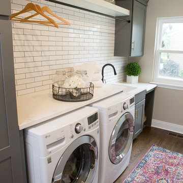
For Chris especially, the laundry room was an entirely dysfunctional eyesore. “We had a washer and a dryer, but it was all kind-of cobbled together!” Chris said. “There were always laundry piles everywhere, we weren’t really sure what we wanted to do in there, but it was time for us to make a change.” The mess of the space was stressful every time they walked in the door from the garage each day. Kids’ backpacks and shoes piled up haphazardly in the makeshift boot-bench closet left the family feeling disorganized and stressed. They needed space for folding clothes and locker cubbies to help keep the family organized.
Having known Christine and Todd in the Huntley community for years, Chris and Meghan were familiar with their work. “We already trusted them personally and having seen their projects for years we knew they did top notch work. After we reviewed the initial round of designs, we knew that hiring them was definitely the right choice,” Meghan and Chris said. Although Chris had done a lot of work in their home himself, the kitchen and laundry room renovation was such a large undertaking that he didn’t want to steal time away from his family to spend what would surely be many long weekends doing the job himself. “That would not have been a wise choice for us,” Chris laughed.
“Our designer, Michelle was very, very, easy to work with; anything we wanted to see or weren’t sure about, she went above and beyond to make this easy for us. She was easy to get hold of and always quick to respond,” the couple said. Michelle pulled ideas that mirrored the couple’s taste and style and was adept at directing the couple to limited choices that didn’t overwhelm them and kept the process moving. “I have a hard time making decisions. Michelle made the decision-making process so easy. I loved how she listened to what I liked and then presented three great options for me to choose from,” Meghan said.
The main objectives for the kitchen were better storage solutions, they wanted the space to reflect their lifestyle and taste, and they wanted it to last for years with low maintenance. One of the first steps in creating a more functional kitchen was relocating the refrigerator, creating an improved workflow for the busy family.
“We didn’t know that we could even move the refrigerator to a new location where it is now, that was something that we never would have thought of,” Chris said. “The new refrigerator location makes the kitchen feel so much bigger. We didn’t add any space, but our whole kitchen with the new design just seems like it’s so much larger than before!” Meghan said.
The perimeter mist colored cabinets helped warm and brighten the entire room, while the graphite colored cabinets on the island added contrast. Using this fresh, clean color palette satisfied the couple’s desire for a bright space that was the exact opposite of what they had before. Organization accessories were also added to the cabinets such as a spice drawer tray and roll outs to create hidden convenience.
“I absolutely love the hidden spices – it makes cooking so much more enjoyable!” Chris said. “And all the pull outs, and the double trash bin, who would think you could get so excited about organization!” the couple said in unison.
One thing they hated in their original kitchen was how dark the space felt. Added lighting on the ceiling with the new light fixtures combined with the lighter cabinetry colors throughout solved this problem. “Our new kitchen has this warm, almost cozy feeling that our old kitchen never had, it’s just a space that I love spending my time in now,” Meghan said. The light airy feeling was accentuated with the use of floating white shelves on either side of the decorative range hood. “We have so much cabinetry space, the new design is amazing we actually have more storage space than we will ever need,” Meghan said.
The island was extended to create more work surface and added space for stool seating. “The new island changes how we live. Now the kids can be in the kitchen with us, doing homework, eating breakfast, and the three of us have special dinners there when Chris is working late,” Meghan said.
The Carrara Marmi Quartz countertops were chosen because they are, not only beautiful, but are made from hard-working material that doesn’t require maintenance. The white subway tile backsplash that wraps to the ceiling behind the focal point cooktop range/hood compliments the crisp white countertops perfectly, while brushed brass hardware and light fixtures keep the design fresh and new.
The couple had a few fears at the beginning of the project, as most homeowners do. Their biggest fear was being out of their kitchen and laundry room for an extended time. The crew made it very easy for the family to work in a limited space keeping the washer and dryer hooked up the majority of the time, and also getting appliances working with minimal downtime.
“They above and beyond accommodated us to get us through the process,” Meghan said. “They did a great job making sure we were as comfortable as possible throughout the process,” Chris added.
“Our project manager DJ did a great job. He was very good at updating us on schedule changes, getting guys in as quickly as possible. Everyone that stepped in the house was nice and did great work,” said Chris. They thought Advance’s carpenter was phenomenal and were impressed when he took a conceptual idea from a photograph and worked with designer Michelle to create a one of a kind range/hood that has become the topic of conversation with friends and family who visit the new kitchen. “He was in our house literally every day for several weeks. He was easy to work with and good at what he did,” Meghan and Chris said.
The focal point of the kitchen; a hand-crafted, custom-built ventilation hood was clad with handpicked reclaimed barnwood. Advance Design’s carpenter built the framework and the cladding to create a one-of-a-kind design element that the couple loves.
“I think it was especially fun for him to create something unique from scratch, showcasing his talent in this area,” Meghan said. “I love that my kitchen is not like everyone else’s. I got to pick out the wood on my hood and watch it being built and was able to choose what pieces of wood went where on it. It’s totally unique.”
Red Oak flooring was toothed-in throughout the kitchen and the rest of the first floor anywhere changes were made. Then the whole floor was refinished to tone down the orange undertones in the existing floor stain, ultimately changing the color complexion of the entire first floor. The result is a completely new feeling to the entire home.
Renovating the laundry room was extremely important to Meghan and Chris, but they had trouble visualizing what the possibilities were for the seemingly small space. Michelle produced beautiful 3D illustrations that helped them envision the space in a whole new way.
“I must have told Michelle 100 times that I am a visual person, seeing the designs in 3D made it so easy to make decisions and see what we could really do with our space,” Meghan said.
A dividing wall and doorway were removed between the existing laundry room and hallway formerly containing a coat closet, providing space to design specialized graphite colored cabinetry matching the kitchen island to house custom storage cubbies for each family member. Adding the tall utility cabinetry in the new laundry area helped solve the storage issue, tucking away cleaning supplies, household items, and even the cat got its own cubby.
“I love how everything is now hidden in its own space. I can’t tell you how much I hated coming home and seeing everything sitting around on counters,” Chris said.
Electrical outlets were planned for the inside of utility cabinets, so devices could charge in hidden locations. Stacking the washer and dryer allowed for wider countertop space to provide a folding area and a special space for clothes to hang. “The way I do laundry has been completely transformed! I can actually fold clothes and hang them now right out of the washer and dryer,” Meghan said.
“The end result in the kitchen and the laundry/mud room was an updated light and bright space, with a smarter work flow that better meets the needs of this family,” Michelle said.
“I would totally recommend Advance Design,” Meghan said. “Sometimes I sit and just look at my kitchen and laundry room and think ‘Wow, I can’t believe I get to live here!’ It’s an understatement to say we love our new space.”
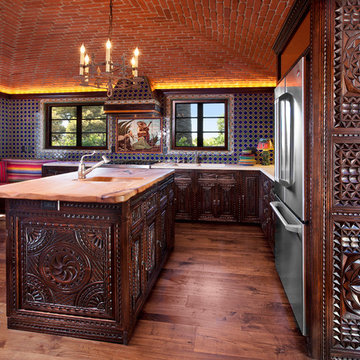
Primarily Alhambra carving pattern. This was a 1928 vintage home on the Riviera in Santa Barbara, Ca. The painted white cabinets in the kitchen were at odds with the elegant style of the home ~ generic and boring ~ transformed by an elegant complete reface in Spanish Colonial Revival style including crown mouldings and stove hood trim. Artisan carved with fine furniture finish created to match the flare and style of the owner's taste.
What an amazing transformation!
This kitchen blended 2 panel designs out of a choice of 15 door styles spanning carving patterns from simple to complex. All with a wide range of elegant, buttery finishes from Miel (honey) to the medium walnut finish pictured here. Surprisingly reasonable price points for an upper end personalized cabinet.
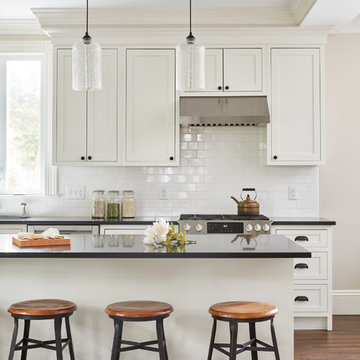
Photo by Jared Kuzia
Large traditional l-shaped open plan kitchen in Boston with a submerged sink, white cabinets, engineered stone countertops, white splashback, metro tiled splashback, stainless steel appliances, an island, brown floors and medium hardwood flooring.
Large traditional l-shaped open plan kitchen in Boston with a submerged sink, white cabinets, engineered stone countertops, white splashback, metro tiled splashback, stainless steel appliances, an island, brown floors and medium hardwood flooring.
The Poggenpohl NYC design team headed by Vanessa Ortiz and Marie-Line Laroche worked in collaboration with Jorge Sosa of NY’s Sosa Design Group, a foremost Hampton architectural firm, to bring about the vision of its East Hampton owners, that was to capture the qualities of the ocean and a forest of beech trees that border their home, with the standard request from our clients-- performance without high maintenance.
Our clients were practical, with legitimate concerns. They wanted a Poggenpohl kitchen with a timeless quality that surpassed the trends with the durability to look unworn after years of love and good use. “Your design from the start and unparalleled construction capture the clean lines and textures which leaves us extremely happy and content,” remarked the clients.
How often are kitchens used as the meeting place for families that seemingly drift apart by day, yet cling to this room for the comfort of familiarity? “Our stove hearth is the heart of our home,” says the owner. “But we have little hands and paws that touch everything.” Poggenpohl’s Sand Pine melamine was the perfect answer for the base cabinets. It not only mirrored the color and texture of the stand of beech trees, its easy-clean surface was capable of hiding everything from a nephew at play to the family cat.
Poggenpohl perfectly marries the theme of form and function and is truly exemplified in the large pantry wall. The pantry wall of fully functional pull out cabinets, wrapped in a satin finish of Polar White Matte Lacquer, reflects the blue sky off the walls and the calacatta caldia countertops. As for the floor tile, it was unanimous. Porcelain with a Limestone lookalike color and texture could handle any traffic pattern. “This kitchen not only cooks, it can sing!”
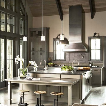
The design of this refined mountain home is rooted in its natural surroundings. Boasting a color palette of subtle earthy grays and browns, the home is filled with natural textures balanced with sophisticated finishes and fixtures. The open floorplan ensures visibility throughout the home, preserving the fantastic views from all angles. Furnishings are of clean lines with comfortable, textured fabrics. Contemporary accents are paired with vintage and rustic accessories.
To achieve the LEED for Homes Silver rating, the home includes such green features as solar thermal water heating, solar shading, low-e clad windows, Energy Star appliances, and native plant and wildlife habitat.
All photos taken by Rachael Boling Photography
The architectural vocabulary draws upon British Colonial precedents in the West Indies with masonry-stucco walls, a standing seam metal hip roof with a kick at the eaves, a wooden balcony supported by wood brackets on the more public street facade, and a wooden gallery atop hefty masonry columns framed with wood brackets on the more private waterfront façade. These features have been developed and refined over hundreds of years to accommodate comfortable living in the Caribbean and have evolved into a living tradition of beautiful vernacular architecture that is, as a result, truly sustainable.
The covered outdoor spaces in conjunction with the protected courts, deep overhangs and operable wood shutters provide a sustainable home that respects the context and climate, maximizes energy-efficiency and minimizes environmental impact. The simple massing and layout of this house with its simple and flexible spaces can accommodate many different family types and lifestyles and can even change uses as market demands change over time. These characteristics together with a timeless elegance and beauty support the firmness, commodity and delight required for truly sustainable living.
Never in their wildest dreams could the clients have ever imagined the possibilities that existed for their tired, segregated and completely non-functional kitchen. The remodeling of the entire space not only presented the opportunity to create a kitchen that the owners had only dream of, but one that would reflect the quality of the home.
The brief was very clear: to create an open-plan kitchen that integrated into the living room whilst still remaining a defined space; provided direct physical and visual access to the newly landscaped outdoor pool and alfresco area without being a thoroughfare; satisfied the requirements of an enthusiastic and demanding gourmand by creating a kitchen that “feels like home" yet still packs a punch for the purposes of entertaining friends and business associates.
The original kitchen resided at the rear of the home in a small closed in room which bar a small opening remained completely separated from the living room making it virtually impossible for the owners to entertain. To pave the way for the sought after open-plan living the dividing wall that separated the kitchen and living room was bought down – a concept the clients had never even considered until now.
The new galley style design required access from several directions. The result is an innovative solution based on a design where the kitchen can be approached from all angles, allowing it to merge with the surrounding living areas as well as offer full view of the beautifully landscaped backyard.
The juxtaposition of parallel and perpendicular forms creates a pleasing aesthetic within the room making the most of light and air within the space.
At the heart of it all is the large unusual ‘L shaped’ island bench which anchors the utility of the kitchen and provides a solid foundation on which the rest of the room comes to life. As the activity hub of the kitchen, it serves dual purposes of preparation and breakfast bar/casual seating (for the master of the home) as well as providing additional serving space, particularly when entertaining.
Finished with a soft lacquered linear timber veneer, the island bench feature adds a sense of solidity to the room and contrasts perfectly with the block colour grey tones used in the remaining high gloss lacquered cabinetry and tiled floor. In addition to providing an interesting textural element to the space, the raised veneer section on the island cleverly conceals the cleaning/sink zone and ensures the preparation mess is hidden from view when entertaining
A fully functional ‘working wall’ of cabinets provides the perfect storage solution in a narrow space. Pantry storage plays a major role with a variety of pull out inner drawers. A number of high end Miele appliances have been integrated into the wall enhancing the cutting edge European look whilst also providing all the functional requirements of the clients demanding cooking style. To make the heights of the combi oven and combi steam (including warming drawer) align, a custom stainless steel drawer was designed for under the combi oven. The effect of this is a seamless look, as if the drawer is part of the appliances themselves.
Well considered functional details add practicality to the room such as the appliance cupboard where pivot sliding doors cleverly conceal a pull out stainless steel bench top. The cupboard serves dual purposes keeping everyday appliances such as the toaster and kettle hidden from view, yet easily accessible whilst also providing another work centre for the client.
Elements of the cabinetry extend to the sunroom where a custom made day bed has been incorporated into the existing bay window area creating visual continuity and cohesion
The project demonstrated some design constraints that had to be overcome. As the house is on a concrete slab there were some initial mechanical challenges reconfiguring the kitchen, as the original layout would significantly restrict what we wanted to achieve. Plumbing was trenched into the slab taking into account the necessary fall for the distance it was being moved and wiring for the electrical was also trenched in to both the slab and the block wall that backed onto the new ‘working wall’.
Another consideration was the desire to retain the existing parquetry flooring throughout the home while replacing the old clip-lock floating floor that resided in the old kitchen. As a solution 600X600 ‘steel grey’ polished tiles were used throughout the kitchen space. Careful placement of the tiles was necessary to ensure visually correct placement delineating the kitchen from the living area, creating a defined space sought after by the clients.
Working closely with the owners the stylized selection of materials and finishes reflects the client’s personal style. The strong colour palette is functional and elegant and complements the modern lines. The deep charcoals make a dramatic statement and are brought to life by the stark white bench tops and warm timber tones in the veneer.
In keeping with the streamlined finish requested by the owners, shadow line finger pulls create a flush finish along the surface of the cabinets and ensure that nothing protrudes into the work areas. Overhead cupboards have been fitted with tip-on touch catches to maintain the minimal look.
The overall transformation shows what is possible when adaptive design techniques focus on the possibilities within an entire space and not an existing room. The design reflects the very best in contemporary kitchen design, clever utilization of space through innovative and multi-functional structural elements. A unique approach to the application of materials, colours and textures result in a space that is efficient, attractive and above all else perfectly suited to the owners needs. The owners not only have a light-filled space, but now have all the inspiration they need to gather their family and friends for a meal and entertain in ultimate style.
Designed by Ken Kelly, Kitchen Designs by Ken Kelly, Inc.
Antique White Wood Mode Cabinetry
kitchendesigns.com
Design ideas for a large classic l-shaped kitchen/diner in New York with a submerged sink, wood worktops, recessed-panel cabinets, white cabinets, multi-coloured splashback, ceramic splashback, stainless steel appliances, travertine flooring and an island.
Design ideas for a large classic l-shaped kitchen/diner in New York with a submerged sink, wood worktops, recessed-panel cabinets, white cabinets, multi-coloured splashback, ceramic splashback, stainless steel appliances, travertine flooring and an island.

Jeff Beene
Interior Design by Michelle Dolasinski with Passages Design Inc.
Inspiration for a l-shaped kitchen/diner in Phoenix with raised-panel cabinets, white cabinets, marble worktops, white splashback, metro tiled splashback and stainless steel appliances.
Inspiration for a l-shaped kitchen/diner in Phoenix with raised-panel cabinets, white cabinets, marble worktops, white splashback, metro tiled splashback and stainless steel appliances.
Photo by Rodolfo Castro
Classic kitchen in Atlanta with granite worktops and white cabinets.
Classic kitchen in Atlanta with granite worktops and white cabinets.
Traditional kitchen/diner in Chicago with white appliances, granite worktops, raised-panel cabinets and white cabinets.
There are so many design elements to this kitchen, I almost don’t know where to start. Bright and airy with crisp clean white cabinets, the kitchen is open and welcoming. Still crisp but gently contrasting, the stainless steel appliance add depth amid the white. To keep this kitchen warm, natural oak covers the floors and a toasted wheat color washes the walls. And then there is the architectural elements. You know. That post and beam in the middle of the room. It’s the center of attention.When you walk into a room your eyes roam around, establishing the size and shape of the room as your feet take you forward. From the front door of this home straight ahead you encountered this wall. The dining area to the right gives you a glimpse of things to come. Where there is a dining room you will usually find a kitchen.
The architecture of years gone by consistently hides the kitchen, the heart of the home, behind walls. I sympathize with my Mom, and all the other Moms, who have had to spend so much time tucked into a tight kitchen, away from the family. This wall had to go, but it was structural. We needed its support but not its bulk.So we got rid of the bulk and only the bulk. Instead of a wall we have a post and beam, offering all of the structure we need. We could have installed a huge steel beam and reconfigure the joists to upset the beam, but why? The small beam and post add an incredible architectural element. It’s turning lemons into lemon, we simply made the most of what we had. It may be functional but it’s so fantastic. It looks like we created the effect just for the drama.
The original kitchen may have had a working triangle and some counter space, but it was fairly small, with each area only a step or two away. The dark cabinets made the space feel even smaller and the butcher block patterned laminate counter tops were very dated. The appliances were feeling their age as well, from a coil burner electric stove to a top freezer refrigerator. To keep this kitchen within its space, a half wall separated it from the dining area.
With the wall gone we borrowed some space from the living room and extended what was a U shaped kitchen into an L. At the living room window we start our new kitchen. We kept a small part of the wall to support the other end of our decorative beam. Sandwiched between a large pantry and our new French door refrigerator, the wall disappears. With our new open floor plan a sizable island was in order.
We split our cooking areas and installed a continuous grill gas cooktop into the island. A sleek island hood takes care of exhaust and adds an extra element to our architectural feature. Under the cooktop we added over-sized drawers for pots and pan storage. The frameless cabinets from New River Cabinetry are maple, painted white, with the Herndon door style. With the cooktop safely nestled into our island, we still had to add an oven.
We used the space where the old range sat for a large single oven of stainless steel and glass. If it worked for one, why not two? We created a home for a microwave in the wall cabinets. It’s perfect for heating leftovers so close to the refrigerator.An important consideration for hot spots in your kitchen is landing zones. Each of our cooking areas have generous landing zones, one on each side of the cooktop and an entire counter area above or below the ovens, depending on which one you’re using.We wanted to give the sink area more room so the half wall had to come out. We moved the trash and recycle cans into a cabinet, removed the heavy soffits and kept the sink under the window.With that little bit of extra space we were able to add a larger cabinet above the dishwasher and slide it all down. This used to be where the carpeting met the vinyl floor, but all of it is gone. Long oak planks eliminate that final divide between the kitchen and the dining area, while adding visual length to the area. White wall cabinets on each side of the window reflect the sunlight for a brighter view.
With all of the darker cabinetry the backsplash walls had been painted white. Even still, there was a darkness in the corners and it wasn’t very exciting. We wanted to add visual interest and reflect the new under-cabinet lighting, eliminating the shadows in this corner.With 1″x 2″ Arabescato Honed marble mosaics and those under-cabinet lights, we achieved the perfect balance. The marble has subtle swirls in gray and beige on a clean white background, but with the honed finish the light is softly reflected instead of glaring. For granite, we chose the soft gray tones of Luna Pearl. The speckles of gray and beige are a gentle contrast to the white cabinets and emulate the color of the stainless steel.Between the carpet, red half wall, dark railing and dated light fixture, the dining area felt tired. Since the kitchen lacked sufficient storage, a large utility cabinet crowded the table space without adding any decorate elements.Although it didn’t get any bigger, our dining area feels fresher and more open too. With the oak flooring joining the area to the rest of our space and the toasted wheat on the walls, the white table and chairs compliment the cabinetry while contrasting the warmer colors. We replaced the chandelier with recessed lighting and changed that railing too.With our new open floor plan, we ended up with a fairly open area in between our foyer closet and the living room window. Not one to miss an opportunity, we filled the space with a multi-functional work space.
With the sunlight streaming in this bright corner works for anything this family needs.
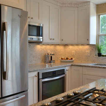
Photo Credit to RJK Construction, Inc.
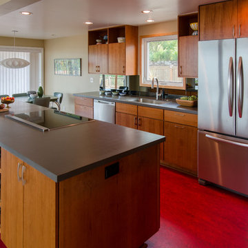
Mid-Century Modern Kitchen Remodel in Seattle featuring mirrored backsplash with Cherry cabinets and Marmoleum flooring.
Jeff Beck Photography
Photo of a medium sized retro l-shaped kitchen in Seattle with flat-panel cabinets, medium wood cabinets, stainless steel appliances, mirror splashback, a submerged sink, an island, composite countertops, lino flooring and red floors.
Photo of a medium sized retro l-shaped kitchen in Seattle with flat-panel cabinets, medium wood cabinets, stainless steel appliances, mirror splashback, a submerged sink, an island, composite countertops, lino flooring and red floors.
French Country
Inspiration for a kitchen in Chicago with an integrated sink, beige cabinets, beige splashback and integrated appliances.
Inspiration for a kitchen in Chicago with an integrated sink, beige cabinets, beige splashback and integrated appliances.
Spectacular Chef's Kitchen
Traditional kitchen in San Francisco with stainless steel appliances.
Traditional kitchen in San Francisco with stainless steel appliances.
photography by Rob Karosis
This is an example of a nautical kitchen in Portland Maine with stainless steel appliances, a belfast sink, shaker cabinets, medium wood cabinets and multi-coloured splashback.
This is an example of a nautical kitchen in Portland Maine with stainless steel appliances, a belfast sink, shaker cabinets, medium wood cabinets and multi-coloured splashback.
Scope of work:
Update and reorganize within existing footprint for new master bedroom, master bathroom, master closet, linen closet, laundry room & front entry. Client has a love of spa and modern style..
Challenge: Function, Flow & Finishes.
Master bathroom cramped with unusual floor plan and outdated finishes
Laundry room oversized for home square footage
Dark spaces due to lack of windos and minimal lighting
Color palette inconsistent to the rest of the house
Solution: Bright, Spacious & Contemporary
Re-worked spaces for better function, flow and open concept plan. New space has more than 12 times as much exterior glass to flood the space in natural light (all glass is frosted for privacy). Created a stylized boutique feel with modern lighting design and opened up front entry to include a new coat closet, built in bench and display shelving. .
Space planning/ layout
Flooring, wall surfaces, tile selections
Lighting design, fixture selections & controls specifications
Cabinetry layout
Plumbing fixture selections
Trim & ceiling details
Custom doors, hardware selections
Color palette
All other misc. details, materials & features
Site Supervision
Furniture, accessories, art
Full CAD documentation, elevations and specifications
108