How to Decorate With Beige
If you yawn and dismiss it, you're missing out on beige's infinite subtleties and the possibilities it brings to room designs

Oh, beige. So overused, so undervalued. Beige is like the plain, dutiful city clerk. She keeps the town running smoothly, but no one throws her a parade. But boring old beige doesn’t have to be boring. It’s just that it is too often used as a default, with no real thought about tone, hue, value and what other colors might look great with it. It’s slapped on cheap apartments and homes about to be put on the market.
Beige is nearly infinite in its subtlety. Which beige you choose can alter the entire mood of a room. It looks different depending on the architecture and kind of light.
Beige is also known as tan, buff, cream and even khaki. It varies from nearly brown to very pale cream. It can have warm yellow undertones or pink undertones or be nearly grey. “Greige” seems to be the “It” neutral at the moment.
Warm, yellowy beiges look great with teals, turquoises and other yellow-blues. True red looks vivid and elegant next to darker warm beiges. Beige and pink also looks lovely, no matter the undertone.
Layering beiges creates a soft, calming look; it makes you feel like you’re walking into a room made of cashmere. And all beige tones, no matter how light or dark, work with bright white trim; nothing looks crisper or more traditional than this combo.
Beige is a favourite of traditional styles, but it is really everywhere — even in wide-open modern spaces and wild, eclectic boho spaces. It’s the unsung workhorse of the decorating world. And if you can see past its reputation, you can appreciate its subtle beauty.
A rich, warm beige with bright red is always a winning combination. Bright white trim keeps it all crisp and clean.
Layers of beige — from a very light cream to a dark tan — add to the airy, calm feeling of this room.
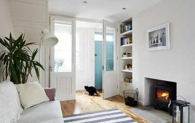
The beautiful architectural details in this stairwell are enhanced by the contrast between the beige walls and the white trim.
A warm, dark beige with a light, warm blue. Sand and sea, a classic combination.
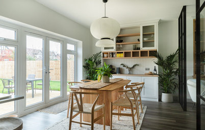
Beige is a great backdrop for an eclectic room with lots of colour. It’s warmer than bright white, and it doesn’t compete with the accessories and furniture the way another colour might.
A light, creamy beige with glossy true-black trim. It's elegant and less predictable than white. I love this room.
These subtle and chic beige and cream stripes are a great alternative to the pink and blue nursery. So soft and calming.
Pink-beige gives this room a softness that a cooler or darker shade would not.
Beige doesn’t have to be the wall colour; it can be the trim. These dark beige doors look great with these white and light beige walls.
Beige walls with a dark beige trim. Painting trim darker than the walls is the opposite of what most people do, and it always looks fresh and modern — even here, with traditional wainscoting and other flourishes.
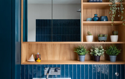
Beige in the Bathroom
This beige tile design is such a beautiful contrast to the bright white in the rest of the bathroom. Eye catching but subtle.
This beige tile design is such a beautiful contrast to the bright white in the rest of the bathroom. Eye catching but subtle.
The beige tiles behind this bathtub are rich and caramel-y. I think I would have continued the white from the ceiling onto the upper wall, to create even more contrast.
Beige gets modern. I love this shiny foil finish for a modern and sophisticated bathroom.
Beige in the Kitchen
Beige cabinets and appliances are a nice alternative to bright white. Everything is still crisp and clean looking, but a little less severe.
Beige cabinets and appliances are a nice alternative to bright white. Everything is still crisp and clean looking, but a little less severe.
Here, light greige walls set off the modern white cabinets and appliances.
Decorating With Beige
The beige sofa, rug and walls are the perfect foils for other colours and textures. It’s traditional meets eclectic.
Browse thousands of living room photos
The beige sofa, rug and walls are the perfect foils for other colours and textures. It’s traditional meets eclectic.
Browse thousands of living room photos
Minimalist and modern and beige.
A creamy beige sofa, walls, rug and chair with warm pink curtains. This room is so refined and lovely.
Beige as an accent with warm white. Used like this, beige becomes a colour full of possibilities.
Traditional chairs upholstered in various shades of beige linen. The word "beige" comes from a type of undyed cotton. This room has a very airy, stately feel. It's shabby chic in the best way.
Beige but not boring. All the different shades of beige here are the perfect backdrop for the multicoloured wall of books and the various pops of bright colour. Love it.
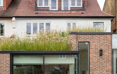
Beige Outside
A beige Victorian with navy trim. A classic.
A beige Victorian with navy trim. A classic.
The old standard: beige with white trim.
A sandy desert beige.
The following paint swatches are for illustrative purposes only, to give an idea of the range of beige paint colours available. To find the shade that works for you, visit your local DIY store for a paint chart and compare, or find a pro to help you.
The following paint swatches are for illustrative purposes only, to give an idea of the range of beige paint colours available. To find the shade that works for you, visit your local DIY store for a paint chart and compare, or find a pro to help you.
Inner Balance 1522 Paint
Another greenish beige but a warmer one. Imagine it with a bright white trim — very crisp.
Natural Wicker 950 Paint
A tad darker but still very creamy.
Have you decorated with beige? Let us know in the Comments.
Have you decorated with beige? Let us know in the Comments.


Sponsored
A light, cool beige in this giant room adds a little warmth but remains steadfastly modern. Light beiges are a great alternative to bright white in modern spaces.