The 10 Most Popular Entrances on Houzz Right Now
Get design ideas for your home’s hallway from these most-saved photos on Houzz

It’s often the smallest areas in our homes that can be the most important to get right, since there’s (literally) less room for error when trying to maximise functionality, flow and aesthetics. Perhaps that’s the reason photos of well-designed entrance halls are so popular on Houzz; from storage and organisation ideas to space-expanding inspiration and welcoming colours and finishes, there’s a lot to consider for the part of your home you and visitors see first when you open the door.
For fresh inspiration, consider the ideas in this countdown of the top 10 most-saved entry photos on Houzz between 1 September and 22 November 2023.
For fresh inspiration, consider the ideas in this countdown of the top 10 most-saved entry photos on Houzz between 1 September and 22 November 2023.
9. Boost a bench
A comfortable spot for pulling on shoes is a luxury addition to any entrance area.
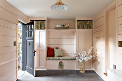
Here, Mowlem & Co has created a bespoke banquette for the homeowners that is deep and wide enough to accommodate storage as well as seating.
Low-level pull-out wicker baskets and a high, bare wood shelf add texture and warmth, as well as useful places for storing shoes, scarves, hats and so on, while the cushion fabric ties in beautifully with the wall paint.
Find local interior designers on Houzz today.
A comfortable spot for pulling on shoes is a luxury addition to any entrance area.
Here, Mowlem & Co has created a bespoke banquette for the homeowners that is deep and wide enough to accommodate storage as well as seating.
Low-level pull-out wicker baskets and a high, bare wood shelf add texture and warmth, as well as useful places for storing shoes, scarves, hats and so on, while the cushion fabric ties in beautifully with the wall paint.
Find local interior designers on Houzz today.
8. Employ careful coordination
When there are numerous colours and patterns going on, as there are with the original features in this hallway in an Edwardian house, the trick to stopping it looking haphazard is subtle coordination.
Designer Beth Dadswell of Imperfect Interiors has picked out colours from the patterned flooring and stained glass for the front door and console table. Crucially, these two colours tone nicely with each other. Pale walls allow the period patterns to shine without competing.
7. Be generous with the essentials
If you’re a household of many coats and shoes, factor that into your design, as Joseph John & Co has done in the back entrance to this Sussex farmhouse.
The cubbyhole arrangement for shoes prevents a potential pile-up and makes footwear easy to find. There’s no scrimping on hooks for coats, either, so lots can be hung up without anything bulging out and spoiling the view.
With a fantastic joiner making you a bespoke piece, it’s all about attention to detail and, here, the moulding above the shelf and the finishing at the top and bottom of the shoe and boot areas, plus tongue-and-groove panelling and decorative shelf brackets, make the design sing.
6. Nail a neutral palette
This elegant entrance, designed by Indie & Co, makes for a calm view from the front door.
Layers of grey and mushroom, along with pale floorboards, are punctuated with shots of black, which anchor the scheme. A skinny antique wooden bench adds character and is a good space-saver for a narrow hallway.
The panelling boosts interest without shrinking the space visually and the colour continuity through to the kitchen and up the stairs connects this space seamlessly with the house beyond.
5. Maximise a contemporary space
This stunning, light entrance by Urban Front is unapologetically modern. Panels of glazing open up the space dramatically, while the oversize wooden door adds architectural drama.
The glass theme continues with the balustrade and minimalist chandelier, while wide, pale floorboards enhance the sense of scale.
Strategically recessed LED strips will provide an interesting glow around the porch and window after dark.
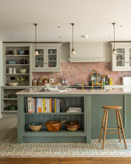
4. Combine with a utility
The owners of this home are lucky enough to have a separate back entrance away from the main cooking and living area, and designer Anna Wilson has made the most of it.
A utility area runs either side of the rear area, while a boot room with generous shelving faces away from the door, so they’re not the first thing the owners see coming in (though, lined up like this, they look rather beautiful).
The herringbone-pattern brick floor brings a rustic feel and the warm pinky tones blend well with the pale grey-green walls and classic Shaker-style cabinetry.
3. Go monochrome
It’s hard to go wrong with a crisp black and white scheme.
In this L-shaped bench and storage area tucked next to the foot of the stairs, designer Doris Lee has had bespoke nooks created for large rustic baskets, which warm the space up. The tiles add character and colour and, being pale, keep the area feeling bright and airy.
It’s nice to have two areas for sitting, too, as daily life isn’t always so perfectly styled and, when the coat rack is full, there’s still plenty of room for perching to pull on shoes.
Glass wall lights are a nice touch to provide a targeted glow and, being see-through, don’t clutter up the wall.
2. Add traditional features
Where period details are absent, do as Beth Dadswell of Imperfect Interiors did and add them.
This compact entrance features a small coat hanging area and narrow bench with space below for baskets or shoes. “We added tongue-and-groove panelling, built-in benches and a tiled Victorian floor to the entrance hallway,” Beth says.
This is just a glimpse of a beautiful hallway, though – there are glass vestibule doors and a mirror of this on the opposite wall. To see it all, simply click on the photo to enlarge it, then on “other photos in this project” (in the app, it’s the two stacked square photos at the bottom of your screen) and enjoy!
1. Zone with lighting
A big hand for our number one most popular entrance area, part of a whole house renovation by Pencil and Brick that’s as beautiful as it is practical.
A muted palette of blues and greys with accents of black and natural wood make it an attractive, calm space to come into, and bespoke storage gives everything its place.
The small wall light is a nice touch that firmly zones the area and the space for storage is varied and compartmentalised. It’s a great use of a compact space.
More: A Period Family Home is Gently Brought Back to Life
Tell us…
Which of these designs would you save to an ideabook? Let us know in the Comments.
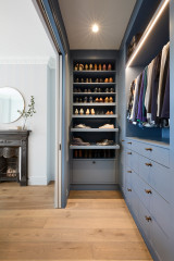
This organised entrance hall by Extreme Design provides space for each member of the household to store their outerwear neatly.
The open storage is brilliant for items in daily use, while a closed cupboard is perfect for the stuff you don’t want to look at: bulky things, dog or child paraphernalia, brollies, re-useable shopping bags, a basket of boots, scooters and helmets…