fehime_halim

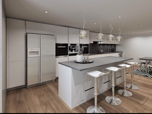
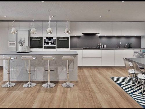
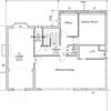
Our Kitchen Design - what's wrong with it?

Fehime Halim
8 years ago
Designers please help us understand what is unsatisfying with this kitchen given the plenty of space available. There is something which we are unhappy about, but we are finding it difficult pinpointing this. Many thanks.

Comments (64)

  • PRO
    Premier Building Design Ltd
    8 years ago

    needs a better 3d render, image too flat and doesn't look natural


  • selinauk1
    8 years ago
    I'm no expert but how about swapping the island to where the table is at the moment. Then placing the table near the door so you have a view while dinning.
  • Related Discussions

    Need help designing our dream kitchen please!

    Q

    Comments (4)
    Those windows look great Claire ! This kitchen design looks ok - but if you are opening up the windows into a bar then echo that with an also slightly unconventional idea perhaps - using a BORA induction hob - which can be fitted ( unusually - but the manufacturers say this is ok) in place if the sink under the window ... the hob itself has a built in extract system - so no extractor needed - and allows you to keep a flatter surface there and entertain your guests by cooking for them while they perch outside ! By moving the sink to where the hob area was allows you to take the DW out of the corner to the end of the run so it's easier to load and unload without being in the way. If you wanted to explore the options more, we are totally independent designers who have years of experience designing kitchens . We help you get the best design to suit your needs - then you shop around with one plan and get as many quotes as you like ! Haggle - negotiate - do a deal - it's all easier when you have your own plan in your hands !
    ...See More

    Can I implement this kitchen into our design?

    Q

    Comments (33)
    Hi Veronika. I do think this style of kitchen would suit your room or a pared back version anyway. Rockett st George would be the place for accessories, in fact the disco art is from there as is I think the bar trolley! I like the other design too which would look somewhat different once accessorised. I'm struggling to read the measurements but it looks as if you have the minimum clearance for the island? I've attached this article which may be of some help. Although I like islands that morph into tables I wonder I find the room is wide enough for it to be practical? I think I agree with Carolina and would separate it and add a banquette seat (try angel and boho). Depending on kitchen design I might also integrate the fridge freezer, you should be able to find one which has as much storage https://www.houzz.co.uk/magazine/10-essential-kitchen-dimensions-you-need-to-know-stsetivw-vs~77166332
    ...See More

    Kitchen design for our new build house

    Q

    Comments (10)
    Thanks CreatePerfect for your interest in my project. I have a fairly good idea for the style which will be a painted Shaker kitchen with granite countertops. I also want to incorporate a large island and it's this that is causing me the most trouble! The reason is that on the long run of units on the back wall there will be a range cooker, set slightly out. Which is making it difficult to place where the island should be positioned as it makes the island offset. I think it's because of the shape of the back wall coming inwards next to the bifold doors. It's the lack of symmetry there that I'm struggling with...so this is where I need some inspiration. I would be grateful if you could give me an alternative that doesn't compromise my island! Hope this makes sense?
    ...See More

    Our New Kitchen CAD Design - any thoughts/comments?

    Q

    Comments (11)
    Hi there. I think your kitchen looks fab but agree the render maybe creating a slighting different feeling of the space. I create 3D renders for most of my clients and offer a package creating 3D visuals to show clients what their space will look like once done and this one definitely doesn't give a very homely feel to the space with the colour and lighting shown. I have attached a few images to show you the sort of 3D images we use to give you a feel for the space as a whole. I agree with Jonathan above that the sink would be better nearer the dining table - another plus up this is when you enter with shopping your island will be where you head and with that moved you will have a better layout of space for that. I look forward to updates so do keep us informed of how your project is progressing :)
    ...See More
  • bookworm987
    8 years ago

    It feels like a very impractical layout - for such a large kitchen, there is very little usable worktop space near the sink and hob for food prep. The island is too far from the sink and hob to be of any use, so is basically a second table rather than a worktop. There's nowhere to safely put a hot dish when you take it from the oven, a pet hate of mine! It's very much designed to be looked at rather than lived in.


  • PRO
    The Colour Club
    8 years ago
    I work as a colour consultant specialising in colour psychology. Did your designer work with you to discover your personality? What behaviours you wanted evoked? This is important otherwise the space will never be right. What I first notice is you have a conflict in colour and design style here so initially that could be what your feeling. The flooring is distinctly from another group colour and design style... This could be where the problem lies but without being able to consult with you it is difficult to say. Like I said at the beginning your personality and what behaviours you wish to evoke are the key building block here.
    Let me know if I can be of further assistance
  • gokr
    8 years ago
    1. Kitchens generally should have the hob, sink and fridge / oven in a triangle format. Here they're all in a line so you're doing a lot of moving around. If have used the island for the sink or hob and the long units behind for the other high use bits.
    2. Colour: you could try injecting some colour with accessories such as tea towels / flowers / kettle / etc. If you're concerned about over bold colours you try blues/ purples - I think you already have a blue rug under the dining table. If you're happy to go bold a red could work
    3. More work-top space. There doesn't seem much work-top space around your hob / basin
  • PRO
    TreeSaurus
    8 years ago

    Try adding a large colourful painting on the wall above the table and maybe change the island work top for a piece of wood with a rich and interesting grain. There's not enough difference in the finishes even the wooden floor is pale.

  • Linda Hargrave
    8 years ago

    If you're a keen cook the kitchen layout looks reasonably OK - easy to shove the bits into the sink when you're hacking the veggies about, but the bar stool arrangement looks uncomfortable. How can you relax with Sunday morning breakfast when you're in constant danger of sliding off the stools?

    It looks gorgeous and sleek and enviable to have, but you need to think about how it will make your friends feel relaxed and welcomed when they come round to eat.

    No criticism - we've just bought a house and are facing the same questions ourselves, which is why I'm giving so much thought to it - but maybe a useful suggestion?

  • PRO
    N7 Design Studio Ltd.
    8 years ago

    I think the overall look of the kitchen would benefit from a degree of symmetry. The worktop should be centred on the island with the taller units either side. I certainly think the fridge/freezer should be integrated. Either the sink or hob could be moved onto the island to free up some worktop space. A simple way of adding personality to the design would be to have a vibrant colour on the splashback or unique hanging light fittings. I hope this of some help.

  • p_e_morgan
    8 years ago
    I would have the sink nearer the island by moving the in built ovens or having a sink in the island. You might get food from the fridge, go and wash it, take it back to prep on the island, turn and put it in the pan on the hob and then wash your hands. these actions don't flow easily. Also it may just be me, but the end of the island doesn't line up with any of the cabinets or the fridge door.
  • Mehmet Halim
    8 years ago

    I would listen to your son... he knows best

  • alyper
    8 years ago

    I think it's a great kitchen, just needs injection of colour. Change the grey on the wall, change the lights, change the seats to colourful versions Bunch of flowers, bowl of fruit on the island (bowl of lemons one of the best and cheapest decoration for kitchens). Tada!!

  • nonnya
    8 years ago

    I'd move the sink as close to the windows as possible. Being able to look out when washing up is much more cheerful than being stuck in the bowels of the room at the far end.

  • guest1
    8 years ago
    Too many bar stools - it would be too cramped for 4 people to sit there. 3 lights rather than 4 would look better. The worktops are very dull. You need a shot of individuality - perhaps a vintage table.
  • karen6696
    8 years ago
    What direction do your glass doors face? Natural light is also an important issue to consider. Having tall cabinets and fridge on the side closest to your patio doors will cast some degree of shadow where your hob, sink and worktop prep space areas are, especially since you have cabinets overhead as well. In addition having your island where it is will mean it could cast shadows on your dining table area. As mentioned by others before, the triangle system for hob/fridge-freezer/sink is a practical idea and perhaps you should think about having an L-shaped kitchen with sink and hob on the wall where the dining table is, move the island further away from the patio doors (maybe turned 90 degas) and have the dining table closer to the doors so you can enjoy the views while eating?
  • bomgoof
    8 years ago

    Not a kitchen designer but, as someone with a kitchen, I notice all the business stuff faces the wall. I hate that: 'Woman Work Kitchen, Woman No Need Make Conversation, Wall Plenty Interesting Enough For Woman - When Food Ready Woman?'. Not that I, as a woman, do ALL the cooking here - just most of it.

    Could you put the hob on the island, might be a better balance?

  • Simon Aubrey
    8 years ago
    create a work triangle, move hob/sink units to be opposite the island, maybe have hob or sink in the island. place tall units either side, add colour and texture. change light fitting to 3 pendants,
  • Brandi Nash Hicks
    8 years ago
    Paging psychologist to help me see what I'm trying to evoke in my comment
  • Valerie Wingrove
    8 years ago
    Bright coloured rugs would add another dimension to this lovely space.
  • margoledbetter
    8 years ago

    I think it looks great!

  • Lynne Saunders
    8 years ago
    This kitchen lacks balance! All the tall cupboards are to the left only! Agree with other comments three is the number not four for lights and island seating. Central island also feels small in this space and needs a much heavier larger possibly overhanging top on the seating side. Why is the kitchen designed in a linear style when it doesn't need to be? Suggest hob or sink would be better placed on the island! Go bold with a splash back to inject some colour into the room.
  • Kate Amor
    8 years ago
    Hello - would you consider flipping things around so that:
    The tall units including ovens are along the wall where the dining room table is shown
    Turn the island 90 degrees and make it double width to include job and sink so when cooking you face the garden view
    Units along the wall to where the ovens are now (and following the triangle principle mentioned earlier)
    Move dining table parallel to island in front of French Windows to garden
    Low level units or cadenza where American fridge is now / TVs above / mirror / armchair area
    A random suggestion - Do you have or require a larder / utility area at all? where dining room table is shown could be used and would 'shorten' the area and might make easier to plan.

    We marked out spaces for our kitchens with masking tape on the floor which helped us envisage our layouts.

    Good luck with all your planning
  • judiep1
    8 years ago
    I think that the flooring is running the wrong way , it would have looked better running from the window to the wall behind the table.
  • alyper
    8 years ago

    So busy looking at kitchen I missed the spectacular view! Move island further into the room and put the table at the window! Then add colour ...

  • Fiona Tamplin
    8 years ago
    I'd move the island 1200mm to the right and put the dining area nearer the window. The island would over lap the ovens and the sink area to make it more practical. I'd integrate the fridge & freezer, we did so have a full height & full width fridge & freezer so it's go more space than the American style and looks amazing. I'd make the floor a darker wood, maybe walnut and go for matching worktop to warm the place up. Paint the end wall a soft dark grey, slightly lighter than the splash back. If there's space maybe double the width of the island with back to back units so you've got storage both sides and a lot more workspace.
  • PRO
    Ace Your Space
    8 years ago
    last modified: 8 years ago

    Make the focus of the room that lovely big door. Could you put the table near the window and also the island? I'd also make the island have a sink and or hob so that you get more chance to enhoy the view. As other people have said, think through the practicalities of making a meal. How close is everything, etc.

  • Marie-Laure Bernet
    8 years ago
    I had my kitchen done recently. All kitchen makers wanted to force me in a one line plan I managed to get a L/triangle shape as I wanted.
    Bottom line with everything on one line walking is intense and not smooth, but really enjoyable when cooking.
    Second the only nice work area it the island extra walking.
    Finally, at least that was my reason to disagree with the makers in total a one line days a lot of space in the living area funnily more than with a well planned L because at the end the L square and that's your entire kitchen space whereas visually and unless you have at least three times the size of your kitchen in the living area you feel like living in a kitchen with a living area attached and not the reverse. Secondly, I what I mean by space is that for the line of the kitchen you need some extra 90 cm to move around so in total the actual space used by the kitchen is the width of the kitchen plus 90 cm.
    Hope this is your issue otherwise accept my apology of I mentioned unpleasant stuff ☺
  • PRO
    Visuals by design
    8 years ago
    The island doesn't sit right with the hob position at a quick glance. Maybe fridge to the far right, hob etc more central and the sink in the Island? Maybe more of a feature around the Hob? Hope this helps
  • PRO
    P & P Maintenance Services
    8 years ago

    It lacks colour. You need an accent wall and accessories in the same colour. Otherwise it's a nice kitchen.

  • gd11
    8 years ago

    It's a really lovely kitchen. What I think it lacks is a bright white ceiling which will open the room up as it looks squashed with a dark flooring and greyish ceiling. Then just introduce some white accessories to pick up with your stool seats. Make it more homely.........add a modern fruit bowl, herbs by the cooker and small vase of flowers on table. A 20" Thomas Kent clock by the table would look amazing preferably in white.

  • midcenturyreno
    8 years ago

    I like the look - just needs a pop of colour on the walls. HOWEVER, ergonomically, it doesn't work. Like the other commenters, the business end needs to be up near the island and the storage/tall units at the other end - a flip flop. Probably VERY expensive to fix with plumbing and if the cabinets are custom/bespoke. I would NOT put an appliance on the island - it clutters it up and its either wet because of a sink or has cooking stuff on it and always messy. A long run of island worktop is better for baking/pasta making/homework/ craft projects/ hanging out. You could put a smaller SECOND island (rectangular, square, L-shaped?) near the business end instead of the table and chairs - as it looks like you have enough space. This might be your most inexpensive fix and would correct the ergonomics. Just think of the work space!!

  • PRO
    Dee Design
    8 years ago

    Here's a photo of a similar kitchen which divides up the tall cabinet banks. Bringing the island gables down to the floor is both practical and looks much better, three lights rather than four. I would suggest quality finishes and attention to detail if you want to pull off the simple and understated look of muted grey and white. And lighting is sooo important,

    Best of luck with it. Dee.

    Matt Grey kitchen without handles - Glasnevin Dublin · More Info


  • PRO
    Casa Colori
    8 years ago

    I think the tall units should be rearranged. the hob should be in the island.

    I would add some splash of colors, chairs, fruit basket as well. nice canvas on the wall

  • Jayk
    8 years ago

    Many people would love to have a kitchen like yours. I suspect you won't really want to make major, costly changes so soon so the best route may be to introduce more colour via redecoration and accessories. Change the splashback. Paint the wall by the dining table. As they are adjacent to one another I would consider having the splashback and wall the same colour to connect the two areas and make a feature of that corner. Hang pictures or a clock. Replace the bar stools. Add some flowers.

    I think part of your problem may be the ceiling is low for such a large space so that should be as unobtrusive as possible - which probably means white.

    Make the simple, less expensive changes first and then live with it for a few months. I think they may do the trick.

    If not I would then consider relocating the island and dining area. The island doesn't look like it's got any power or plumbing running to it so that shouldn't be too difficult but will probably require the re-laying of some of your flooring.

    Perhaps you could post some photos of the changes you finally decide to make?

  • Karen Kemp
    8 years ago
    The island and work bench don't line up... Then on the appliance wall you have this long line of ovens... Should have limited then to 2 doors. And the floor is all wrong
  • alyper
    8 years ago

    Why is everyone tearing the kitchen apart?! Question wasn't about a makeover. It's a great kitchen, apart from needing injection of umph in the way of colour, and maybe the island and dining table possibly being swapped over at the very most.

  • Jonathan
    8 years ago
    This is a computer generated image
  • PRO
    Creative Rooms
    8 years ago
    Include some colour accents and texture with a bold rug and accessories
  • alyper
    8 years ago

    Very interesting comment jonathandb1972.. Thought the view too good to be true. What's happening here Houzz?

  • vespin
    8 years ago
    There is no movement ... What about this layout?
  • Victoria
    8 years ago
    @alyper,
    Someone has posted a design picture for critique. States in the post they want critique and early comments reveal it's a CAD drawing.
    The OP is planning a kitchen and tweaking the design.
  • alisonmb7
    8 years ago
    The zones... it is surprisingly similar to my current kitchen. There isn't enough space next to the hob for food prep, and the dirty dishes are going to be competing for space by the sink. You will have to do a lot of walking when you take things out of the fridge. Think of a few meals you make regularly and mentally walk through making them. I don't have a solution as I'm still working on how to rearrange mine and justify a new kitchen when this was just put in by the previous owners.
  • Lisa Burdett
    8 years ago
    I echo some of the comments here. It's nothing to do with colour or flooring, you can always add colour in the accessories. For me it's very simple your working end of the kitchen should be opposite the island.
  • PRO
    John Roberts Design Ltd
    8 years ago

    In general its too heavy at one end, not enough prep area around sink & hob.

  • PRO
    GHS Special Projects
    8 years ago
    last modified: 8 years ago

    Although the kitchen is white, it is set into a return where there is little direct light from the very large window which casts shadows in the space making even a white kitchen look sombre by contrast. I would suggest more powerful down lights at least 13W that would highlight and reflected off the stunning gloss units. Additionally you could add plinth lighting under the kitchen units. Cool white to keep it minimalist or RGB ribbon (red, green, blue, which would allow you to colour mix) which can give the kitchen a whole spectrum of characters depending on the colour you choose or both RGB and W to keep your options open. Ribbon light is also a low cost way to improve this space. Ensure you get nothing lower than 9W per metre as it may not have enough light output against the natural light from the window.

  • Marie Price
    8 years ago

    I can't make head or tail of this kitchen! It would be useful to see the other two walls, including the internal door(s). The black and white zigzag patterned rug is too busy, and why is the table not somewhere where diners can enjoy the "view" from the window? Why is everything so cramped, when there appears to be so much space available.

  • ummimez2
    8 years ago
    hi would would paint the end wall a dramatic colour or maybe a large painting rest is superb .
  • PRO
    Surreal Designs Kitchen Studio
    8 years ago

    Assuming this kitchen is still at design stage (CAD drawings suggests it is), I would suggest going back to scratch with your designer or perhaps trying someone else as this design has been slated for lots of good reasons which have been listed above.

    Once you have fixed the layout you can then worry about aesthetics

  • blubrookemoss
    6 years ago

    just a few ideas:

    change the flooring

    add some green either dark or lime.

    make the island bigger - include the hob and sink , or step it up so you sit up slightly higher than the work top.

    make the island a different shape.... make a feature , curved at one end?

    and make sure the chairs are facing the garden

    swap the american f/f for integrated


  • Hanna T
    6 years ago
    I agree with the arrangement of the units and working areas near island. If Thai was an Brittish kitchen there would be additional window in the exterior wall and u-shape low units with sink in front to create a cosy corner.

    I also think that the design is purely of cold and hard materials and there is a lot of metal (lights, chairs) but no warmer wooden elements. These could be reconsidered without changing the whole scheme.. Flooring was wood but is is artificial?
  • Daisy England
    6 years ago
    Probably done by now. This post is 15 months old.
United Kingdom
Tailor my experience with cookies

Houzz uses cookies and similar technologies to personalise my experience, serve me relevant content, and improve Houzz products and services. By clicking ‘Accept’ I agree to this, as further described in the Houzz Cookie Policy. I can reject non-essential cookies by clicking ‘Manage Preferences’.