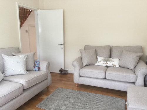
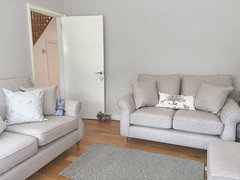
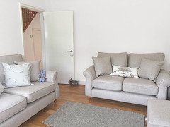
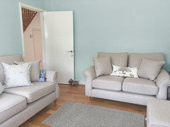
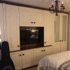
Wall colour inspiration to move away from magnolia
Poppy Smith
5 years ago
Featured Answer
Sort by:Oldest
Comments (15)

AMB
5 years agoembzop
5 years agoRelated Discussions
Needing exterior colour inspiration
Comments (26)Thank you so much that was really kind of you! Darker fascias make a surprising amount of difference, which I really like, and I can see how it anchors the roofline back down on the windows. I am pleased we decided not to switch the windows immediately as I can get the outside sorted and may be back pedalling and keeping dark ones even if we do replace them. The green/grey is lovely, the house is in a small village in rolling fields cow countryside rather than the higher sheep mountain country so as you can see in window there are a lot of trees around. The colour seems to settle the house nicely into that kind of environment. My list at the moment is now looking like -Remove stone around windows -Balance the new plainer wall with something tall -Darken the fascia/gutter -Fresher base tone paint - nothing creamy - looking to chalky/grey/green -Pop the front door :D -Poke around at the base of the house to see if the lawn can be pulled back a bit in front of the central wing. (haha - giving a bungalow wings - but you know what I mean!)...See MorePaint colour for estate farm office: moving away from white?
Comments (3)Hi. Colours of the period would include cream, terracotta, mustard, olive green, forest green, deep blues and crimsons (look at William Morris fabrics for colour inspiration). A number of paint companies list historic colours according to the period. If you want the building to blend in I'd opt for green on the creosote part. You could then go for a lighter shade of green for Windows, terracotta, cream or deep red etc...See MoreKitchen colour inspiration
Comments (8)The world is literally your oyster -- you could go for any colour you like! Don't be afraid of strong colours. But one way to take away some of the "whiteness" without going the whole hog is to have the splashback area under the cupboards a stronger colour. That could be either a glass splashback (which you should consider at least behind the cooker), or hard-wearing paint. You could use a stronger colour below the cupboards, and a lighter version on the bigger walls. We used a strong blue here; the under-cupboard lighting made it look a bit lighter:...See Moreattic room colour inspiration/advice
Comments (7)Here's the same version, but with Colourhappy's suggestion, Pigeon, which is probably a bit warmer and definitely lighter and brighter. Colours will be different in real life, but it'll give you sort of an idea of how it will look. I was thinking that although blue is a cold colour, your floor and furniture are warm coloured, so it would be levelled out, so to speak. And I don't mind dark colours for bedrooms, but it's a personal preference. I also think that you might want to try a different ceiling light, before installing recessed spotlights. I think your current one is small and only lets out light on the top and bottom? A larger shade that is more transparent and perhaps a brighter bulb, will make a lot of difference. You can add lighting inside the closets (if you don't have that already). There are battery operated LED strips that react to movement, so as soon as you open the door they will light up....See More- PRO
User
5 years ago 
Carolina
5 years agoCarolina
5 years ago PRO
PROamordesigns
5 years ago
Robin Turner
5 years agoRobin Turner
5 years agoRuth Watt
5 years agoCarolina
5 years ago PRO
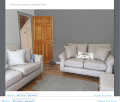
PROCelery. Visualization, Rendering images
5 years agolast modified: 5 years agoSal89
5 years ago
KK1000
5 years ago
Louise Solomon
3 years agolast modified: 3 years ago


Juliet Docherty