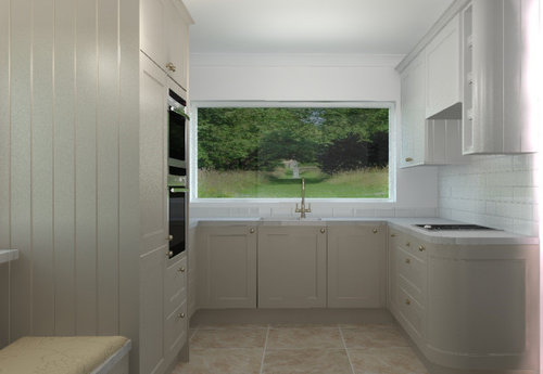
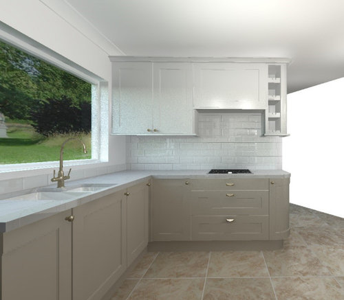
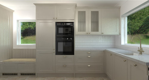
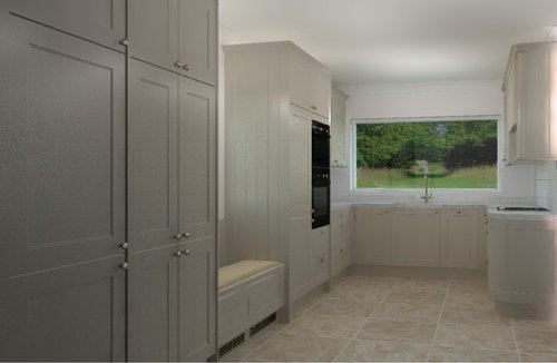
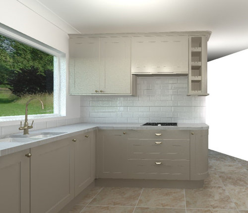
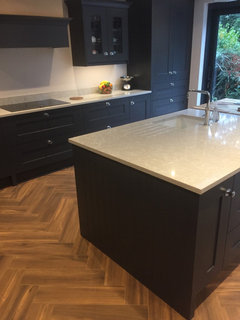
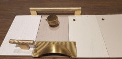
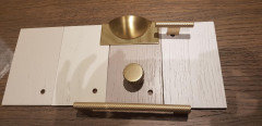
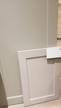
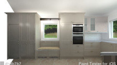
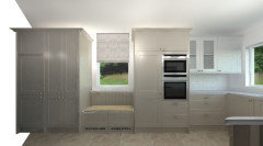
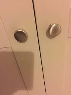
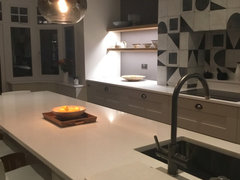
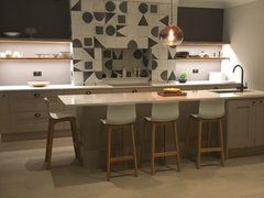
Two-tone kitchen or one colour?
Aisling
3 years ago

Featured Answer
Sort by:Oldest
Comments (33)

Daisy England
3 years ago PRO
PROLifestyle Kitchens
3 years agoRelated Discussions
two tone kitchen with island
Comments (12)This colour is rather Dark Brown, I feel adding a further Brown into the Mix will be a little too much, so if you are looking to create a brighter more inviting area. I would stick to a lighter stone or granite worktop with a 'flec', something more Vanilla-Pure White. But, not Brilliant white, you could have a brown flec, as this would be a nice contrast against the Brown Cupboards. I hope this helps! Kerry...See MoreThe Two-Tone Trend
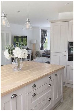
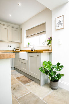
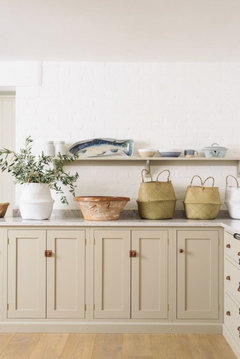
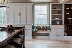
Comments (0)Time to step outside your comfort zone! Add interest to your kitchen design by using another colour. Two-tone kitchens are currently a big trend, working well in both country style kitchens and chic, contemporary style kitchens. Neutrals look great in modern kitchens but why not mix it up by using a bolder colour as a contrast? This may involve creating a focal point in the centre of the room, which could be done by having an island unit in an alternative colour to the surrounding units. Another option would be to have darker base units and lighter wall units, which gives the illusion of more space by drawing the eye upwards. You can then add in other elements in the room in the same colour as the wall units, to let the design flow throughout the kitchen. Go for it, you will love it!...See MorePainting dado rails for two tone effect
Comments (4)Hi woodster1987, Traditional paint brands have paints for walls & ceilings as well as wood & metal. Paints for walls & ceilings are available in matt finish and sheen finish. Matt finish, depending on brand and range, could be non-wipeable, wipeable and washable. Those reflect little light, upto 8%. Sheen finishes (Soft Sheen, Silk, Eggshell) are best for kitchens and bathrooms as well as stairwells and hallways and light reflection upto 30%. Those are durable and washable finishes. Paints for wood & metal are "made for purpose", and come in Satin, Eggshell and Gloss durable finishes with a higher sheen. The least shiny is Satin, the most Gloss and High Gloss. Last decade those were mostly oil based, but today most are water based and low odour. There are some paint brands that provide matt finish for walls and wood, but those shouldn't really be used in kitchens and bathrooms and high traffic areas. Please note, whatever finish you choose, no matter what paint brand you use, the old woodwork must be sanded to add "key" - and undercoated before applying finish coats. Are you London based? If yes you could call PAINTFORME® for free consultation. Hopefully you find this helpfull. Kind Regards, Paintforme...See MoreTwo Toned Cashmere Kitchen
Comments (6)This is just my option .... I would avoid cashmere. I have sold it to customers and they have not been happy with it. It definitely has a pink undertone and it is difficult to get things to go with it. If you want a 2 tone nothing mixes well with cashmere IMO. Light colours on walls and darker colours on base units normally looks good. Navy and graphite fascias look lovely but not with cashmere....See More
Aisling
3 years agoDaisy England
3 years agoAisling
3 years agoDaisy England
3 years ago
Sonia
3 years ago- PRO
Lifestyle Kitchens
3 years ago Aisling
3 years agoAisling
3 years agominnie101
3 years agolast modified: 3 years agoSonia
3 years agoAisling
3 years agominnie101
3 years agolast modified: 3 years agoSonia
3 years agoAisling
3 years agoAisling
3 years agoAisling
3 years agoAisling
3 years agoAisling
3 years ago


Deborah Lee