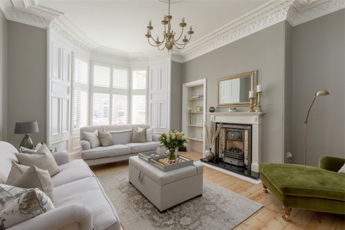
Living room paint colour for former rental flat
Gordon
last year


Featured Answer
Sort by:Oldest
Comments (16)
 PRO
PROThe Living House
last year
Juliet Docherty
last yearRelated Discussions
Decorating a student's room (rental)
Comments (1)Wow, student digs have changed since my uni days! Plants always liven up a space and make it healthier too, so it's a great idea to have some in your home. Are you allowed to paint? If not you're on the right lines in your sleeping area, choosing a few coordinating items to develop a colour scheme. My rooms have each started with one item I love - a painting, a cushion, anything really. Then I've picked a colour from it to take the theme onwards. For example, in my lounge I have a collection of antique bird prints, some of which have a pastel green in them, and the fireplace has exposed pinkish brickwork. The walls are painted a slightly stronger shade of green, my sofa and chairs are a deep green velvet, and I've selected cushions with a similar pastel green and pinkish colours in the design to link with the prints and the brickwork. While nothing matches, it all harmonises. While that is a far cry from your taste, the idea might give you a starting point. It might sound complicated, but it really isn't - just start with one thing you love and it will grow from there. Perhaps a trip to an art shop for a great picture might give you a burst of inspiration....See MoreRental living/dining room redesign
Comments (15)Hi Minnie, Thanks so much for your comments and links; all very helpful and absolutely to my taste. Right now I am playing around with layouts (see photos) and I think the current set up may be the best, although not ideal. You are right that my hopes for a three seater or l-shaped sofa are slim as I can't find a way to work it out. I really liked the dinning room table you suggested, but I think it could be too big? Also we're totally on the same page re sheepskin rugs and benches as i've got my eye on some. What do you think of this current layout? I could fit the TV to the right of the door, but given the TV unit depth (which looks to be standard) do you think it would be too much of a intrusion as you walk into the room? Also it could fit on the chest (potentially too high) but the sofa would then need to be by the window and I find that slightly too far away. Thanks again!...See MoreHelp! Best colours for paint, carpet and window treatments for RENTAL
Comments (16)I have to agree with Crafty Countess about having a vinyl flooring. I would recommend Loose Lay by Karndean. The range comes in wood plank and stone tile effects, does not have to be glued down except around the edges of the room and damaged "tiles" can be easily replaced. They are made for commercial use, so are very durable and will retain their looks for years to come. From our own tenants, I've found that white or off- white works best. You'll never get a colour right for a tenant. In the past, we've hung curtains, which our tenants always ask to take down and put up their own. We've painted lightly fresh or richly cozy feature walls, which our tenants have asked to paint over. So we always use a neutral paint now. We allow our tenants to hang pictures, providing they repair and paint the holes when they move out and use wall stickups that they can take with them. The less colour you put in, the more you allow your tenants to make the space their own....See MoreWarm white paint for a dark North facing living room in England
Comments (37)Hi Evie. The reason I've been slow to post photos is because my house is very much still a building site and work in very slow progress. I have flung paint on walls a relief from 1927 plaster and peeling wallpaper that went up decades ago. I haven't hung pictures yet as the walls are so hard - picture hooks break - and the friend who is going to do the task hasn't yet been. So, none of these photos will persuade you to use colour - the walls are bleak. But I'm posting them in the right spirit. As for feature walls, I have never liked them. For info, Kate Watson-Smyth said, in a recent post, that they are "so ova". I associate them with the 1970s, which is when I believe they first emerged. I like all over colour; I find it much less intrusive than one wall that stands out awkwardly. As for my furniture, it's mostly interim - on loan as I had nothing after chucking out my two sofas which I bitterly regret. Anyway, with all those embarrassing provisos, here we go. Terracotta sitting room: Caravan by Paper & Paint Library (it's not a current colour; my local independent paint shop keeps records of previous colours and identified it for me); it goes up to the picture rail; I haven't yet found the colour I want above it and on the ceiling; the picture rail, window frames, doors and door frames will all be Caravan, too; the room is really bitty (four doors, jutting out bits, fussy door and windows into the garden, a big fireplace, original tiles around the fire area that I wanted to complement but tone down, and a busy stained glass window) and needs blanket coverage to make it seem less busy. .Green bedroom: Sanderson Laurel below the picture rail; Goblin Green above it and on the ceiling; picture rail and all other woodwork not yet painted; I might do them in a linen colour to tie in with the bed frame though I hate the bed frame and am desperate for a new one. You can see that I'm work in progress by the undealt-with and unpainted grille covering the hole where the fireplace was. Hideous and offensive; longing to put it right. Lots of pictures/paintings to be hung all over. Blue bedroom: This blue is a bit flat but it was only after painting it that I discovered the colour I really want - Abigail Ahern's Bowery Blue which despite being intense has a real lift to it giving it life and vibrancy. The ceiling in here is the wrong blue (bought in haste); I will use a lighter blue. The unhung painting on the right (sorry it's not more visible) is so much more vibrant against this blue than it was against the pale yellow of the wall it was hung on in my previous home. I will have mirrors above the bedhead and a gallery wall opposite plus a mirror near the small window to throw a bit more light in this seriously dark bedroom (dismally dark before I painted it interestingly dark). Bronze shower room: Impossible to photograph this as it's a tiny room; the tiles in the shower area are subtly jazzy and moody. I love having it open (I grew up in India where all showers were in the middle of the room so I've never understood the closed-in box version or the fiddly over the bath option). The bronze tiles are much richer in colour than the photo conveys; the walls are Sanderson Brick Light which looks pale and peculiar in this photo; it is a lot more interesting than on the paint card and picks up on colours streaking through the tiles; it's not such a stark contrast as the photo conveys. That's it. The bedroom that will be a mustardy yellow isn't painted yet so I can't show the walls in there. And, again, apologies for the really unsophisticated furniture and mismatched upholstery, etc. Lots still to be done!...See MoreJuliet Docherty
last year
thistlejak
last year PRO
PROPaintforme
last year PRO
PROAL PAINTING
last year
T S
last yearsmac232
last year
Gordon
last yeartim_baker921
last yearlast modified: last year
Amber
last year
David Thomas
last year- PRO
The Living House
last year 
Sonia
last year
angelavdavis
last year


Sonia