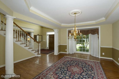
dleder

Color confusion

dleder
9 years ago
I'm looking for a good neutral paint color that complements our floor color and is less yellow and more greige and will be used in most of the house. I have a friend who manages a Pittsburgh Paints store, and he's giving me a great deal. They can do color matches to other paint brands, too. Please help!

Comments (83)

  • PRO
    Rebecca Mitchell Interiors
    9 years ago
    Regarding your living room, I would do the darker colour above the chair rail and keep the bottom portion white - for a clean look that won't date.
  • poof
    9 years ago
    last modified: 9 years ago
    I don't understand the attraction to grey. I'm not a professional interior designer. but to me, these "colors" look like they would zap all the light and life out of the space, and you would end up feeling like you are inside a prison, especially on a grey day. There are so many beautiful colors in nature's palette. I predict that when grey falls out of fashion, we will have an EXPLOSION of color in the home.
  • Related Discussions

    Confused about colour scheme

    Q

    Comments (10)
    Neutral can look great and restful. You don't need to skip yellow completely. This is kind of what I meant (hard to find exact pics!) just have 1 yellow cushion on each sofa and add something like this deep teal. The yellow/mustard looks better IMO when sat on the patterned cushion. Play around with coloured pieces you have lying around though or buy from somewhere you can get a refund!
    ...See More

    colour confused

    Q

    Comments (2)
    maybe you could keep the colours neutral like the rest of the brickwork, but I think that black railings would look very smart?! ;) hope this helps!
    ...See More

    Open plan kitchen diner confusion!

    Q

    Comments (19)
    Hi, Firstly, I love the room, it has a lovely feel and the table, in my opinion, works really well. The issue for me is about zoning, you need to clearly define the spaces, open plan rooms need to have defined areas. The rug idea is really good idea but you need to make sure it is large enough to define the space and allow the chairs to sit on it even when pulled out. Have you considered putting a larger chandelier in to really define the space ? Something really OTT...... make a statement ! The windows would benefit from full length curtains even if they were dress only to frame the windows. These would soften the dining area and centralise the eye on the table / chandelier. The lights over the island are difficult to specify, if you put modern in the don't go with the dining room, if you put traditional in they don't go with the kitchen. Have a look at naval lanterns. The chrome ties in with the kitchen but the shape is essentially traditional. I use these a lot and they always look good, I hang them in groups of three or four. Love the black stools Jones 1987 have suggested. With regards to the back wall, pictures for me. Large black and black and white pictures. Adds interest and injects personality. Look at the mix of styles in this room, beautiful ! Hope that helps, Martin: www.angel-martin.com
    ...See More

    confused! art work and wall colour accent colours

    Q

    Comments (7)
    Now thinking if it’s best to place the wall art by the dining table and do a corner photo collage.
    ...See More
  • PRO
    Rebecca Mitchell Interiors
    9 years ago
    I understand why poof isn't turned on by all the grey in interior design today. It's not for everybody! But when I see the right grey, I see a colour from nature (driftwood, the ocean, etc.) that soothes the spirit and doesn't suck the life out of the room. I also love grey with pops of colour - it's the new neutral - it's the new beige!
  • Draper Whitney
    9 years ago
    Rebecca Mitchell is absolutely correct!! Whiskers is too much like a dull gray day. Opt for more color--you won't regret it. Good Luck, Dieder!
  • 9898
    9 years ago
    Be careful to take into consideration the color of your carpet runner when choosing your final color unless you are replacing it. While it may seem a minor detail, the wrong wall color can make it look "dirty" when in reality it is not.
  • mrsjean
    9 years ago
    I have a similar large entry way open to a great room. I chose basket beige by Sherwin williams. I just couldn't go with the grey trend either. I chose baguette for my dining room and am considering doing a black texture to my trey ceiling. I am having mega trouble choosing a couch to go with it. My interior designer is always "busy" and I feel like she hasn't been much help! It can be so overwhelming!!!
  • leedur
    9 years ago
    I love greys but having now used some in my home I feel that it should be used somewhat sparingly. Greys have a "cool ish" feel to them, so if that is your goal to have your home feel cool then you should pick lots of grey. I had previously used nothing but warmer tans and very earthy colors and then decided to try out grey. Glad I didn't use to much grey because it definitely has a colder feel than the warmer tones.
  • jimhallxx
    9 years ago
    I know this is not an answer to your question but you should consider removing the carpet from your beautiful stairs. The stairs are too gorgeous to hide with a strip of carpeting up the middle.
  • PRO
    The Green Room Interiors
    9 years ago
    Here's my 2 cents. Paint the walls a complex gray/blue/green, like Benjamin Moore's Quiet Moments. It has enough green in it to keep it from going cool and depending on the light it receives at the time it will change colors throughout the day. I know you didn't ask, but I would paint the handrail of the staircase black and the balusters white. Change out the chandelier - Ballard Designs has some affordable and stylish options. Finally, I would add box molding under - and even above- the chair rail in the adjoining room. Good luck -your home is beautiful!!
  • piefer
    9 years ago
    Have a look at Mexican Feathergrass, Ralph Lauren. Changes color with the light. I love it.
  • ownerr
    9 years ago
    Take a look at Soft Fern it's a Ben Moore color #2144-40 anyone can match it.
  • PRO
    Adrian J. Naquin Interior Design L.L.C.
    9 years ago
    A light grey will not make the room to cold - these mentioned are mostly a warm toned grey and is great for a space with so many rooms keyed off this entry.Because this color will work with many different hues, much like a neutral does , so all rooms don't have to duplicate same color palette . I would agree with the comment of black on the handrail since it will be more dramatic and the oak finish on the stair rail is not helping matters. Lighting is key. The grey needs to be light enough to offset the small amount of natural light . Millions of sites for lighting one of my favorite is Lighting Universe. Still not considering a prof. interior designer's help? Most professional will not take control but involve you in the process. In this way when you proceed onto other rooms you will have someone who has the total picture in mind. The one thing that separates the "boys from men" ( so to speak) The cost of remodeling a house on this scale takes some serious bucks and, as such, should be devoid of amateur mistakes $. I have seen it all- one of my clients wasted $40,000 before calling and wish she had involved me in the beginning, since my fees would have saved her $ 30,000 even with me fees. What's the saying about " dollar wise and pound foolish" :) With ASID you won't have to worry if they know what they are doing since all prof. members are pre-qualified thru strict qualifications in education, experience, and examination. Just a suggestion .
  • designinggirl007
    9 years ago
    Greek Villa Sherwin Williams
  • rubyloves2shop
    9 years ago
    last modified: 9 years ago
    I agree you have a wonderful space. Have you considered a color consultant? In the photos the grey does appear cool even if it is not in person. The color will react to its environment so an expert can help factor in things you may not be considering. The flooring is such a focal point the walls need to support it by being in the same pallet or season. There are grays for every occasion but be careful about being trendy with such a classic look. Maybe check out historical collections especially Ben Moore. Also chameleon colors are great since they bend to work in more circumstances.
  • leedur
    9 years ago
    I agree with piefer, about Mexican Feathergrass. It's a great color. All the Ralph Lauren colors are beautiful, but it's hard to find color swatches for them anymore. Once upon a time they had swatches in Home Depot, that's when I nabbed most all of them. But HD doesn't stock that brand anymore. Didn't love RL paint, but did love their colors ! All the colors in my house are by Ralph Lauren.
  • leedur
    9 years ago
    I think a short color consultation is a good idea, if you feel unsure of your color choices. I no longer feel intimidated to much by paint colors, as I've made enough mistakes, and know I can just repaint again if I detest it. But you really don't want to have to figure that out after you've spent hundreds on paint....and finished the job !
  • PRO
    Loribeth Clark
    9 years ago
    last modified: 9 years ago
    One thing you need to be aware of that a lot of people don't realize is the colors on a paint strip are not necessarily different shades of the same color. Sharkskin looks like it has a pink undertone, and Whiskers looks like it has a green undertone.

    It is really hard to choose colors for an empty room, because there is nothing in the room to coordinate with. And once the color is on the wall, especially in a space as large as yours, it becomes the boss of the room. Everything you purchase to go in those rooms will have to go with your paint color.

    I highly recommend spending the money to have a color consultant help you choose your colors. I make this suggestion this because the colors you've chosen, although you think they are neutrals aren't as neutral as you think.
  • skyeryder
    9 years ago
    last modified: 9 years ago
    I would go with a lovely light taupe. It looks good with white and makes all the colors you add later pop! Taupe is a little warmer than grey
  • paigepatrick
    9 years ago
    Ben Moore REVERE PEWTER is the best color is ever used. I'm obsessed.
  • 1maps
    9 years ago
    We've used Porter Paint's Summer Suede as our neutral, and everyone who comes in comments on the beautiful color and want to know what it is. It's a very warm, rich neutral -- and it contrasts beautifully with the white woodwork.
  • summgardner
    9 years ago
    I like grays but enough is enough. Grays are trendy now, but I agree should be used sparingly and thoughtfully. HGTV Candice Olson suggests "Niveous" from Ben Moore as one of her go to colors. You may want to check it out and the other three she suggests at a Benjamin Moore dealer. P.S. One is a gray.
  • dilmiller
    9 years ago
    Lampsplus.com is a great website for lighting fixtures. If you are patient, almost all of their fixtures seem to go on sale at some time. We bought all of the lighting for our new home through Lamps Plus. Have fun!
  • PRO
    Loribeth Clark
    9 years ago
    I wanted to add that wood floors are like a pair of jeans, almost anything goes with them.
  • kmr kmr
    9 years ago
    Agree with the colour suggestions! Then get a runner that pops!
  • Mich
    9 years ago
    Suggest Sherwin Williams Accessible Beige
  • Bridget
    9 years ago
    A word of warning, speaking from experience, word to the wise, how ever you say it. I grew up in a small 1900 two story home, with hard wood floors, fireplaces in the living room and dining room with beautiful burl wood columns, mantels, mirrors, floor to 14 foot ceilings. The foyer, living room, dining room, up the stair case down the hall to the bedrooms, all were painted green. The color was called Gulf Green. Probably Pittsburg Paint as it was in Southwestern Pennsylvania. To this day I cringe when anyone suggest the color green. All I see is the color we lived with for 14 years. I have a very hard time buying anything that is green.

    On my screen, the entrance way with the stairs has a greenish tint, in the other room the brown(?) wainscoting makes the walls a grayish pancake batter and fights the floors. The living shows almost an antique white, so the lighting makes a big difference.

    The color of runner on the stairs does not help anything, it appears the color of slush or putty.

    As for painting that beautiful expensive wood handrail, I never paint wood. Part of the charm of your home must of been that stair case with a wood baluster and stairs.

    I agree with Loribeth-Moments of Art, hire a color consultant. Or check out historical colors for your classic home as rubyloves2shop suggested.

    If you have children still at home, ask them their opinion, the will be honest and will not be scarred for life.

    Most of all, it is your home and you should what makes you happy.

    For what it is worth, that is my 2 cents.

    Good luck.
  • Bridget
    9 years ago
    Look at Houzz -Houzz Tour Caretaking a Handsome Yonkers Foursquare. The use of color in that house is amazing.
  • zweiback
    9 years ago
    Sorry if I'm repeating a comment made somewhere above - I've tried to read all carefully - but I think gray, dark OR light, does not work with the wood handrails and floor, judging from your photos above, dieder. You might consider some of the other color suggestions, and I'll add one more - "Silver Sage" from Restoration Hardware.
  • onthecoast1
    9 years ago
    I love the photo posted by The Green Room Interiors above. I really, really dislike the heavy shades of Whiskers and Sharkskin for such an open area......they look too blue, not something I would put in your beautiful space.
  • dleder
    Original Author
    9 years ago
    Wow! This advice is so conflicting and overwhelming...not sure if I'm feeling better about this..May just have to follow my own instincts...
  • victorianbungalowranch
    9 years ago
    last modified: 9 years ago
    https://www.houzz.com/magazine/houzz-tour-caretaking-a-handsome-yonkers-foursquare-stsetivw-vs~22303764

    As suggested, nice use of color through whole house. Some nice touches, like pale grey waibscott, white trim and blue walls in hall with yellow parlor with green sash and ceiling beams, and white beams with blue ceilings in dining/kitchen. Sounds terrible, but the colors are muted and the rooms are less open than your house. When you have nice moldings, it is possible to play with subtle tones to give them more depth, but it takes some experimentation and some practice to pull it off.

    Do you have any art, rugs or upholstered furniture that is going in? That will give your color cues. Soft tones with a variety of slight tints can look great in this space. There was a sort of a very pale salmon that was the favorite of Edwardian decorators that was mentioned above that can be very flattering and warm. Actual Georgian/Federal homes used some surprisingly bright colors, but in a restrained way--see Mt. Vernon and Montecello and work by the Adams brothers in England for some examples.

    Agree that finding the right person to help you, and trying out swatches (on posterboard so you can move them around) will help. The color will look different depending on the light, placement on wall, time of day and even to the season, and will look totally different from what's on the chip.

    See Maria Killiam's blog Colour Me Happy for insight into colors and neutrals.
  • mmilos
    9 years ago
    last modified: 9 years ago
    I would seek a professional color consultant's advice.

    You have very large areas to paint. People always say paint is cheap...it's not! It's expensive to have a professional paint job.

    Pay a couple hundred dollars and get a pro's advice. It will potentially save you money.

    Check out Mariakillam.com. She's a color expert and can do online consultations. Good luck!
    *Cross posted with Victoriabungalow* :-)
  • esupple
    9 years ago
    last modified: 9 years ago
    I recently painted my family room Elmira White https://www.houzz.com/photos/elmira-white-phbr0lbl-bl~l_41988 and I love it. It is a warm, light greige - very neutral but not boring. Revere pewter is nice too https://www.houzz.com/photos/benjamin-moore-revere-pewter-phbr0lbl-bl~l_39
  • esupple
    9 years ago
    See more examples of Whiskers here: http://www.houzz.com/pittsburg-paints-whiskers
  • Bridget
    9 years ago
    last modified: 9 years ago
    Esupple, thank you so much for the link. Wow, amazing use of colors and even grey. To be able to see how others have use the different colors is so helpful. To see instead of read about colors is inspiring.
    I will admit there is more to gray than I realized.
    Thanks again esupple!
  • PRO
    Loribeth Clark
    9 years ago
    I just read through all the comments, and I can see why it is so confusing. There ARE a lot of conflicting opinions. My grandpa had a saying about opinions, but I won't share it here, because it isn't appropriate.

    I will, however, suggest again that you hire a color consultant to help guide you in your selection. I also suggest you search for pictures of rooms you love to get some ideas of the look you want. Houzz has thousands of examples of wonderful color combinations in every room imaginable. Plus, the designers often list the colors they used.

    I know this might seem like a lot of work, but maybe you should use a primer to cover all the current color. That will give you a blank slate and eliminate the possibility of the current color influencing how the new color looks.

    Remember, making a color mistake when you're painting a very small room isn't a big deal or a huge expense to correct. When you're painting a huge area, a color mistake can be very expensive.
  • Bridget
    9 years ago
    Loribeth I think I know the saying about opinions you are talking about, at times it is very appropriate, especially here. When people say paint is cheap, I laugh. Benjamin Moore or Sherwin Williams are not cheap, then there is the time and labor.

    Dieder you are the one that lives in that house, will look at it everyday.. Think about what you want to achieve in your rooms, what foyer you have seen that you really like. Check out other posting on Houzz with pictures, figure out what you really like. Do you want wow factor, wow I love this room or slow and steady: your house is so warm and welcoming?

    What ever you choose, if should make You feel good when you walk in the room.
  • PRO
    Veronneau
    9 years ago
    last modified: 9 years ago
    You can paint the staircase all white! And an other color on the wall because the yellow make your wood look older.
  • Bridget
    9 years ago
    Pleas I beg you, do not paint the wood on the staircase! The way it is now is perfect, just change the stair runner.
  • dleder
    Original Author
    9 years ago
    I'm not painting the staircase! I'm having the house painted, changing lighting fixtures, purchasing area rugs, art and furniture next, and getting a new runner. We just bought the house, so I'm not doing everything at once..little by little...
  • Bridget
    9 years ago
    Love you house. Can see a bridge coming down the steps, it decorated for the holidays. Hope you have many happy times in it.
  • suedee
    9 years ago
    dleder My understanding is house decor should be approached pretty much opposite of your plan. Furniture, rugs, art all before choosing paint. You find art, fabric, rugs, etc. that inspire you and pull your paint palette from there. I think you'll find the process of choosing paint colors much easier and you'll be able to choose lighting that compliments your style. I do agree re: not painting staircase. I have used white beneath chair rails and like that much better than a color.
  • The big house
    9 years ago
    I would spring for grass cloth in the hall. With a lovely oriental runner your already lovely hall will be a timeless show stopper.
  • PRO
    Eagle Brothers Roofing & Chimney
    7 years ago

    Good luck!!!!!!

  • cpaul1
    7 years ago

    Wow, I know you asked about paint, but to me the bigger issue is .... how beautiful that staircase could be! I would put in wrought iron railings, switch out that brassy chandelier, remove the carpet on the steps .... wow, that could really be very beautiful.

  • pandang81
    6 years ago

    Would love to see the "after" pictures of your rooms and know if you used ppg whiskers and sharkskin after all? I am also deciding between ppg whiskers or sherwin Williams agreeable gray paint for my house.

  • Lilytomar
    5 years ago

    I’m between whiskers and agreeable gray too! Please, if someone can share pictures, I would appreciate it.

  • pandang81
    5 years ago

    I used PPG Whiskers. It's a very light taupe gray. It is VERY similar to agreeable gray but IMO slightly warmer. Whiskers is actually Pittsburgh paint's equivalent color match to Agreeable Gray....here are my photos. As you can see, in some lighting it looks more gray & in others more taupe brown. Dont mind the filthy floors due to construction. :)

  • Lilytomar
    5 years ago
    last modified: 5 years ago

    Beautiful! Thank you for sharing! I decided to go with PPG Whiskers. I’m painting the ceiling the same color.

  • pandang81
    5 years ago

    Good luck! Sounds like a fun, rewarding task. I love mine. I didnt want a true gray all over so the warmth of Whiskers works well for me.

United Kingdom
Tailor my experience with cookies

Houzz uses cookies and similar technologies to personalise my experience, serve me relevant content, and improve Houzz products and services. By clicking ‘Accept’ I agree to this, as further described in the Houzz Cookie Policy. I can reject non-essential cookies by clicking ‘Manage Preferences’.