2018 Colour Trends: How to Use Orange, Yellow and Brown in Decor
Don’t panic, these strong colours are some of 2018’s top colour trends for interior design

When I think of the colour orange, what comes to mind is the image of a rather nasty shade of strong orange that decorated my mother’s kitchen in the late 1970s. What’s worse, it was paired with an equally nasty shade of yellow brown. Oh, and there were flashes of sunflower yellow and brass to go with it all.
Needless to say, orange, brown and yellow have remained the most detested colours in my life. I’m all about black, white, grey and silver with touches of cobalt blue and aqua. However, I’ve recently become aware that there are actually some shades of orange, brown and yellow that aren’t so hideous, thanks to the new colour trends I’ve noticed from international paint brands like Dulux and Nippon Paint.
Needless to say, orange, brown and yellow have remained the most detested colours in my life. I’m all about black, white, grey and silver with touches of cobalt blue and aqua. However, I’ve recently become aware that there are actually some shades of orange, brown and yellow that aren’t so hideous, thanks to the new colour trends I’ve noticed from international paint brands like Dulux and Nippon Paint.
Get the look:
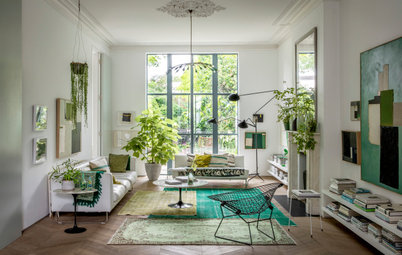
Dulux has created a really neat colour story called ‘Kinship’ that shows you how to mix these new ‘oranges’ with cooler shades of grey and green; you’ll be pleasantly surprised.
Nippon has released a set of colour ideas sourced from Asian interior designers from countries like Singapore, Malaysia, Indonesia, Japan and Hong Kong, and there is a colour scheme, ‘Conscious Being’, that features orange mixed with greys and greens.
Peach is a pink-orange you’ll love
Peach has always been one of the most popular colours for make-up because it suits all kinds of skin tones. Peach isn’t one hue but ranges from yellow-peach to red-peach and even grey-peach.
Peach has always been one of the most popular colours for make-up because it suits all kinds of skin tones. Peach isn’t one hue but ranges from yellow-peach to red-peach and even grey-peach.
Get the look:
Like the flattering effect of peach make-up, putting this pink-orange shade on your walls will effect a similar warm and healthy glow to a space. Dulux’s Escapade paint range includes what they call ‘Cuticle Pink’ (another skin reference!) you can see in this image from Dulux, combined with a lovely pink-red shade that reminds me of Chanel’s Rouge Coco lip colour in Etiene.
Like the flattering effect of peach make-up, putting this pink-orange shade on your walls will effect a similar warm and healthy glow to a space. Dulux’s Escapade paint range includes what they call ‘Cuticle Pink’ (another skin reference!) you can see in this image from Dulux, combined with a lovely pink-red shade that reminds me of Chanel’s Rouge Coco lip colour in Etiene.
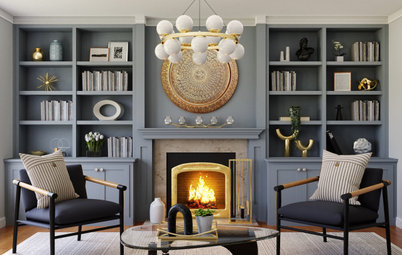
The many shades of yellow… Like orange, yellow has also had a makeover. In the Dulux ‘Kinship’ colour story, there is a muted mustard yellow that has a lovely earthy feel and goes really well with beige neutrals and natural timber.
Get the look:
Metallic Olive from Nippon Paint’s ‘Conscious Being’ range is a green-yellow shade that’s perfect as an accent for black-and-white or black-and-grey interiors.
Metallic Olive from Nippon Paint’s ‘Conscious Being’ range is a green-yellow shade that’s perfect as an accent for black-and-white or black-and-grey interiors.
Get the look:
These yellows echo the colour concept of adding green to your monochrome decor too. Pendant Yellow from Nippon Paint is a lovely clear shade of bright yellow that plays well with aqua and bright pastel blues.
These yellows echo the colour concept of adding green to your monochrome decor too. Pendant Yellow from Nippon Paint is a lovely clear shade of bright yellow that plays well with aqua and bright pastel blues.
Gold is yellow too…
When it comes to metallic accents in your room, remember that ‘gold’ is actually a shade of yellow too. You can use small amounts to add shine and elegance to your decor, or a lot if you’re gunning for a more opulent theme. Gold looks fabulous with black, obviously, but that can be a very strong look in a small space. Think of adding gold to shades like dark mustard yellow for a tone-on-tone look with a touch of bling.
When it comes to metallic accents in your room, remember that ‘gold’ is actually a shade of yellow too. You can use small amounts to add shine and elegance to your decor, or a lot if you’re gunning for a more opulent theme. Gold looks fabulous with black, obviously, but that can be a very strong look in a small space. Think of adding gold to shades like dark mustard yellow for a tone-on-tone look with a touch of bling.
Brown isn’t boring anymore…
I used to really, really, really detest brown. Growing up, everything seemed to be painted that horrible, depressing and flat ‘mission brown’. I even lived in a home that was ‘mission brown’ inside and out! Recently, I discovered that some shades of brown can actually look good.
I used to really, really, really detest brown. Growing up, everything seemed to be painted that horrible, depressing and flat ‘mission brown’. I even lived in a home that was ‘mission brown’ inside and out! Recently, I discovered that some shades of brown can actually look good.
Get the look:
The ‘slow’ fashion trend and emphasis on getting back to nature has seen brown pop up as a popular colour on fashion runways. And of course, brown is a perennial favourite make-up shade.
The ‘slow’ fashion trend and emphasis on getting back to nature has seen brown pop up as a popular colour on fashion runways. And of course, brown is a perennial favourite make-up shade.
Get the look:
Dulux has an entire colour story centred on natural tones called ‘Essential’ which includes pretty, muted shades of brown like clay and a pastel tan; they go really well with grey and blue.
Dulux has an entire colour story centred on natural tones called ‘Essential’ which includes pretty, muted shades of brown like clay and a pastel tan; they go really well with grey and blue.
Mix up brown, yellow and orange…
There are so many ways to mix colours and when it comes to shades found in nature, you can end up with some lovely colour combinations.
There are so many ways to mix colours and when it comes to shades found in nature, you can end up with some lovely colour combinations.
Get the look:
Think of the mingling of various yellows, reds, oranges and browns in autumn and you get the idea. If you find it too bright, mute them with white or black.
Think of the mingling of various yellows, reds, oranges and browns in autumn and you get the idea. If you find it too bright, mute them with white or black.
Get the look:
The autumnal shades of orange, yellow and brown here become warm neutrals that are just right for a Singapore apartment.
TELL US
Have you used orange, brown or yellow in your home? Share a photo in the Comments below.
The autumnal shades of orange, yellow and brown here become warm neutrals that are just right for a Singapore apartment.
TELL US
Have you used orange, brown or yellow in your home? Share a photo in the Comments below.


Sponsored
When we think of orange, we automatically think of the shade of the fruit, right? But there are actually a good number of orange hues: terracotta, tangerine, rust, ochre, and other earthy tones that move either into the yellow or brown realm. A look at the choices from Nippon Paint will show an enormous range of orange shades to choose from.