
5 of the Best Before and After Bathroom Transformations on Houzz
Got plans to revamp your bathroom? Check out these renovations first to get some ideas flowing

Bathrooms may often be small spaces, but that doesn’t mean they can’t also be high-functioning, airy and beautiful. It can sometimes be hard to imagine just how dramatically you could change and improve your own, not-quite-right space, though, which is where a creative designer can be worth his or her weight in gold. Just take a look at these gorgeous rooms transformed by the experts; they’re of varying sizes, but all had very uninspiring starts.
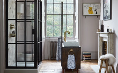
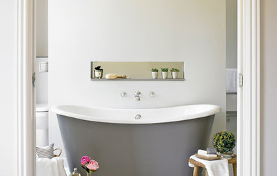
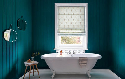
In this ‘after’ photo, the original back door has been replaced by a window and the bath sits beneath the window where the kitchen cabinets were.
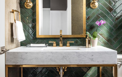
The owner’s collection of blue plates and bowls was part of the inspiration for the look of the new room. One can be seen on the shelf beneath the coordinating basin; two more are on the wall above the bath. Kate blended this with a Moroccan theme, as the owner also loved this style.
Read the full story of how this house was brought into the 21st century.
The bespoke joinery saviour
This ‘before’ photo of a family bathroom in Arizona shows a gloomy, cluttered space.
The bathroom included a dark wood vanity unit with a beige tile top, a decorative tile splashback, and a large, unframed mirror topped with Hollywood-style lights. A mirrored medicine cabinet stuck out on the side wall.
The ‘after’ photo of this part of the bathroom shows the transformative power of carefully designed cabinetry…
Designer Keira Schultz of KSDesigns had a made-to-measure maple unit built, and painted it in a mid-tone aqua-grey.
To further brighten the area, there’s a new, white tile splashback and bright white walls. A pale, polished quartz countertop also keeps things light and provides a durable surface with a marble look.
“The quartz has a hint of gold veining in it,” Keira says. The gold adds depth and warmth, which also comes from the new wood-framed mirror, brass taps and cabinet hardware.
The wide drawer at the bottom is a key feature in the new unit. “I’d seen a drawer like that on Houzz and wanted the new vanity to have a big drawer for towels and other essentials,” Kiera says.
Check out the full bathroom tour.
The budget renovation
This ‘before’ photo shows the bathroom interior designer Amy Shirlaw inherited when she bought her Victorian conversion flat in Edinburgh. Because of the way the building is configured, it wouldn’t have been cost-effective to change the layout significantly. As such, the rethinking of this small space was about changing the finishes and the small details.
The whole bathroom came in at less than £5,000, but the change is dramatic…
Here’s the bathroom after the renovation – colourful, a little bit glam, more spacious-feeling, and with improved storage.
The room is narrower at the basin end and Amy’s redesign took this into consideration. “I moved the towel rail; it had been in the narrowest part of the room and it made no sense to have it there,” she says. She also had the boxed-in pipework under the basin buried into the wall to create a flat surface.
Another space-hogger was the curved bath, which Amy swapped for a straight-edged design. “It’s quite narrow, because it has a wide lip,” she says. “You can put a glass of wine or a cup of tea on it.”
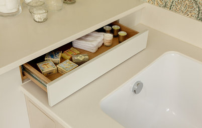
She kept the flat area at the end of the bath free, rather than build shelves to the ceiling. “There’s often not enough surface space in bathrooms – for me anyway,” Amy says. “I like having somewhere to put things.” She was also able to add open-storage below.
Getting rid of a shower curtain was a priority for Amy and this screen has minimal fixtures. “I wanted it to be as invisible as possible,” she says.
See more of this cleverly improved room.
The room is narrower at the basin end and Amy’s redesign took this into consideration. “I moved the towel rail; it had been in the narrowest part of the room and it made no sense to have it there,” she says. She also had the boxed-in pipework under the basin buried into the wall to create a flat surface.
Another space-hogger was the curved bath, which Amy swapped for a straight-edged design. “It’s quite narrow, because it has a wide lip,” she says. “You can put a glass of wine or a cup of tea on it.”
She kept the flat area at the end of the bath free, rather than build shelves to the ceiling. “There’s often not enough surface space in bathrooms – for me anyway,” Amy says. “I like having somewhere to put things.” She was also able to add open-storage below.
Getting rid of a shower curtain was a priority for Amy and this screen has minimal fixtures. “I wanted it to be as invisible as possible,” she says.
See more of this cleverly improved room.
The clever space steal
This bathroom was part of a whole-house renovation outside Paris. The building had lain uninhabited for a decade before interior designer Cécile Humbert was called in to transform it for the new owners.
As part of a radical layout rethink, Cécile expanded this room by borrowing from the fourth bedroom, the rest of which was turned into a dressing room and en suite for the main bedroom.
Ready to kick-start your project? Find a bathroom designer near you.
Here’s the unrecognisable bathroom after Cécile worked her design magic.
Blue hexagonal cement tiles cover the floor and the bath panel. “We took advantage of the space between the wall and the end of the bath to create niches for storing towels and linens,” Cécile says.
Blue hexagonal cement tiles cover the floor and the bath panel. “We took advantage of the space between the wall and the end of the bath to create niches for storing towels and linens,” Cécile says.
Here’s the first floor layout before work. There were originally four bedrooms and a small bathroom. Since the couple have two children, the family only needed three bedrooms.
The first floor layout after work, showing the expanded bathroom.
Check out the full Houzz Tour.
You might also like 5 of the Best Before and After Hallway Transformations on Houzz.
Check out the full Houzz Tour.
You might also like 5 of the Best Before and After Hallway Transformations on Houzz.
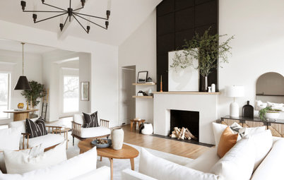
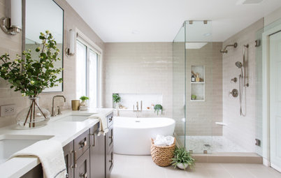
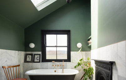
The modern refresh
This bathroom in a family home in North Carolina, USA, was a conundrum: it was a decent size, but it didn’t have enough useable space, a large corner bath took up heaps of room, and its high ceiling made the bottom half of the room appear cramped.
Comparing this snapshot with the next photo provides a lesson in scale and proportion. For example, the mirror is too low, which makes the lower portion of the room seem clunky and the empty wall above look awkwardly vast.
This photo also shows a large linen cupboard on the left, but the deep shelves made it hard to reach items at the back, so this needed to be removed.
Designer-builder Richard Ryder of Clearcut Construction came up with numerous smart design tricks to unlock the potential in this room, as seen in this ‘after’ photo.
As well as new cabinets that make the most of the height in the room and work with the proportions, he fitted stained cypress box beams. “I included the beams to add warmth to the high ceiling and architectural bones that look as if they date back to 1900,” Richard says.
A rod that runs from above the doorway to above the cabinets allowed Richard to fit beautiful and useful pendant lights, but in a neat way; hanging them individually would have created a cluttered look, with wires extending high into the vault.
This ‘before’ photo shows how the built-in corner bath, shower and vanity unit bumped up against one another in a way that made the room feel cramped.
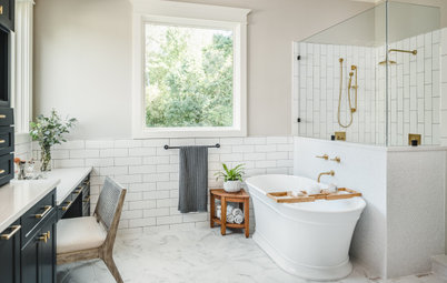
Now there’s a sculptural, freestanding bath, which has transformed the area into a calming corner. Richard also extended the panelling and tiles to the top of the walls to mitigate the soaring ceiling height.
Boxy minimalist wall sconces illuminate above and below, throwing light onto the ceiling and beams. “The way they shine on the texture of the wall tiles at night is really special,” Richard says.
Read more about this bathroom transformation.
Tell us…
Which of these projects inspires your own ideas the most? Share your thoughts in the Comments.

Sponsored
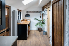
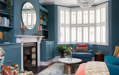
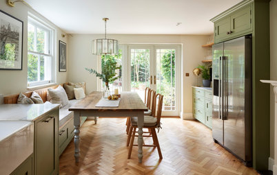
The interesting story behind the renovation of this early 20th century house in north-east London got lots of you talking positively about it in the Comments.
The old kitchen – now transformed into a bright bathroom – is a good example of the state the derelict building was in before designer Kate Clare at LOUD Architecture & Interior Design got to work on it.