Design Ideas to Steal from Your Favourite Kitchen Photos
The top-saved kitchen photos on Houzz worldwide are packed with inspiration, from clever storage to beautiful materials

The goal of good kitchen design is the same no matter where you go. People want a space that functions well for cooking and entertaining, stores everything necessary, consists of durable materials, and looks good, too.
But while great kitchen design is universal, not all kitchens are created equal. What works for a small apartment dweller in Paris, for example, might not work for a suburban homeowner in Surrey. To show how different – and indeed similar – kitchen design can be, we looked at the kitchen photo in each of 13 countries that was most saved by Houzz users at home and abroad. What you’ll find is plenty of variation, but also lots of commonality in how function, storage and style are handled. Which country has your kitchen soul mate?
But while great kitchen design is universal, not all kitchens are created equal. What works for a small apartment dweller in Paris, for example, might not work for a suburban homeowner in Surrey. To show how different – and indeed similar – kitchen design can be, we looked at the kitchen photo in each of 13 countries that was most saved by Houzz users at home and abroad. What you’ll find is plenty of variation, but also lots of commonality in how function, storage and style are handled. Which country has your kitchen soul mate?
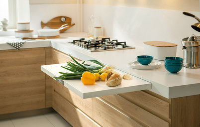
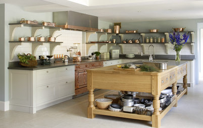
Australia
This Australian kitchen by Plot project management builds on the simplicity of the Scandinavian aesthetic by mixing quality materials – timber, dolomite, polished concrete – in an unfussy way. The result is a clean-lined space with a focus on materials.
The elements in this kitchen, from the island to the open shelves and feature joinery, combine for a furniture-like appeal that works well in an open-plan environment, where the kitchen is often connected to the living area.
Durable, low-maintenance surfaces are the order of the day, because if there’s one thing Australians love, it’s a combination of pretty and practical.
Japan
Photos of kitchens that feel more like furniture than functional spaces – especially through the use of wood – are currently trending on Houzz Japan, too.
This is a great example. Its interior naturally connects with the dining area and the other parts of the house.
The owners, a family of three who love nature, requested a stylish, open-plan kitchen that would utilise natural materials. The architect at the Dwarf construction company finished the peninsula unit with Japanese cedar in a chevron pattern. The same cedar is also used on the ceiling and floor. The worktop is stainless-steel.
Find kitchen designers and fitters in your area on Houzz.
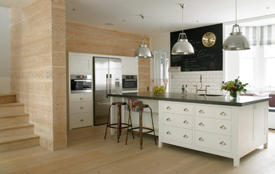
United States
This kitchen, by MSA Architecture + Interiors for a home built by and owned by Keith Wing of Keith Wing Custom Builders in Texas, was the most popular new photo uploaded to Houzz in the US this year, and exemplifies many of the reigning trends in American kitchens today: white Shaker-style cabinets (Pure White by Sherwin-Williams), a coloured island base (Gravel Gray by Benjamin Moore), warm-coloured hardware, and pendants over the kitchen island.
Houzz users also loved the unique island worktop, which is Florida quartzite, a natural stone, and the flooring, which is engineered, wire-brushed European oak. Glossy grey splashback tiles in a herringbone pattern dressed up the walls, and black granite in a leather finish adds contrast on the perimeter worktops.
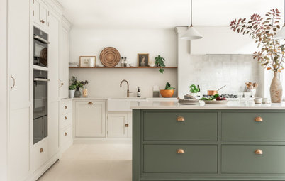
Italy
This kitchen features clean design with a natural twist, with finishes such as wood repurposed from old Venetian briccola – wooden structures, known as “dolphins” in English, used for mooring gondolas – and tiles by Gio Ponti, which recall the colour of the sea. One of Italy’s most famous television series, Un posto al sole ("A Place in the Sun"), was even filmed here.
The project’s starting point was the challenge of hiding a storage area in the left-hand corner of the room. “We created a door (on the left in the photo) flush with the rest of the kitchen cabinetry. We also included a 70cm built-in fridge with freezer,” says Maurizio Giancarli, chief architect and managing partner at Toffini.
The owners also wanted to be able to accommodate friends and prepare dinners for several people, “so we opted for a central island that would feature various cooking systems: gas, induction and teppanyaki (a very versatile cooking plate that reaches 300°C and dissolves fat). We added a second sink, to give the island more autonomy, and a downdraft extractor, so we wouldn’t need one on the ceiling, which would have disrupted the overall look of the kitchen, given the height of the room,” Giancarli says.
“Furthermore, a wine cabinet was placed into the lateral side of the island to make opening a bottle of wine or preparing an aperitif more practical, so as not to get in the way of the people doing the cooking,” he says.
The frame and inserts of repurposed briccola wood, mentioned above, make this project unique and connect it to the sea. “Natural materials, such as wood, which we used a lot – at times lacquered – and stones, are an element of uniqueness that characterise a kitchen and make it non-replicable,” Giancarli says.
Singapore
The open-plan layout was interpreted differently in this Singapore kitchen to suit the owners’ entertainment and lifestyle needs.
The condo’s existing open-concept kitchen had an island that divided the cooking space from the living and dining area. There was a cavity for the fridge, and the hob and oven were built into the same worktop as the sink, galley-style.
Priscilla Tan from Styledbypt designed a storage column next to the island, filling the open gap between it and the balcony wall, and relocating the oven within that. A flat induction hob was built into the island (now a peninsula unit), creating a triangle workflow. She used Silestone Et Calacatta Gold from Cosentino for the waterfall and kitchen worktops as well as the splashback.
The owners wanted an eat-in kitchen as their main dining space, Tan says. “There’s only the two of the them (although now they also eat in the living area while watching TV). When they have friends or family over, they’ll eat on the balcony, where we have an alfresco dining area.”
The Escher-esque graphic flooring is vinyl, and “helped to shape and ground the kitchen area and ties the palette together beautifully,” Tan says.
What made this kitchen so popular? It’s a cleverly designed small kitchen that doesn’t sacrifice its big, statement-making style (courtesy of its bold floor pattern) just because of its compact size.
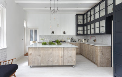
France
But an open-plan scheme doesn’t work for everyone, and the pros and cons of open layouts was one of our most debated topics this year. This French kitchen went for the best of both worlds.
The design, by Archipelles studio, was very popular in France after having being featured in a Before & After story. It consists of Ikea modules customised with high-quality finishes, such as the custom-made Carrara marble worktop and the handles, switches and taps in brushed brass. The Farrow & Ball paint on the walls and the geometric floor were also popular, according to the comments left by French readers.
In addition, it’s a semi-open kitchen with a glass partition facing the living area. Houzz users liked this design, as it maintains an opening towards the living area while protecting it from noise and odours.
Interior designer Hélène Paoli says, “My clients didn’t want an open kitchen, because they wanted to keep cooking smells and noise out of the living area. Nevertheless, they wanted the two areas to be in close dialogue. We nibbled away at part of the large 32 sq m living area to create this 12.6 sq m kitchen and make it the centre of the flat.”
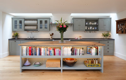
India
“We managed to pack plenty of functional elements into the compact space, while still making it aesthetically pleasing,” says Sunita Yogesh, founder and principal designer of Sunita Yogesh Studio. Most Indian city flats have compact kitchens and effort is always expended on maximising the space and bringing in as much storage and functionality as possible. This kitchen brings both, and with style.
The owner of this house moved back to India after living in the United States for more than 10 years. She wanted the design of her 105 sq m flat to make the most of available space, yet reflect a contemporary, calm and soothing ambience through clean lines and subtle neutrals. This can be seen in the kitchen space as well.
This kitchen was originally outfitted with basic materials, but was completely torn down and redesigned from scratch.
The homeowner’s dream was to have an all-white kitchen, so the designers opted for a herringbone splashback, quartz worktop and Shaker-style cabinets in an all-white palette. They then incorporated open wooden shelves to give the space some warmth. The kitchen also hosts a small utility zone at the far end for laundry and storage.
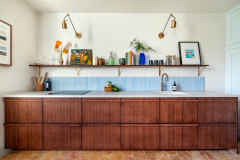
Spain
Clever design tricks and custom personalisation are always popular with Houzz users, as is the case of this Spanish kitchen.
This kitchen island stands out, above all, for a very nice and warm colour palette and details that personalise the space, such as the pan filler tap in the hob area and the carefully planned lighting.
“The white Corian worktop with a built-in sink is a fundamental feature that brings elegance to the space, as does the glass cupboard that stands on top of it,” says Lluisa Deulonder, founder of Deulonder Arquitectura Doméstica.
“This solution works only for custom-made kitchens and is very practical, because you can store small appliances and always have them within arm’s reach. The American lamps in the hob area bring a unique touch to kitchens of this style.”
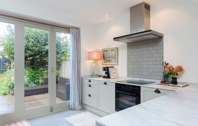
United Kingdom
This cupboard is a beautiful piece of design that maximises space and provides custom storage in this London kitchen designed by Barry Sawyer at Brayer Design.
The Shaker cabinets were designed with minimal ornamentation in order to blend traditional and contemporary styles. “The units go right to the ceiling, but without any decorative mouldings at the top,” Barry says.
Next to a bank of integrated ovens, Barry designed the breakfast cabinet with a marble surface and plug sockets for a coffee machine and juicer. “The doors are retractable and slot into the sides,” he says. “The cabinet is located near to the breakfast bar for easy access, and concealed lighting comes on when you open the doors.”
Germany
Even though space in this studio apartment is limited, interior designer Ute Günther was able to install a fully equipped small kitchen. And sacrificing a dining table wasn’t an option: here, one simply pulls out from the kitchen front.
“This kitchenette and bench was made by our carpenter. There’s storage space under the bench, and the corner cupboard can be reached from the door under the table. You can never have enough storage space,” Günther says.
Another trick is that the sink and hob disappear under a cover when not in use.
This mini-kitchen shows that a well-designed kitchen is a question not of size, but of good planning and clever solutions.
Russia
Houzz Russia featured this kitchen, designed by Tatyana Arkhipova, twice. The first story was about unusual Russian kitchens, where designers were asked to explain unusual features we couldn’t figure out ourselves. Here, all attention was on the surprising door on the side of the kitchen island. It turns out it was a Dunavox wine fridge for six bottles.
The second feature was about the 30 most popular Russian kitchens in the first half of 2019. This article pointed out that the upper cabinets here are designed in two rows, with the lower one set further back. This clever design trick ensures the homeowners don’t accidentally bump their heads when washing dishes.
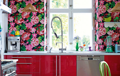
Sweden
Of course, we love clever aesthetic choices as well. As Swedish kitchens go, this is not one locals would recognise as typical. Of course, Swedes love white cabinets, but bold wallpapers in the kitchen are not a common sight, though Swedish homeowners are increasingly embracing colour and pattern in other parts of the home. Yet the floral wallpaper on the island was enough to make this the most-saved kitchen photo in Sweden.
Tell us…
Which of these kitchens is your favourite? Let us know your thoughts in the Comments section.
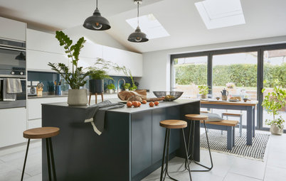

Sponsored
Dominated by black, white and grey, and featuring clean lines, this kitchen lives up to classic Danish style, so it’s no wonder it’s admired worldwide.
The matt fronts create a calm feel, while the bright ceiling, walls and window frames, along with the magnificent natural illumination, provide a light and vivid contrast. Moreover, its well-thought-out design makes the kitchen practical and easy to clean.
“A large cupboard wall in the kitchen provides plenty of storage space,” JKE Design writes in a statement about the project. “For example, there are pull-out drawers with sockets behind the black doors, so there’s room for a mixer, coffee-maker and other electric kitchen appliances.”
Characteristic of local homes, the interior is a mix of newer and older Danish design: the About a Stool bar stools – designed by Hee Welling for Hay – are from this century, while the Flowerpot lights over the island were designed by Verner Panton in 1968.