

Houzz Tour: A Poky Mansion Flat Gets a New Broken-plan Layout
A tweaked layout and beautiful design details have refreshed this London apartment

Most designers will tell you that creating a ‘good flow’ is key to the success of a home, however big or small the property may be. That was exactly the case when interior designer Jess Lavers was faced with the overhaul of this red-brick mansion block apartment in the heart of London.
“The greatest challenge was to create a good flow throughout the property,” she says, “as all the main living areas – the kitchen, dining room and living room – are in separate rooms.”
Lavers also cleverly made better use of the bathroom space – scroll to the end to see the before and after floor plans.
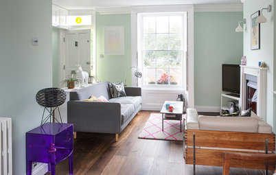
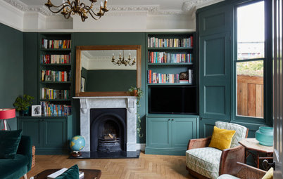
The bespoke TV cabinet was designed especially for the living room to accommodate the client’s large TV.
“We used rich materials, such as smoked oak veneer and brass panels, to ensure the screen doesn’t dominate the space,” Lavers says. “By adding brass to the back of the shelving, the eye is drawn to the objects displayed there rather than the TV.”
Madison armchair in grey velvet, Love Your Home.
“We used rich materials, such as smoked oak veneer and brass panels, to ensure the screen doesn’t dominate the space,” Lavers says. “By adding brass to the back of the shelving, the eye is drawn to the objects displayed there rather than the TV.”
Madison armchair in grey velvet, Love Your Home.
Forest green velvet and gold detailing combine to add a luxurious edge.
The large, comfortable sofa is finished with a selection of smart, monochrome-print cushions.
Izzy sofa, sofa.com.
Izzy sofa, sofa.com.
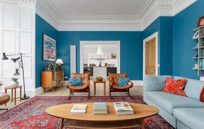
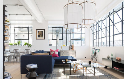
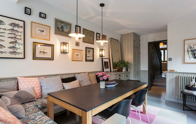
The living room and adjacent dining room were originally two totally separate spaces, but Lavers opened up the wall to create more living space and improve the flow.
“Our clients really enjoy hosting, and having the two spaces joined encourages guests to move easily from the living room to the dining area and vice versa,” she explains.
“Our clients really enjoy hosting, and having the two spaces joined encourages guests to move easily from the living room to the dining area and vice versa,” she explains.
For an easy-on-the-eye, harmonious look, the designer painted the walls in the living and dining spaces in the same chalky, off-white paint.
“We kept the same colour throughout as it’s important to maintain a good flow between the two spaces,” the designer adds.
Walls painted in Wood Ash, Little Greene.
“We kept the same colour throughout as it’s important to maintain a good flow between the two spaces,” the designer adds.
Walls painted in Wood Ash, Little Greene.
The chandelier is a similar design to the one in the living room, further linking the spaces. The brass and mango wood mirror makes the most of the light from the French windows.
Octagonal wall mirror; Chevron sideboard, both Atkin and Thyme.
Octagonal wall mirror; Chevron sideboard, both Atkin and Thyme.
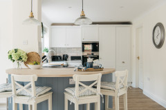
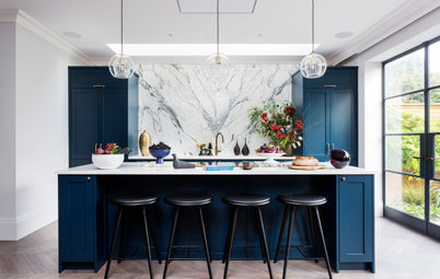
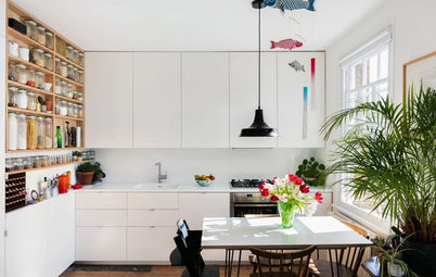
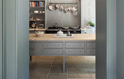
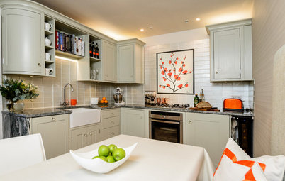
Once a dated, dark space, the compact kitchen (located just to the left of the entrance), is now light and airy thanks to pale painted wood cupboards and white marble worktops.
“It’s a compact size, so clever space planning was crucial,” says Lavers. “We used a mix of full-height cabinets, wall units and open shelving to utilise the space to the maximum.”
A mirrored splashback was fitted retrospectively, after these photos were taken. It further reflects light around the kitchen and also makes the narrow galley seem much larger.
Lavers has managed to fit in a tiny peninsula. “The clients were very keen on a breakfast bar for two,” she explains, “so the biggest challenge was fitting that in without compromising too much on storage.”
An integrated washer-dryer and dishwasher have been squeezed in beside the sink, while the microwave is hidden inside the tall cupboard.
Clear glass pendants provide extra light without blocking the view through the room.
Warm metals feature in here, too, through brass fittings. “We sourced the polished brass cupboard handles separately, as we believe the right handles can really lift a kitchen and make it look more expensive,” Lavers explains.
Bell blown glass pendants, Holloways of Ludlow.
Warm metals feature in here, too, through brass fittings. “We sourced the polished brass cupboard handles separately, as we believe the right handles can really lift a kitchen and make it look more expensive,” Lavers explains.
Bell blown glass pendants, Holloways of Ludlow.
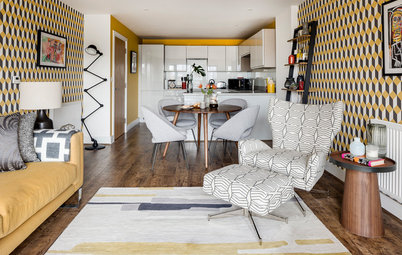
In tones of blush and silver, the second bedroom is located opposite the kitchen on the right-hand side of the entrance hall as you walk into the apartment.
“This is where the client sleeps when she’s at home,” Lavers says. “The idea was to create a calming, relaxing environment for her to unwind in, since her career has her jetting around the world.”
“This is where the client sleeps when she’s at home,” Lavers says. “The idea was to create a calming, relaxing environment for her to unwind in, since her career has her jetting around the world.”
“To utilise the natural light coming in and create a sense of space in the second bedroom, we sourced mirrored bedside tables and lamps to reflect the light,” the designer says.
Walls painted in Wevet, Farrow & Ball.
Walls painted in Wevet, Farrow & Ball.
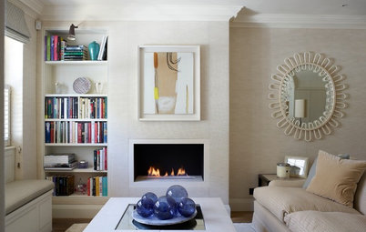
The fireplace, with its pretty blue and white tiles, is original to the apartment.
The built-in, mirrored wardrobes have brass handles to chime with the warm metallics throughout the flat, and manage to incorporate a range of storage while respecting the original coving in the room.
Patsy gold wall mirror, Habitat.
The built-in, mirrored wardrobes have brass handles to chime with the warm metallics throughout the flat, and manage to incorporate a range of storage while respecting the original coving in the room.
Patsy gold wall mirror, Habitat.
The main shower room is next to the master en suite. “We reconfigured the bathrooms to create a better flow,” Lavers explains. “Originally, there were two long, narrow wash spaces, so we took out the vertical wall and put in a horizontal one to create two squarer rooms instead.” (Scroll to the floor plans at the end of the story to see how the layout changed.)
The décor in here is a simple, unfussy design in tones of grey and white.
Aster framed mirror in antique brass, Rowen & Wren.
Discover beautiful bathrooms where marble steals the show
The décor in here is a simple, unfussy design in tones of grey and white.
Aster framed mirror in antique brass, Rowen & Wren.
Discover beautiful bathrooms where marble steals the show
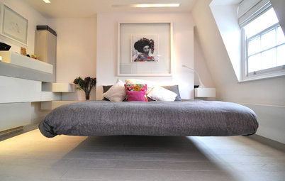
In a striking monochrome palette, the master bedroom is crisp and calming at the same time.
“The client’s son wanted a masculine, hotel-style bedroom and really liked the idea of the oversized headboard, which he’d seen in our portfolio,” says Lavers.
“The client’s son wanted a masculine, hotel-style bedroom and really liked the idea of the oversized headboard, which he’d seen in our portfolio,” says Lavers.
Built-in bespoke joinery creates masses of useful and organised storage space…
…and once closed, the mirrored wardrobe doors are reflective and space-enhancing.
The textured design on the bedside tables echoes the buttoning on the headboard for a subtly cohesive feel.
Bedside tables, telescopic table lamps, all West Elm.
Bedside tables, telescopic table lamps, all West Elm.
The en suite bathroom is the only space not accessible from the main corridor. “The bespoke, cut-mirror bath panel makes the room look bigger,” Lavers says.
Find out how to squeeze in a master suite – and make it feel roomy
Find out how to squeeze in a master suite – and make it feel roomy
The ‘before’ floor plan shows how the two bathrooms were previously very narrow spaces, while the living room and dining room (centre left and bottom left) were two separate rooms.
Lavers reconfigured the space to create two squarer bathrooms and a ‘broken-plan’ dining and living space.
Check out the trend for broken-plan living
What do you think of this elegant, city-centre home? Share your thoughts in the Comments section.
Check out the trend for broken-plan living
What do you think of this elegant, city-centre home? Share your thoughts in the Comments section.

Sponsored

Sponsored
Who lives here A film producer and her son (in his twenties), who’s studying in London
Location Marylebone, London
Property An apartment in a period, red-brick mansion block
Size 2 bedrooms, 2 bathrooms
Designer Jess Lavers of Jess Lavers Design
It’s difficult to believe this 900 sq ft apartment once resembled student digs. “It was dark, small and desperately dated,” says interior designer Jess Lavers, who took on the job. “It had a real student feel to it, with badly painted floorboards and poorly made joinery.
“The clients wanted an elegant, contemporary home with a practical layout for entertaining and relaxing.”
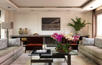
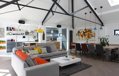
All the rooms (apart from the master bathroom) lead off a central hallway, with the living room facing the front of the building at the end of the corridor. The mood in here is elegant and luxurious, with natural wood, brass details and tactile fabrics adding warmth to the space.