

Houzz Tour: Strong Colours Give a Simple Flat a Bold New Look
A palette taken from architect Le Corbusier’s manifesto on colour brings a sense of balance to this family space

Architect Betti Sperandeo transformed this flat in central Milan, Italy, into a ‘pictorial project’ for her sister’s family. Her clever and measured use of colour has given a sense of life and harmony to the spaces. The beautiful chromatic balance that zones the apartment was inspired by Polychromie Architecturale, iconic modernist architect Le Corbusier’s 1931 manifesto on his theory of colour, in which he offers a palette of 43 harmonious shades.
The result is an eclectic home where spaces flow into one another and complete each other in a dynamic but functional blend, in which colour acts as an architectural feature. Betti and the owners were on the same page from the start: their shared vision has created this welcoming and comfortable home, where, as Betti says, they now “love to get together in the evening” to let loose and relax.
The result is an eclectic home where spaces flow into one another and complete each other in a dynamic but functional blend, in which colour acts as an architectural feature. Betti and the owners were on the same page from the start: their shared vision has created this welcoming and comfortable home, where, as Betti says, they now “love to get together in the evening” to let loose and relax.
“It was a head-to-toe renovation, and there’s almost nothing left from before, since the original layout was very poorly done,” Betti says. “As this is a family of three, the request was to have two bedrooms and two bathrooms – the old design only had one bathroom – well separated from each other, as well as a spacious living area.
“To fulfil this latter request, I came up with the idea of creating a kitchen within a transparent geometric structure inside the living room,” she says. “They enthusiastically and appreciatively accepted this idea.”
“To fulfil this latter request, I came up with the idea of creating a kitchen within a transparent geometric structure inside the living room,” she says. “They enthusiastically and appreciatively accepted this idea.”
“Colour has always been a crucial part of my projects,” Betti says. “Since I’m also a graphic designer, colour plays a fundamental role in whatever I design. I always start from the geometry and distribution of spaces, which is then completed and accentuated with colour. It’s through colour that I can create emotional suggestions.
“My style is eclectic,” she continues. “I love mixing things and adding objects. It has to convey the idea of a warm and welcoming home while being practical and functional.”
“My style is eclectic,” she continues. “I love mixing things and adding objects. It has to convey the idea of a warm and welcoming home while being practical and functional.”
The inspiration for the colours used in this house comes from the palettes and chromatic variations found in Le Corbusier’s Polychromie Architecturale. Betti studied one of Le Corbusier’s palettes in particular, which centres on green, rust and dove grey.
Her sister and her husband gave her complete carte blanche.
Find an architect in your area and read reviews from other homeowners.
Her sister and her husband gave her complete carte blanche.
Find an architect in your area and read reviews from other homeowners.
The three colours that make up the palette alternate in a studied balance in the spaces, working well with the finishes and furnishings.
“The space itself determined the placement of the colours,” Betti says. “In the hall, for example (see next photo), I chose a warm rust: I wanted a colour that would create a sort of envelope for this area that is a place of transit.”
“The space itself determined the placement of the colours,” Betti says. “In the hall, for example (see next photo), I chose a warm rust: I wanted a colour that would create a sort of envelope for this area that is a place of transit.”
The floor is dark wood throughout, apart from in the kitchen and bathrooms. Sanded and treated with a water-based varnish, this is the only feature of the old design Betti kept. She chose to retain it because it produces an interesting contrast with the wall colours.
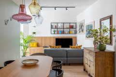
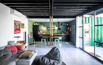
The decision to keep a large living room wrapped around a kitchen that’s partitioned but not hidden from view was motivated by the fact that the family, especially the son, love having friends over.
The trapezoidal kitchen structure was custom-made by a local craftsman in black-lacquered iron and glass. It can be completely closed if needed, but can also be easily opened up to the living room.
The worktop overhangs on both the living room and kitchen sides. With the addition of bar stools, it lets the family make the most of the space and lends a sense of dynamism to the whole.
The worktop overhangs on both the living room and kitchen sides. With the addition of bar stools, it lets the family make the most of the space and lends a sense of dynamism to the whole.
Betti also designed the kitchen cabinets. Made of black lacquered wood with an oak worktop, they’re another piece of the chromatic puzzle in the living room. Inside the structure, the floor is covered with porcelain tiles in pink, black and white; they’re reminiscent of the iconic designs of Milanese architect Piero Portaluppi.
“The kitchen floor was an opportunity for me to create something different but not dominant that goes well with everything else,” Betti explains. “The many strong elements in the kitchen are perfectly balanced.”
“The kitchen floor was an opportunity for me to create something different but not dominant that goes well with everything else,” Betti explains. “The many strong elements in the kitchen are perfectly balanced.”
The table and chairs are vintage pieces from the 1960s that have been restored and painted black. They were also reupholstered with a mustard yellow fabric, and the table was given a new glass top with an aqua-green tint.
Although the flat is on the ground floor, it’s very quiet and bright thanks to the large windows – there are four in the living room alone – which open onto two internal courtyards.
Although the flat is on the ground floor, it’s very quiet and bright thanks to the large windows – there are four in the living room alone – which open onto two internal courtyards.
To create continuity of palette throughout the house, Betti used the intense green of the kitchen units for the headboard wall in the bedroom. Instead of a walk-in closet, Betti designed a double built-in wardrobe.
Next door is the spacious main bathroom.
The couple chose to install a whirlpool bath and a large shower.
Tell us…
What’s your favourite part of this creatively designed apartment? Share your thoughts in the Comments.
Tell us…
What’s your favourite part of this creatively designed apartment? Share your thoughts in the Comments.


Sponsored
Sponsored
Who lives here? The architect’s sister, her husband and their 20-year-old son
Location Repubblica/Central Station area of Milan, Italy
Year built 1939
Architect Betti Sperandeo
Size 100 sq m
Budget €70,000 (around £63,497)
Project duration About three months across 2016 and 2017
Photos by Cristina Galliena Bonham