Houzz Tours

House Tours


Houzz Tour: A Tiny Flat With Not a Single Right Angle
A 9 sq m space with awkward angles and rotting woodwork has been turned into a cosy home thanks to very clever design

The owners of this apartment bought it for their daughter, who was about to start classes at a business school in the Saint-Bruno district of Grenoble, France. Their plan was to let her use it for her time at university, and then rent it out once she graduated. The studio was in poor condition and needed a head-to-toe renovation.
Sophie Graves, the interior designer who took on the project, recalls, “The family first called a contractor for an estimate. He then called me one day to say that he had to put together a quote for a very small, 9 sq m, space and that, for the first time in his life, he really didn’t know what to say. As he knows my penchant for developing small spaces, he asked me to contact the owner.”
Sophie Graves, the interior designer who took on the project, recalls, “The family first called a contractor for an estimate. He then called me one day to say that he had to put together a quote for a very small, 9 sq m, space and that, for the first time in his life, he really didn’t know what to say. As he knows my penchant for developing small spaces, he asked me to contact the owner.”
Before The small studio is located on the first floor of an old, three-storey building, above a bakery and facing the courtyard. The block is divided into dozens of rooms like this one.
These 9 sq m were in very poor condition, and the common areas were equally unsightly. “There was water trickling through the flat,” Sophie says.
These 9 sq m were in very poor condition, and the common areas were equally unsightly. “There was water trickling through the flat,” Sophie says.
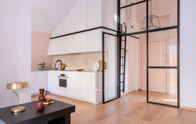
The studio has only one window, so there is little natural light. Most peculiarly, there’s not a single right angle in the space. From the front door, the space narrows towards the window. On its other side, the bathroom is crooked because the building’s sewage drainage duct runs through one of its corners.
After With her proposal, Sophie was able to convince the owners that a more original and optimised solution for this space would be in their best interests.
In order to avoid any unpleasant surprises, Sophie made it clear that demolition was a prerequisite. The owner eventually decided to instead get an acquaintance to manage the work, thinking that would save time and money.
“She called me back five months later in total distress. She had already exceeded the three-month deadline and had spent much more than expected. She finally decided to hand over all the finishing and carpentry work so that the project could get done,” Sophie says.
“She called me back five months later in total distress. She had already exceeded the three-month deadline and had spent much more than expected. She finally decided to hand over all the finishing and carpentry work so that the project could get done,” Sophie says.
Before The interior designer had been right to want to get rid of the existing finishes. Under the linoleum, a decomposed wood floor lay on rotten joists. These had to be replaced and a light screed was poured on top, so as not to put too much weight on the structure of the building.
Layers and layers of old wallpaper, saturated with humidity and mould, were found under the wall finish. The walls had to be treated and covered with a damp-proofing agent.
Sophie had to install a dropped ceiling to run electrical wiring to the bathroom and to house the meter. She also installed double-flow controlled mechanical ventilation (CMV) – which uses the heat from the internal air being pumped outside to warm the fresh air coming in – to address the humidity issues in the small space.
After Sophie and her carpenter created a clever layout, which has added to the value of the flat. “I put the bed by the window to redraw the space orthogonally [with right angles] and make it easier to forget the unpleasant geometry. My idea was to design a ‘chill out’ zone based on the habits of young people, who like to live lying down and no longer necessarily work at their desks,” she says.
Behind the formwork of the electricity meter, Sophie transformed an existing niche into a bookshelf, fitted with connections for the router and a video projector.
Behind the formwork of the electricity meter, Sophie transformed an existing niche into a bookshelf, fitted with connections for the router and a video projector.
The bed rests on a 200cm-long platform made of melamine chipboard. It’s 45cm high and tailored to the uneven dimensions of this part of the room: the part near the window is 160cm wide, while the other end is 200cm wide. The mattress is 120cm wide.
“We had to create a second orthogonal structure inside to accommodate two 140cm-wide, 30cm-high drawers, which can be pulled out fully. One is for clothes and the other is for bags,” Sophie says.
“We had to create a second orthogonal structure inside to accommodate two 140cm-wide, 30cm-high drawers, which can be pulled out fully. One is for clothes and the other is for bags,” Sophie says.
The bed base is perforated to allow the mattress to breathe, and the bedding is firm enough to double as an extra-large bench seat. On the right-hand side, the ledge serves as a bedside table or as a backrest when lined with cushions. On its other side, three niches store blankets, stationery and a bar.
Shelves above maximise the space. The radiator was replaced with more efficient and economical radiant heating, covered with perforated wooden battens to make it possible to rest in the lounge area without getting burned.
Sophie chose innovative flooring. “It’s a material composed of 70% PEFC (Programme for the Endorsement of Forest Certification)-certified wood, without plasticisers, PVC or toxic substances. We chose it for its textured design, which is a great imitation of wood. It is damp-resistant and has acoustic benefits,” Sophie says.
Before The cupboard at the entrance and opposite the kitchenette had stored clothes. The bathroom door had opened right against it.
Make the challenge of finding the right people for your project easier by searching the Houzz Professionals Directory.
Make the challenge of finding the right people for your project easier by searching the Houzz Professionals Directory.
After The bathroom door was replaced with a pocket door that slides behind the wardrobe, which was rearranged to optimise the layout.
Pictured here are the finishes added by the carpenter to the chipboard. These panels, which are less expensive than MDF, had to be applied to the edges, which could not remain untreated.
Before The original kitchen was dated, with its hotplates, old fridge and limited storage space.
Initially, Sophie had planned to put a window in the partition between the kitchen and bathroom, as in this early render. However, that idea was scrapped, as the partition had to be thickened to allow for the double-flow CMV ducts.
After Two 60cm-wide modules now house a stainless-steel sink and a domino induction hob. The melamine worktop has been reduced to 55cm in depth, down from the original 63cm, thanks to the round basin, which is only 45cm in diameter.
Overhead cabinets offer more storage and integrate an extractor hood and a niche for the microwave oven. On the right, the foldable table offers space for up to four diners: “Two on the bench, one at the end and another in the kitchen,” Sophie says.
Overhead cabinets offer more storage and integrate an extractor hood and a niche for the microwave oven. On the right, the foldable table offers space for up to four diners: “Two on the bench, one at the end and another in the kitchen,” Sophie says.
Before In the original bathroom, the 70cm sq shower was on the left, behind the wardrobe. The washbasin was in the centre, with a freestanding toilet on the right.
After opening up the room and removing the wall finish, the designer found that an existing, covered-up window could be used to create a niche.
On the right we can see the building’s waste water duct. Sophie placed the motor housing of the double-flow CMV in a dropped ceiling at the level of the duct outlet.
On the right we can see the building’s waste water duct. Sophie placed the motor housing of the double-flow CMV in a dropped ceiling at the level of the duct outlet.
After Facing the entrance to the small room, the flared plated mirror works to visually enlarge the space, by acting like a vanishing point.
On the left, an extra-flat water heater hangs over a suspended toilet. The water meter sits between the two.
On the left, an extra-flat water heater hangs over a suspended toilet. The water meter sits between the two.
The space on the other side of the basin was irregular because of the drainage pipes. By pushing the shower towards the drainage boxing, Sophie managed to avoid using boxing to make the angle more regular, which would have taken away 19cm of depth.
“We also accentuated the contrast with a black floor, which rises in a band behind the shower column, because the white alone does not define the space properly. The smaller the room, the more contrast is needed,” Sophie says.
“We also accentuated the contrast with a black floor, which rises in a band behind the shower column, because the white alone does not define the space properly. The smaller the room, the more contrast is needed,” Sophie says.
Although the renovation was not smooth sailing, the young student was able to move in just in time for the start of the academic year.
Project plan view. Clockwise from top left: shower, kitchenette + folding table, bed + hatches and drawers, wardrobe, toilet, basin.
Tell us…
What do you think of the designer’s transformation of this tiny space? Share your thoughts in the Comments.
Tell us…
What do you think of the designer’s transformation of this tiny space? Share your thoughts in the Comments.


Sponsored
Who lives here? A young student
Location On the courtyard side of an old building, on the first floor, in Grenoble, south-east France
Size 9 sq m
Date completed September 2019
Duration of work Six months
Interior architect Sophie Graves and Emmanuelle Doncarli of HomebOxcreation
Budget €69,000 (approx £62,382)
Budget details €35,000 (approx £31,641 for the purchase of the flat; €21,000 (approx £18,985) for the first phase of work; €3,000 (approx £2,712 for the work done by Sophie Graves; €8,000 (approx £7,232) for custom-made carpentry; €2,000 (approx 1,808) for the furniture
Photos by HomebOxcreation
The interior designer got to know the mother’s wishes on her first visit. “The family only wanted to redo the bathroom and kitchenette and add a splash of paint,” Sophie says. “They wanted a retractable ceiling bed, but I thought that, in this unusual flat, it would have produced an overwhelming feeling and resulted in a loss of space.”