Houzz Tours

Kitchen Tours
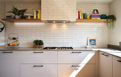
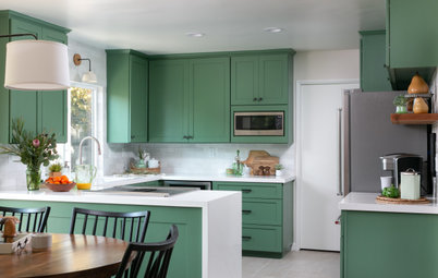
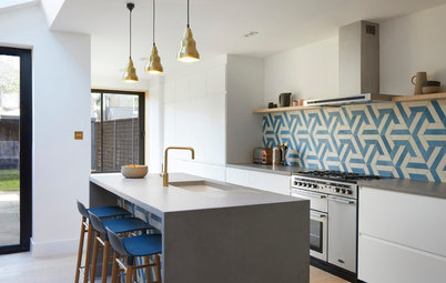
Kitchen Tour: A Once-cramped Kitchen is Now a Calm Scandi Delight
From dated and dark to white and wood simplicity, this small kitchen makeover has transformed a family home

In a Q&A format, we talk to the designer and examine the creative thinking behind this beautifully renovated kitchen.
The kitchen before works.
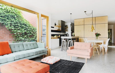
This is an old, long and skinny terrace house. The original home is the first half of the house, and an extension had been built on to double its size. The kitchen used to be a lean-to on the back of the old home. It now adjoins a large, open-plan dining and lounge area.
This is an old, long and skinny terrace house. The original home is the first half of the house, and an extension had been built on to double its size. The kitchen used to be a lean-to on the back of the old home. It now adjoins a large, open-plan dining and lounge area.
What was the brief?
Our client was catching up with a friend, who also happened to be a past client of ours. She loved her friend’s new kitchen, especially how every cabinet had a specific purpose (including pull-out mechanisms for easy access to blind corner cabinets). Given it was a small space – like her own kitchen – she wanted to know who completed the project for her. After that, we received the call.
Upon meeting with her at her terraced home – where old meets new with the extension on the back of the original house – her brief was simple: more storage to help her declutter; a modern finish with clean lines; some wood elements to add warmth, and an overall light and bright feeling, given the space was so small.
She also wanted to incorporate a space for friends to sit while her young adult son (a passionate cook) prepared a feast for their guests.
Thinking of renovating your kitchen? Find a kitchen designer in your area on Houzz.
The kitchen before works.
What was the starting point?
There was nothing specific, apart from her friend’s kitchen that she loved and which inspired her to take action.
She had lived with a tired, dark, frustrating old kitchen that was in need of upgrading for quite some time, so visiting a fresh new kitchen was the motivation she needed to take action. She was happy to let us design what we felt suited the space, based on the discussions we had with her at the site visit.
What were the key design aspects?
Colour palette White, timber (walnut) and grey (not dissimilar to a Scandi scheme).
Colour palette White, timber (walnut) and grey (not dissimilar to a Scandi scheme).
Materials palette
- Polytec ‘White Cement’ laminate worktops from the Matera range.
- Polytec ‘Notaio Walnut’ Woodmatt-finish timber feature accents.
- Polytec ‘Blossom White’ matt-finish melamine cabinetry.
- Undulating gloss-white metro tiles from Beaumont Tiles (laid in a mix of shorter and longer lengths) with a mid-grey grout.
- Kethy HT017 handles in a charcoal matt finish.
Key pieces of furniture/fittings
- Aiden pendant in Walnut/Black from Beacon Lighting.
- Wilson & Bradley compact pull-out pantry system.
- The Shelving Shop Lip shelf brackets in Matt Black.
- Blum soft-closing hardware throughout.
The kitchen before works.
What was the thinking behind the arrangement of the furniture and fixtures?
We wanted to keep the space as light, bright and spacious as possible. This is why, instead of wall cupboards above the sink area, we fitted an open shelf, which is still handy for occasional items while keeping the area near the window bright and spacious.
The pendant light at the corner of the peninsular, over the breakfast bar, hangs lower as a feature, similar to bar lighting.
Any challenges you worked around?
It was a very small space. Small kitchens are harder to design than larger ones. You need to fit in the essential items – fridge, hob, oven, extractor and sink – while ensuring the client won’t be knocking their hip against the worktop while frying up their eggs for breakfast.
Discover 8 professional tips to make a kitchen look beautifully finished.
We needed to ensure there was sufficient clearance for the barstool seating, while not compromising on the internal clearance when working in the kitchen.
The levels of the walls and floor were a long way out, due to the fact that the space used to be a lean-to on the back of the old terrace house, which resulted in a more time-consuming installation process.
The levels of the walls and floor were a long way out, due to the fact that the space used to be a lean-to on the back of the old terrace house, which resulted in a more time-consuming installation process.
The kitchen before works.
Why do you think this room works?
It’s an inviting, light and bright, highly functional area of the home. It now feels like a place you want to spend time in. The styling of the kitchen suits the contemporary feeling of the back half of the home (the extension was completed 20-plus years ago).
It’s an inviting, light and bright, highly functional area of the home. It now feels like a place you want to spend time in. The styling of the kitchen suits the contemporary feeling of the back half of the home (the extension was completed 20-plus years ago).
Tell us…
What do you like about this small, but perfectly formed kitchen? Share your thoughts in the Comments.
What do you like about this small, but perfectly formed kitchen? Share your thoughts in the Comments.


Sponsored

Sponsored
Who lives here? A busy woman with her young adult son (who enjoys cooking, so he wanted a say in the kitchen design and appliance selection)
Location Norwood, South Australia
Budget $25,000 (around £13,963) excluding new flooring, splashbacks, painting and appliances
Room dimensions Approx 3.5m x 3.3m, including the passage/doorway
Questions answered by Alison Burfield, co-director and project manager of Transform-A-Space
Photos by Art Department Creative; Styling by Art Department Styling