Decorating
You-tell-us Trends: Blue Kitchens
Want a snapshot of the UK’s favourite interiors trends? Check out Houzz’s Newly Featured search tab and filter by room, region and more

If you’re planning a kitchen renovation and want to check out what the digital versions of the Joneses are up to, look no further than Houzz’s Newly Featured search function. Simply click into Photos on the home page and filter on the left-hand side, according to what you’re looking for, then select Newly Featured (from the drop-down Popular Today box) for the latest projects.
A quick glance at the past three months’ worth of freshly uploaded UK kitchen projects reveals a growing and unmissable penchant for blue in the kitchen. Be inspired by the many different ways Houzzers are channelling this on-trend hue – and then share your thoughts about it in the Comments below.
A quick glance at the past three months’ worth of freshly uploaded UK kitchen projects reveals a growing and unmissable penchant for blue in the kitchen. Be inspired by the many different ways Houzzers are channelling this on-trend hue – and then share your thoughts about it in the Comments below.
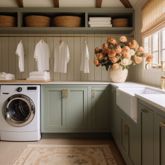
Warm it up
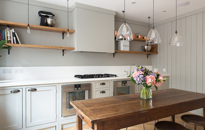
This modern yet eminently welcoming kitchen, part of a 1920s chalet bungalow renovated by Pataross Projects in East Sussex, features a blue that’s rich and bright without being in-your-face.
The cool shade used here tempers the gingerbread tone of the wood, which in turn adds warmth to this large and uncluttered space. The circular red stools enhance this effect and, again, grey gets in on the act, but this time a deeper version, which matches the chalky quality of the blue peninsula.
Blue up your greys
Is it blue, is it grey? If you’re not quite ready to relinquish a love of all things grey, you’re not alone: this stormy colour trend has been an enduring one. However, a blue-grey paint is a nod towards the future and could give your kitchen a foot in both camps.
Ramp up a blue tint (or change the look of an already grey space) by accessorising liberally with the shade in all its glory. In this generously proportioned Surrey kitchen, you can see how the pale blues in the sofa fabric and cushions begin to bring out this side of the grey cabinetry.
Go further with sapphire-coloured ceramics, aqua artworks or even simply a trio of blue-tinged tea-towels picked as if from the blue section of a paint chart.
Check out more grey kitchen ideas in Photos
Be a baby
Baby blue is a less directional take on this trend, as they say in fashion circles, but, worn all over, its impact can be just as striking.
This powdery take on sky blue ensures the expanse of this light and bright version of the colour doesn’t overwhelm. For a crisp and airy effect, mix it with white – for a country twist, layer in some cream tones; for a nautical wink, drop in a splash of red or add a section of tongue-and-groove panelling.
Start an industrial revolution
Yet again, deep blue, white and pale grey work beautifully together to create a traditional feel in this London kitchen. Throw in some black accents, a factory-style clock and wall light, and some reclaimed accessories in the form of the pendants and crate storage, sit them alongside the classic wood panelling and butler’s sink – and you’ve got “vintage industrial” with a touchy-feely twist.
Yet again, deep blue, white and pale grey work beautifully together to create a traditional feel in this London kitchen. Throw in some black accents, a factory-style clock and wall light, and some reclaimed accessories in the form of the pendants and crate storage, sit them alongside the classic wood panelling and butler’s sink – and you’ve got “vintage industrial” with a touchy-feely twist.
Win in the primaries
Who says blue needs to be refined or classic? Here, a muted shade of cerulean chums up with a lively yellow and jaunty red in the bar stools to create an energising, playful mood.
Note how the colour splash is concentrated around the central island, with neutral space all around leaving room for the scheme to breathe.
Big up your bottom
This kitchen has no wall units and everything above those glorious deep blue base units is white. Dark below, paler above is a design convention, and here you can can see why. The white walls and pale worktops really open up the space, while the blue units add colour without dominating the entire design of the space.
This kitchen has no wall units and everything above those glorious deep blue base units is white. Dark below, paler above is a design convention, and here you can can see why. The white walls and pale worktops really open up the space, while the blue units add colour without dominating the entire design of the space.
Feel floored
The blue trend doesn’t begin and end with cabinet colour. Here, it’s instead been channelled via the boldly tiled floor in this London kitchen. A neutral backdrop that mixes white with pale blues and grey, and a wooden focal point in the form of the table and chair legs, keep this statement on the downlow, rather than ramping it up. A different approach to the one in the next kitchen…
The blue trend doesn’t begin and end with cabinet colour. Here, it’s instead been channelled via the boldly tiled floor in this London kitchen. A neutral backdrop that mixes white with pale blues and grey, and a wooden focal point in the form of the table and chair legs, keep this statement on the downlow, rather than ramping it up. A different approach to the one in the next kitchen…
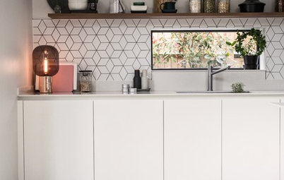
Make it midcentury modern
This highly patterned island wouldn’t be for everyone, but these blue geometric tiles do look very cool, don’t you think? The overall feel, despite such a decorative feature being centre-stage, has a utilitarian, Bauhaus feel about it.
This is clever and has been created in several ways: the no-nonsense space around it is virtually all white, except for those few dashes of red; the unusual yet fuss-free grid-like arrangement of tiles on the splashback has been highlighted with dark grout, and the print on the back wall cements the midcentury mood.
It’s clever, because with just a few small changes, these blue tiles could equally have provided a decidedly Moorish flavour (think raw concrete surfaces, brass taps and a splash of ochre).
Take a look at how modern geometric designs are reinventing cement tiles
Don’t let size stand in your way
The obvious choice for this compact cook space in the East Midlands might have been to go all white – the theory being that pale would make it look bigger. But opting for inky blue adds so much character to this diddy, heritage-look kitchen, and the colour also visually separates it from the dining space in a zoning trick open-plan room designers often use.
The obvious choice for this compact cook space in the East Midlands might have been to go all white – the theory being that pale would make it look bigger. But opting for inky blue adds so much character to this diddy, heritage-look kitchen, and the colour also visually separates it from the dining space in a zoning trick open-plan room designers often use.
Go two-tone
Again, a lack of wall cupboards really allows the sky blue hues to shine in this airy wooden kitchen.
Here, the different tones of the wood and tan of the leather provide the counterpoint to the two blues, and help to unify them. There’s also, just visible on the right, a tall cupboard in the same watery shade as the island, which makes it more of an equal partner to the darker blue units.
This could also have been achieved, as seen in many of the previous examples, by the addition of simple accessories – never forget the power of friends such as tea towels, jugs or even a framed postcard, for adding an entirely new colour scheme to your space.
TELL US…
Do you have a blue kitchen? If not, do any of these schemes tempt you? Share your thoughts in the Comments below.


Sponsored

Sponsored
Don’t fancy all-over (or even permanent) blue? Highlight your island with it instead – all the better if yours is as generously proportioned as this solid wood number, designed by 360 Design in Belfast and painted in Farrow & Ball’s Stiffkey Blue.
From 17th century Delftware in the Netherlands to the ubiquitous willow pattern that began to adorn British fabrics and ceramics in the 18th century – both influenced by a trend that began in ancient China’s Ming Dynasty – blue and white make for one of history’s most enduring colour combinations, especially when the shade is rich and dark, as here.
As such, this combination is the perfect blend for enhancing the sense of history in a period property, and it looks beautiful in this kitchen, which is part of a renovated period house in Holywood, County Down.
Give the scheme a gentle contemporary wash by adding pale grey as an accent colour – in this case, Farrow & Ball’s Elephant’s Breath.