
A colourful London homeTransitional Living Room, London
What Houzz contributors are saying:

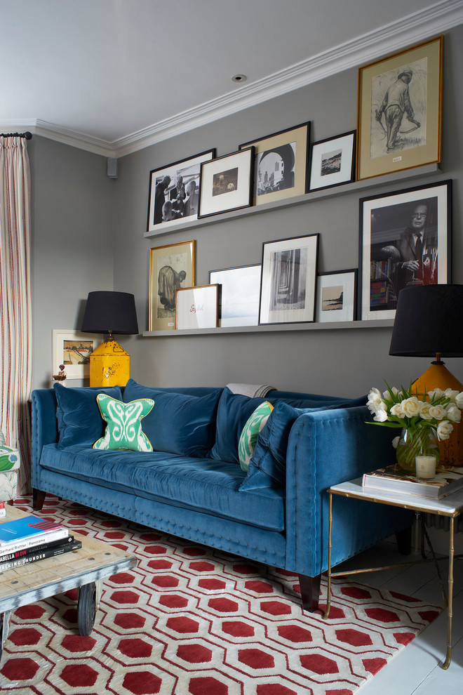
Peacock blueWhile they might not seem obvious bedfellows, grey and blue can actually nicely complement each other if chosen wisely, as illustrated here. Pick a jewel shade – sapphire, teal or turquoise, for instance – rather than a duller airforce or very pale blue, so it shines against the grey. Velvet in a rich blue shade will look wonderful next to matt grey, as the sheen on the fabric will reflect the light and add a ripple of glamour.Tell us…Which colour would you pair with grey? Let us know in the Comments section.

Use blue as a neutralLong gone are the days when beige and off-white were the only useful neutrals for your interiors scheme. Here, a dark blue sofa becomes a chic ‘new neutral’ and is used to ground a wider palette of red, peppermint green and yellow.The eclectic vibe is enhanced by the shelves of propped-up pictures, the brass-legged side table and the industrial-style coffee table.

Inject colourIntroducing colour with a few choice pieces will elevate your home immediately from run-of-the-mill to inspirational. In this eclectic living room, the warm grey backdrop is transformed with hits of bright yellow, jewel-like blue and rich red. If you’re not sure which colours to use, try using your pictures as a jumping-off point, pulling out your favourite colours and tones.

Bring out other coloursIn an eclectic look, the right rug can make a room’s colour palette sing. Here, a geometric pattern in a strong shade of red injects just the right amount of formality. It also sets off the strong blue and yellow tones to mouthwatering effect. Far from being overwhelming, the room is warm, inviting and relaxed.

Pair with greyIf you’re not ready to go for a ‘blue out’ in your space, but still want the depth and cosiness of darker walls, grey could be the perfect alternative. The darker the grey you choose, the brighter your blue will appear. Although there are a number of strong colours here – the deep red in the rug, the egg-yolk yellow of the lamps and the minty green in the cushions – the arrangement doesn’t feel chaotic. This is thanks to the clever use of symmetry and because the gallery wall is broadly monochrome, so it doesn’t introduce more shades, which could compete in the space.
Turner Pocock
Karen Miller