Search results for "Large family kitchen" in Home Design Ideas
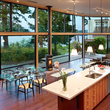
The Port Ludlow Residence is a compact, 2400 SF modern house located on a wooded waterfront property at the north end of the Hood Canal, a long, fjord-like arm of western Puget Sound. The house creates a simple glazed living space that opens up to become a front porch to the beautiful Hood Canal.
The east-facing house is sited along a high bank, with a wonderful view of the water. The main living volume is completely glazed, with 12-ft. high glass walls facing the view and large, 8-ft.x8-ft. sliding glass doors that open to a slightly raised wood deck, creating a seamless indoor-outdoor space. During the warm summer months, the living area feels like a large, open porch. Anchoring the north end of the living space is a two-story building volume containing several bedrooms and separate his/her office spaces.
The interior finishes are simple and elegant, with IPE wood flooring, zebrawood cabinet doors with mahogany end panels, quartz and limestone countertops, and Douglas Fir trim and doors. Exterior materials are completely maintenance-free: metal siding and aluminum windows and doors. The metal siding has an alternating pattern using two different siding profiles.
The house has a number of sustainable or “green” building features, including 2x8 construction (40% greater insulation value); generous glass areas to provide natural lighting and ventilation; large overhangs for sun and rain protection; metal siding (recycled steel) for maximum durability, and a heat pump mechanical system for maximum energy efficiency. Sustainable interior finish materials include wood cabinets, linoleum floors, low-VOC paints, and natural wool carpet.
Download our free ebook, Creating the Ideal Kitchen. DOWNLOAD NOW
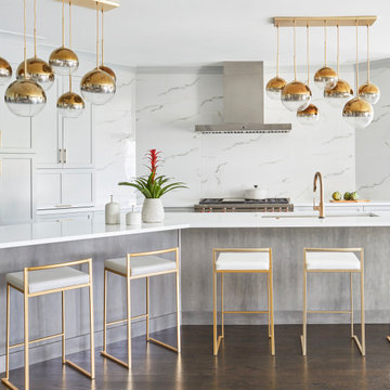
This client was referred to us from a past client. They are a busy 2-career household with young children and enjoy entertaining friends and family in their home. They have a beautiful open concept home but unfortunately the kitchen was not fitting for the rest of the home. They were not quite sure what to do with the space. We talked about trying to refresh it or do more of a minor remodel, but in the end they decided a full gut would get them to where they wanted to be.
One problem was there was no place for guests to hang out other than the large and awkward banquette area. The brick wall and tiled hood area were feeling a bit dated and tired. The space was just not functional for their lifestyle. There was no prep space near the cooktop and no landing area for items coming out of the ovens or refrigerator, plus a big dead zone in the center of the room.
Banquettes, like the one they previously had in the space, are great for small spaces, but when they get really large like this one, it makes getting in and out of the seating area awkward and uncomfortable. Plus, there was room for a large table, so we eliminated the awkward built in.
We started by removing the faux brick wall between the kitchen and back entry. We relocated the entry to the garage over a couple feet in order to get every last inch out of the new kitchen. We also made the decision to close up the primary window that faced the pretty ho hum brick wall of the neighbor’s house. There was plenty of light coming in from the seating area, so we just didn’t feel the window was adding much to the room.
Construction went smoothy. There was a bit of rework with electrical, flooring and HVAC, but in the end, we think it was well worth it.
The clients really wanted a sleek contemporary look, and we originally had planned for a full height slab backsplash, but due to it’s size, it was a budget buster. Instead, we got creative and settled on large format porcelain tiles that have a similar feel but were a fraction of the cost. We made sure the wall was plumb and level so that the fit and finish would mimic that of slab material.
The final space was quite a change. A large prep sink sits directly across from the new pro-style range with plenty additional prep space on the large island. The refrigerator and ovens now have miles of landing space, and a nice tight work triangle makes cooking a breeze.
Since we wanted a more contemporary feel, not many wall cabinets were included. Instead, we outfitted some of the drawers for dish storage with a peg system. Two large pantries flanking the refrigerator hold baking supplies and small appliances. Large drawers by the cooktop hold pots and pans, and an appliance garage tucked away to the left of the range hides away miscellaneous items. The large island also houses a microwave drawer and tons of storage, most of which is drawers offering maximum convenience.
The island now seats 5-6 people comfortably along with the new table in the seating area which can seat up to 8. Entertaining will be a breeze in this space. With such a clean backdrop, we knew we would need some drama with the lighting, so we chose two sets of staggered pendants, which we adjusted for the right visual balance above the island.
We also included a small coffee station to the right of the main kitchen, which helps keep the coffee clutter out of the kitchen proper. Two tones of complimentary gray are featured in this kitchen. The perimeter is a light gray that reads almost white. The island is a gray stain that adds some depth and interest with the visible wood texture. The countertops are clean white quartz, and the hardware, barstools and light fixtures add warm brass tones. I see lots of cooking and entertaining with family and friends in the near future in this bright and airy new space.
Designed by: Susan Klimala, CKD, CBD
Photography by: Michael Kaskel
For more information on kitchen and bath design ideas go to: www.kitchenstudio-ge.com
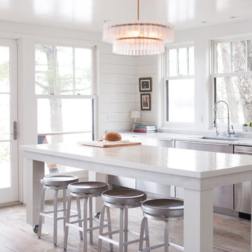
A cabin in Western Wisconsin is transformed from within to become a serene and modern retreat. In a past life, this cabin was a fishing cottage which was part of a resort built in the 1920’s on a small lake not far from the Twin Cities. The cabin has had multiple additions over the years so improving flow to the outdoor space, creating a family friendly kitchen, and relocating a bigger master bedroom on the lake side were priorities. The solution was to bring the kitchen from the back of the cabin up to the front, reduce the size of an overly large bedroom in the back in order to create a more generous front entry way/mudroom adjacent to the kitchen, and add a fireplace in the center of the main floor.
Photographer: Wing Ta
Interior Design: Jennaea Gearhart Design
Find the right local pro for your project
Our clients loved the location of their duplex home with its peak-a-boo ocean view, but their existing kitchen was not suited for their growing family. They wanted a kitchen with a coastal vibe, plenty of storage space, and an eat-in area.
We started by bringing the far wall into the kitchen space to accommodate a large panty and communication center for the family. Doing this allowed us to move the refrigerator out of the main traffic area and doubled the amount of storage space. Several new windows were added to bring in natural light. A half wall was moved to allow more countertop area and open up sight lines. The previously awkwardly shaped island was slimmed down to create better flow.
There were a few venting challenges to overcome; gas lines and plumbing had to be re-routed without disturbing the unit below. To open up sight lines, soffits were eliminated which allowed the extension of cabinets to the ceiling. To stay within the homeowner’s budget, we match existing scraped flooring by lacing in and repairing patches.
The old dining area was too small for table, so we designed and built a custom banquette to maximize the space and take advantage of the outdoor views. The overall space works for family meals as well as entertaining.
A light summer palette was used to reflect the shades of the sand, sea and sky. Even though the new kitchen is actually smaller than the original space, its now far more functional and open.
Classic luxury with an Airoom flair, our Lincolnwood showroom kitchen has it all. From gorgeous waterjet marble mosaic for the mural behind the stove to beautiful porcelain tile on the floors, from antique mirror cabinetry facing on the subzero refridgerator to the elegant yet understated ceiling treatment, and from the crystal chandelier to the stunning marble island, this kitchen is exactly what a kitchen should strive to be.
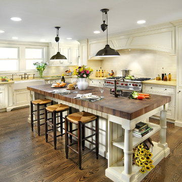
Gracious country living! Generous open floor plan provides plenty of space for family and guests alike! Classic American Farmhouse!
Photography: Phillip Mueller Photography
Photo by Jared Kuzia
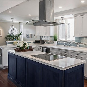
Large traditional l-shaped open plan kitchen in Boston with a submerged sink, white cabinets, engineered stone countertops, white splashback, metro tiled splashback, stainless steel appliances, an island, brown floors and medium hardwood flooring.
Large traditional l-shaped open plan kitchen in Boston with a submerged sink, white cabinets, engineered stone countertops, white splashback, metro tiled splashback, stainless steel appliances, an island, brown floors and medium hardwood flooring.
Free ebook, Creating the Ideal Kitchen. DOWNLOAD NOW
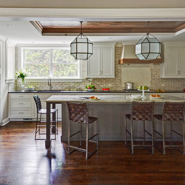
One of my favorite things to work on is older homes with a bit of history because I find it an interesting challenge to marry the historical architectural features of a home with modern design elements that work well for my client’s current lifestyle.
This home was particularly fun because it was the second kitchen we had done for this family and was quite a departure from the style of the first kitchen.
The before shot of the kitchen shows a view from the family room. See the dropped ceiling? We were curious, was this just part of the design or was the dropped ceiling there to hide mechanicals? Well we soon found out that it was mostly decorative (yay!), and with the exception of a little bit of work to some plumbing from an upstairs bathroom and rerouting of the ventilation system within the original floor joists, we were in the clear, phew! The shot of the completed kitchen from roughly the same vantage point shows how much taller the ceilings are. It makes a huge difference in the feel of the space. Dark and gloomy turned fresh and light!
Another serious consideration was what do we do with the skinny transom window above the refrigerator. After much back and forth, we decided to eliminate it and do some open shelving instead. This ended up being one of the nicest areas in the room. I am calling it the “fun zone” because it houses all the barware, wine cubbies and a bar fridge — the perfect little buffet spot for entertaining. It is flanked on either side by pull out pantries that I’m sure will get a ton of use. Since the neighboring room has literally three walls of almost full height windows, the kitchen gets plenty of light.
The gold shelving brackets, large pendant fixtures over the island and the tile mural behind the range all pay subtle homage to the home’s prairie style architecture and bring a bit of sparkle to the room.
Even though the room is quite large, the work triangle is very tight with the large Subzero fridge, sink and range all nearby for easy maneuvering during meal prep. There is seating for four at the island, and work aisles are generous.
Designed by: Susan Klimala, CKD, CBD
Photography by: LOMA Studios
For more information on kitchen and bath design ideas go to: www.kitchenstudio-ge.com
This Shaker kitchen in our SW17 Heaver Estate family home is cosy but elegant, and great for entertaining friends and family. We sanded and re-stained the floors, painted the kitchen & added new cupboard knobs to make it feel more premium
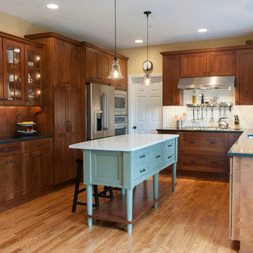
This kitchen was designed to function around a large family. The owners spend their weekend prepping large meals with extended family, so we gave them as much countertop space to prep and cook as we could. Tall cabinets, a secondary banks of drawers, and a bar area, were placed to the connecting space from the kitchen to the dining room for additional storage. Finally, a light wood and selective accents were chosen to give the space a light and airy feel.
The Hartford collection is an inspired modern update on the classic Shaker style kitchen. Designed with simplicity in mind, the kitchens in this range have a universal appeal that never fails to delight. Each kitchen is beautifully proportioned, with an unerring focus on scale that ensures the final result is flawless.
The impressive island adds much needed extra storage and work surface space, perfect for busy family living. Placed in the centre of the kitchen, it creates a hub for friends and family to gather. A large Kohler sink, with Perrin & Rowe taps creates a practical prep area and because it’s positioned between the Aga and fridge it creates an ideal work triangle.
Traditional kitchen remodel designed by Ron Fisher in Woodbridgde, Connecticut
To get more detailed information copy and paste this link into your browser. https://thekitchencompany.com/blog/featured-kitchen-elegant-addition,
Photographer, Dennis Carbo
Inspiration for a medium sized classic l-shaped kitchen/diner in Chicago with a submerged sink, shaker cabinets, white cabinets, marble worktops, white splashback, stone tiled splashback, stainless steel appliances, medium hardwood flooring and an island.
Kitchen designed & installed by Inline Kitchens, Pontefract.
© 2014 Paul Leach
This is an example of a large contemporary galley kitchen/diner in Other with flat-panel cabinets, white cabinets, green splashback, glass sheet splashback, light hardwood flooring and a breakfast bar.
This is an example of a large contemporary galley kitchen/diner in Other with flat-panel cabinets, white cabinets, green splashback, glass sheet splashback, light hardwood flooring and a breakfast bar.
Free ebook, Creating the Ideal Kitchen. DOWNLOAD NOW
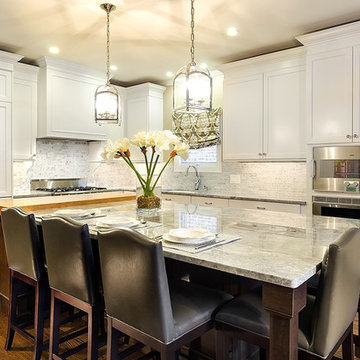
This young family of four came in right after closing on their house and with a new baby on the way. Our goal was to complete the project prior to baby’s arrival so this project went on the expedite track. The beautiful 1920’s era brick home sits on a hill in a very picturesque neighborhood, so we were eager to give it the kitchen it deserves. The clients’ dream kitchen included pro-style appliances, a large island with seating for five and a kitchen that feels appropriate to the home’s era but that also is fresh and modern. They explicitly stated they did not want a “cookie cutter” design, so we took that to heart.
The key challenge was to fit in all of the items on their wish given the room’s constraints. We eliminated an existing breakfast area and bay window and incorporated that area into the kitchen. The bay window was bricked in, and to compensate for the loss of seating, we widened the opening between the kitchen and formal dining room for more of an open concept plan.
The ceiling in the original kitchen is about a foot lower than the rest of the house, and once it was determined that it was to hide pipes and other mechanicals, we reframed a large tray over the island and left the rest of the ceiling as is. Clad in walnut planks, the tray provides an interesting feature and ties in with the custom walnut and plaster hood.
The space feels modern yet appropriate to its Tudor roots. The room boasts large family friendly appliances, including a beverage center and cooktop/double oven combination. Soft white inset cabinets paired with a slate gray island provide a gentle backdrop to the multi-toned island top, a color echoed in the backsplash tile. The handmade subway tile has a textured pattern at the cooktop, and large pendant lights add more than a bit of drama to the room.
Designed by: Susan Klimala, CKD, CBD
Photography by: Mike Kaskel
For more information on kitchen and bath design ideas go to: www.kitchenstudio-ge.com
KITCHEN RENOVATION
In a house with four children and the family dog, the family needed a space large enough for them to alll gather together in the evening for dinner and homework. The kitchen also serves as one of the main passage ways through the house and the original layout was closed off and cramped. By enlarging the opening to the family room, adding the bench nook for additional seating, extending the countertop space, and designing a large island, the kitchen is now a central place to be.
Photographs by jeanallsopp.com
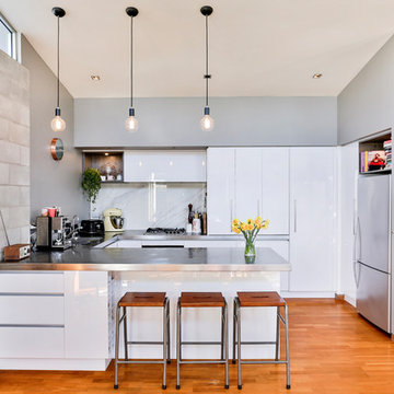
Modern Industrial Kitchen Renovation in Inner City Auckland by Jag Kitchens Ltd.
Photo of a large industrial u-shaped open plan kitchen in Auckland with a double-bowl sink, flat-panel cabinets, white cabinets, stainless steel worktops, white splashback, glass sheet splashback, stainless steel appliances, medium hardwood flooring, an island and multi-coloured floors.
Photo of a large industrial u-shaped open plan kitchen in Auckland with a double-bowl sink, flat-panel cabinets, white cabinets, stainless steel worktops, white splashback, glass sheet splashback, stainless steel appliances, medium hardwood flooring, an island and multi-coloured floors.
Design ideas for a traditional kitchen in Chicago with stainless steel appliances, a belfast sink, wood worktops and yellow worktops.

Interior Design: Sara Gilbane Interiors
Architecture: Newport Collaborative Architects
Custom Cabinetry: Woodmeister Master Builders
Photography: Gary Sloan Studios
Search results for Large Family Kitchen in Home Photos
This kitchen remodel by The Kitchen Studio at Pine Street features Dura Supreme Cabinetry with a Craftsman panel cherry door with a cinnamon stain finish.
Photo by John Welsh.
143