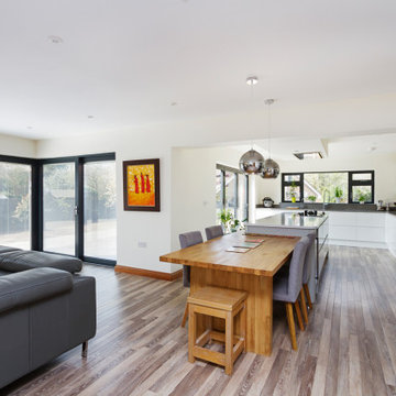
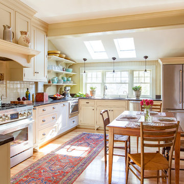
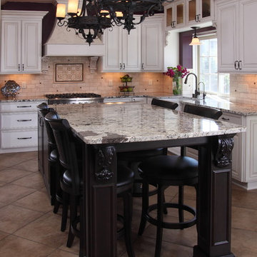
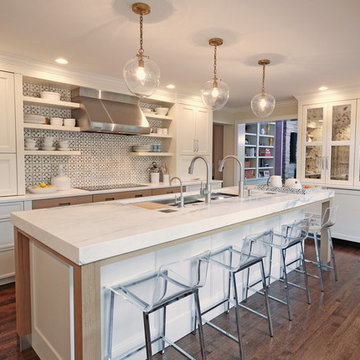
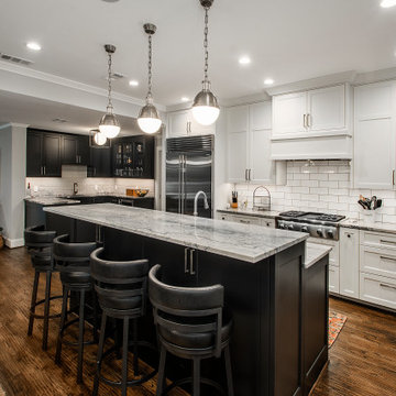
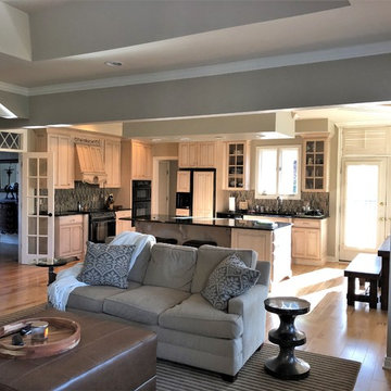
Search results for "Small open plan kitchen and living room" in Home Design Ideas
In brief
Location, location, location
When looking for your perfect home where you can put down your grass roots and start a family there are many ‘must haves’ that we all have on our wish lists. The obvious contenders are price and location with many other niceties, like the number of bedrooms, layout and decor taking a back seat. As we all know, location can sell a home to those who strive to be in the right area, for transport links, local amenities and the all-important school catchment areas.
Like many other families throughout the UK our clients chose their house for its excellent location. Just ten minutes from the centre of Stafford by car, our client’s house is in a popular and sought-after suburb of the town for couples and families alike. They have always loved the location of their house for its easy access to work, schools, leisure facilities and social connections, but they were becoming increasingly frustrated with the layout of the ground floor of their home.
It’s inevitable that families will evolve and our needs from our properties will change too. Since the young family of four moved to their large four-bedroom detached house a few years ago, their property has been unable to meet their lifestyle needs and living patterns.
Although their property has adequate bedroom space for them and their two children, the layout of the downstairs living area was not functional and it obstructed their everyday life, making entertaining and family gatherings difficult.
Our First Meeting
Upon our initial consultation with our clients it was clear from the outset why they sought to make changes to the layout of their house. The property had been extended to create extra space by the previous owners, but unfortunately the design and build hadn’t been executed well at all. The rooms and layout were awkward in size and shape and it didn’t allow the family to come together and enjoy their home. They had the floor space, but it was sectioned off into separate rooms, some without a purpose.
The garden surrounds the house on all three sides and is of a good size in its entirety with different areas on each aspect. We could clearly see that the house itself didn’t address any particular aspect of the garden in any way.
Moving to a new house wasn’t an option, the family were happy with the location and size of the property. What they wanted was a modern, functional, stylish space for everyday family life, with the flexibility to accommodate their large extended family when needed and to ultimately add value to their property.
We were appointed by our clients to create a design solution to redesign the ground floor living area with a modern, light filled, open plan space that connects with the garden. It was clear from outset that our design intention was to break down the room barriers and to respond to the needs of the family, supporting their lifestyle now and for the future, bringing them together and creating a house they could call a home.
Delivering a project on time and within our client’s budget are always a top priority for our team. The family decided to stay in their house during construction, therefore it was even more essential to minimise the level of disruption to their daily lifestyle with a young family living on site.
The family needed help from our team at Croft Architecture to swiftly and successfully acquire Building Control Approval for their project to progress rapidly, ensuring project completion on time and to their determined budget.
Our Approach
Surveying the site
The client’s home is located on the entrance to a quiet cul-de-sac on a mature, leafy, suburban housing estate. Their home nestles into its well-established site, with ample space between the neighbouring properties and has considerable garden space to the rear and both sides.
During our initial visit we spent a long time with the family observing the existing layout, talking about how they currently live in the property, their annoyances with the house in its current form, how they would like to be able to live in their family home and how they aspired it to feel, look and live.
We walked through the house and it was clear that the existing layout didn’t work downstairs. The house had been extended onto before they had bought the property and the space hadn’t been well thought through in terms of how it would be used effectively.
The rooms directly to the left off the hallway, didn’t really have a proper function. The previously extended space had resulted in the house with too many rooms and subsequently this had led to a series of impractical spaces.
The long and narrow extension was home to a small U-shaped kitchen at the front of the house, which led onto the dining area and then onto a small room at the back of the extension. For the size of the house the kitchen and dining room in a much smaller and narrower area, leaving larger living areas to the rear of property with copious amounts of dead space. The small kitchen was tucked away at the front of the property which made life difficult for our clients to observe their children playing safely in the garden whilst preparing food and carrying out work in the kitchen. On the opposite side of the property there was another old extension which had a step down into it. This living area had a tiled floor and large glazed windows on all sides which made it feel almost like a conservatory.This area was rarely used by the family as it had no real function, plus it was hot in the summer and cold in the winter. It had become an under utilised space.
We walked around the property and it was clear that the house itself didn’t address their private garden space to any particular aspect in any way, meaning that the garden space was under used because of the poor connections.
The family wanted a combined kitchen, dining, lounge space for daily life and also for entertaining their family.
Design Approach
The size of the property presented the opportunity to substantially reconfigure the family home to create a series of dynamic living spaces oriented towards the large, south-facing garden.
Our team suggested removing the little kitchen from the front of the property and re positioning it within the unused glazed space at the back of the house.
The glazed room had internal French doors with a step down into the space separating it from the lounge. We proposed to remove the French doors, level the floor and make it into one room with the existing lounge.
To connect the new open plan kitchen and living space to the rear and side garden sliding and folding doors were the solution, extending the family’s usable living space by creating a seamless indoor-outdoor flow. There was already a patio area there and it made sense for the kitchen to move to the rear of the house to be close to the patio for easy outside dining.
It was therefore logical to retain the existing living space in it's current location next to the new kitchen, maintaining the natural flow of the house for the family after eating and entertaining in the kitchen.
When making decisions regarding the kitchen design, we worked closely with the family. They thoroughly enjoy spending time cooking and entertaining with their large extended family. To assist with their culinary preparations our clients had aspired to have an induction hob within their new kitchen. As they were working through the design with us, they weren’t sure about an induction hob because of different cooking methods required for certain meals that they like to produce. They particularly like making chapatis which require a round pan and a gas hob. We didn’t see this as a problem and suggested having a single gas burner for purely this purpose whilst still installing an induction hob. They decided to go ahead with our idea, choosing a single gas burner and an induction hob, and it looks great!
The existing lounge space had a corner aspect at the rear property that protruded into the garden. Positioned next to the kitchen and dining space it seemed logical to us for the living area to also open out onto the patio, thus connecting the garden to the house on a wider aspect. To enhance the connection between the garden and the living room we thought that a corner door would work extremely well to really open up this space. The clients really liked the design concept to create a feature of the corner with glazed sliding doors that would completely open the house up to the garden. They were excited about the prospect of the allowing huge amounts of natural light into their home and the flexible access it would provide to the garden.
Once the new kitchen, dining and living space had been concluded, we then had to consider what the previous kitchen and dining area was going to be used for within the small, long side extension. We talked with our clients about a few possible uses. We noticed that the family have a piano and few other musical instruments. It made sense for this space to become a quiet part of the house for them to escape to, play music, read and generally relax in a snug area.
To shorten the length of the new music room and make an additional feature in the newly created open plan kitchen, dining and living area, we reclaimed some of the space from the back of the side extension and opened it up to the main open-plan space, thus creating another new snug. We added an additional design feature within the snug by creating a timber window seat. Not only does it provide extra seating, but it’s also created a snug within a snug, a haven for reading, napping and gazing out into the garden.
As part of their brief our clients also wanted a to incorporate a log burner into their newly remodelled home. To connect the new music room and snug to the living space we proposed to position a two-way log burner where the existing gas fire was located. By retaining a fire in the original location it would minimise the disruption and work required to install the wood burner. However, the theory didn’t turn into reality and the new fire resulted in being quite a task to get it to work. When the contractor began to strip back the existing fireplace, they discovered that fitting the pipe within the building was going to be more challenging than they anticipated because of the poorly constructed extension. It was difficult to execute but it was ultimately achieved.
What lies beneath?
It’s not until you uncover the fabric of the building that you fully understand what’s going on underneath. When the contractor exposed the structure of the house, we found out that the property had been poorly constructed, and they uncovered a lot of poor workmanship from the original builders. As the build progressed the inner skin of the extended structure was exposed, we found that it wasn’t actually strong enough and we needed to make it safe in order to proceed. Going forwards we ensured that the structure was safe, and all issues were identified and immediately rectified.
The previous extensions to the house also presented further challenges as the build progressed. We found that the floors between rooms were not level. We wanted to create the appearance of one space rather than lots of chopped up areas. To do so we needed to alter the floor and ceilings to ensure that they were flush right through the new open plan living space. Also, after removing the internal French doors, the down-stand beam where the doors had previously been were subsequently left prominent down from the ceiling. The design required careful planning and attention to detail to achieve the best looking finished results for the client.
For us, in principle our clients’ scheme at the outset was quite a simple project but when the strip out commenced there was actually a more going on underneath that needed attention before the project could start to take shape. A lot of things needed to be considered to make it work structurally and properly for the family.
When the carpet was initially lifted, we found a parquet floor underneath. The family and our team were extremely excited at the prospect of having a traditional parquet floor that could be sanded down and made good. However, when ‘all’ of the carpet was removed only half of the living room had been covered in parquet flooring and the other half was actually a solid concrete floor. Unfortunately, we couldn’t proceed with the flooring and our clients chose another floor finish.
Making connections
Our team at Croft Architecture have created a new, sleek, spacious family ‘hub’ that’s light with clean lines. The open plan space unites the family of four whilst providing the ability to gather the wider family and seamlessly connecting their home with the garden through the new full length sliding doors. Although they now have plenty of space to gather with the family, they also have areas of seclusion to spread out and escape to when needed.
A strong working relationship between our team, the client and Building Control enabled us to gain the necessary permissions promptly. We enjoyed working with the project team and we’re extremely pleased to successfully deliver the completed project. Although it wasn't in accordance with our client’s timescales with the discovery of hidden structural challenges, we spent the time carefully resolving the issues to unsure that our clients home was not only safe, but also looks great and functions perfectly.
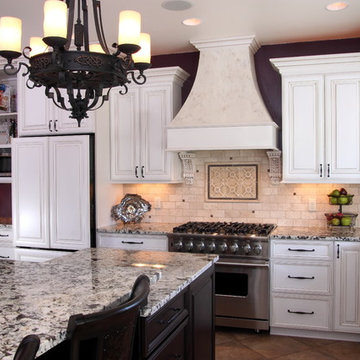
Houzz Kitchen of the Week April 8, 2016. Kitchen renovation for Victorian home north of Boston. Designed by north shore kitchen showroom Heartwood Kitchens. The white kitchen custom cabinetry is from Mouser Cabinetry. Butler's pantry cabinetry in QCCI quarter sawn oak cabinetry. The kitchen includes many furniture like features including a wood mantle hood, open shelving, beadboard and inset cabinetry. Other details include: soapstone counter tops, Jenn-Air appliances, Elkay faucet, antique transfer ware tiles from EBay, pendant lights from Rejuvenation, quarter sawn oak floors, hardware from House of Antique Hardware and the homeowners antique runner. General Contracting: DM Construction. Photo credit: Eric Roth Photography.
Make no mistake: Heidi’s passion was the basis of the project.
Heidi loves to cook. Given a choice, she might live full-time in the kitchen. She revels in creating culinary delights for family and friends. She lives to entertain.
Her kitchen is her castle. It has to be just right. But, it wasn’t.
For starters, she wanted a different stove. Looking around, other things jumped out. This wasn’t the cooking mecca she envisioned. There were better options available. The ball started rolling.
“I needed a bigger island and a bigger stove,” Heidi said. “That led to ‘We need a bigger kitchen.’”
This wasn’t a new revelation. She had been researching kitchens for some time. She didn’t have all the details, but she had a plan.
“My vision was to have it very clean and simple, but I wanted some artistic flair,” she explained.
Our task was to design the kitchen her passion demanded. It needed more countertop space. It needed more storage space. It needed functional elements that were big, bold and suited to the needs of an active, passionate user.
So, first things first. We started with a Viking Professional stove and oven that would make Julia Child proud. “I told Kevin (her husband) it’s coming with us if we move,” Heidi said. The custom stove hood was custom-made on site of wood and dual-color Venetian plaster, with a Ventahood exhaust inside. Two corbels accent its artistic look and feel, hewing to Heidi’s desire to make the kitchen both fully functional and pleasing to the eye.
When working at the deluxe Viking unit, Heidi doesn’t have to go far for pots and pans, either. The new island has three large base drawers built into it directly across from the range. She can literally turn around, take what she needs from the drawers, and go right back to work.
We nearly doubled the cabinet space in the kitchen, offering many more storage and organizational options. The drawers are all soft-close, full-extension design. The doors are soft-close. The upper cabinet above the refrigerator has vertical tray dividers, easing the sometimes arduous task of sorting trays and cookie sheets.
Heidi sought an antique look for her cabinetry. To achieve this, we utilized maple cabinets with a mink wash treatment and ancient bronze hardware. We ordered matching panels for the dishwasher and refrigerator doors, creating a seamless look with the cabinetry.
We maintained visual interest by staggering the heights of the different cabinets. Upper cabinets feature double-stack crown moldings. Some cabinets have rain glass inserts to display decorative items within.
Meanwhile, the entire area was brightened with a plethora of new lighting. Eight recessed lights in the 9-foot ceiling illuminate the counter space. Undercabinet lights brighten any food preparation work. In-cabinet lighting spotlights decorative items within glass-door cabinetry. Above-cabinet lights offer just the right ambiance to complete the scene.
Above the island hang two distinctive, eye-catching chandeliers that definitely set off the kitchen’s mix of antiquity and artistry. Heidi simply would not be denied these fixtures, with their oil-rubbed bronze finish and Renaissance-era feel. “Everybody doubted me on them,” she said. “My kitchen’s not that big. I had to have these big, beautiful, glamorous lights. They make the room extra special.”
The island itself took a bit of doing. Ultimately, we created a two-tier structure that provided invaluable food preparation and staging space, plus a dining area that allowed the owners to get rid of a kitchen table that had fallen out of favor. The 120-inch length of the island allows it to meet these dual needs. The island offers plenty of room for people to gather around during parties, with wide open spaces that offer guests ready access to food and drink. The increased seating space offers Heidi’s family a comfortable dining table, with more than enough room for plates and serving dishes. She bought accompanying chairs that blend with the island’s cherry base and the granite countertop’s multicolored brown hues. Two corbels built into posts on the island base give it a sturdy, dignified look.
Heidi selected the white tumbled travertine subway field tile that makes up the backsplash ringing the main kitchen area. During its installation, she personally directed the placement of floral bronze metal accent pieces scattered into the backsplash. She helped create a six-tile decorative mural insert above the expansive range of her new Viking range.
We put in a farmer’s sink with space galore for food, dishes or whatever Heidi desired. The structure and decorative feet of the sink, plus the mounted corbels above, create a furniture resemblance. “I just love my sink,” she said. “It’s big, it’s nice, and my family just loves it because they can help with the dishes and can easily reach into it.”
Space wasn’t necessarily the final frontier in Heidi’s kitchen, but she definitely wanted more. We removed a wall from a pantry, transforming its small dark space into additional cabinets and counter area. Heidi keeps small appliances on the new counter and prepares her daughters’ lunches there.
The rest of the former pantry was converted into a laundry area and new mudroom. By stacking the washer and dryer in the laundry area, space was freed up next to it to add new storage cabinets and a countertop for laundry sorting.
On the other side of the mudroom, we opened and renovated a previous cramped closet for greater functionality and efficiency. By adding shelving and hanging hooks near the top, and storage drawers at the bottom, the variety and quantity of items it can accommodate was multiplied several times. This allowed the closet space to be narrowed by 18 inches, widening an adjacent hallway to the dining room. The top of the drawers doubles as a bench, further enhancing the area’s usability.
The entire mudroom area can be closed off to the kitchen via a pocket door built into the reworked closet. The door has full-view etched glass, allowing light into the mudroom and visibility from the kitchen.
The flooring in the kitchen and new mudroom – formerly engineered hardwood – was replaced with stonefire noce ceramic tile. Its color was chosen to blend in with the family room carpet, now a true neighbor after we took out a wall between the two rooms.
The remainder of the living room wall was converted into two pillars that were custom-built on site and resemble the posts on the island. Removing the wall was a last-minute call by the owners. After living with the results for just a short time, Heidi called it “the best decision ever.” It’s not hard to see why – both the newly-remodeled kitchen and the family room seem larger, with a smarter and more efficient traffic flow.
Accenting the freshly-opened space is a new sliding patio door whose color matches its casings. Its grid design matches those in nearby windows.
The door casings bear the literal touch of the homeowners, who saved thousands of dollars by painting many parts of the project. Heidi personally painted the walls, window casings, base molding, shoe molding, pocket door and mudroom. She applied many coats of Venetian plaster to the stove range hood to create its soft, velvety look.
We saved the homeowners at least $500 by researching the corbels used in the kitchen. After learning the steep price charged for corbels by the cabinet manufacturer, we found an online catalog that offered them for substantially less. Heidi gladly chose from the catalog, and this decorative touch was added at a great savings.
In addition, we worked to keep the project within budget by providing Heidi with material allowances for the countertops, plumbing fixtures and all tiles. She had no problem working within these parameters – a win-win situation for all concerned.
When all is said and done, the greatest achievement is hearing Heidi talk about the joy her new kitchen has brought her, and how it has benefited her family. “It’s exactly what I wanted,” she said, standing in front of the kitchen and spreading her arms wide to take in the expanse. “My vision is this right here.”
Find the right local pro for your project
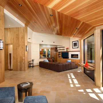
The living area has an open floor plan with kitchen, living area, and entertainment corner. The ceilings are vertical grain Douglas Fir. French Oak is found in the walls and the TV entertainment system shelves. Flooring in this main area of the home is Jerusalem Gold tile. The built in desk nook allows for every day practicals and the built in nooks and shelves allow for art and knick-knacks to be tastefully displayed. The fireplace is a linear fireplace with custom concrete facade and a walnut mantle. There is a live-edge walnut cantilever indoor/outdoor table with sliding glass barn doors on either side that allows access to the outdoor living-cooking area. The tall frosted-glass pivot doors lead to a separate office and a play room, both off the main living area.
The kitchen boasts a custom Spekva counter with waterfall edge. The cabinetry is custom made walnut. There is a breakfast bar with pendant lighting above as well as a kitchen-breakfast nook.
(Photo by: Bernard Andre)
There are so many design elements to this kitchen, I almost don’t know where to start. Bright and airy with crisp clean white cabinets, the kitchen is open and welcoming. Still crisp but gently contrasting, the stainless steel appliance add depth amid the white. To keep this kitchen warm, natural oak covers the floors and a toasted wheat color washes the walls. And then there is the architectural elements. You know. That post and beam in the middle of the room. It’s the center of attention.When you walk into a room your eyes roam around, establishing the size and shape of the room as your feet take you forward. From the front door of this home straight ahead you encountered this wall. The dining area to the right gives you a glimpse of things to come. Where there is a dining room you will usually find a kitchen.
The architecture of years gone by consistently hides the kitchen, the heart of the home, behind walls. I sympathize with my Mom, and all the other Moms, who have had to spend so much time tucked into a tight kitchen, away from the family. This wall had to go, but it was structural. We needed its support but not its bulk.So we got rid of the bulk and only the bulk. Instead of a wall we have a post and beam, offering all of the structure we need. We could have installed a huge steel beam and reconfigure the joists to upset the beam, but why? The small beam and post add an incredible architectural element. It’s turning lemons into lemon, we simply made the most of what we had. It may be functional but it’s so fantastic. It looks like we created the effect just for the drama.
The original kitchen may have had a working triangle and some counter space, but it was fairly small, with each area only a step or two away. The dark cabinets made the space feel even smaller and the butcher block patterned laminate counter tops were very dated. The appliances were feeling their age as well, from a coil burner electric stove to a top freezer refrigerator. To keep this kitchen within its space, a half wall separated it from the dining area.
With the wall gone we borrowed some space from the living room and extended what was a U shaped kitchen into an L. At the living room window we start our new kitchen. We kept a small part of the wall to support the other end of our decorative beam. Sandwiched between a large pantry and our new French door refrigerator, the wall disappears. With our new open floor plan a sizable island was in order.
We split our cooking areas and installed a continuous grill gas cooktop into the island. A sleek island hood takes care of exhaust and adds an extra element to our architectural feature. Under the cooktop we added over-sized drawers for pots and pan storage. The frameless cabinets from New River Cabinetry are maple, painted white, with the Herndon door style. With the cooktop safely nestled into our island, we still had to add an oven.
We used the space where the old range sat for a large single oven of stainless steel and glass. If it worked for one, why not two? We created a home for a microwave in the wall cabinets. It’s perfect for heating leftovers so close to the refrigerator.An important consideration for hot spots in your kitchen is landing zones. Each of our cooking areas have generous landing zones, one on each side of the cooktop and an entire counter area above or below the ovens, depending on which one you’re using.We wanted to give the sink area more room so the half wall had to come out. We moved the trash and recycle cans into a cabinet, removed the heavy soffits and kept the sink under the window.With that little bit of extra space we were able to add a larger cabinet above the dishwasher and slide it all down. This used to be where the carpeting met the vinyl floor, but all of it is gone. Long oak planks eliminate that final divide between the kitchen and the dining area, while adding visual length to the area. White wall cabinets on each side of the window reflect the sunlight for a brighter view.
With all of the darker cabinetry the backsplash walls had been painted white. Even still, there was a darkness in the corners and it wasn’t very exciting. We wanted to add visual interest and reflect the new under-cabinet lighting, eliminating the shadows in this corner.With 1″x 2″ Arabescato Honed marble mosaics and those under-cabinet lights, we achieved the perfect balance. The marble has subtle swirls in gray and beige on a clean white background, but with the honed finish the light is softly reflected instead of glaring. For granite, we chose the soft gray tones of Luna Pearl. The speckles of gray and beige are a gentle contrast to the white cabinets and emulate the color of the stainless steel.Between the carpet, red half wall, dark railing and dated light fixture, the dining area felt tired. Since the kitchen lacked sufficient storage, a large utility cabinet crowded the table space without adding any decorate elements.Although it didn’t get any bigger, our dining area feels fresher and more open too. With the oak flooring joining the area to the rest of our space and the toasted wheat on the walls, the white table and chairs compliment the cabinetry while contrasting the warmer colors. We replaced the chandelier with recessed lighting and changed that railing too.With our new open floor plan, we ended up with a fairly open area in between our foyer closet and the living room window. Not one to miss an opportunity, we filled the space with a multi-functional work space.
With the sunlight streaming in this bright corner works for anything this family needs.
Photo Credit to RJK Construction, Inc.
This project is a Houzz Kitchen of the Week! Click below to read the full story!
https://www.houzz.com/ideabooks/116547325/list/kitchen-of-the-week-better-brighter-and-no-longer-basic
Our clients came to us wanting an elegant and functional kitchen and brighter living room. Their kitchen was dark and inefficient. The cabinets felt cluttered and the storage was there, but not functional for this family. They wanted all new finishes; especially new cabinets, but the floors were going to stay and be refinished. No wall relocation was needed but adding a door into the dining room to block the view from the front into the kitchen was discussed. They wanted to bring in more light somehow and preferably natural light. There was an unused sink in the butler’s pantry that they wanted capped, giving them more space and organized storage was a must! In their living room, they love their fireplace because it reminds her of her home in Colorado, so that definitely had to stay but everything else was left to the designers.
After all decisions were made, this gorgeous kitchen and living space came to life! It is bright, open and airy, just like our clients wanted. Soft White Shiloh cabinetry was installed with a contrasting Cocoa island. Honed Levantina Taj Mahal quartzite was a beautiful countertop for this space. Bedrosians Grace 4”x 12” wall tile in Panna was the backsplash throughout the kitchen. The stove wall is flanked with dark wooden shelves on either side of vent-a-hood creating a feature area to the cook area. A beautiful maple barn door with seeded baroque tempered glass inserts was installed to close off the pantry and giving them more room than a traditional door. The original wainscoting remained in the kitchen and living areas but was modified in the kitchen where the cabinets were slightly extended and painted white throughout. LED tape lighting was installed under the cabinets, LED lighting was also added to the top of the upper glass cabinets, in addition to the grow lights installed for their herbs. All of the light fixtures were updated to a timeless classic look and feel. Imbrie articulating wall sconces were installed over the kitchen window/sink and in the butler’s pantry and aged brass Hood classic globe pendants were hung over the island, really drawing your attention to the kitchen. The Alturas fixture from SeaGull Lighing now hangs in the center of the living room, where there was once an outdated ceiling fan. In the living room, the walls were painted white, while leaving the wood and stone fireplace, as requested, leaving an absolutely amazing contrast!
Design/Remodel by Hatfield Builders & Remodelers | Photography by Versatile Imaging
Reminisce about your favorite beachfront destination and your mind’s eye evokes a serene, comfortable cottage with windows thrown open to catch the air and the relaxing sound of waves nearby. In the shade of the porch, a hammock sways invitingly in the breeze.
The color palette is simple and clean, with hues of white, like sunlight reflecting off sand, and blue-grays, the color of sky and water. Wood surfaces have soft painted finishes or a scrubbed-clean, natural wood look. “Cottage” styling is carefree living, where every element conspires to create a casual environment for comfort and relaxation.
This cottage kitchen features Classic White paint with a Personal Paint Match kitchen island cabinets. These selected soft hues bring in the clean and simplicity of Cottage Style. As for hardware, bin pulls are a popular choice and make working in the kitchen much easier.
Request a FREE Dura Supreme Brochure Packet:
http://www.durasupreme.com/request-brochure
Find a Dura Supreme Showroom near you today:
http://www.durasupreme.com/dealer-locator
Reload the page to not see this specific ad anymore
Interior Design by Martha O'Hara Interiors
Built by Stonewood, LLC
Photography by Troy Thies
Photo Styling by Shannon Gale
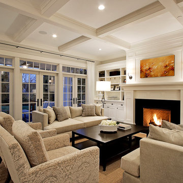
Traditional living room in Minneapolis with feature lighting.
Traditional living room in Minneapolis with feature lighting.
When designing this beautiful kitchen, we knew that our client’s favorite color was blue. Upon entering the home, it was easy to see that great care had been taken to incorporate the color blue throughout. So, when our Designer Sherry knew that our client wanted an island, she jumped at the opportunity to add a pop of color to their kitchen.
Having a kitchen island can be a great opportunity to showcase an accent color that you love or serve as a way to showcase your style and personality. Our client chose a bold saturated blue which draws the eye into the kitchen. Shadow Storm Marble countertops, 3x6 Bianco Polished Marble backsplash and Waypoint Painted Linen floor to ceiling cabinets brighten up the space and add contrast. Arabescato Carrara Herringbone Marble was used to add a design element above the range.
The major renovations performed on this kitchen included:
A peninsula work top and a small island in the middle of the room for the range was removed. A set of double ovens were also removed in order for the range to be moved against the wall to allow the middle of the kitchen to open up for the installment of the large island. Placing the island parallel to the sink, opened up the kitchen to the family room and made it more inviting.
Embrace the essence of cottage living with a bespoke wall unit and bookshelf tailored to your unique space. Handcrafted with care and attention to detail, this renovation project infuses a modern cottage living room with rustic charm and timeless appeal. The custom-built unit offers both practical storage solutions and a focal point for displaying cherished possessions. This thoughtfully designed addition enhances the warmth and character of the space.
This is an example of a contemporary galley open plan kitchen in London with flat-panel cabinets, white cabinets, white splashback, light hardwood flooring and an island.
Expansive classic living room in Seattle with a standard fireplace, no tv, white walls, dark hardwood flooring and feature lighting.
Reload the page to not see this specific ad anymore
Make no mistake: Heidi’s passion was the basis of the project.
Heidi loves to cook. Given a choice, she might live full-time in the kitchen. She revels in creating culinary delights for family and friends. She lives to entertain.
Her kitchen is her castle. It has to be just right. But, it wasn’t.
For starters, she wanted a different stove. Looking around, other things jumped out. This wasn’t the cooking mecca she envisioned. There were better options available. The ball started rolling.
“I needed a bigger island and a bigger stove,” Heidi said. “That led to ‘We need a bigger kitchen.’”
This wasn’t a new revelation. She had been researching kitchens for some time. She didn’t have all the details, but she had a plan.
“My vision was to have it very clean and simple, but I wanted some artistic flair,” she explained.
Our task was to design the kitchen her passion demanded. It needed more countertop space. It needed more storage space. It needed functional elements that were big, bold and suited to the needs of an active, passionate user.
So, first things first. We started with a Viking Professional stove and oven that would make Julia Child proud. “I told Kevin (her husband) it’s coming with us if we move,” Heidi said. The custom stove hood was custom-made on site of wood and dual-color Venetian plaster, with a Ventahood exhaust inside. Two corbels accent its artistic look and feel, hewing to Heidi’s desire to make the kitchen both fully functional and pleasing to the eye.
When working at the deluxe Viking unit, Heidi doesn’t have to go far for pots and pans, either. The new island has three large base drawers built into it directly across from the range. She can literally turn around, take what she needs from the drawers, and go right back to work.
We nearly doubled the cabinet space in the kitchen, offering many more storage and organizational options. The drawers are all soft-close, full-extension design. The doors are soft-close. The upper cabinet above the refrigerator has vertical tray dividers, easing the sometimes arduous task of sorting trays and cookie sheets.
Heidi sought an antique look for her cabinetry. To achieve this, we utilized maple cabinets with a mink wash treatment and ancient bronze hardware. We ordered matching panels for the dishwasher and refrigerator doors, creating a seamless look with the cabinetry.
We maintained visual interest by staggering the heights of the different cabinets. Upper cabinets feature double-stack crown moldings. Some cabinets have rain glass inserts to display decorative items within.
Meanwhile, the entire area was brightened with a plethora of new lighting. Eight recessed lights in the 9-foot ceiling illuminate the counter space. Undercabinet lights brighten any food preparation work. In-cabinet lighting spotlights decorative items within glass-door cabinetry. Above-cabinet lights offer just the right ambiance to complete the scene.
Above the island hang two distinctive, eye-catching chandeliers that definitely set off the kitchen’s mix of antiquity and artistry. Heidi simply would not be denied these fixtures, with their oil-rubbed bronze finish and Renaissance-era feel. “Everybody doubted me on them,” she said. “My kitchen’s not that big. I had to have these big, beautiful, glamorous lights. They make the room extra special.”
The island itself took a bit of doing. Ultimately, we created a two-tier structure that provided invaluable food preparation and staging space, plus a dining area that allowed the owners to get rid of a kitchen table that had fallen out of favor. The 120-inch length of the island allows it to meet these dual needs. The island offers plenty of room for people to gather around during parties, with wide open spaces that offer guests ready access to food and drink. The increased seating space offers Heidi’s family a comfortable dining table, with more than enough room for plates and serving dishes. She bought accompanying chairs that blend with the island’s cherry base and the granite countertop’s multicolored brown hues. Two corbels built into posts on the island base give it a sturdy, dignified look.
Heidi selected the white tumbled travertine subway field tile that makes up the backsplash ringing the main kitchen area. During its installation, she personally directed the placement of floral bronze metal accent pieces scattered into the backsplash. She helped create a six-tile decorative mural insert above the expansive range of her new Viking range.
We put in a farmer’s sink with space galore for food, dishes or whatever Heidi desired. The structure and decorative feet of the sink, plus the mounted corbels above, create a furniture resemblance. “I just love my sink,” she said. “It’s big, it’s nice, and my family just loves it because they can help with the dishes and can easily reach into it.”
Space wasn’t necessarily the final frontier in Heidi’s kitchen, but she definitely wanted more. We removed a wall from a pantry, transforming its small dark space into additional cabinets and counter area. Heidi keeps small appliances on the new counter and prepares her daughters’ lunches there.
The rest of the former pantry was converted into a laundry area and new mudroom. By stacking the washer and dryer in the laundry area, space was freed up next to it to add new storage cabinets and a countertop for laundry sorting.
On the other side of the mudroom, we opened and renovated a previous cramped closet for greater functionality and efficiency. By adding shelving and hanging hooks near the top, and storage drawers at the bottom, the variety and quantity of items it can accommodate was multiplied several times. This allowed the closet space to be narrowed by 18 inches, widening an adjacent hallway to the dining room. The top of the drawers doubles as a bench, further enhancing the area’s usability.
The entire mudroom area can be closed off to the kitchen via a pocket door built into the reworked closet. The door has full-view etched glass, allowing light into the mudroom and visibility from the kitchen.
The flooring in the kitchen and new mudroom – formerly engineered hardwood – was replaced with stonefire noce ceramic tile. Its color was chosen to blend in with the family room carpet, now a true neighbor after we took out a wall between the two rooms.
The remainder of the living room wall was converted into two pillars that were custom-built on site and resemble the posts on the island. Removing the wall was a last-minute call by the owners. After living with the results for just a short time, Heidi called it “the best decision ever.” It’s not hard to see why – both the newly-remodeled kitchen and the family room seem larger, with a smarter and more efficient traffic flow.
Accenting the freshly-opened space is a new sliding patio door whose color matches its casings. Its grid design matches those in nearby windows.
The door casings bear the literal touch of the homeowners, who saved thousands of dollars by painting many parts of the project. Heidi personally painted the walls, window casings, base molding, shoe molding, pocket door and mudroom. She applied many coats of Venetian plaster to the stove range hood to create its soft, velvety look.
We saved the homeowners at least $500 by researching the corbels used in the kitchen. After learning the steep price charged for corbels by the cabinet manufacturer, we found an online catalog that offered them for substantially less. Heidi gladly chose from the catalog, and this decorative touch was added at a great savings.
In addition, we worked to keep the project within budget by providing Heidi with material allowances for the countertops, plumbing fixtures and all tiles. She had no problem working within these parameters – a win-win situation for all concerned.
When all is said and done, the greatest achievement is hearing Heidi talk about the joy her new kitchen has brought her, and how it has benefited her family. “It’s exactly what I wanted,” she said, standing in front of the kitchen and spreading her arms wide to take in the expanse. “My vision is this right here.”
Free ebook, Creating the Ideal Kitchen. DOWNLOAD NOW
The Klimala’s and their three kids are no strangers to moving, this being their fifth house in the same town over the 20-year period they have lived there. “It must be the 7-year itch, because every seven years, we seem to find ourselves antsy for a new project or a new environment. I think part of it is being a designer, I see my own taste evolve and I want my environment to reflect that. Having easy access to wonderful tradesmen and a knowledge of the process makes it that much easier”.
This time, Klimala’s fell in love with a somewhat unlikely candidate. The 1950’s ranch turned cape cod was a bit of a mutt, but it’s location 5 minutes from their design studio and backing up to the high school where their kids can roll out of bed and walk to school, coupled with the charm of its location on a private road and lush landscaping made it an appealing choice for them.
“The bones of the house were really charming. It was typical 1,500 square foot ranch that at some point someone added a second floor to. Its sloped roofline and dormered bedrooms gave it some charm.” With the help of architect Maureen McHugh, Klimala’s gutted and reworked the layout to make the house work for them. An open concept kitchen and dining room allows for more frequent casual family dinners and dinner parties that linger. A dingy 3-season room off the back of the original house was insulated, given a vaulted ceiling with skylights and now opens up to the kitchen. This room now houses an 8’ raw edge white oak dining table and functions as an informal dining room. “One of the challenges with these mid-century homes is the 8’ ceilings. I had to have at least one room that had a higher ceiling so that’s how we did it” states Klimala.
The kitchen features a 10’ island which houses a 5’0” Galley Sink. The Galley features two faucets, and double tiered rail system to which accessories such as cutting boards and stainless steel bowls can be added for ease of cooking. Across from the large sink is an induction cooktop. “My two teen daughters and I enjoy cooking, and the Galley and induction cooktop make it so easy.” A wall of tall cabinets features a full size refrigerator, freezer, double oven and built in coffeemaker. The area on the opposite end of the kitchen features a pantry with mirrored glass doors and a beverage center below.
The rest of the first floor features an entry way, a living room with views to the front yard’s lush landscaping, a family room where the family hangs out to watch TV, a back entry from the garage with a laundry room and mudroom area, one of the home’s four bedrooms and a full bath. There is a double sided fireplace between the family room and living room. The home features pops of color from the living room’s peach grass cloth to purple painted wall in the family room. “I’m definitely a traditionalist at heart but because of the home’s Midcentury roots, I wanted to incorporate some of those elements into the furniture, lighting and accessories which also ended up being really fun. We are not formal people so I wanted a house that my kids would enjoy, have their friends over and feel comfortable.”
The second floor houses the master bedroom suite, two of the kids’ bedrooms and a back room nicknamed “the library” because it has turned into a quiet get away area where the girls can study or take a break from the rest of the family. The area was originally unfinished attic, and because the home was short on closet space, this Jack and Jill area off the girls’ bedrooms houses two large walk-in closets and a small sitting area with a makeup vanity. “The girls really wanted to keep the exposed brick of the fireplace that runs up the through the space, so that’s what we did, and I think they feel like they are in their own little loft space in the city when they are up there” says Klimala.
Designed by: Susan Klimala, CKD, CBD
Photography by: Carlos Vergara
For more information on kitchen and bath design ideas go to: www.kitchenstudio-ge.com
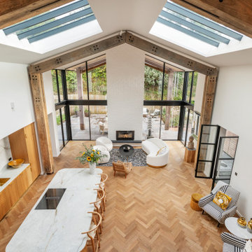
View from the mezzanine floor onto the large open plan living room and kitchen
This is an example of a farmhouse living room in Devon.
This is an example of a farmhouse living room in Devon.
Our clients were living in a Northwood Hills home in Dallas that was built in 1968. Some updates had been done but none really to the main living areas in the front of the house. They love to entertain and do so frequently but the layout of their house wasn’t very functional. There was a galley kitchen, which was mostly shut off to the rest of the home. They were not using the formal living and dining room in front of your house, so they wanted to see how this space could be better utilized. They wanted to create a more open and updated kitchen space that fits their lifestyle. One idea was to turn part of this space into an office, utilizing the bay window with the view out of the front of the house. Storage was also a necessity, as they entertain often and need space for storing those items they use for entertaining. They would also like to incorporate a wet bar somewhere!
We demoed the brick and paneling from all of the existing walls and put up drywall. The openings on either side of the fireplace and through the entryway were widened and the kitchen was completely opened up. The fireplace surround is changed to a modern Emser Esplanade Trail tile, versus the chunky rock it was previously. The ceiling was raised and leveled out and the beams were removed throughout the entire area. Beautiful Olympus quartzite countertops were installed throughout the kitchen and butler’s pantry with white Chandler cabinets and Grace 4”x12” Bianco tile backsplash. A large two level island with bar seating for guests was built to create a little separation between the kitchen and dining room. Contrasting black Chandler cabinets were used for the island, as well as for the bar area, all with the same 6” Emtek Alexander pulls. A Blanco low divide metallic gray kitchen sink was placed in the center of the island with a Kohler Bellera kitchen faucet in vibrant stainless. To finish off the look three Iconic Classic Globe Small Pendants in Antiqued Nickel pendant lights were hung above the island. Black Supreme granite countertops with a cool leathered finish were installed in the wet bar, The backsplash is Choice Fawn gloss 4x12” tile, which created a little different look than in the kitchen. A hammered copper Hayden square sink was installed in the bar, giving it that cool bar feel with the black Chandler cabinets. Off the kitchen was a laundry room and powder bath that were also updated. They wanted to have a little fun with these spaces, so the clients chose a geometric black and white Bella Mori 9x9” porcelain tile. Coordinating black and white polka dot wallpaper was installed in the laundry room and a fun floral black and white wallpaper in the powder bath. A dark bronze Metal Mirror with a shelf was installed above the porcelain pedestal sink with simple floating black shelves for storage.
Their butlers pantry, the added storage space, and the overall functionality has made entertaining so much easier and keeps unwanted things out of sight, whether the guests are sitting at the island or at the wet bar! The clients absolutely love their new space and the way in which has transformed their lives and really love entertaining even more now!
Search results for Small Open Plan Kitchen And Living Room in Home Photos
Reload the page to not see this specific ad anymore
Creating an open concept living area.
Large classic open plan games room in Detroit with a standard fireplace, grey walls, light hardwood flooring and beige floors.
Large classic open plan games room in Detroit with a standard fireplace, grey walls, light hardwood flooring and beige floors.
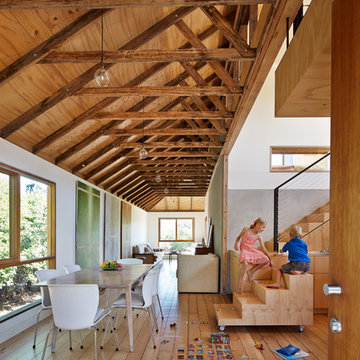
Internal view of living room, dining room and kitchen.
Design: Andrew Simpson Architects in collaboration with Charles Anderson
Project Team: Andrew Simpson, Michael Barraclough, Emma Parkinson
Completed: 2013
Photography: Peter Bennetts
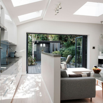
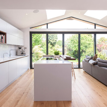
Galley kitchen in open plan extension, looking out onto garden.
Inspiration for a medium sized contemporary open plan living room in London with grey walls, bamboo flooring, a two-sided fireplace and white floors.
Inspiration for a medium sized contemporary open plan living room in London with grey walls, bamboo flooring, a two-sided fireplace and white floors.
41