lokilo

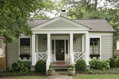
Help with exterior paint scheme of architectural design elements

Laura
11 years ago
Finally close to painting "some" of the exterior trim. I'm on a massive budget and doing everything myself, so many things are staying as is (windows white; aluminum siding pale pink sand). But I've been scratching my head trying to figure out the scheme for the architectural details, especially around the bay window, door, finials, brackets, panels, etc. Darker red for the brick foundation, and repeated somewhere as a thin band. Bluish grey for the porch floor, and also repeated somewhere with the details. Any thoughts on how to go about doing this? Good sites, sources, references? I've been collecting images of exterior paint trim schemes online and hunting down houses in my town. Even have an old pic to help. I have some hunches, but any help and design advice much appreciated! Thanks.

Comments (43)

  • edvh
    11 years ago
    have you ever checked out http://www.historichousecolors.com/ ? he's expensive and i know you're on a budget, but this site could give you some great ideas at least. good luck. your home has great architecture that would really pop with the right colors!
  • Laura
    Original Author
    11 years ago
    I had stumbled on to this page eons ago (well, 4 years ago), but other projects took over. With a basic color palette already in mind, it might in fact be affordable. Great pics on that site too! Thanks!!
  • Related Discussions

    Exterior paint colours

    Q

    Comments (89)
    Hi Minnie I'm good thanks. Sounds like we need to form a George Clarke fan club! I've stalked him on Twitter for years :) Minnie was in John Lewis earlier and had a gander at the Little Greene colour chip board and have to say Silt looked fabulous with the Purple Brown you like, it's looks fairly dark compared to other colours you've mentioned (and maybe a wildcard offering) but might work for exterior. Also had a little play with the Johnstones visualiser thingy on their website and very straightforward, I've never had any joy with the Dulux one.
    ...See More

    Help with exterior paint colour

    Q

    Comments (13)
    Love the green. I had a similar era house but this one is was in Australia. If it's not too dissimilar, I found in my research they loved to paint up the details. And the colour schemes had up to 4 colours. I'd find that the windows would be a different colour than the window frames and so on. I don't think anyone needs to follow the original schemes but often they can look great on these houses. Anyways, that traditional dark warm cream, heading towards brown that they loved might be nice for render or timbers. Some thing like York White or Bathstone Beige by Dulux. And a limed white for the other trims. https://www.designerpaint.com/products/dulux-heritage/bathstone-beige/61614
    ...See More

    Victorian Townhouse, Highgate - LLI Design

    Q

    Comments (12)
    Very smart transformation. Only thing I don't think is the logs which would gather dust and spiders! Rest is fabulous
    ...See More

    Edwardian Semi - Exterior Help!

    Q

    Comments (27)
    People asking about me? Oh wow, I really integrated here, have I? And thanks Carolina. The pity me is wearing off though, baby steps onward and upward. ;) But yes it was a sad year, for everyone really, I simply got the chronical physical part too. Almost there, yet still not at work (and will need to look for new adventures once fully back on my feet).
    ...See More
  • houssaon
    11 years ago
    last modified: 11 years ago
    Wow what a cute house with lots of character! Lucky you.

    I'd paint the porch floor blue grey, but I wouldn't use it elsewhere. Paint the porch roof a light blue - It is such a happy feeling to sit on a porch with a blue ceiling.

    For your pale blush pink, I would use three colors. For the screen door and the window sashes I'd painted them Sea Star 2123-30 from Benjamin Moore.

    For the trim around the windows, the fence, the railing and the moulding, I'd paint them Ivory Tusk 2153-70

    For all the fascia surfaces, the base of the bay window, and the foundation I'd paint them Silhouette AF-655. I think your front door is wood stained. If it isn't then paint that Sea Star.

    I noticed the wood railing in the old picture. Would you be up to replacing the current railing with a Chippendale style one? See this photo:
    Modern Bungalow · More Info


    It is a shame that the electrical has to come into your smack in the middle of the front. Can the electric company move it to the side? If they say it will be too low, what do they do with one story homes?
  • Laura
    Original Author
    11 years ago
    last modified: 11 years ago
    Wow! this is SO helpful!! Thanks so much. I was thinking too of painting the ceiling light blue. Unfortunately, yes, I have to live with the electrical stuff there. The wisteria is in front, but alas here in the NE, only grows lush late May-Sept. I've thought of planting an evergreen there as well. Also thought of painting the metal pipe the runs along the front with the same blush/pink and make it disappear, a bit. As to the fence, yes, that fence/deck *needs* to be replaced, so I'll keep your suggestion in mind!
  • scoutmom12
    11 years ago
    I really like the red one above if you can change everything, but it sounds like you need to do it in stages. We're in the same boat. Sherwin Williams (and probably others too - looks like Ben Moore must have from other comments) has a great tool on their website where you can upload your photo, mask out specific areas and try out hundreds of color choices. I would play around with that, using some of the color ideas you have already collected. The SW online tools also suggests coordinating color palettes based on the choices you make. You have a super cute house!
  • PRO
    Garden Inspire
    11 years ago
    Check out http://www.behr.com/Behr/home under "find your color" use "Paint your place virtually"
  • portpiro
    11 years ago
    I quite like that reddish hue on the brick foundation. The easiest pick me up for the house would be to repeat that colour on the handrail of the verandah and on the fascia boards over the windows and on the gable. The brackets, balustrading, the timber the brackets are attached to above the window and that latticey thing over the verandah in a neutral stone colour. Not too much work and would give it punch and show off the architectural detail. (I'm using Australian terms here so hope they translate!)
  • Laura
    Original Author
    11 years ago
    Thanks all for these great comments! Australian translates perfectly!! I do like how the details pop in restamps' red house; subtle but effective. (Also love the red stained glass in the multi-light windows; I have a pack of those down the side of my house... hm... more projects!!). I like repeating the foundation color on the handrail and fascia boards. I had picked light greyish blue for that third color to repeat the deck color, but maybe sand/stone color instead... I'm going to do some virtual painting, and think also of that sand/stone neutral color.
  • cluny
    11 years ago
    I love this house! Is there any chance that you could show us the inside - even if you haven't gotten it decorated yet, I would love to see the floorplan and any elements inside the house.
  • Laura
    Original Author
    11 years ago
    will do, even if this means making public my failed design decisions, and the still "work in progress" atmosphere of the house... check back soon...
  • PRO
    PaintColorHelp.com Dallas
    11 years ago
    I'm not going to get into specifics of what to put where, too hard to advise long-distance from a photo. But in general, some colors that would pair well with the light pink include:
    charcoal gray, navy, chocolate brown as neutrals; and as pastels or bolder depths of colors, you can use yellow, Majolica green, kelly green, grass green, aqua, dusty lavender, or plum. If you going for hysterical rather than historical ; ) , you could even consider various shades of deeper pink and pops of orange. Just remember, the brighter the color, the more sparingly I would apply it. A front door, a tiny sliver of trim.
  • Heidi Turner
    11 years ago
    5 colors is the magic number - one strictly for your door - and 4 others in 2 shade tones (greens/beige, blue/grey, etc) make magic instantly - if you can find 5 colors you love that work together you won't ever go wrong. The mistake most people make is stopping at 3 - and it never works as well as 5.
  • Laura
    Original Author
    11 years ago
    Wow! This is all very helpful. Thank you so much. (And I've been busy today but will post pics shortly.)
  • Laura
    Original Author
    11 years ago
    last modified: 11 years ago
    Whew! Pics of my house: done. There are lots of little rooms, hence lots of pics. I've posted them in this ideabook. http://www.houzz.com/ideabooks/2470495
    House is still a "work in progress..." the projects never end!
  • Grace Pugh
    11 years ago
    We are renovating our exterior (house very similar to yours built between 1901 - 1905 - pic attached). We are going half & half: stone veneer called Rivendale from Stone Selex & stucco - maybe BM Rockport Grey or Sandy Hook Grey or Chelsea Grey if I can convince my hubby. For the trims and porch pillars and all others: BM Simply White and an existing Black door. Also please try www.Pinterest.com for inspiration (my go to website - love it)
  • PRO
    Chroma Design
    11 years ago
    Don't feel compelled to use your foundation color elsewhere as an accent on the trim. These may be independent. This will allow you to have a darker, neutral foundation to help make it go away and select the right accent color that goes with your siding that you intend to keep its existing color.
    Pretty much the same for the porch decking because of its small size. But the porch decking does easily lend itself to be used as an accent somewhere else. Your call on that one. Btw, great house!
  • Grace Pugh
    11 years ago
    Thanks Chroma Design. I truly need a designer's perspective. So here it goes...the siding/black awning/black shutters are coming down this week to be replaced by stone half way up and wrap around by about 2 feet on the sides and the rest will be re-stucco'd and there will be a transition band between the stone and stucco. We are building a new front porch 10x8 with copper roof overhang and a new stone landing in the front is being built. Do you have a colour suggestion. Here's what I have in the inside of the house (top to bottom gutted & reno'd) Love grey tones as you will see. Inside colours: BM: Nantucket Grey (family room), Sag Harbour Grey (library/computer), Revere Pewter/Raindance (kitchen/dining), Boothbay Grey & Grey Wisp (kids' rooms)/Coventry Grey (attic)/Rockport Grey (ensuite)/Sandy Hook (master)/Grey Horse (basement). Please share your colour idea for my exterior.
  • PRO
    Chroma Design
    11 years ago
    I couldnt quickly find rivendale on the website and I'm running out the door for the day. But I would say because you are doing the stone only 2 feet up, your stucco color should be equal to or slightly greater than the stone in value.

    Perhaps you should start your own question thread on this, you may get more responses.
  • bluefoot
    11 years ago
    Looks like you already have enough ideas from this thread -- but you might want to look for the book, "Rehab Right." Not sure if it's been updated, but hubs & I used that as a starting point for all our old-house rehabs from the late 80s thru the 00s. For starters, it'll show you what sort of architectural style you have, & what the traditional exterior color strategies are for each style.
  • elcieg
    11 years ago
  • Grace Pugh
    11 years ago
    thanks all for your great input. Judy, you are right, this is a beautiful house. I have it pinned on my pinterest pin board. Thanks again
  • einkatz
    11 years ago
    I would highly recommend you contact the "Color People" www.colorpeople.com and get them to help you. Although you may be on a budget, the exterior of your house makes an enormous statement about you and the "face" you present to the world, as well as it being your contribution to the neighborhood. To pay for their recommendations on both colors and the location of the colors is a very small portion of the amount of money and work you are going to put into the painting of your building exterior. The level of their expertise is the best I've seen, they will make your house look like it was professionally painted, and will save you money and work in the long run. I'm a designer, live in Denver where the Color People have their offices, and thus am very familiar with their work as there are examples all over town. Once you know their work, you can easily recognize it as it stands head and shoulders above other color consultants. Your house is charming and deserves the right colors and composition. Good luck and hats off to you for taking on this huge job!
  • Grace Pugh
    11 years ago
    Thanks again for your great advice. I agree with you, I have to live with my choice for years to come. I am going to seek advice from my local designers in Toronto, Canada and I am working with a pretty reputable contractor who just finished my interior reno. He'll be working on the outside. Here are some pics of his work inside my house. He did a great job, now I just need to match the exterior to the inside. Thanks again for your kind words and advice.
  • Laura
    Original Author
    11 years ago
    chromadesign: wasn't sure to whom you were responding earlier, but your comment about foundation color had me looking at foundation colors on houses all day! Especially in winter, that brick foundation just yells through the snow. I like the idea of making the foundation "go away." (I know, a few evergreen shrubs will help.) You suggested dark neutral colors. Were you thinking of how users houssaon and rstamp (pics above) have their foundation in sort of muted browns? hmmmm food for thought, definitely!

    sailnmufin: thanks for the book recommendation. A few years ago I tried looking for a good book on this topic but didn't get far. This is very helpful.

    einkatz: Thanks for the advice on the color people. You make a very good point. Will check them out too. I'm still on the fence with colors, especially with the recommendations and food for thought I've received on this post. Invaluable.

    candecorate: good luck with all your exterior renovations!
  • Grace Pugh
    11 years ago
    lokilo, I was pretty sure I can do this on my own but I may just go with a local colorist or Ben Moore colour consultant. Good luck with your reno too. Post some pictures when you are done.
  • PRO
    Chroma Design
    11 years ago
    Sorry, I was't clear about who I was addressing.

    Lokilo, yes, my first post was to you. Your foundation color could be only used on the foundation. This allows you to select a dark neutral to minimize it's appearance. Then you're free to select trim colors that work with the body. Yes, houssaon and rstamp provided good examples of that. I felt the same way about your porch decking. It too may be unique to any other color, but the porch deck color could be used in your overall scheme. As you noted, landscaping will further soften the foundation.

    My second post was to candecorate. I couldn't find the stone you mentioned on the Stone Selex website. So, I was unable to suggest a color. Rather, general advise about the value of the body color. Something that was equal to or slightly greater than in value. I thought this was best for a front with half stone and sides that has stone only 2 feet up. It was to candecorate that I suggested a new posting. Also, candecorate, I didn't understand what you meant by a "transition band" between the stone and stucco. Really, start a new thread for your home and include a pic of the stone you will use.
  • Grace Pugh
    11 years ago
    Lokilo, I apologize for butting in on your thread, didn't mean to, but I did get some great advice - Thanks again

    Chroma Design, here are the websites if you want to peruse & have fun. I'll check you out on Pinterest.com if you are on it.- cheers.

    1. 'Rivendale': http://www.stoneselex.com/Natural-Stone-Veneer
    2. Transition Band or mid band: http://www.mouldexmouldings.com/mouldings/crown-moudlings.html?view=onepagedirectory&cat_id=3&prod_id=47
  • PRO
    Chroma Design
    11 years ago
    Candecorate- thanks for putting the links to your building products. I understand the midband! Will be very elegant. So is the inside of your home. Beautiful job. O to your stone... The rivendale looks great, and it makes sense you chose it based on your photos. The pic on the website is a brochure photo, so the real stone may have different subtleties in person. So take this recommendation lightly. Either AC-25 harbor gray or AC-26 ozark shadows.
  • Grace Pugh
    11 years ago
    Chroma Design, you have been wonderful and very generous with your advice. Both AC 25 & 26 are great colours, love them both. I'll get my stucco guy to paint out samples on larger stucco chips to see the true colours against the stone in real, also given the fact my house is North facing. The final call will be when the stones are up on the wall, porch is built btw...porch roof will be standing seams metal roof in matte black, I will post pics when I'm done. Please do sign up on www.pinterest.com. You will find many designers like yourself on it. Great place for design inspiration & idea exchange :)
  • PRO
    Chroma Design
    11 years ago
    Yes, paint samples are a crucial step! I love that your metal roof is matte black. Its great how you're putting this all together. Thank you for your kind words. I'm glad to offer advise, I hope it is helpful to you in the end. Please post pics of the final result!
  • nhgranny
    11 years ago
    All fabulous ideas, you guys are so talented!! I love the red house!
  • Grace Pugh
    11 years ago
    last modified: 11 years ago
    Hi Chroma Design, our exterior project is finally done. I now have pics to post as a result of ideas picked up from these postings directly or indirectly. Thanks Chroma for your design perspectives, it was a great validation to what I had envisioned. Colours - Stucco: Gray Cloud (Senergy); Porch Roof: Standing Seam Metal in mat Commercial Brown; Trims/Sills/Pillars: BM OC-38 Acadia White; Soffit & Facia: Linen White & Eavetroughs: Slate (Gentek) & of course Stone veneer (Rivendale from Stone Selex)
  • PRO
    Chroma Design
    11 years ago
    Candecorate, WOW that is fantastic! It is a stunning and sophisticated transformation. Well done. Thank you for posting finished pictures. It is a treat to see the final product! I'm glad you found Houzz useful on your design journey. Yes, both directly and indirectly, there is much valuable info to be had here. But give yourself a huge pat on the back as this was your vision all along! I see you pictures of your home in your projects folder, I'm sure it will inspire many people. I wish you countless, happy years in your home.
  • Grace Pugh
    11 years ago
    Thanks Chroma. It has been a long journey and our family is finally enjoying our home without the chaos of reno. Wish you all the success in your design world.
  • Sandy Cadieux_Cronn
    11 years ago
    what a beautiful pink house with the white picket fence! I painted my 1890 beauty about 8 years ago, and I went with 7 colors plus the white gingerbread......3 shades of periwinkle for the shingles on second story, grey on main, the window treatment was curry spice and pistachio(lime green) and a thin line of a ollive green. Fun fun fun to have your house be the popper of the street. Good luck
  • Laura
    Original Author
    11 years ago
    Thanks Sandy! I've been doing lots of work on the house: stripped the peeling paint on the brick, put in evergreens in front of the foundation, hardscaped (can't see in this pic, but fixed the patio just behind the picket fence), repaired and stained the decks (a nice grey color), painted the porch ceiling a nice light blue as someone suggested in this thread (it looks amazing), and am now playing with contrasting colors for the trim on the bay window and around the front door. I would love to see pics of your house!
  • Sandy Cadieux_Cronn
    11 years ago
    If I can figure out how to send a pic I will ha! I can from my phone to you?
  • hmarney
    9 years ago
    Hi Laura,
    One combo that always works is:
    Benjamin Moore (all):
    Ranchwood, with windows highlighted in white chamois (creamy white) rest of trim black bean soup, front door is Sundried tomato!
    It is a great, warm combo.
    Oh window boxes in black bean soup as well.
    Good luck.
  • PRO
    JudyG Designs
    9 years ago

    This post is from 2012!


  • decoenthusiaste
    9 years ago

    Four year old dead thread!


  • hmarney
    9 years ago
    Ooo ops!!
United Kingdom
Tailor my experience with cookies

Houzz uses cookies and similar technologies to personalise my experience, serve me relevant content, and improve Houzz products and services. By clicking ‘Accept’ I agree to this, as further described in the Houzz Cookie Policy. I can reject non-essential cookies by clicking ‘Manage Preferences’.