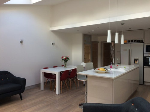
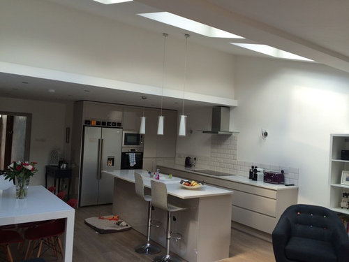
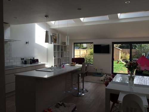
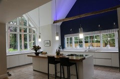
New kitchen - what's missing?
Kerry McGreavy
8 years ago

Featured Answer
Sort by:Oldest
Comments (18)

minnie101
8 years agotemple274
8 years agoRelated Discussions
What's missing from this room?
Comments (16)I think you're in danger of mixing warm colours (wooden tones of a table, brown leather and beige walls) with cool colours (curtains with grey in them, purple rug). Those cushions in the photo above are gorgeous - but they are all blue-undertones (therefore cool) colours so I think they'd be compounding the problem. Room needs a lift so I'd go with a cream rug, with a pattern on it. Rich texture on it (no shoes in your sitting room from now on!) and big enough for the chair and the sofa to sit on it (ideally, all on it - yep, that big) completely. At the very least - to have the front legs of sofa and chair on it. Size adds richness and cohesion - I thought of this "Diamond Shaggy Rug" from M&S - http://www.marksandspencer.com/diamond-shaggy-rug/p/p22329608 Also - that blank wall where a fireplace used to be. the room has no welcoming focal point - could you at least fit a fire surround and knock into the chimney to create a hole for flowers, stacked logs or the like? Alternatively - put a small console table there with some slim lights on it and some decorative items - not too many. Plus a great picture or photo above it. Lighting looks sparse (i.e. non overhead lights). Can you manage a slim side table next to the left (as you look at it) side of the chair? Agree about smaller coffee table. Hope that sparks some ideas but I think you're biggest wins would be a large, large textured cream rug and some kind of focal point on chimney breast. Oops one final point which you MUST do: the chimney breast has no air vent in it - this is against Building Regs and must be inserted as a safety measure and to ensure you don't get damp. If you do nothing else, get that done ASAP. Regards Denise...See MoreWhat's missing in this kitchen?
Comments (21)I don't think colour is the issue, it's tone that is lacking. Convert the image to black and white and it will look a bit insipid. The bank of cupboards where the fridge is would have benefited form being a dark colour, the pendants are nice but need to be much lower and the wall cupboards look a little high with gaps. I actually think the rug works well and would add more things with character. The splash back would have been more dramatic if perhaps teal tiles were used instead of glass....See MoreDoes this kitchen look like it's missing an island
Comments (26)It's quite hard to tell if an island would fit widthways as it's hard to get a perspective where the supporting column is to the left of the kitchen unless you had a really short one. It also doesn't look as if one could run the other way as I'm not sure you could swing the table around and the benches in the living area appear to be built in so you may be limited on a reshuffle? I'm not sure if you're tiling behind the hob but wonder if you'd consider putting a runner in front of the oven? Lovely room btw...See MoreKitchen/dining upgrade - Am I missing something?
Comments (1)If you moved the proposed storage built in to the wall between the lounge and the dining room it would keep the room square allowing for the table and chairs to be aligned in both directions. Would work particularly well with a circular table. Also you could have floor to ceiling cupboards with glass doors at the top and solid at the bottom to hide the less lovely items. Narrow cupboards at 30 - 40 cm depth with lights could work well....See More PRO
PROSurreal Designs Kitchen Studio
8 years ago PRO
PROZoe Glencross Fabric & Home
8 years agoStella Pullar-Strecker
8 years ago
Sal Pigott
8 years agoSal Pigott
8 years ago
Mike Phillips
8 years agoAMB
8 years ago PRO
PRO
Kerry McGreavy
8 years ago
E D
8 years agojustina
8 years agoMike Phillips
7 years agoAMB
7 years agoAMB
7 years agoAMB
7 years ago


Lynsey Jane Designs