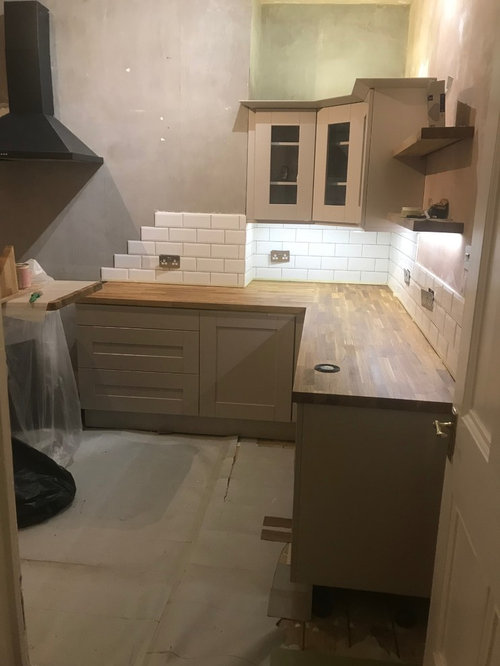
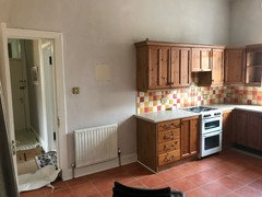
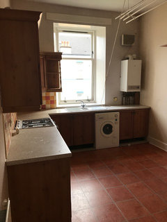
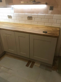
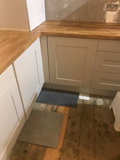
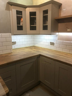
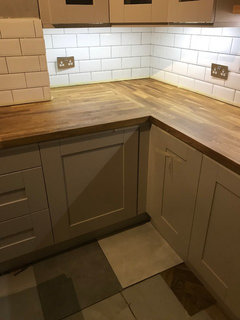
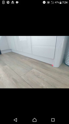
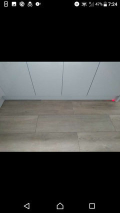
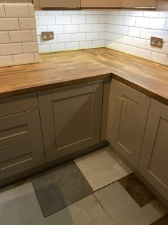
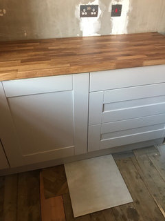
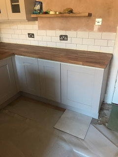
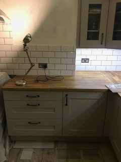
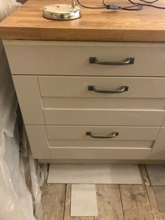
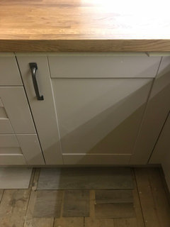
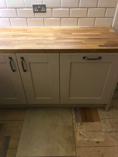
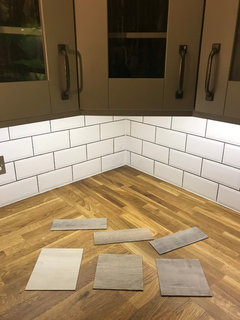
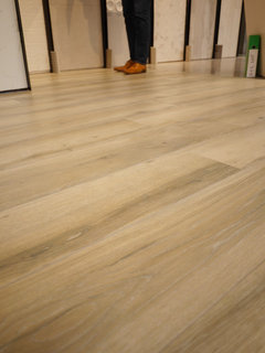
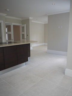
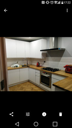
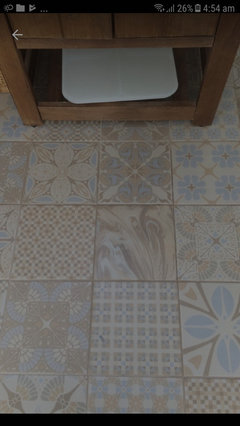
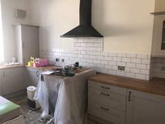
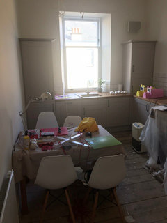
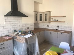
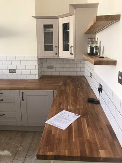
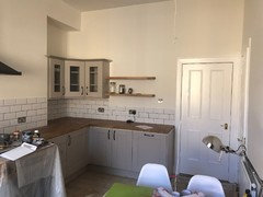
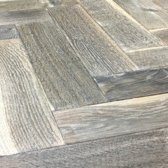
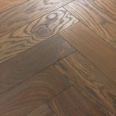
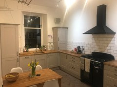
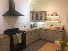
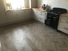
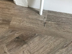
Floor for kitchen with cashmere units and oak worktops
Ben
6 years ago
last modified: 6 years ago


Featured Answer
Sort by:Oldest
Comments (31)

Ben
6 years agoBen
6 years agoRelated Discussions
What Colour Kitchen Tiles with White Shaker Units and Walnut worktops?
Comments (1)Hi, we are having White Gloss Shaker cabinets fitted shortly, we have an oak solid wood worktop and have just laid coffee oak solid wood flooring. Thanks...See Morei need to decide on a worktop for cashmere gloss kitchen help please
Comments (3)White. Honed/leather/satin. What style is the kitchen, house, you? What flooring? Wall color?...See MoreWhat colour handles for cashmere kitchen units?
Comments (6)Thanks Daisy! i love thé floor, can’t wait to it in place. I had looked at black but thought it might deaden the softer earthy tones. I might have to look at it again. I wondered if the rose gold might bring out those pink undertones? which i like...See MoreWhat colour floor goes well with a High gloss Cashmere Kitchen ?
Comments (12)Cashmere changes colour throughout the day depending on the light so i would keep all units the same colour. Personally not a lover of American fridge freezers especially in smaller kitchens. They seem to draw your eye to them as they are so bulky. Depending on the brand you will need to allow ventilation around it and also space each side if you intend to have tall units....See MoreBen
6 years agolast modified: 6 years ago PRO
PROHBD Systems
6 years agoBen
6 years ago
tamp75
6 years ago
A S
6 years agoBen
6 years agoBen
6 years ago PRO
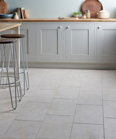
PROWoodpecker Flooring
6 years agoA S
6 years ago PRO
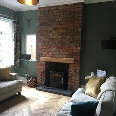
PROFloor Monster
6 years agoBen
6 years ago PRO
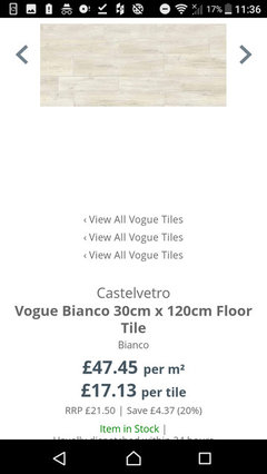
PROStone & Ceramic Warehouse
6 years agodawn_ramsay_rae
6 years ago
Misha M
6 years ago
MaHa H
6 years agoBen
6 years ago- PRO
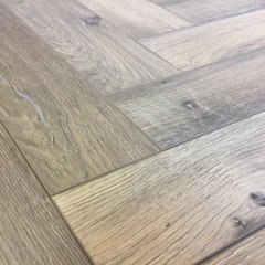
Floor Monster
6 years ago  PRO
PROAndreea De Mirabela Design
6 years agoBen
6 years agoA S
6 years agoJ C
6 years agolaylabates
6 years agoBen
6 years ago
Martin Cook
2 years ago


minnie101