silverdragon0330

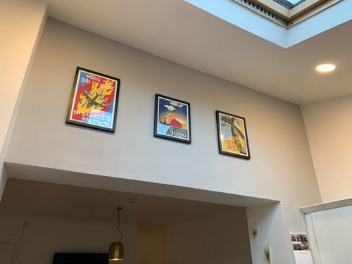
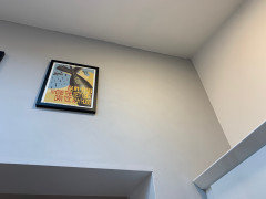
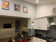
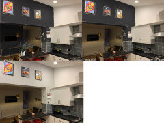
What colour should I paint the wall that will work with the prints?

Jess Perry
3 years ago

The wall is soft grey from when I moved in. I’ve repainted the rest of the kitchen walls (white) but I’m not sure what to do about this one. You can only see it from the garden and while you’re in the kitchen so it doesn’t really need to match with anything. The kitchen is grey and white.
Thank you!

Comments (45)

  • Daisy England
    3 years ago

    I’d have all the walls the same colour. For me it doesn’t look as though it could be classed as a feature wall to have it in a different colour. I also think the black frames would stand out more against a white wall.

  • Jess Perry
    Original Author
    3 years ago

    Thanks. Why don’t you think it should be a feature wall?

  • Daisy England
    3 years ago

    If it’s just the bit at the top that I can see from the image I don’t think there’s sufficient of it to class it as a feature wall.

  • Juliet Docherty
    3 years ago

    What is the wall colour currently?

  • Jess Perry
    Original Author
    3 years ago

    A light grey. I think this photo might show it better.

  • E D
    3 years ago

    I like the grey with the pictures and the way it works with the white wall, as far as I can judge from the photos.

    Colour advice is always tricky, but perhaps if you show more of your space, people can form more of an opinion.

  • Daisy England
    3 years ago

    That second image shows the colour to be different. Always a problem doing it online combined with lighting and different times of day.

  • Jess Perry
    Original Author
    3 years ago

    My kitchen isn’t that big so it’s hard to get a good photo but hopefully this helps. 🙂

  • Sonia
    3 years ago

    The wall is fine as it is, but you could try a mid grey like your tiles if you want to. A feature wall is usually a large wall incorporating a fireplace or behind a sofa. The wall is a bit high for pictures, they’re usually better at eye level.

  • Sonia
    3 years ago

    This sort of thing

  • E D
    3 years ago

    Yes, that clock is hung too high! 😄😄

  • Jess Perry
    Original Author
    3 years ago

    They’re not the kind of images you’d want at face height and they’re massive. They make the room. I think painting it white would be really boring?

  • Jess Perry
    Original Author
    3 years ago

    Thanks for your comments. 🙂

  • Juliet Docherty
    3 years ago

    If you painted it something like Downpipe it would accentuate the colours in the artwork, white walls will accenture the black frames. Something like Sonia's image.

  • minnie101
    3 years ago
    last modified: 3 years ago

    A dark shade works really well with the art but it does also frame the tv so I’d consider extending it onto that wall too personally


  • E D
    3 years ago

    Maybe it’s just me, generally not being convinced by the trend for darkness, but I like it the the way it currently is, best.


  • Wumi
    3 years ago
    last modified: 3 years ago

    You could try leaving a block of the grey colour around your artwork and painting the rest white so it makes a ‘feature’ of your artwork.

    Some examples:


    BAGEL FACTORY, E9 · More Info


  • clarekelly2002
    3 years ago

    i think it d look alot better painted white like the other walls

  • Jayk
    3 years ago

    A true neutral grey is very good. It doesn’t compete with colours and tends to make colours in pictures “pop”.

    However, other colours work. It’s not a bad idea to take some clues from what art galleries do. The range is surprising. A while ago my wife and I were visiting the Whitworth Art Gallery in Manchester and were taken by the colour being used on its walls. On enquiring we were advised it was Little Greene Attic II. We would never have chosen it from a paint chart but now use it successfully in our home.

    It all depends what overall look/style you are seeking.

  • PRO
    asart Ltd
    3 years ago

    My suggestion would be to paint the wall the same colour as the darker grey tiles. It will both unify the space and the bright colours of your prints will really stand out.

  • Phillipa Craddock
    3 years ago

    I think Wumi’s suggestion could work well if you painted one rectangular block of colour behind the 3 pictures. I was told with pictures or similar to take the colour from a them that makes up the lowest percentage of coverage and use that as an accent colour. So here you might pick a dark grey or red? It wouldn’t require much paint but the tricky bit would be calculating and marking out the rectangle.

  • PRO
    Nellie Vin
    3 years ago

    this size works its too high, no matter what color you paint or here some suggested...there need some large size art work something like 140 x 100 cm, or else .

  • E D
    3 years ago

    Or else what? 😱😄

    Lost in translation, I guess. 😊

  • Esme Marshall
    3 years ago

    As an aside, did you buy the prints from the poster shop near the cathdral in Hanoi?

  • Nicky Graham
    3 years ago

    You can use the dulux visualizer app to easily see how different colours will look on that wall 🙂

  • E D
    3 years ago
    last modified: 3 years ago

    The prints look nice and colourful, but what about their subject matter?

  • PRO
    Nellie Vin
    3 years ago


    this is can be all what you like to see there, here is few my works, bluebells, , how about this red apple. O you can look in search wall art for kitchen, one more thought , if you do posters maybe you have four just hang all closer to each other and that its the best way without new investments. Nellie.

  • PRO
    Nellie Vin
    3 years ago
    last modified: 3 years ago

    looked again to your wall, just try to get posters closer each other maybe 1 cm apart not more.... there nice red accent in poster and chairs; maybe the door for paint in red in the right side cupboard, that gives more cheerful and happy look for the kitchen

  • Jess Perry
    Original Author
    3 years ago

    @Esme Marshall I bought them 11 years ago so I can’t remember exactly but yes I think that’s the one!

  • Elizabeth Keenan
    3 years ago

    I wonder if Dulux's colour of the year Brave Ground would work - it would give you something of the feature wall I assume you are looking for and still work quite well with the prints - the mustard/ochre colour in the article might also work as long as as it doesn't present a problem with the yellow in the prints(https://www.houzz.co.uk/ideabooks/140293014/list/back-to-life-discover-dulux-s-colour-of-the-year-2021. Sometimes pure white walls can be a bit stark with other colours so if that is the case you could consider painting over them with a softer natural off white. I agree with Tobe's suggestion about reframing the prints with a good sized mount all the same size if that is possible and set against the right feature wall colour the area would really pop. I would also position them very slightly off centre with the smaller space at the bottom -

  • Helen Grützner
    3 years ago

    There are yellows and reds and oranges in those paintings - you could try a bright colour like that to pep the whole area up a bit? You also have red stools, you could use that.

  • None None
    3 years ago

    Navy

  • E D
    3 years ago

    Army

  • PRO
    Starfish Interiors
    3 years ago

    Good Morning.. 😁.. SO.. There is already a lot of visual detail in your kitchen.. It's very eclectic and interesting... You then have the nook at the back which also draws the eye. I agree with one of the previous comments that whatever colour you paint the opening wall, you should also paint the TV wall... It will add definition and uniformity to a visually busy space... I would also consider a slightly darker grey to what you have... Mid grey would work very well (similar to the tiles but doesnt have to be the exact same tone) it would add instant warmth and depth.. But not feel dark and overbearing.. Pin or paint some samples up on both the opening wall and the TV wall and see what you like.. And what you want to live with. A mid grey would make real sense of your gorgeous pics and stools.. And give them a slightly more dramatic backdrop to make them pop. I'm not keen on red on walls unless it's just a hit... It influences the mood too much.. To keep your current palette I would def stick with a grey.. There are sooooo many greys... Ones with red tones, blue tones etc... See what you like.. Have fun. 💃🏽💃🏽

  • PRO
    Starfish Interiors
    3 years ago

    Yep

  • Deborah smith
    3 years ago

    I I could take a colour from the prints and paint the wall that or you could change the frames the prints are in maybe white ones would look better

  • Nicola Creasey
    3 years ago

    Dark!

  • User
    3 years ago

    Hate to throw a spanner in the works but why that wall? To me it looks like the space above your cupboards is crying out for attention. You’ve got a fab space to play with their so of it was mine, I’d match the tiles with paint and use the cupboard tops as shelves for display of lovely ornaments or rarely used (but aesthetically pleasing) kitchen and/or dining pots.....and in answer to the original question have the art wall white. Other than my suggestion if you leave the cupboard walls white then i‘d paint the art wall in a fave colour for impact (I see you have some red stools, go daring!)

  • julesdxb
    3 years ago

    Instead of painting the wall, you could consider putting a thick white border/mount around the 3 pictures (even adjusting the middle mount to make the frame the same size as the other 2) then use white frames - your kitchen is white and grey and you have great pops of colour in the pictures, but the dark frames take away from this.

  • jackiemplummer
    3 years ago

    Paint it a bright mustard, I dont like the dark grey suggestions. A bright mustard would pick out the mustard colour in all 3 prints, yes it's a bright choice, but will be nice to look up to, like looking up at a sunny sky!

  • donut99
    3 years ago

    Prefer it as it is. It looks too oppressive in dark . Would be more inclined to paint above the cabinet a darker shade but it looks great as it

  • Umi Sinha
    3 years ago

    I agree with the mustard suggestion for a lift and to add a touch of warmth but then I'm a sun lover. I think everything matching can be a bit boring and I'm not fan of dark grey, which would make the kitchen darker. If not, the light grey is quite nice as it is.

  • JC
    3 years ago

    I’m generally a fan of strong colours behind pictures however I think your current colour works fine and agree with others would go for larger mounts and frames (think about colours too) so the pictures stand out and balance the space.

  • JC
    3 years ago

    Sorry, just seen date on this! Not sure why it was showing as a recent thing on my app!

United Kingdom
Tailor my experience with cookies

Houzz uses cookies and similar technologies to personalise my experience, serve me relevant content, and improve Houzz products and services. By clicking ‘Accept’ I agree to this, as further described in the Houzz Cookie Policy. I can reject non-essential cookies by clicking ‘Manage Preferences’.