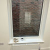
tiling options!
Victoria Riley
2 years ago

Featured Answer
Sort by:Oldest
Comments (8)

Daisy England
2 years ago
Alyson Jones
2 years agoRelated Discussions
Ikea kitchen finishing touches - what worktop and splashback?
Comments (7)How about making a concrete worktop. This isn't beyond the ability of a fairly competent DIYer. There are lots of YouTube videos to help and the worktops can be practically any colour and add a personal touch. The materials are extremely cheap. We have recently made concrete tops for within our larder to see whether is really as easy as it looks, and are delighted with the results....See MoreBathroom tiling and painting - help!
Comments (5)In my opinion it's all about: undertones, natural or artificial light, overall tone and other materials. Undertones - you need to clarify what the undertone is of the tile (that means is it biased towards a cool possibly blue colour or a warmer colour). Look at a paint chart, perhaps F&B next to the tile in good light. Try to match the tile with the correct colour, for example Strong White has a blue undertone, Skimming Stone has a violet undertone. If you do this it should work. Light - once you have identified the undertone you could paint the wall in a dark or light version of that colour. Consider natural light and artificial, and also consider the temperature of the LEDs. I only use very warm which is I think 2700 kelvins - it makes a huge difference. Overall tone. Some rooms look insipid because everything is too tonally similar. Rooms that are all tiles the same with pale walls can look like this. Adding a darker tone (it could be wood, or a wall tiled darker or accessories) will improve this. Materials, try to place samples of everything together to get it right. Wood or wood effect will add warmth, if you have a room with no wood, will it be cold? If wood isn't an option make sure there is tonal interest....See MoreNew fitted Kitchen...wrong colours.
Comments (17)Hi, I too wouldn't tile and would simply leave the upstands. I would remove the cream splashback and replace with a Blue (similar to what is posted above) coloured splashback. Alternatively a splashback In a similar finish and colour to worktop can be raised upto the wall units to give a seamless, easy to clean splashback. I think one of the major issues, in terms of aesthetics, with this kitchen is the cool cream paired with the warmer brown which is fighting against the white of the walls and flooring. I would paint the walls a shade of brown (dark or light) which tonally works with the cabinets and worktop and accessorise with teals and mustards. Alternativly you can use a neutral coloured glass splashback paired with orange accessories, blinds and even a feature wall to draw the eye away from the kitchen. If you can change the flooring to a wood effect vinyl, IMO, the overall look will be improved....See MoreWhich metro tiles?
Comments (15)What colour grouting is what our clients always struggle with. When going for a metro tile and a wood finish vanity unit, we suggest the white tile with darker grey grouting. It will give the effect of a more rustic/industrial bathroom. Cream metro tile is suitable for more traditional victorian, does not look very fresh tbh. And white metro with white grouting is for more contemporary bathrooms, but we believe that way the metro brick effect wall looses its charm. Examples of all three are below. Good luck, I'm sure it will look great at the end. You cannot really go wrong with metro tiles, in whichever version they might be....See More
Sarah U-S
2 years agoclarekelly2002
2 years ago
Juliet Docherty
2 years ago
Sonia
2 years agoMary Ketchley
2 years ago


Ribena Drinker