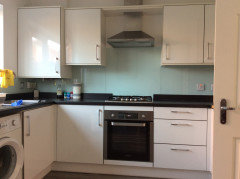
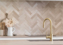
Toning down grey kitchen
Jo O
last year

Featured Answer
Sort by:Oldest
Comments (24)

Jo O
last year
Sonia
last yearRelated Discussions
Kitchen blinds - tone in or contrast?
Comments (8)I'd add a bit of colour to add some zing and bring it to life, especially in the kitchen, looks a bit flat just blue and grey. The complement of blue is orange but other colours would work. Orange and yellow together an option. Don't worry too much about 'rules'. I love colour and too co-ordinated can look like a showroom rather than a home. Choose something you love, think of food (think fruit) colours, I think they look good in a kitchen....See MoreWait - Should I calm down with colour? Manor House Gray v Vardo (Teal)
Comments (11)I think 'man about the house' is giving good advice. I adore teal but in this instance a paler grey with teal accents in accessories may suit the space better. I painted a similar wall in a lovely rich purple and it was too much, too dominant for my space :/ . It is a gorgeous colour though it really looks amazing against the lamp and couch.... Oh maybe be brave and go for it!!...See MoreToning down a grey that looks green in a hallway
Comments (17)Hi EE BB. North facing rooms get no direct light so can appear cool and a bit bluish. A neutral with some warmth to it would counteract this. Strong saturated colours can be good for breaking through the grey. East facing rooms get morning sun but go flat and lifeless in the afternoon. the light can look warm and yellowy in the morning but go bluer in the afternoon. As a result, they are hard to choose colours for, Farrow and Ball suggest Duck Egg Blues but I personally am not a fan. West facing rooms get warm pinkish sun late in the afternoon and so will make warm colours glow. South facing rooms get really strong light and I did read something interesting about this today in an amazing book about colour. It suggested that a South facing room is so beautiful in terms of light that to put strong colour on the walls is akin to putting makeup on a beautiful face, totally unnecessary! The only thing that seems to really matter with colour is light....See MoreSmall kitchen island design advice please, two-tone or single
Comments (8)Normally i think islands in a small room work better if they’re in the same colour. Personally I prefer Matt and think shaker style would work. The kitchen will probably look bigger minus handles but I think shaker handleless are more expensive but might be wrong. You could have discreet handles anyway. Have you considered an induction hob? It’s sleeker and will give you more worktops space when not in use. It also looks as if you could have a deeper than normal worktop on the back run (more storage space)? i added some tiles for texture but you may hate the colour (Apologies for the bad photoshop!)...See MoreJo O
last year
Daisy England
last year
CWD
last year
Juliet Docherty
last yearlast modified: last yearminnie101
last year PRO
PROCIA_Studio
last yearJo O
last yeartamp75
last year PRO
PROFrank ‘n’ Style
last yeargold895
last yeargold895
last year
Sharon Daly
last yearLinda
last year PRO
PROJikoni Interiors
last yearK G
last year
Louise Tobin
last yearSi Co
last yearlast modified: last year PRO
PROCarla / kolours.space
last year- PRO
Carla / kolours.space
last year siobhanmcgee90
last yearChristina Cornish
last year


Morello