10 Gorgeous Green Front Doors
Repainting the front door is a lovely job for a sunny weekend. Now to choose the colour... Will these shades inspire you?

There’s something wholesome and energising about the colour green – with its connotations of freshness ranging from apples to spring grass, soft sage and beyond. Equally, green can be dark and stately, or zesty and modern. And this versatile hue is a great colour for a front door, whether you want to go for bold and bright or muted and elegant. Check out this pick of gorgeous green doors from around Houzz.
Channel the 1970s
Three is the magic number for nailing a look – because a trio of thematically linked details is all you need to set the tone you’re after. Here, the owners have gone for a 1970s entryway, choosing classic wood-panelled walls, a retro table lamp and a flash of psychedelic acid green paint to set out their style stall.
However, in an all-white, clean-lined hallway, the same wide, modern, acid green door could look utterly contemporary. It’s all about context.
Go local
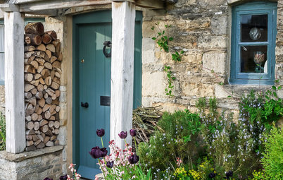
Dark green is one of the colours associated with Scotland and its national textile, tartan, with dyes in this hue traditionally made from pre-flowering heather plants and iris leaves. So what better shade for this elegant Scottish front door, particularly when it’s surrounded by equally traditional stonework?
Choosing a darker shade of green here also adds a layer of grandeur to what could otherwise be a wholeheartedly rustic frontage; a softer green would play more to the gentle colours in the stonework, creating more of a farmhouse look.
Highlight period details
Millions of us live in 1930s houses and, if you’re lucky, you’ll still have the original stained-glass windows.
Here, the owners have chosen to show off the green in the pattern of theirs by plumping for a slightly darker tone that gives the viridescent tinted glass a beautifully luminous quality.
Get more ideas for enhancing a 1930s home
Emphasise with artwork
This vibrant emerald door really stands out against a brilliant white backdrop, and highlights its pretty coloured glass to boot.
But what makes it really work is the choice of framed prints on the wall; these leafy plants pick up on the paint perfectly, providing balance as well as interest in what could otherwise be a rather stark entrance.
Be inspired to paint your walls green instead
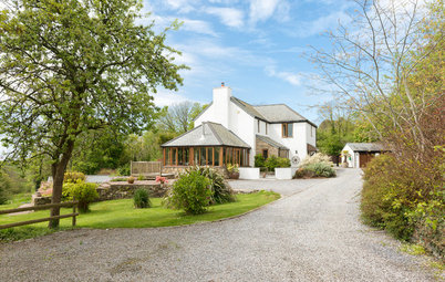
Soften with sage…
Creamy sage is the go-to hue for boosting a building’s rustic credentials. This gentle colour perfectly blends in with the slate and natural stone used to construct this dreamy barn conversion.
Creamy sage is the go-to hue for boosting a building’s rustic credentials. This gentle colour perfectly blends in with the slate and natural stone used to construct this dreamy barn conversion.
…and capitalise on the view
Here’s the same door seen front on, where you also catch a glimpse of the natural colours inside: the taupe sofas, slate flooring and jute mat – and those glorious rolling fields beyond. This isn’t a just a picture perfect frontage, it’s a whole landscape painting.
Here’s the same door seen front on, where you also catch a glimpse of the natural colours inside: the taupe sofas, slate flooring and jute mat – and those glorious rolling fields beyond. This isn’t a just a picture perfect frontage, it’s a whole landscape painting.
Pick a pastel
Combined with fresh white walls, this pistachio green door and matching shutters lends this very ordinary house front a cute, 1950s ice-cream parlour prettiness. Painting shutters is a nice alternative to painting window frames.
Combined with fresh white walls, this pistachio green door and matching shutters lends this very ordinary house front a cute, 1950s ice-cream parlour prettiness. Painting shutters is a nice alternative to painting window frames.
Pair green with green
This shady front garden feels lush and jungly, thanks to the abundance of foliage on display. The painted chairs and floral cushions are a good touch, too. And why break all that up with contrasting paint on the front door? This earthy green stands out just the right amount, and layering different variations of the same shade is a powerful design trick that adds real depth to a space.
This shady front garden feels lush and jungly, thanks to the abundance of foliage on display. The painted chairs and floral cushions are a good touch, too. And why break all that up with contrasting paint on the front door? This earthy green stands out just the right amount, and layering different variations of the same shade is a powerful design trick that adds real depth to a space.
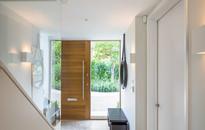
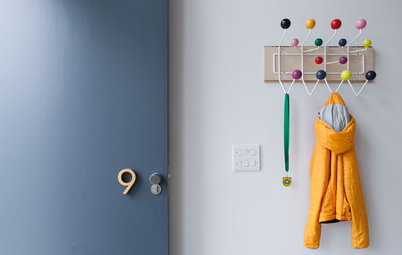
Add energy
Going out each morning through a hallway that looked like this would certainly set you up with the energy and verve required for the day ahead. Not only is this light, white-painted space supremely well ordered, with a satisfying nook for everything, it has an element of fun, too.
If you’re brave enough to go for a zingy lime like this, try pepping it up further with bold flashes of red in your accessories – keep the colours limited to let them sing. And for a gear change with this colour scheme, how about switching the breezy white to a moody deep grey?
If bright and breezy is your style, check out these yellow front doors
Coordinate your colours
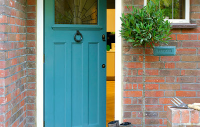
The red-spotted chair cushions on this porch help to create a sweet, retro vignette that’s about so much more than just the turquoise-y green door. Even if you don’t have a generous, dry porch like this, it’s a trick worth trying with other exterior accessories – floor tiling, window frames, flower pots or even hanging floral baskets in the summer. A soft, dusty rose would also work beautifully with this blue-green shade.
TELL US…
Which is your favourite shade of green for a front door? Share your thoughts or photos in the Comments below.

Sponsored
Sponsored
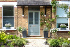
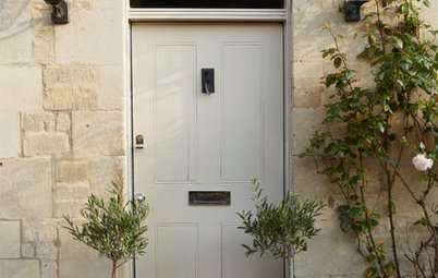
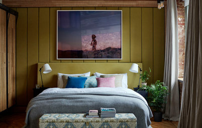
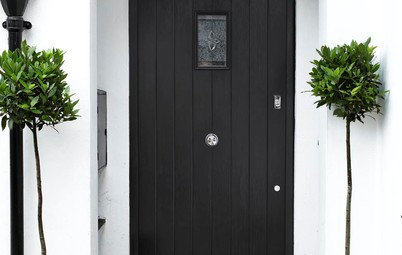
An understated heritage shade (in this case, Farrow & Ball’s Card Room Green) is always going to set a tone of quiet sophistication. If you’re after a grown-up feel for your frontage, this is the failsafe way to do it.