Houzz Tours

House Tours


Houzz Tour: A Bright Apartment with a Cosy Mix of Materials
The design of this home plays with colours, patterns and textures against a simple white and wood backdrop

“The clients wanted a cosy but contemporary aesthetic cocooned in white tones,” says Sunita Yogesh of Sunita Yogesh Studio, based in India. “Their exact words were, ‘We want it to feel like a home and not a hotel.’ The neutral shell gave us ample room to experiment with textures, patterns and colours by way of accents and accessories,” she says. “Yet, with such a brief, we had to tread the line between spartan and sophisticated very carefully.”
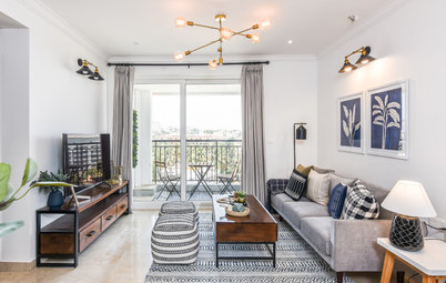
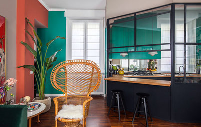
The apartment’s open floor plan is divided into zones with the help of distinct furniture layouts. A formal living area, with dove grey sofas, lies to the right of the entrance.
“For the layout, we went for two compact, inward-facing sofas,” Sunita says. “We backdropped the seating area with a white, built-in shelving unit filled with vibrant tchotchkes [small decorative objects] and pared-back pottery. Gilded black accent lights punctuate the aesthetic,”
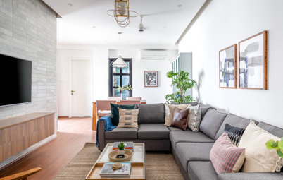
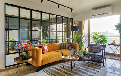
Further ahead, to the right, an informal lounge conjures a warm and intimate air. The neutral shell is enlivened by colourful accents, natural-grain wooden furniture, elegant artworks and lighting fixtures in brass and iron.
A large indigo corner sofa and a pair of midcentury-modern armchairs define the seating area, while layered textures and patterns in the form of a rug, cushions and upholstery, weave visual variety.
Find an interior designer near you.
A large indigo corner sofa and a pair of midcentury-modern armchairs define the seating area, while layered textures and patterns in the form of a rug, cushions and upholstery, weave visual variety.
Find an interior designer near you.
“We placed a console table behind the sofa to divide the formal and informal sections. We kept the design language organic and free-flowing, and combined various styles, to give the home a lived-in feel,” Sunita explains.
“For instance, the black credenza at the entrance adds a modern touch, the accent chairs in the living room smack of midcentury sensibilities, while the block-printed fabrics and Nagaland accent cushions infuse an ethnic, local flavour,” she says.
“For instance, the black credenza at the entrance adds a modern touch, the accent chairs in the living room smack of midcentury sensibilities, while the block-printed fabrics and Nagaland accent cushions infuse an ethnic, local flavour,” she says.
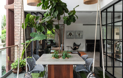
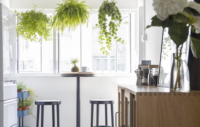
Outside is a balcony that sweeps the entire length of the room.
“The client was keen on a bar, and the balcony, given its volume, appeared to be the best place to house it,” Sunita says. “We styled the open bar with industrial elements, such as iron and wood. We also added an outdoor dining nook to turn the balcony into a self-sufficient entertaining zone.”
“The client was keen on a bar, and the balcony, given its volume, appeared to be the best place to house it,” Sunita says. “We styled the open bar with industrial elements, such as iron and wood. We also added an outdoor dining nook to turn the balcony into a self-sufficient entertaining zone.”
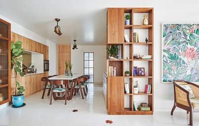
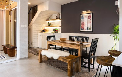
“We didn’t want to hinder the flow between the living and dining spaces with partitions, so we introduced distinction through the ceiling,” Sunita says. “We used rafters in the living room while maintaining a plain ceiling in the dining room.
“We also anchored the dining zone with an eight-seater table, contrasting black chairs and a wicker cabinet[see previous image]. A brass ‘Sputnik’ light overhead notches up the glam quotient.”
“We also anchored the dining zone with an eight-seater table, contrasting black chairs and a wicker cabinet[see previous image]. A brass ‘Sputnik’ light overhead notches up the glam quotient.”
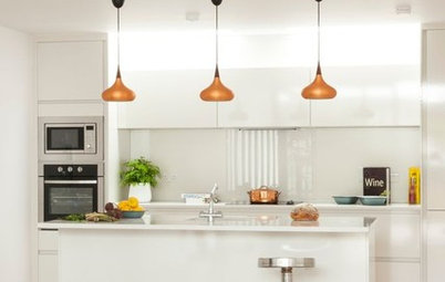
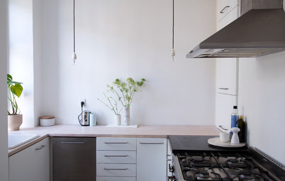
The kitchen is a calming oasis of duck egg blue and white.
“We juxtaposed shaker-style cabinets with brass hardware against a splashback of square, glossy white tiles,” Sunita says.
“We juxtaposed shaker-style cabinets with brass hardware against a splashback of square, glossy white tiles,” Sunita says.
“We also knocked down a wall at the entrance so we could fit in a small breakfast bar. We highlighted it with subtle, grey-patterned tiles and a pair of brass pendants,” Sunita adds.
The cloakroom originally came with builder-grade materials and fixtures.
“The room was in desperate need of an overhaul,” Sunita recalls. “We went with teal blue tiles for the feature wall and a pale oak finish for the cabinetry. We installed a large round, brass-finish mirror and two globe pendant lights to give the space a luxurious facelift.”
“The room was in desperate need of an overhaul,” Sunita recalls. “We went with teal blue tiles for the feature wall and a pale oak finish for the cabinetry. We installed a large round, brass-finish mirror and two globe pendant lights to give the space a luxurious facelift.”
The master bedroom is minimalistic, with muted colours, subtle textures, and a melange of styles.
“The clients wanted the bedroom to be a calm space where they could unwind, so we pared it down to a bare minimum,” Sunita explains. “We chose tongue-and-groove wall panelling, midcentury-style bedside tables and a beautiful woven bench to create a sense of comfort and cosiness. A reading nook in the corner completes the knocked-back look.”
“The clients wanted the bedroom to be a calm space where they could unwind, so we pared it down to a bare minimum,” Sunita explains. “We chose tongue-and-groove wall panelling, midcentury-style bedside tables and a beautiful woven bench to create a sense of comfort and cosiness. A reading nook in the corner completes the knocked-back look.”
The en suite bathroom is monochrome uplifted by geometry and metallic shine.
“We counterbalanced the geometric-patterned floor with classic white metro-tiled walls. We also augmented the black cabinetry with brass hardware, and chose a wood-rimmed mirror to warm the space,” Sunita says.
“We counterbalanced the geometric-patterned floor with classic white metro-tiled walls. We also augmented the black cabinetry with brass hardware, and chose a wood-rimmed mirror to warm the space,” Sunita says.
The parents’ bedroom is clean, simple and frill-free. The white shell is enhanced by powder-blue wardrobes, a wooden bedhead and a wood-and-black TV console.
“Since it was a room for elders, we gave it a vintage touch with a wooden bed and traditional white bedside tables,” Sunita says. “We also created sleek wooden shelves in the narrow alcoves on either side of the window.”
“Since it was a room for elders, we gave it a vintage touch with a wooden bed and traditional white bedside tables,” Sunita says. “We also created sleek wooden shelves in the narrow alcoves on either side of the window.”
As a shared space for two boys, the kids’ bedroom is an even reflection of both its occupants’ tastes.
“The clients wanted something that straddled childlike charm and subtle sophistication. We chose a grey, gingham-patterned wallpaper for the feature wall and divided the twin wooden beds with a pale blue chest of drawers,” Sunita says.
“The clients wanted something that straddled childlike charm and subtle sophistication. We chose a grey, gingham-patterned wallpaper for the feature wall and divided the twin wooden beds with a pale blue chest of drawers,” Sunita says.
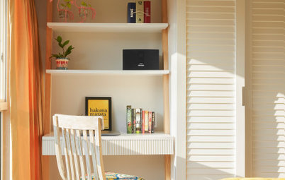
Opposite the bed is a dark blue wardrobe with a built-in study space.
“The light oak finish separates the study from the bold cabinetry,” Sunita says. “We also added floating bookshelves next to the wardrobe (not pictured), as the kids are avid readers.”
“The light oak finish separates the study from the bold cabinetry,” Sunita says. “We also added floating bookshelves next to the wardrobe (not pictured), as the kids are avid readers.”
The fourth bedroom has been converted into a playroom.
“The space doubles as a guest bedroom, courtesy of a teal sofa-bed,” Sunita explains. “We installed an open shelving unit on one side to serve as storage for toys and knick-knacks. We also brought in a custom chalkboard and a kid-sized table and chairs to give the space a whimsical classroom vibe.”
“The space doubles as a guest bedroom, courtesy of a teal sofa-bed,” Sunita explains. “We installed an open shelving unit on one side to serve as storage for toys and knick-knacks. We also brought in a custom chalkboard and a kid-sized table and chairs to give the space a whimsical classroom vibe.”
Tell us…
What did you like most about this home? Share your thoughts in the Comments.
What did you like most about this home? Share your thoughts in the Comments.


Sponsored
Who lives here? A couple, their two sons, and their parents
Location Bangalore
Property An apartment built in 2019
Size Four bedrooms and three bathrooms; 288 sq m (3,100 sq ft)
Interior designer Sunita Yogesh, founder and chief interior designer of Sunita Yogesh Studio
Photos by Nayan Soni
The main door opens into a hall area accentuated by a characterful vignette. Sunita explains: “Since the home didn’t come with a designated foyer, we carved out an entrance zone by highlighting the wall with a credenza, ornamental mirrors and glass globe table lamps,” she says.