Houzz Tours

House Tours

Houzz Tour: A Bright Family Home in San Francisco
An evolving home in San Francisco has a mini renovation to make it more child friendly and flowing

Updating the kitchen, dining room, living room and bathroom took Lucy McLintic three months, following nine months of planning beforehand.
Lucy had wanted to renovate these room since she moved in five years ago and this was finally the right time. The layout had two major problems: a narrow corridor leading off the kitchen to a small bathroom (only a toilet, no basin). The bathroom was so tiny that the door knocked the toilet bowl when it opened. And more space was needed for two boys under six to play in.
Some crafty rearrangement was required to avoid major structural work or an extension. Read on to see the bright, natural and modern haven now.
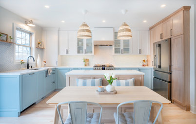
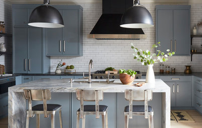
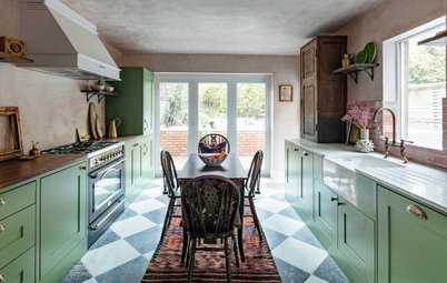
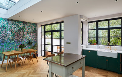
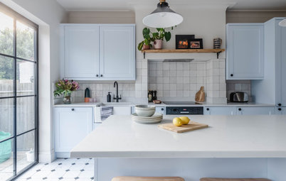
Lucy has dreamed of this kitchen for years. She knew the cupboards and worktops had to be white. That necessitated darker shades for the flooring and tiles, and some pattern. She chose herringbone floor tiles to echo the zigzag rug that would be reused in the family room. Silver limestone wall tiles added a touch of texture and luxury, while staying within the modern, clean-lined look.
The old kitchen (which had four doorways) was poorly organised and falling to pieces. The problems were solved by blocking up a doorway between the kitchen and bathroom, creating more worktop space for the kitchen and room for a basin unit in the bathroom. The doors were removed between other rooms.
The worktops have an unusual finish to the edges: a reverse bevel, or ‘shark nose’. Lucy noticed this as an emerging trend in Europe and wanted to try it out. It was difficult to explain, but her contractor knew what she meant and got it just right.
See more contemporary white kitchen schemes
The worktops have an unusual finish to the edges: a reverse bevel, or ‘shark nose’. Lucy noticed this as an emerging trend in Europe and wanted to try it out. It was difficult to explain, but her contractor knew what she meant and got it just right.
See more contemporary white kitchen schemes
Open walnut wood shelves and skirting boards warm up the space. A white kitchen can be so clinical, but open shelving allows you to bring some personality to the space. The shelves are filled with a mix of older items, gifts and products from a local restaurant supply store.
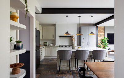
The dining room and living room were swapped around, making the dining room now visible from the kitchen so it feels like a kitchen-diner. It all feels like one space, though no major structural changes were made.
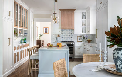
The small dining room is the perfect size for the family. Attention is focused on the table from Room and Board. The neutral palette is in shades of coffee, latte and milky white, but interesting shapes and textures were added, such as the Link suspension pendant light by LZF. It’s made of wood veneer and is quite the statement piece.
The small dining room is the perfect size for the family. Attention is focused on the table from Room and Board. The neutral palette is in shades of coffee, latte and milky white, but interesting shapes and textures were added, such as the Link suspension pendant light by LZF. It’s made of wood veneer and is quite the statement piece.
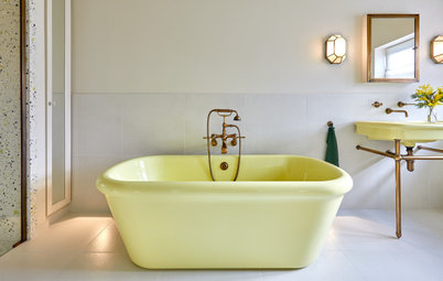
The mirror was the starting point for the bathroom. Lucy didn’t want the overall effect to be traditional, so she paired it with modern minimal glass tiles and a floating walnut basin unit with square-edged worktops in the same granite as the kitchen. The sink unit is bespoke, but from the same store as the kitchen cupboards. The paint is Benjamin Moore’s Iron Mountain. Wall-mounted taps were chosen due to limited space.
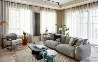
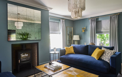
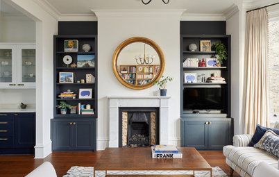
The living room is used all the time. It’s the centre of the house physically, so there’s a natural gravitational pull towards this room. Now that the dining room has been moved to the back of the house, the space feels more open and inviting. Most of the items in the room – the sideboard, mirror, rug and occasional table – were reused. The sofa and the chair were the only new additions.
Discover how to use natural wood in your home
Discover how to use natural wood in your home
The room was deliberately kept sparse to reserve the floor space for the kids to play. The deeper wall colour (Benjamin Moore Wiemaraner) and patterned rug keep it from feeling empty.
Do you like this home? Tell us why you like it in the Comments below.
Do you like this home? Tell us why you like it in the Comments below.


Sponsored