Houzz Tours

House Tours


Houzz Tour: A Revived Victorian House With a Showstopping Kitchen
Characterful features and thoughtful colour choices have turned this once-tired house into a warm family home

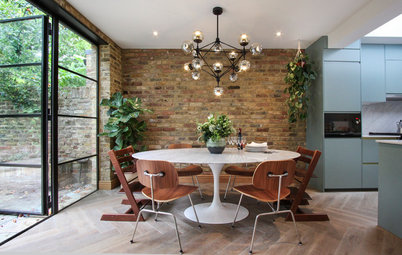
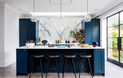
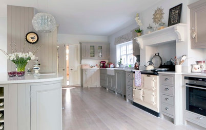
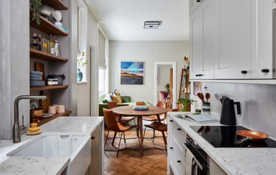
Large islands, offering additional storage and worktop space, are at the heart of many a kitchen, but the central unit in this period home is the main event in more ways than one. Glossy metro tiles at either end, arranged in a herringbone pattern, add a striking flash of cobalt blue for an uplifting feel on even the greyest of days.
“The owner wanted the antithesis of a glossy white kitchen,” says designer Mel Massey, who was brought in to revamp the whole of this four-storey Victorian terrace. “I see so many homes where I think, yes, that’s really beautiful, but what makes it stand out? The blue tiles soften the industrial elements in the room, and add a bit of life. Otherwise, it could just have looked too pristine.”
“The owner wanted the antithesis of a glossy white kitchen,” says designer Mel Massey, who was brought in to revamp the whole of this four-storey Victorian terrace. “I see so many homes where I think, yes, that’s really beautiful, but what makes it stand out? The blue tiles soften the industrial elements in the room, and add a bit of life. Otherwise, it could just have looked too pristine.”
The gloomy basement kitchen was in a particularly poor state. “It was awful in here before – dull, depressing and dark,” Mel recalls.
“We completely reconfigured it. We took out a wall, which wasn’t structural, then took out the old kitchen cabinets, which were blocking the light and just didn’t fit the space,” she says.
“Suddenly, the light could flow from one end to the other – it was amazing. We also moved the kitchen from the back of the house to the front,” she adds.
The windows and doors were already in place. “We were really lucky we could work with what was there. They weren’t rotten or anything,” Mel says.
Apart from those striking cobalt blue tiles, perhaps the biggest change in here was the new floor, which instantly lifted the room.
“We wanted a hint of an industrial look,” Mel says. “Originally, we considered polished concrete, but it’s really expensive and takes ages to dry properly. We didn’t have the luxury of time, as the owner was renting somewhere, so we needed to find a cost-effective alternative.”
The solution was a concrete-effect topping called Pandomo. “We put down a subfloor, then underfloor heating, something over that and then the topping,” Mel explains. “It has concrete in it, but it’s not solid. It’s fast-drying, weathers well, is hard-wearing and looks amazing.”
Tiles, Bert & May. Island unit painted in Hague Blue, Farrow & Ball.
The worktop is crisp white Corian, while the tap has an aged-bronze finish for a heritage feel.
The orange pendants add another tone. “I think the orange goes really well with the blue and bronze tones,” Mel says.
Pangen pendant lights, FontanaArte.
The orange pendants add another tone. “I think the orange goes really well with the blue and bronze tones,” Mel says.
Pangen pendant lights, FontanaArte.
The owner wanted to max his storage space, so the tall, oak-fronted cabinets were made bespoke
“He was also really keen to have a double oven, because he cooks quite big meals with his family,” Mel says.
Kitchen units, Ashley Smith Furniture. Brass and grey pendant lights, Gubi.
“He was also really keen to have a double oven, because he cooks quite big meals with his family,” Mel says.
Kitchen units, Ashley Smith Furniture. Brass and grey pendant lights, Gubi.
The front of the house, where the kitchen now is, before the renovation.
Find the right people to help with your renovation in the Houzz Professionals Directory.
Find the right people to help with your renovation in the Houzz Professionals Directory.
Two slim, bespoke oak and glass wall cabinets now fill the alcoves without jutting out too far into the room. “They make use of the dead space in the fireside alcoves and give much-needed storage space for the owner’s glassware collection,” Mel says.
White walls keep things simple, light and uplifting. “We wanted white, but not a bright, cold, stark one,” Mel says. “Because of the industrial look, we had to have a hint of grey.”
Walls painted in Celestial White, Little Greene. Alcove cabinets, Ashley Smith Furniture.
White walls keep things simple, light and uplifting. “We wanted white, but not a bright, cold, stark one,” Mel says. “Because of the industrial look, we had to have a hint of grey.”
Walls painted in Celestial White, Little Greene. Alcove cabinets, Ashley Smith Furniture.
Mel has painted the frame of the cabinets in a rich blue-green for an extra design details.
In this picture, you can see the beautiful oak detailing inside the cabinets on the pull-out rack.
Cupboard frame painted in Canton, Little Greene.
In this picture, you can see the beautiful oak detailing inside the cabinets on the pull-out rack.
Cupboard frame painted in Canton, Little Greene.
The island is definitely on the big side – for a very good reason. “We wanted the island to have plenty of space, as the worktop is literally all in the middle in this kitchen – there’s nothing around the sides,” Mel says. “We needed it to be as wide as possible, too, as the sink, hob are dishwasher are all in there.”
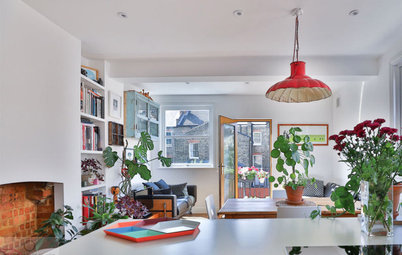
A relaxed, inviting dining area sits by the French windows. The oak trestle table and classic midcentury chairs were previous possessions that the owner brought with him to this house. “I don’t think we would have put anything too slick in here, as it would have looked contrived,” Mel says.
Eiffel chairs by Charles and Ray Eames; Series 7 chairs by Arne Jacobsen, both available at Heal’s.
Eiffel chairs by Charles and Ray Eames; Series 7 chairs by Arne Jacobsen, both available at Heal’s.
What’s inspiring about this room is how it combines different elements to create one special whole. “I think mixing up modern and vintage really makes a room,” Mel says.
The owner already had the vintage scales and trolley (flea market finds), but they fitted in perfectly. “He isn’t a minimalist, but he doesn’t want a lot of clutter, either,” Mel says.
The owner already had the vintage scales and trolley (flea market finds), but they fitted in perfectly. “He isn’t a minimalist, but he doesn’t want a lot of clutter, either,” Mel says.
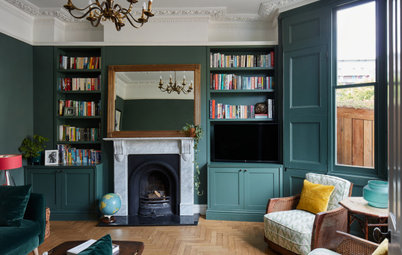
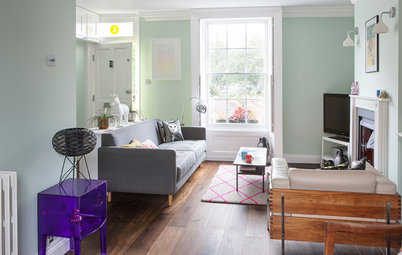
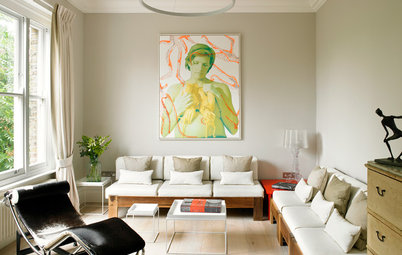
“I walked into this room and thought ‘those windows are amazing’,” Mel says of the elegant, knocked-through living room on the upper ground floor.
“We wanted to create a gentleman’s club vibe in here,” she explains. “The owner definitely didn’t want a bachelor pad vibe, too cold or masculine.”
The walls are painted in an earthy grey-green. “It’s such a gorgeous colour,” Mel says. “Painting the shutters and the woodwork in the same shade is what makes it. Because there are such big windows, and it’s an open-plan space, you can get away with it.”
Walls and woodwork painted in Card Room Green, Farrow & Ball. Sofa, chair and rug, existing possessions.
The owner is a bookworm, with an overflowing collection to match, so Mel filled the alcoves with shelves. “We built four sets to house his collection, making some larger to fit the bigger books.”
A sculptural light adds a classic midcentury touch; the rose-blush tones work beautifully against the grey-green walls.
PH5 pendant light by Poul Henningsen for Louis Poulsen, available at The Conran Shop.
PH5 pendant light by Poul Henningsen for Louis Poulsen, available at The Conran Shop.
The floorboards throughout the broken-plan reception room have been sanded to refresh them.
The back of the reception room has been turned into a home office. “This area is a study-cum-library for the owner,” Mel says. “He does quite a lot of work from home.”
Chair and desk, existing possessions.
Chair and desk, existing possessions.
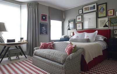
The master bedroom was in need of a refresh.
The cool grey tones have given the room a sophisticated feel.
“We ripped out the alcove cupboards in here and sanded the floorboards,” Mel says.
Again, period features such as the coving and fireplace add that extra-special something. “There are some lovely period features in this house,” she says.
Walls painted in Spruce 690, Paint & Paper Library. Here Comes The Sun Pendant, DCW Editions.
The bathroom has a similarly cool feel thanks to a grey and white colour palette.
One of the children’s bedrooms is another example of elegant period simplicity, with sanded boards, an original fireplace and cool grey and blue tones.
The exterior of the property.
Tell us…
What do you think of this refreshed Victorian home? Share your thoughts in the Comments section.
Tell us…
What do you think of this refreshed Victorian home? Share your thoughts in the Comments section.


Sponsored
Who lives here? A single advertising professional with three teenage children
Location Stoke Newington, northwest London
Property A four-storey Victorian townhouse, including a basement containing the kitchen-diner
Size Four bedrooms and two bathrooms
Duration of the work Four months
Interior designer Mel Massey of Mel Massey
Photos by David Giles Photography
Mel’s brief was simple: to help the owner revamp his new home. The work was mainly cosmetic – “restoring the floorboards, painting walls and just adding that bit of magic” – but with a few major changes, including transforming an unloved basement into a cooking and entertaining space.
“The house was perfect for him [location-wise],” Mel says, “but it was very tired and not decorated in his style at all. My job was to turn it into a home.”